Do you want to add more life and interest in your coloring projects? When people first start coloring stamps with Copic Markers or colored pencils, they often concentrate on color.
Which marker colors should I buy? Which pencil colors should I use?Color-color-color. Later, as we build up a pretty good color collection, the focus shifts to blending.
What color blend should I use on the bow? What color blend should I use for the snow?
And there’s the catch: Even though you’re thinking about blending technique, it’s still all about the color-color-color.
Hello, my name is Amy Shulke and I’m the illustrator and art instructor over at VanillaArts.com. Today I’d like to show you behind the scenes of my latest coloring project, Pewter & Snow.
Last month, we explored how artistic coloring differs from traditional coloring for cards and paper crafting.
This month, let’s look how to take the first step to adding more artistry to your next coloring project. There’s more to coloring than just color-color-color, blend-blend-blend, and assorted novelty techniques.
Your Power Poppy digital stamps can be used for realistic, framable, artistic coloring projects. The kind of project that are more than coloring, they’re paintings. And you can do this.
It’s easier than you think, if you take it one baby step at a time.
It starts with making a mental shift. Let’s move beyond the colors and the blends. Let's think about texture.
First, give yourself space to color
You’ll notice above that I mentioned Power Poppy digital stamps versus the clear polymer sets.
While there are painters and illustrators who create miniature art, we typically don't teach art at small scale. "Small" in art classes is a whopping 11x14 inches!
I know working large sounds scary to cardmakers who are used to coloring two inch stamps but if you want to learn to how color with greater realism, you need more room to learn and practice.
With Power Poppy digital stamps, you are only limited by the size of your paper and printer.
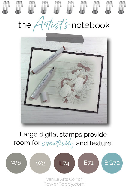
For my Pewter & Snow online class, we use Mittens and Merriment, a digital version of the mitten bough from the Bough Wow Wow clear set. The polymer stamp is about 3.5 inches tall. Instead, I’ve printed the digital version at 7 inches tall.
The extra space gives us room to add the texture and shaping essential to realistic coloring.
Someday, I’d like to print a Power Poppy stamp at 18 inches tall, just to demonstrate how much more potential these images have when we give ourselves ample space for details.
Select one element to celebrate
Don’t overwhelm yourself by trying to color every object in the stamp with full realism and tons of texture.
Start small by finding the most important element and coloring it a little better than everything else around it.
In every image there is a focal point or a main object, something that is supposed to be the star of the show. It’s the largest flower in the bouquet, the church in a sparse landscape, or the mittens nestled in lots of greenery.
Luckily, most stamp artists are very clear about the focal point. It’s usually towards the center and everything else frames it. If you still can’t decide on the focal point, check the title of the stamp. Notice the name of this stamp is “Mittens and Merriment” not “Ten Snowballs plus Random Branches”.
I highly recommend choosing the main object for your texture experiments. Texture attracts attention, so it doesn’t make sense to lead everyone to the third snowball on the right.
Adding texture to the star of the show makes it starrier and showier.
Tip: A BIG mistake a lot of card colorers make is to heavily embellish snow with glitter or flocking. Snow is almost never the focal point and neither is the tiny puff ball on the end of Santa’s hat. Your best coloring gets completely ignored when you make some minor element 3-dimensional or sparkly! It's a cute cardmaking gimmick but imagine how distracting it would be if one mountain behind the Mona Lisa had sparkle snow on it.
Think about what the object is made of
This is the hardest part for colorers who have learned traditional Copic Marker methods because we’re about to break the number one coloring rule.
Copic Marker classes teach you to blend. Everything you color is blended smooth, smooth, smooth.
Which is fine if you’re coloring rubber mittens.
But who wants rubber mittens?
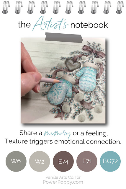
Mittens are warm and soft. They’re a comfort item which we remember fondly from childhood. Were grandma’s lovingly handmade mittens hard shiny plastic?
Sadly, that’s how your mittens look if you blend them smooth. Knit mittens are not reflective glass or high gloss vinyl. They’re matte wool and nubbly knots. When you blend things smooth, you make them look plastic and generic.
You move beyond coloring and become an artist when you add memories and grandma’s love to the stamp.
But what if you’re coloring a stamp that doesn’t trigger memories for you? What if there was a pair of snowshoes behind the mittens and greenery here? Most of us have never seen real snowshoes much less used them.
Luckily, we have Mr. Google. There are a ton of photo references online just waiting for you. I typically find photos for everything, even if it’s something I’ve touched a million times. So for my Pewter & Snow livestream lesson, I give students photo references for mittens, fur cuffs, snowballs, pewter, boxwood, ribbon, and even rustic wooden boards.
Photo references aren’t just for color and shape, they’re full of texture information too.
Pay attention to edges
Have you ever talked with a woman wearing heavy makeup that ends abruptly at her jawline?
It’s disconcerting because everything above the Mason Dixon line is pure Kardashian and below, she’s pale and blotchy. Like it or not, your eyes keep going back to line.
You can’t create an illusion if it stops dead at the edge.
Most people ignore the outline of a mitten. You’re worried about the blend, so you tend to concentrate on the center of the shape, because that’s where the blend is the most obvious.
But I want you to close your eyes and imagine running your fingers over grandmother’s mittens. What does it feel like?
Knitting is bumpy, you can feel ridges and rises.
Which means that the outside edge of knitted mittens would also have ridges and rises.
One of the things I really appreciate about Marcella’s illustrations is that she takes the time to include accurate lumpy bumpy edges. I just asked Mr. Google to show me some other mitten stamps and most have straight sides.
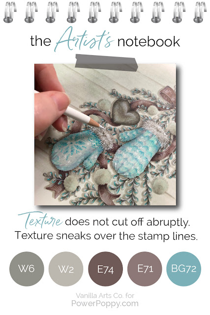
Do not smooth out the edges of your mittens or other bumpy objects. And if the stamp has crisp edges, you can restore missing texture by coloring over the outline.
As I colored the areas around the mittens here, I was very careful not to smooth away the rough edges. It makes my mittens look softer, fluffier, knitted, and real.
Use your marker or pencil to mimic the texture
Smooth blending has it’s place but not when you’re tying to capture lumpy, bumpy, reticulated, or grainy texture.
- The mittens are knitted, so my pencil strokes are short and V shaped, just like a knit stitch. If I wanted them to look purled, I would have made short lateral hash strokes.
- On the fur cuffs, I switched from my usual slow stroke to super-quick flicks that leap outside the stamp lines. It gives that area a fluffy look that begs to be touched.
- The pewter heart was colored slow and smoothly but I came back with light skipping strokes to damage and tarnish the surface into something well-worn and antique.
- Snowballs are grainy, so I danced my marker and pens over the surface in a dotted pointillism pattern. Grainy texture comes from grainy marks.
- Boxwood is a thick glossy leaf so I pressed harder and added sharp highlights and harsh lowlights.
- For the wood grain, I used long, slender, casual strokes. I ran the strokes in the direction the grain flows.
- And on the ribbon, I initially blended the tails smooth in order to get the dimensional waves and folds but then I came back with short crosswise hatching to simulate the ridges of grosgrain ribbon. It’s subtle but it adds to the tactile nature of the project.
Every object in this image was colored with a completely different mindset and stroke pattern.
You do your art a disservice when you treat everything the same.
So here’s my Artist’s Notebook challenge for you this month...
Find the focal point and spend the bulk of your time working there. Experiment to make your markers or pencils dance, simulating the grain, fiber, or pattern of real texture.
When you have more experience and as you gain confidence not-blending everything, start to develop texture in other areas.
I deliberately went overboard with this Pewter & Snow project. I layered texture over texture as I would in my own personal artwork. It's designed to challenge intermediate and advanced level students; sometimes I have to work pretty hard to keep them busy.
But no matter what your skill level, you can add a wee bit more texture and tad more thought to your next project. Baby steps lead to bigger steps... but you’ll go nowhere if you’re on smooth autopilot.
Artistic, textural, and realistic coloring is something that you can learn to do.
You’ve blended enough. Let’s try something new.
Want to color Power Poppy’s Mittens and Merriment with me?
My Pewter & Snow class is part of the Vanilla Livestream series for intermediate to advanced Copic colorers.
This lesson covers how to use texture both generously and intelligently to create the look and feel of real objects. I’m offering a wide range of textures here in this one image but we’ll also cover the steps on how to invent your own custom textures.
You can find out more about Vanilla Livestream classes here.
And I’ll see you back here next month for another glance into my Artist’s Notebook!


2 comments:
I am sooo in love with this! The focus on texture is brilliant - it looks amazing! And the colors! Love it!!!
Very awesome colouring, I love always to read your post and learn from it. The texture is so visible and the image so realalistic.
Thank you so much for sharing and have a great day.
Post a Comment