Hello all and happy Tuesday to you! Welcome to the Creative Confetti Challenge! This week, I'm going to not only issue a challenge for you all, but I actually "took" a challenge in the process of creating one! Confused? Well, a few weeks ago, one of my fellow designers Barbara Campbell said to me, "What about a challenge where you color up a fall image, but you don't use any fall colors? I thought that sounded like heresy but honestly, after I got to thinking about it, why not? We can all put the comfort of our Pumpkin Spice everything down and think a little out of the autumnal box, right?
HOW TO PLAY: To play along in the "Fall Away" Challenge, all you need to do is get creative when choosing a fall image. Maybe you color up those Black Eyed Susans or Asters to look like daisies! Maybe you pick a pumpkin but choose a non-standard color like the graphic above -- white! Maybe you choose a typical fall foliage illustration and color the leaves (gasp) green! I am going to be really liberal on this one - so you just let this challenge inspire you however you see fit!
And now, on to my creation!
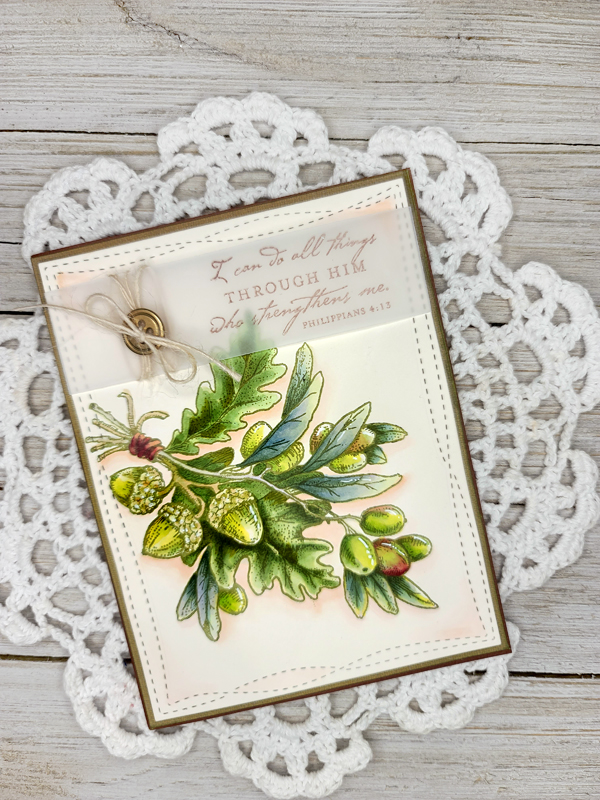
So, the first image that I thought of when I thought of this challenge was the stamp from the Olive and Oak Expanded clear set. That set is out of stock right now but you can always find this beauty in the digital format HERE and it's called Olive & Oak.
Honestly, I will admit it! I struggled a bit because after I stamped my image and committed to using it, I realized that this image had the potential -- if I wasn't careful -- to look like one big green blob. I needed to study each bit of foliage and really see how each was different. I realized that the olive leaves were a little silvery grey-green instead of a straight green. The Oak leaves were a little deeper in color than I thought. The acorns had a yellow tinge to them and the olives, well, at times, they had a streak of rosy red as they started to ripen. So, my dear stamping friends, that's what I aimed to see on paper!
After I was done coloring using a myriad of green markers, I did add some white gel pen for a touch of light and then I used R00 and R0000 to bring my image forward by using it as a big of an unrealistic shadow.
See?
You can also see that I stamped one of the sentiments from the clear set on a strip of vellum, wrapped it in twine, added a gold button and then wrapped the vellum around my main card panel. Ta da! Done!
I will say that after making this card, I yearned so deeply for autumn color that I took the rest of the afternoon to sew up a Thanksgiving apron! LOL! You might remember THIS post where I made a holiday apron for my mom-in-law. Well, now Thanksgiving had a turn! ;-) I still need to sew on the back fabric and add the ties and then I will be all ready and raring to go! Did I mention that Fall is my absolute favorite season?
Have a great week! I can't wait to see what you create!


Julie, you have truly colored this image beautifully, and I love how you've made the greens different. It's stunning, and I love this Scripture verse -- one of my favorites and one that encouraged me this past year and a half. And what the seamstress you are with this beautiful fall apron! I love the lovely fabric patterns and the sweet pocket. I think you are getting ready for Thanksgiving for sure! Can hardly wait to see this finished. Hugs and love, sweet friend!
ReplyDeleteWhat a gorgeous card. So many more colors than straight up green...no blob showing. Thanks for sharing. (Your Mom's gonna love the apron.)
ReplyDelete