


Boosting Your Artwork's Creative Curb Appeal:
Photo Ops, Flops, and Crops!
Hello Friends,
This is Catherine Anderson, your Power Poppy Bloomie of the day!
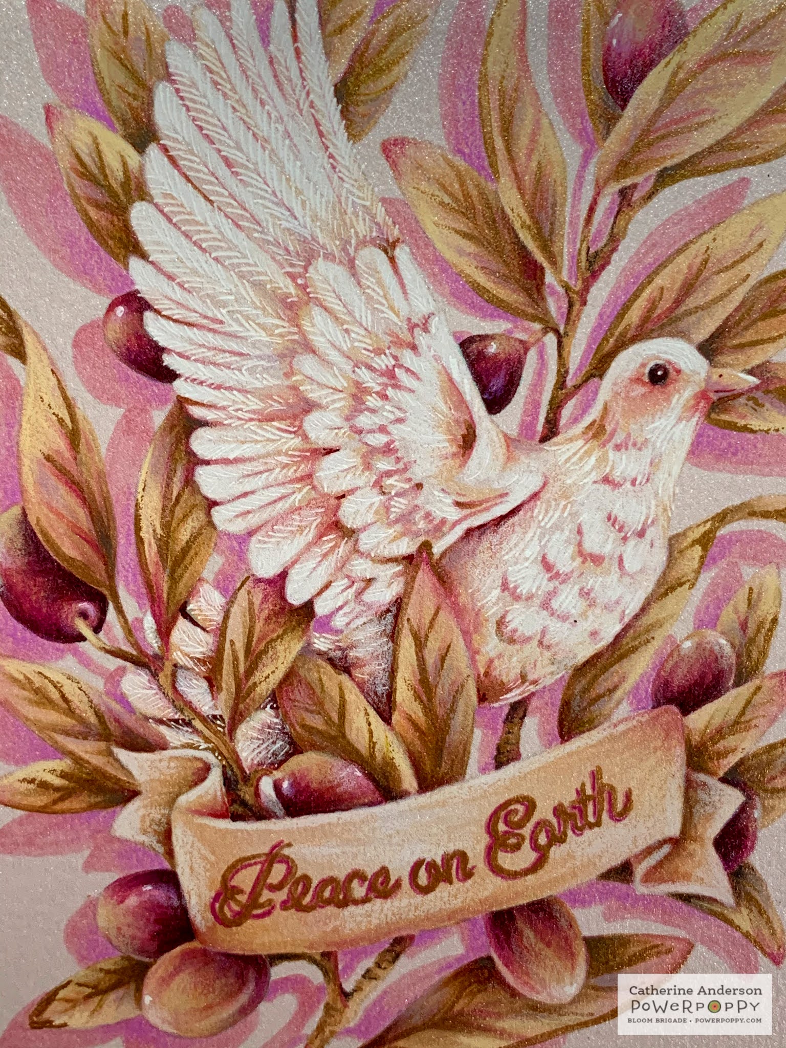
The lyrics for that old Christmas carol say,
"On the second day of Christmas my true love gave to me: two turtle doves."
Perfect for Day 2 of our challenge! I'm honored to showcase the blissfully beautiful "Heavenly Peace Dove" stamp set!
(Digital version available here .)

Suppose you are on your lunch break. You're giving your thumb an aerobic workout, scrolling in a mad dash through the Instagram posts of the 462 people you follow.
What makes you pause and linger?
Bold color?
Dramatic composition?
Detailed close-ups?
Whatever trips your trigger, I'll wager that for the artistically minded, it's never "ordinary!"

Just as a realtor stages a house to grab the attention of prospective buyers, your artwork needs to be seen at its best. Even if you don't post on social media, cards get given away. Markers fade.
TIP: Here's a thought! After all the hours spent coloring, wouldn't it be rewarding to create a personal portfolio of your work?

If you post publicly, it doesn't matter how fabulous your cards look in person if your photography fails to capture their beauty.
So here are a few tips that I've called "Ops, Flops, and Crops" guaranteed to help bring out the best in your art!

Photo Ops
Top Tip #1:
Take an abundance of photos...No "one and done!"
Remember: digital pictures are free. Just delete the ones you don't choose.
For this photo shoot, I snapped over 90 pictures. For my "Time to Fly," I took almost 200! There is safety in numbers. It allows you to be choosey about your handful of winners.

Top Tip #2:
I take my photos outside in early morning or late afternoon. Areas with a bit of shade are better than the glaring sun. But beware of rogue breezes! My "Joy to the World Bouquet" nearly got swept into the pool during its photoshoot.
(Who knew I could run that fast?!)
If you must work inside, a fixture that simulates natural lighting...such as an Ott-Lite...is a great option.

Top Tip #3:
Don't you hate when your white backgrounds look like you ran them through the washing machine with a load of dark laundry?
My photographs are taken with an iPhone. It does great, but my whites used to look dingy. A free, easy-to-use, editing app called Pic Monkey, has cured that complaint!

Top Tip #4:
Never forget "who" the star of the show is.
The whole purpose of staging the scene is to draw attention to your artwork, not make people ask for a link for that cool prop!
Top Tip #5:
How would you set the scene for "Heavenly Peace Dove"?
My vision was to create something ethereal...like the gentle rustling of feathers.
My tool box consisted of a white sheet, white quilt batting, a few diaphanous clouds of..ahem...polyester stuffing, some pink quilter's calico, a few white ostrich plumes...and a metallic pastel ribbon.

Photo Flops
Oh, dear! Let's chat about some things that distract from your work.
When choosing the best photos, there are bound to be some runners up that don't make the cut.
Let's examine some of my poor little rejects. Let them have their day in the sun while we learn what looks good by understanding what looks not-so-good.

Flop #1
The ribbon looked quite pretty in real life. However, in the photos it weighs the celestial atmosphere down with a thud.
Plus it's positioned all wrong. Horizontal compositions tend to be stagnant and boring. The dark ribbon leads your eye in one side, then straight off the other.
There is no unity in the elements. It's too busy.
(In addition, the intense glow from the setting sun obliterated my delicate white gel pen details. A shadier location would have been better.)

Flop #2:

Flop #3

Flop #4:

Flop #5
Photo Crops


Here's the Instagram version:
