Showing posts with label Color Swatch. Show all posts

Monday

Garden Dirt: Flowering Clover, a Swatch for Underpainting with Copic Marker


Guest post by Amy Shuke of VanillaArts.com Add realism to Copic Marker blends by underpainting with complementary colors. Pink RV55 marker creates natural looking shade underneath green markers for sweet clover leaves and blossom. | PowerPoppy.com | Alcohol Markers, Colored Pencils, Underpainting Swatch


Need a quick bit o' luck?


Saint Patrick's Day is almost upon us.

Uh oh... so soon? Already? Wait, what month is it anyway?

If you're anything like me, you've totally lost track of days and months. Luckily, I've got a quick coloring project for you today, just in case you need to pop a card into the mail, pronto!

Hello, my name is Amy Shulke and I'm the illustrator and art instructor over at VanillaArts.com. Welcome to another edition of my color swatch series here at Power Poppy-- The Garden Dirt.

Are you wondering why I'd name a collection of beautiful color combinations after dirty ol' dirt? It's because in realistic coloring, we take pretty colors and cover them with other pretty colors to make muddy colors. The real color of shade and shadow is always a little yucky, a little muddy, and a little dirty.

You can read more from my Garden Dirt series here.


Guest post by Amy Shuke of VanillaArts.com Add realism to Copic Marker blends by underpainting with complementary colors. Pink RV55 marker creates natural looking shade underneath green markers for sweet clover leaves and blossom. | PowerPoppy.com | Alcohol Markers, Colored Pencils, Underpainting Swatch


Sometimes I color for realism. Other times, I color for fun.


If you're a fan of Marcella's stamps and digis, you're pretty darned used to coloring leaves.

So even though shamrocks and clover are cute as the dickens, they're still... ho hum... sigh... just another green leaf using the same old green Copic Markers and colored pencils.

Unless we have a little fun with the underpaint.

Check out the shady spots on my green clover leaves here. See that funky shade color? What is that weird color?

Would you believe it's the same color as the clover blossom?


Guest post by Amy Shuke of VanillaArts.com Add realism to Copic Marker blends by underpainting with complementary colors. Pink RV55 marker creates natural looking shade underneath green markers for sweet clover leaves and blossom. | PowerPoppy.com | Alcohol Markers, Colored Pencils, Underpainting Swatch


Pink under Green makes a shady green


I know it sounds weird but weird color is what we're after.

Last month I shared with you about layering green under pink. This month we're reversing the combo because this magic trick works both ways. Green and magenta sit opposite of each other on the color wheel and when opposites cross paths, the color get a little wild and funky. 

To color the Shamrock n' Roll digital stamp, I started with RV55 and layered two leafy green markers over the top. I have no idea what to call this new color. Gink? Preen? I don't know but it sure is fun to make.

And guess what?

This same marker combination can be used on several of Marcella's clover-ish shamrocky floral images. Try it on Clover and Pansies, Wish You Luck, Asters Abuzz, or the magnificent Lumious Bouquet with its oversized Japanese Peony blossom and clover.

Green, pink, gink, or preen, it comes out a little different every time. I color with gink and preen a lot. When I'm working with a pink blossom, it's really hard to resist the ginky temptation.

Try it, you might be a ginky kind a person too.


Guest post by Amy Shuke of VanillaArts.com Add realism to Copic Marker blends by underpainting with complementary colors. Pink RV55 marker creates natural looking shade underneath green markers for sweet clover leaves and blossom. | PowerPoppy.com | Alcohol Markers, Colored Pencils, Underpainting Swatch


Let's color Flowering Clover together!


I've got a special treat for you today. 

Head on over to my site at VanillaArts.com to download the FREE Flowering Clover recipe guide. I've included a few photos of the process plus a couple of tips to help you make the most of this odd blending combination.


And if you're looking for an online class to really explore pink and green, you're in luck!

My Verdant Spring class uses a similar color palette on Power Poppy's Bowl of Beauty digital stamp. We layer green under pink and then green over pink with beautiful results.

All Vanilla Workshop classes are immediate access. Work at your own pace, color it as many times as you want with no expiration date. 

Have fun playing with gink and preen! 


And I'll meet you back here next month with another colorful swatch of Garden Dirt.

Garden Dirt: Bleeding Hearts, a Swatch for Underpainting with Copic Marker


Amy from VanillaArts.com helps you add realism to Copic Marker blends by underpainting with complementary colors. Pale green marker creates natural looking shade underneath magenta markers for a beautiful Bleeding Hearts flowers. | PowerPoppy.com | #copicmarker #realisticcoloring #underpainting

Let's color one more heart project!

I know Valentine's Day is technically over but honestly, I'd color heart shapes all year if students would let me.

Last month, I shared with you the Vital Rose digital stamp, colored with red Copic Markers and die-cut into a heart shape. This month, let's tackle hot pink and one of the sweetest species of flowers I've ever seen.

Hello, my name is Amy Shulke and I'm the illustrator and art instructor over at VanillaArts.com. Welcome to another article in my color swatch blending combination series here at Power Poppy-- The Garden Dirt.

Why dirt? I know it's not the most attractive name but that's what we do in realistic coloring. We take beautiful colors of Copic Marker and colored pencil and blend them together to make yucky, dirty colors. You can't grow flowers without a bit of dirt and you can't color realistic flowers without dirty color.

I've got a whole series of artistic coloring articles here at the Power Poppy blog. Here's a link to read more.


Amy from VanillaArts.com helps you add realism to Copic Marker blends by underpainting with complementary colors. Pale green marker creates natural looking shade underneath magenta markers for a beautiful Bleeding Hearts flowers. | PowerPoppy.com | #copicmarker #realisticcoloring #underpainting


Bleeding Hearts are one of my favorite flowers!


Actually, at my house, we call them weeds.

My yard is tree covered and almost full shade everywhere; I can barely grow grass. For years, we had nothing but Hosta, random ferns, and scattered Lily of the Valley but then a little pinkish-greenish scrawny looking weed popped up, out of nowhere. 

If something's brave enough to try living in my near-night conditions, I'm certainly not going to tell it no, so I let the weird little guy grow a while. Eventually the stalk bent over and sprouted the cutest little heart shapes. 

BEST WEED EVER!!!!

When I found myself looking for something to color for this month's Dirt article, I thought of my beautiful little weeds and wondered if Marcella had ever drawn them.

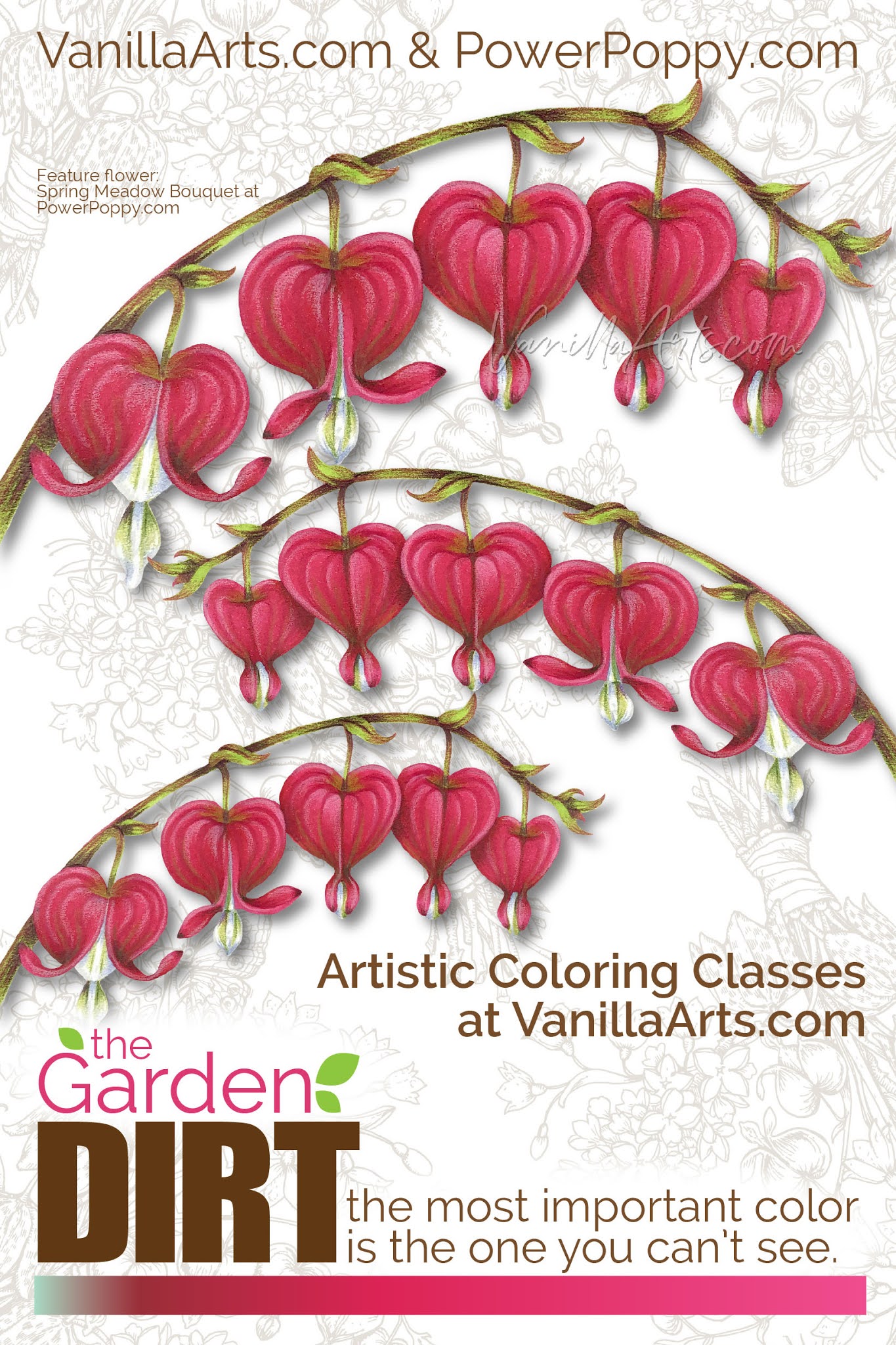
I'm a digital stamp girl, so I isolated the Bleeding Hearts from the Spring Meadow Bouquet to share with you today. 

She also has a few Bleeding Hearts tucked into the Springtime Love Roundel stamp here

Today's swatch will work with either version.


Amy from VanillaArts.com helps you add realism to Copic Marker blends by underpainting with complementary colors. Pale green marker creates natural looking shade underneath magenta markers for a beautiful Bleeding Hearts flowers. | PowerPoppy.com | #copicmarker #realisticcoloring #underpainting


Green under Red Violet makes a shady pink


Remember, realistic shady colors are not usually beauty contest winners.

Go ahead, look around you right now. Find something pretty on your desk or in the room beyond and really look at the color of the shady side. Surprised? The color of real shade is always a bit ugly. In art, we call shady colors "neutralized" or "desaturated". They're not the vibrant, gorgeous colors you see in traditional Copic Marker blending combinations.

Green sits opposite of magenta on the color wheel which makes the G marker family a natural choice to underpaint RV markers. I was shocked at how little green I needed to add murkiness to RV29. 

G02 was a bit strong, so I ended up using G00 but I really wish Copic made a G01.

In the Bleeding Hearts here, I added G00 where one heart overlaps another heart, where the stem inserts at the top, and down at the bottom where the heart cinches inward. Then I layered RV29, R35, and RV25 over the top of the green to complete the blend.

I printed my hearts large, the smallest heart is almost 1 inch wide. If you color a smaller version, you can skip the R35 in the blend.

Green under magenta sounds weird but it's what makes my Bleeding Hearts look rounded, layered, and pretty darned cute.

Amy from VanillaArts.com helps you add realism to Copic Marker blends by underpainting with complementary colors. Pale green marker creates natural looking shade underneath magenta markers for a beautiful Bleeding Hearts flowers. | PowerPoppy.com | #copicmarker #realisticcoloring #underpainting


Let's color flowers together


I love coloring Power Poppy bouquets! Today's Bleeding Hearts project uses the same techniques I demonstrate in this class using Marcella's Bowl of Beauty stamp and in this class using Marcella's Daffodil Bouquet stamp

We use different blending combinations and colors in each class but we always underpaint for depth and dimension.

All Vanilla Workshop classes are immediate access. Work at your own pace, color it as many times as you want, with no expiration date. The techniques are great for any Power Poppy digital stamp.

Have fun experimenting with green under magenta and I'll meet you back here next month with another colorful bit of Garden Dirt.


Garden Dirt: Copic Marker Swatches for Power Poppy Stamps, Red Rose


Add realism to Copic Marker blends by underpainting with complementary or opposite colors. Turquoise BG marker creates natural looking shade underneath warm scarlet markers for a beautiful Valentine’s red rose. | VanillaArts.com | #copicmarker #realisticcoloring #underpainting

Are you coloring hearts and flowers yet?

Yes, it's that time of year when our thoughts turn to roses, bouquets, and heart shaped boxes full of treats.

It's also the time when I pull out my red Copic Markers and colored pencils.

Valentine's Day is when Power Poppy stamps really shine! So many blossoms to choose from, perfect for declarations of love, devotion, or even simple friendship.

Hello, my name is Amy Shulke and I'm the illustrator and art instructor over at VanillaArts.com. Welcome to another article in my blending combination series here at Power Poppy-- The Garden Dirt.

Why dirt? I know, it sounds like gardening tips or gossip-- but really, it's about dirty color. I layer odd colors underneath bright and happy colors to make the murky, muddy colors necessary for realistic depth and dimension.

I've got a whole series of artistic coloring articles here at the Power Poppy Blog. Here's a quick link to read more.


Add realism to Copic Marker blends by underpainting with complementary or opposite colors. Turquoise BG marker creates natural looking shade underneath warm scarlet markers for a beautiful Valentine’s red rose. | VanillaArts.com | #copicmarker #realisticcoloring #underpainting


I love red Copic Markers!


Not just for Valentine's Day; I'll take any excuse to pull out and play with my favorite colors.

I happen to really love red and turquoise color palettes. Red and blue-green sit opposite of each other on the color wheel which makes them "complementary". It's a yin-yang thing, red makes turquoise feel turquoisier and vice versa.

This same complementary relationship doesn't just work for color palettes, it also works for underpainting. Mixing red with turquoise sounds strange but together, they create the wonderful neutral color you'll see in the shady recesses of rose blossoms.

Add realism to Copic Marker blends by underpainting with complementary or opposite colors. Turquoise BG marker creates natural looking shade underneath warm scarlet markers for a beautiful Valentine’s red rose. | VanillaArts.com | #copicmarker #realisticcoloring #underpainting


By the way, the image here is Power Poppy's Vital Rose digital stamp which I've printed nice and large, then die cut the fully colored rose into a crisp heart shape.

Power Poppy has several rose images available and many will work as a die-cut. I recommend the digital version so that you can size it precisely to fit your unique heart die.

But back to the color swatch here, I started with BG05, placing it into the shadiest, darkest crevices of the rose, then layered warm reds on top. The golden color isn't just on the petal undersides, you'll also see it kissing just the edges of each red petal.

Red over turquoise sounds yucky but wowzers! It makes for a gorgeous rose!

Add realism to Copic Marker blends by underpainting with complementary or opposite colors. Turquoise BG marker creates natural looking shade underneath warm scarlet markers for a beautiful Valentine’s red rose. | VanillaArts.com | #copicmarker #realisticcoloring #underpainting


Let's color roses together!

Today's cut-heart rose project was the class sample from one of my online Marker Painting Workshops. Rosie Gets the Blues is a beginner's challenge level online class.

This class is available now with no wait. Work at your own pace, color it as many times as you want, no expiration.

Rosie Gets the Blues uses Power Poppy’s stunning Vital Rose digital stamp. We use a combination of Copic Markers plus Prismacolor Soft Core colored pencils to underpaint the red rose with gorgeous turquoise.

You can find out more about my Rosie Gets the Blues class here.

And I'll meet you back here on the blog next month with another colorful bit of Garden Dirt.

Garden Dirt: Copic Marker Swatches for Power Poppy Stamps (Oranges or Clementines)


Add realism to Copic Marker blends by underpainting with complementary or opposite colors. Power Poppy’s guest author Amy Shulke from VanillaArts.com offers fresh perspectives on blending combinations. I Green neutralizes vibrant YR markers, perfect for shading orange fruit. | VanillaArts.com | #copicmarker #realisticcoloring #underpainting

Ready for a Citrus Punch?


Aloe and Oranges is a brand new digital stamp arriving this week at Power Poppy.

I’m here today with a bright, zesty, and totally unconventional Copic Marker blending combination to help you color it.

Hello, my name is Amy Shulke and I’m the illustrator and art instructor at VanillaArts.com. Welcome to my new feature series here at the blog; I’m calling this The Garden Dirt. 

Why dirt? We’ll get to that in a minute.

But first, I’ve got a whole series of artistic coloring articles here at the Power Poppy blog; here’s a quick link to a bunch of my previous articles.


Add realism to Copic Marker blends by underpainting with complementary or opposite colors. Power Poppy’s guest author Amy Shulke from VanillaArts.com offers fresh perspectives on blending combinations. I Green neutralizes vibrant YR markers, perfect for shading orange fruit. | VanillaArts.com | #copicmarker #realisticcoloring #underpainting

Let's color an orange!


Today I’m showing you a close-up, tight shot of just one glorious orange. The entire Aloe and Oranges stamp has a lot more to color. This digital image will be available in the Power Poppy shop soon!

Confession time: I ate at least a half box of clementines during the week I worked on the full digital image. 

Fun fact: a trash can full of clementine peels makes your craft room smell divine!

I think this is the best orange in the digital stamp, it’s a juicy cut cross-section showing off the cute orange segments. It's perfect for fun texture details. I’ve colored the orange with a combination of Copic Markers and Prismacolor Premier Pencils.

So why would I name my color swatches after yucky dirty dirt?

Take a closer look. This isn’t just any old Copic color swatch.

In my freelance illustration work, I use a shading technique called Underpainting. I teach Copic Marker classes using this same technique. Instead of using a light, medium, and dark orange marker to color oranges or clementines, I deliberately throw in a clashing color to create a more realistic shade color.


Add realism to Copic Marker blends by underpainting with complementary or opposite colors. Power Poppy’s guest author Amy Shulke from VanillaArts.com offers fresh perspectives on blending combinations. I Green neutralizes vibrant YR markers, perfect for shading orange fruit. | VanillaArts.com | #copicmarker #realisticcoloring #underpainting

The secret to my very dimensional orange rind is the green marker.


Where’s the green?

It’s UNDER the orange. That’s why we call this method underpainting. We’re using green to create the muddy, neutralized shade color that you’ll see on real oranges in real life.

Garden Dirt? Yep, we’re making dirty color!

Now to make this swatch work, you need to work dark to light. 

I know, I do everything backwards!

Start by adding YG63 with very light strokes to the shadiest areas of the orange rind. Don’t press too hard; you don’t need a lot of green to make this work. We want a little mud, not a swampy mess!

Then go over the YG63 with YR68, hiding the green completely. Let your orange strokes come out beyond the green strikes to create 2 colors— a dirty orange and a clean orange. Remember, no green is left uncoated! No-one should ever know it’s there. The rest of the world will think you used an ugly brick colored marker.

Now blend with the Y38 and Y35 just as you normally would.

Underpainting takes a bit of getting used to. The technique feels weird at first and the color looks even weirder… let’s call realistic shade an acquired taste. 

The funny thing is that once you get used to the color of real shade, you start to see it everywhere, all around you! Your entire life, you’ve been surrounded by murky colors, you just never noticed them.


Add realism to Copic Marker blends by underpainting with complementary or opposite colors. Power Poppy’s guest author Amy Shulke from VanillaArts.com offers fresh perspectives on blending combinations. I Green neutralizes vibrant YR markers, perfect for shading orange fruit. | VanillaArts.com | #copicmarker #realisticcoloring #underpainting

Want to color Power Poppy’s “Aloe and Oranges” with me? 


Citrus Punch is part of the my Marker Painting Workshops series of online classes for intermediate to advanced Copic colorers. We broadcast the class live to show you real coloring in real time. I also take questions from the student audience. After the broadcast, you can watch and rewatch the class as many times as you want.

Can’t make the live session? No problem! We record and lightly edit every class. Purchase recorded Workshops at your convenience and enjoy anytime access.

Citrus Punch uses Power Poppy’s beautiful Aloe and Oranges digital stamp set.

You can find out more about Marker Painting Workshops here.

And I’ll see you back here next month for another fun color swatch!