Showing posts with label Vanilla Arts. Show all posts

Monday

Garden Dirt: Tulips in Hobnail Pitcher, a Swatch for Underpainting with Copic Marker


Green is bursting everywhere!


We're still a bit early in the season to have many flowers blooming here in my small corner of the world, but the green spouts and buds are out.

Tulips are one of my favorite flowers and I thought I'd force a few bulbs (artistically) for this segment of The Garden Dirt. Let's get ready to talk about green!

Hello, my name is Amy Shulke and I'm the illustrator and art instructor over at VanillaArts.com. Welcome to another edition of my color swatch series here at Power Poppy.

If you're new to my lessons, you're probably wondering why I'd name a beautiful flower coloring series after dirt. We want to think about pretty colors right? Certainly not dirt. But we're talking dirt because every garden needs dirt, it's the foundation for life. We need dirt for coloring too, dirty colors are the foundation for realism.

You can read more from my Garden Dirt series here.


Think about the parts of a flower...


Most people don't think deeply about flower anatomy. You've got a general idea about leaves, stems, petals, and the funny things in the center that the bees all like.

Close your eyes and picture your favorite flower. No cheating, don't go sneak a peek at one, let's just think about a flower you know really well... Now tell me about how the flower petals connect to the stem.

Hmmm. This is harder than you expected, right?

We're so used to thinking about the blossoms and leaves that we rarely think about the stems. When we do think about stems, they're just some random tube shapes coming from somewhere under the blossom.

Admit it. Right now, you're not really sure how flower petals connect to the stem. Most of you are thinking about silk flowers where you can pop the whole flower head right off the plastic stick.

Ahhhhhh, grasshopper-- you're missing the most astoundingly beautiful part of a flower!


Real flowers are not like silk flowers!


With silk flowers, you have a green plastic stem and pretty colorful petals glued on top.

But with real flowers, the petals grow out of the stem. With some flowers, it's actually hard to tell where the stem stops and the petal starts.

We all remember chlorophyll from elementary school science class, that's the stuff which makes leaves look green. And if you think about it, chlorophyll makes the stem green too.

But here's the cool part... chlorophyll doesn't just stop dead at the top of a stem.

If you look closely at the base of a petal, you'll see green chlorophyll climbing up from the stem into the flower petal. Look even closer and you'll see the pretty pink, yellow, or red color from the petal leaking down into the stem.

Colorful petals and green stems are connected; they're part of the same system. The color from one body part oozes into the next body part.

Which means that even on the most brilliantly colored blossoms, you'll see green seeping up on the underside of many petals.

That green blend is beautiful!

For more realistic flower petals, add green to your Copic Marker blending combination


I know this idea frightens you. Green blended with red makes blech! Green blended with yellow ruins the yellow. Green blended with orange makes vomit...

I know. I can see you getting squirmy in your seat. The laws of color mixing strictly prohibit mixing light red and green together.

Uh... what exactly is it that happens if you mix light red and green? Does it explode? Does fire rain from the sky? Plagues of frogs, locusts, or IRS agents?

Relax.

Nothing bad will happen if you add G43 to your pretty red blending combination.

I did it in my tulip project here and I'm still alive enough to tell you about it.

Go ahead and try it. Tell the cops that Amy said it was okay. You'll be fine.

It's pretty.

Very, very pretty. And isn't that why we color?


Let's color tulips together!


The tulips shown here are a small portion of Power Poppy's Tulips and Hobnail Pitcher digital stamp but my color recipe will work with any tulip image. Try it on the tulips in Springtime Love Roundel, Spring Border, or Love One Another. This recipe even works with other flowers.

I started by bringing the G43 from the stem up and into the base of each petal. Then I softened the G43 with a few flicks of G40. Then I continued on with R21 up to the middle of each petal and softened it with R00. I left the edge of each tulip as clean white paper. 

G43 to G40 to R21 to R00. Sounds weird, looks stunning!

And hey, we're coloring tulips over at Vanilla Arts this month. My Tulip Wreath project uses a very similar blending combination. Join us there for a little bit of advanced artistic coloring.

All Vanilla Workshop classes are immediate access. Work at your ow pace, color it as many times as you want!

Have fun adding green ink to all your blending combinations!


Happy Coloring!

Garden Dirt: Flowering Clover, a Swatch for Underpainting with Copic Marker


Guest post by Amy Shuke of VanillaArts.com Add realism to Copic Marker blends by underpainting with complementary colors. Pink RV55 marker creates natural looking shade underneath green markers for sweet clover leaves and blossom. | PowerPoppy.com | Alcohol Markers, Colored Pencils, Underpainting Swatch


Need a quick bit o' luck?


Saint Patrick's Day is almost upon us.

Uh oh... so soon? Already? Wait, what month is it anyway?

If you're anything like me, you've totally lost track of days and months. Luckily, I've got a quick coloring project for you today, just in case you need to pop a card into the mail, pronto!

Hello, my name is Amy Shulke and I'm the illustrator and art instructor over at VanillaArts.com. Welcome to another edition of my color swatch series here at Power Poppy-- The Garden Dirt.

Are you wondering why I'd name a collection of beautiful color combinations after dirty ol' dirt? It's because in realistic coloring, we take pretty colors and cover them with other pretty colors to make muddy colors. The real color of shade and shadow is always a little yucky, a little muddy, and a little dirty.

You can read more from my Garden Dirt series here.


Guest post by Amy Shuke of VanillaArts.com Add realism to Copic Marker blends by underpainting with complementary colors. Pink RV55 marker creates natural looking shade underneath green markers for sweet clover leaves and blossom. | PowerPoppy.com | Alcohol Markers, Colored Pencils, Underpainting Swatch


Sometimes I color for realism. Other times, I color for fun.


If you're a fan of Marcella's stamps and digis, you're pretty darned used to coloring leaves.

So even though shamrocks and clover are cute as the dickens, they're still... ho hum... sigh... just another green leaf using the same old green Copic Markers and colored pencils.

Unless we have a little fun with the underpaint.

Check out the shady spots on my green clover leaves here. See that funky shade color? What is that weird color?

Would you believe it's the same color as the clover blossom?


Guest post by Amy Shuke of VanillaArts.com Add realism to Copic Marker blends by underpainting with complementary colors. Pink RV55 marker creates natural looking shade underneath green markers for sweet clover leaves and blossom. | PowerPoppy.com | Alcohol Markers, Colored Pencils, Underpainting Swatch


Pink under Green makes a shady green


I know it sounds weird but weird color is what we're after.

Last month I shared with you about layering green under pink. This month we're reversing the combo because this magic trick works both ways. Green and magenta sit opposite of each other on the color wheel and when opposites cross paths, the color get a little wild and funky. 

To color the Shamrock n' Roll digital stamp, I started with RV55 and layered two leafy green markers over the top. I have no idea what to call this new color. Gink? Preen? I don't know but it sure is fun to make.

And guess what?

This same marker combination can be used on several of Marcella's clover-ish shamrocky floral images. Try it on Clover and Pansies, Wish You Luck, Asters Abuzz, or the magnificent Lumious Bouquet with its oversized Japanese Peony blossom and clover.

Green, pink, gink, or preen, it comes out a little different every time. I color with gink and preen a lot. When I'm working with a pink blossom, it's really hard to resist the ginky temptation.

Try it, you might be a ginky kind a person too.


Guest post by Amy Shuke of VanillaArts.com Add realism to Copic Marker blends by underpainting with complementary colors. Pink RV55 marker creates natural looking shade underneath green markers for sweet clover leaves and blossom. | PowerPoppy.com | Alcohol Markers, Colored Pencils, Underpainting Swatch


Let's color Flowering Clover together!


I've got a special treat for you today. 

Head on over to my site at VanillaArts.com to download the FREE Flowering Clover recipe guide. I've included a few photos of the process plus a couple of tips to help you make the most of this odd blending combination.


And if you're looking for an online class to really explore pink and green, you're in luck!

My Verdant Spring class uses a similar color palette on Power Poppy's Bowl of Beauty digital stamp. We layer green under pink and then green over pink with beautiful results.

All Vanilla Workshop classes are immediate access. Work at your own pace, color it as many times as you want with no expiration date. 

Have fun playing with gink and preen! 


And I'll meet you back here next month with another colorful swatch of Garden Dirt.

Garden Dirt: Bleeding Hearts, a Swatch for Underpainting with Copic Marker


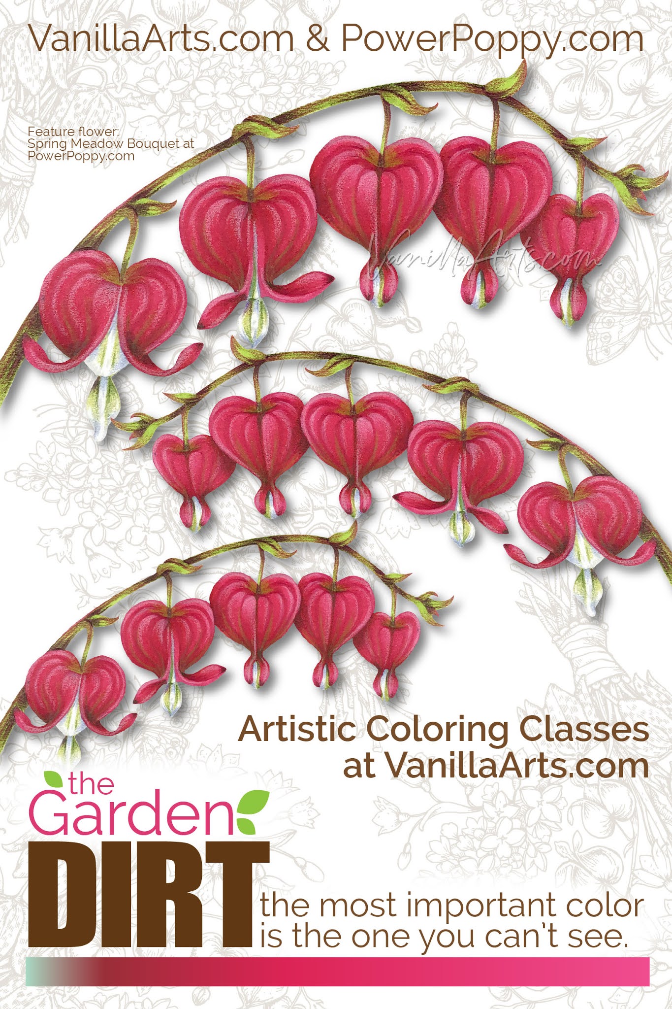
Amy from VanillaArts.com helps you add realism to Copic Marker blends by underpainting with complementary colors. Pale green marker creates natural looking shade underneath magenta markers for a beautiful Bleeding Hearts flowers. | PowerPoppy.com | #copicmarker #realisticcoloring #underpainting

Let's color one more heart project!

I know Valentine's Day is technically over but honestly, I'd color heart shapes all year if students would let me.

Last month, I shared with you the Vital Rose digital stamp, colored with red Copic Markers and die-cut into a heart shape. This month, let's tackle hot pink and one of the sweetest species of flowers I've ever seen.

Hello, my name is Amy Shulke and I'm the illustrator and art instructor over at VanillaArts.com. Welcome to another article in my color swatch blending combination series here at Power Poppy-- The Garden Dirt.

Why dirt? I know it's not the most attractive name but that's what we do in realistic coloring. We take beautiful colors of Copic Marker and colored pencil and blend them together to make yucky, dirty colors. You can't grow flowers without a bit of dirt and you can't color realistic flowers without dirty color.

I've got a whole series of artistic coloring articles here at the Power Poppy blog. Here's a link to read more.


Amy from VanillaArts.com helps you add realism to Copic Marker blends by underpainting with complementary colors. Pale green marker creates natural looking shade underneath magenta markers for a beautiful Bleeding Hearts flowers. | PowerPoppy.com | #copicmarker #realisticcoloring #underpainting


Bleeding Hearts are one of my favorite flowers!


Actually, at my house, we call them weeds.

My yard is tree covered and almost full shade everywhere; I can barely grow grass. For years, we had nothing but Hosta, random ferns, and scattered Lily of the Valley but then a little pinkish-greenish scrawny looking weed popped up, out of nowhere. 

If something's brave enough to try living in my near-night conditions, I'm certainly not going to tell it no, so I let the weird little guy grow a while. Eventually the stalk bent over and sprouted the cutest little heart shapes. 

BEST WEED EVER!!!!

When I found myself looking for something to color for this month's Dirt article, I thought of my beautiful little weeds and wondered if Marcella had ever drawn them.

I'm a digital stamp girl, so I isolated the Bleeding Hearts from the Spring Meadow Bouquet to share with you today. 

She also has a few Bleeding Hearts tucked into the Springtime Love Roundel stamp here

Today's swatch will work with either version.


Amy from VanillaArts.com helps you add realism to Copic Marker blends by underpainting with complementary colors. Pale green marker creates natural looking shade underneath magenta markers for a beautiful Bleeding Hearts flowers. | PowerPoppy.com | #copicmarker #realisticcoloring #underpainting


Green under Red Violet makes a shady pink


Remember, realistic shady colors are not usually beauty contest winners.

Go ahead, look around you right now. Find something pretty on your desk or in the room beyond and really look at the color of the shady side. Surprised? The color of real shade is always a bit ugly. In art, we call shady colors "neutralized" or "desaturated". They're not the vibrant, gorgeous colors you see in traditional Copic Marker blending combinations.

Green sits opposite of magenta on the color wheel which makes the G marker family a natural choice to underpaint RV markers. I was shocked at how little green I needed to add murkiness to RV29. 

G02 was a bit strong, so I ended up using G00 but I really wish Copic made a G01.

In the Bleeding Hearts here, I added G00 where one heart overlaps another heart, where the stem inserts at the top, and down at the bottom where the heart cinches inward. Then I layered RV29, R35, and RV25 over the top of the green to complete the blend.

I printed my hearts large, the smallest heart is almost 1 inch wide. If you color a smaller version, you can skip the R35 in the blend.

Green under magenta sounds weird but it's what makes my Bleeding Hearts look rounded, layered, and pretty darned cute.

Amy from VanillaArts.com helps you add realism to Copic Marker blends by underpainting with complementary colors. Pale green marker creates natural looking shade underneath magenta markers for a beautiful Bleeding Hearts flowers. | PowerPoppy.com | #copicmarker #realisticcoloring #underpainting


Let's color flowers together


I love coloring Power Poppy bouquets! Today's Bleeding Hearts project uses the same techniques I demonstrate in this class using Marcella's Bowl of Beauty stamp and in this class using Marcella's Daffodil Bouquet stamp

We use different blending combinations and colors in each class but we always underpaint for depth and dimension.

All Vanilla Workshop classes are immediate access. Work at your own pace, color it as many times as you want, with no expiration date. The techniques are great for any Power Poppy digital stamp.

Have fun experimenting with green under magenta and I'll meet you back here next month with another colorful bit of Garden Dirt.


Garden Dirt: Copic Marker Swatches for Power Poppy Stamps, Red Rose


Add realism to Copic Marker blends by underpainting with complementary or opposite colors. Turquoise BG marker creates natural looking shade underneath warm scarlet markers for a beautiful Valentine’s red rose. | VanillaArts.com | #copicmarker #realisticcoloring #underpainting

Are you coloring hearts and flowers yet?

Yes, it's that time of year when our thoughts turn to roses, bouquets, and heart shaped boxes full of treats.

It's also the time when I pull out my red Copic Markers and colored pencils.

Valentine's Day is when Power Poppy stamps really shine! So many blossoms to choose from, perfect for declarations of love, devotion, or even simple friendship.

Hello, my name is Amy Shulke and I'm the illustrator and art instructor over at VanillaArts.com. Welcome to another article in my blending combination series here at Power Poppy-- The Garden Dirt.

Why dirt? I know, it sounds like gardening tips or gossip-- but really, it's about dirty color. I layer odd colors underneath bright and happy colors to make the murky, muddy colors necessary for realistic depth and dimension.

I've got a whole series of artistic coloring articles here at the Power Poppy Blog. Here's a quick link to read more.


Add realism to Copic Marker blends by underpainting with complementary or opposite colors. Turquoise BG marker creates natural looking shade underneath warm scarlet markers for a beautiful Valentine’s red rose. | VanillaArts.com | #copicmarker #realisticcoloring #underpainting


I love red Copic Markers!


Not just for Valentine's Day; I'll take any excuse to pull out and play with my favorite colors.

I happen to really love red and turquoise color palettes. Red and blue-green sit opposite of each other on the color wheel which makes them "complementary". It's a yin-yang thing, red makes turquoise feel turquoisier and vice versa.

This same complementary relationship doesn't just work for color palettes, it also works for underpainting. Mixing red with turquoise sounds strange but together, they create the wonderful neutral color you'll see in the shady recesses of rose blossoms.

Add realism to Copic Marker blends by underpainting with complementary or opposite colors. Turquoise BG marker creates natural looking shade underneath warm scarlet markers for a beautiful Valentine’s red rose. | VanillaArts.com | #copicmarker #realisticcoloring #underpainting


By the way, the image here is Power Poppy's Vital Rose digital stamp which I've printed nice and large, then die cut the fully colored rose into a crisp heart shape.

Power Poppy has several rose images available and many will work as a die-cut. I recommend the digital version so that you can size it precisely to fit your unique heart die.

But back to the color swatch here, I started with BG05, placing it into the shadiest, darkest crevices of the rose, then layered warm reds on top. The golden color isn't just on the petal undersides, you'll also see it kissing just the edges of each red petal.

Red over turquoise sounds yucky but wowzers! It makes for a gorgeous rose!

Add realism to Copic Marker blends by underpainting with complementary or opposite colors. Turquoise BG marker creates natural looking shade underneath warm scarlet markers for a beautiful Valentine’s red rose. | VanillaArts.com | #copicmarker #realisticcoloring #underpainting


Let's color roses together!

Today's cut-heart rose project was the class sample from one of my online Marker Painting Workshops. Rosie Gets the Blues is a beginner's challenge level online class.

This class is available now with no wait. Work at your own pace, color it as many times as you want, no expiration.

Rosie Gets the Blues uses Power Poppy’s stunning Vital Rose digital stamp. We use a combination of Copic Markers plus Prismacolor Soft Core colored pencils to underpaint the red rose with gorgeous turquoise.

You can find out more about my Rosie Gets the Blues class here.

And I'll meet you back here on the blog next month with another colorful bit of Garden Dirt.

Tuesday

Creative Confetti: Color Your Image on Colored Cardstock

Hello! I think this is my first time hosting the Creative Confetti Challenge. I wanted to inspire you to great heights, but I have been distracted with a visit from my adult children. My son came for the long Labor Day weekend, but my daughter came for a WEEK! Plus, my college-age son started online classes this last week. I have been enjoying the "kids" and not spending as much time in my studio.

However, I hope that you enjoy the challenge this week. I had fun making the samples!


HOW TO PLAY: Stamp or print a Power Poppy Stamps image onto COLORED CARDSTOCK!  Then, color away! Use ANY color cardstock, as long as it's NOT white.

On to my creations! 


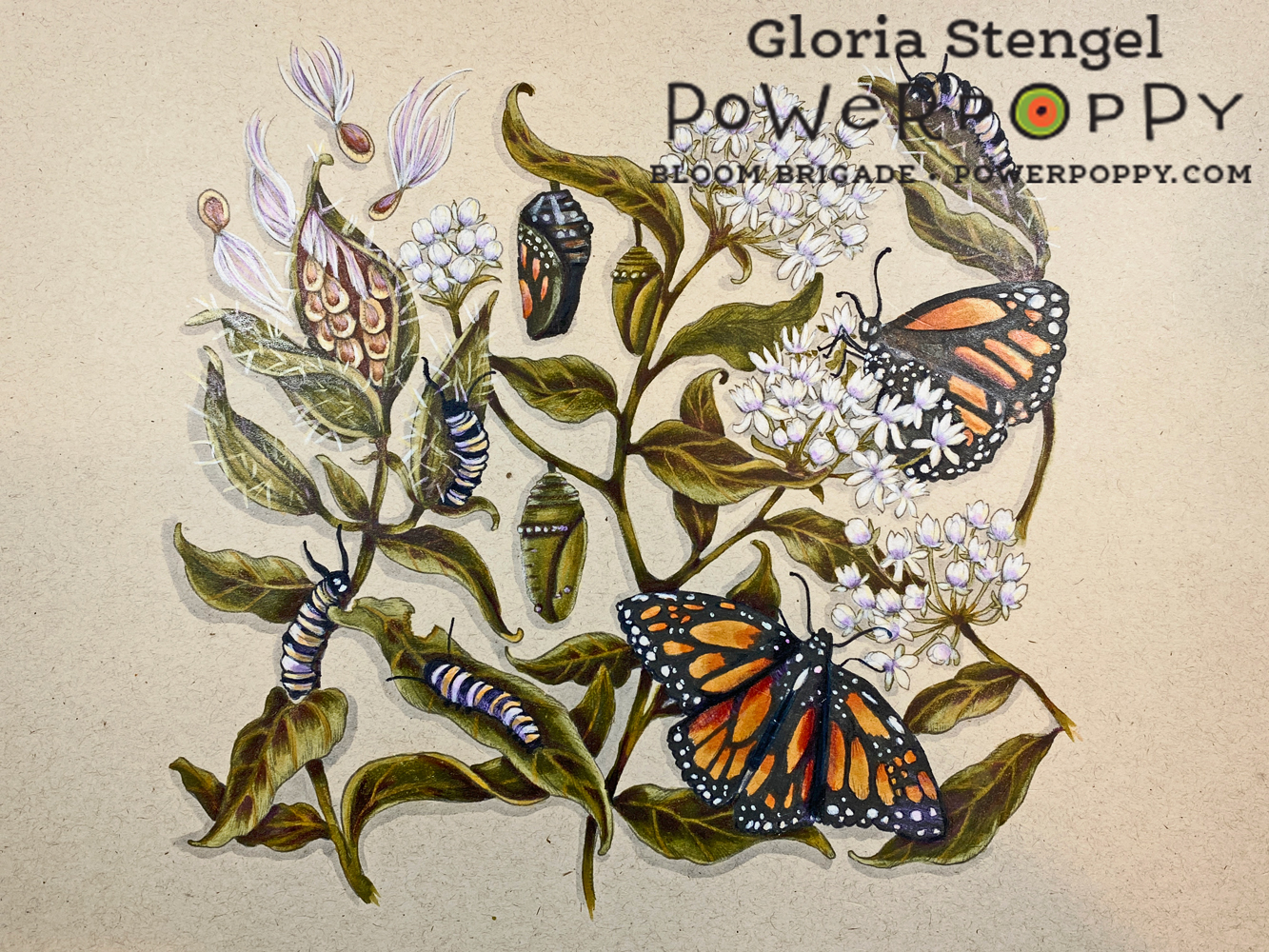
The project that started me thinking about coloring on colored cardstock was this class from Vanilla Arts called Illustrated Monarch

The class was to color the Monarchs and Milkweed image onto tan cardstock. I had a lot of fun coloring on the tan paper with Copics and Prismacolor pencils. 

The tan cardstock was light enough that the Copic markers looked fine, if muted, and the colored pencil looked AMAZNG!

So...I thought...what OTHER colors could I print onto and color?!?


I chose a few images to print onto a few colors of cardstock. I found that if I wanted to color an image onto very dark cardstock such as black or navy blue, I would have to somehow trace the image with a white pencil or use a similar technique. The printed image did not show up quite enough to allow me to see the lines, especially on a detailed image. Also, Copic markers are too transparent to show up on super dark cardstock.

I asked my artist daughter about using colored paper and she said the standard colors she used were white, off white or cream, tan, and gray. But, I was sure that light blue, pink, even red would work! I tried a few different papers and colors and learned lots of things!

This is another example of playing around before you start an actual project. Be prepared to "waste" a little printer ink and a few sheets of cardstock! It's worth it to experiment!

I learned that you need to test the paper with the medium you wish to use. I printed this sunflower image from Sunflower Power onto cream linen cardstock. I had hoped to use watercolor pencils for the image, but the paper was too thin to accept the water! I also found out that while the Copics looked amazing, they "oozed" too much on the linen cardstock (no surprise there). The colored pencils loved this lightly textured paper!

In my discovery I learned that you also need to allow Copics to DRY before you can see how the color really looks on colored paper. 
I had my heart set on using Copics on this sky blue cardstock, but they wanted to bleed. Any attempt to push the color back with the blender only made a "drool" line on the paper! The paper had a bit of a rough texture, and no coating so the alcohol ink just wanted to soak in and wick out! 

The colored pencils loved this paper! And they looked amazing on the blue background! I had found my perfect match!
I printed the Chinese Lantern image onto the sky blue cardstock at about 7" x 5".  I printed the lines in pale gray as well. I colored the image with Prismacolor Colored Pencils, which worked beautifully!

I hope you enjoyed my versions of the challenge for this week! If you want to join me and show off some of your Power Poppy Projects, please be sure to share what you come up with by using the linky below! Every entry -- no matter what the week -- is thrown into a virtual hat for our random drawing at the end of the month for a $25 gift code to the Power Poppy Shop! 

Have a great week! I can't wait to see what you create! 


You are invited to the Inlinkz link party!

Click here to enter

Monday

Inspire Me Monday: So, You've Taken a Class, Now What?


Hello, colorists! The last time I was here, I talked about taking a class to help you get past creative block. Well, perhaps you've taken a class or two...or three! But, are you saying, "Now what, Gloria?" since you've finished your class?

That is a good question! We often take a class and enjoy ourselves very much. We come away feeling that we've learned a lot. But, then we get back to our desks and studios and...have no idea what to do next! It seems as if all that wonderful information has leaked right out of our brains!

I took THIS class from Vanilla Arts in which we were to color the Bowl of Beauty image. I learned how to shade green leaves with pink (yes, pink!) and how to color glass, and a host of other things. My project turned out fantastic, if I do say so myself.

I also took THIS class where we were to color the Tree Peony image. I learned about distress ink backgrounds and how to add interest to leaves, plus how to make light colors look deeper and darker while still being pale colors. Oh, and a host of other cool stuff. 

I confess, I "failed" at a few of the concepts and wanted to work on just those tasks again. I did not return to my desk and try to recreate each of these pieces! I really did not want to simply copy Amy's project a second time. I wanted to move forward, meaning I did not want to re-take the class or re-color the same images! 

I wanted to use what I'd learned. But, how? It all seemed very overwhelming. I feel that I am a seasoned colorist, but I still felt that I had information overload! What to do?!

Since one of the concepts I wanted to try again was coloring a two-toned flower, I decided to print the Rose All Day image onto printer paper. Yes, I said that. I just printed it onto plain old printer paper! 

The image is about 6 1/2" x 6 1/2", which means it is on the larger side. I printed it on 8 1/2" x 11" paper and then trimmed the paper down and matted with black cardstock once I was finished coloring. 
You are now asking, "Why did you print on such terrible paper?" Well, I wanted to try out some new pencils and I always test them on various papers, even plain printer paper! (These pencils are called Schpirerr Farben oil-based pencils, which are a budget-friendly oil pencil.)

Not all pencils work on all papers, so I always do some test coloring on various papers before I judge the quality of the pencils. This brand is a creamy, oil pencil, and seems to like ALL papers. And, let's face it. Sometimes I just want to color for fun with no plan to make something out of the finished project!  
As I was coloring, the pencils were doing very well on the printer paper, so I just kept going! As I colored, I had a list of techniques to try next to me. It helped me focus on a few things, rather than trying to focus on EVERYTHING. I ended up trying the leaf technique from one class and the flower technique from another, and the next thing...the picture was finished!
Don't be afraid to "waste" paper and printer ink trying new techniques or new tools! Sometimes you need to make some mistakes to learn! This picture is FAR from perfect, but I learned new things and had FUN!
If you are new to coloring digital images, this project is proof that you don't need all the bells and whistles to get started! If you have paper for your printer and something to color with...get going! (I will say, if you plan to color with alcohol markers or watercolors you do need a type of paper suited for those mediums, but if you plan to try colored pencils, try them on printer paper if that's all you have at the moment!)
Also, don't think every image you print must be small and fit on a card. This finished picture is 8 1/4" x 8 1/4". Far too large for a card. When learning new techniques, a larger picture will help you to have more space to "stretch out"!

Plus this large image is perfect to put in a frame or stand on an easel, or even attach to the front of a scrapbook or journal! 

Once you have taken a class, go back to your desk and try ONE technique that you learned from class. The more you use your new skills, the more likely you are to have these techniques at your fingertips every time you color.

And don't forget to have fun!


Friday

It's Power Poppy Friday!


Hello all! Hope your harvest hearts are overflowing these days! We can see that Mr. Tibbs, the Power Poppy mascot is loving this gourd-geous season!  ;-) Sorry, couldn't resist!

Mr. Tibbs is heading up the household these days while this fine lady -- our Power Poppy Peep-in-Chief-- is running the streets of New Orleans with her old high school bud Laurie. I don't think they are having ANY fun at all! Aren't they just the cutest? I thought I'd share because if you place an order, it will be a few days until it gets shipped your way.


Some of you have asked about Christmas and what Power Poppy's plans are for the holidays! I have some good news for digi lovers! Sometime in the next two weeks, look for a new crop of digis, perfect for the season! Marcy's sketchbook is overflowing with concepts for clear sets but those sets won't be ready until late winter, early spring. Yes, it's a wait but as with all things Power Poppy, it's totally worth it! Stay tuned for news on our digi release and some incredibly fun things Marcy plans to unveil!

Did you catch last week's Inspire Me Monday? Oh, my goodness, it is a veritable spring of tidbits thanks to the oh-so-talented Amy Shulke of vanillaarts.com. She invites us into her Artist Sketchbook to break down color and show us how there are more ways to color a pumpkin than just to reach for an orange marker. It's a must-read!  Just click HERE if you haven't read it yet! And, if you didn't sign up for Amy's Silvered Pumpkins Vanilla Livestream, there's still a little bit of time!

Just click HERE to learn more. Remember, if you miss the LIVE class, Amy does allow you to watch the taped version if you become a Livestream Member! I've taken a few of her classes and she is an amazing teacher. I thought there was no way I could get similar results but she takes you step by step in such an incredible way and explains the "why" behind her coloring. She makes it all look so easy even though it is anything but!

And, last but not least, it's Friday so.... you know what that means!


Thanks so much for stopping by! We hope you have a beautiful and creative weekend ahead! We'll see you back here soon with new bits of inspiration that you can hopefully take with you next time you step into your stamping spaces!

Until next time!
Julie 

Monday

Inspire Me Monday: Hitting a Home Run with Depth & Dimension


Hello everyone! Amy Shulke here from Vanilla Arts. Thanks for joining me for Inspire Me Monday. 

Do you get bogged down by the color selection process? Do you question those Copic blending combinations that other stampers swear by because they don't seem to deliver the realism you're looking for? Today, I am going to tell you a little bit about what it takes to create that depth and dimension -- especially when it comes to monochromatic coloring. 

Take a look at the finished piece before we get started. 
And now, let's delve into the image, starting with that warm, antique background. I used Power Poppy's Baseball Vignette for this creation. 


Tip 1: Antique Linen is a very subtle color and when applied with a Lifechanging Brush, the application is flawless. I’ve tried to get these faded backgrounds for years and my success rate was really low. The brush (which looks kind of like a makeup brush) makes it so simple to fade color seamlessly to white paper. 


Tip 2: I can already tell I’m going to have problems between the bats and the glove. It’s a lot of the same value range (W4, W6 & W8 Copics), so separating them will be tricky. That’s the challenge of monochromatic coloring, it’s easy to separate something when you can make it a brighter color. I’ll be doing some subtle bat adjustments later with my pencils.


Tip 3: Don’t let a stereotype ruin the realism! When I squint my eyes at real grass, I see small patches of color. So many people think “oh, it’s grass, I should make long grassy strokes”. But long marker strokes would be way out of scale for the image here. It’s grass, not a bamboo jungle. I’m doing the grass in two phases. Right now, I’m working on that patchy color. Later, I can add correctly scaled blades of grass with a finely sharpened pencil. 


Tip 4: Honesty time- I colored all the peanuts light but it just felt too boring. Then I realized peanut skins are darker. So I colored two dark. Luckily, I took a break and when I returned to color another one dark I realize that two was enough. Be willing to let the drawing change your mind. It will tell you what it needs if you listen.


Tip 5: I still haven’t used a white pencil yet. Why not? Because nothing I’ve colored here is white. Again, stop falling for coloring stereotypes, highlights are rarely white. They’re lighter but lighter is not white.


Tip 6: I’ve tried my hardest to keep that darned baseball round but man, it’s impossible. I’ve used a 90% French gray pencil to recarve the shape. The ball is smaller than when I started and I still don’t think it’s totally round, but it’s better than it was. But be honest, I can see the ball is off-round but if I hadn’t said anything, would you have noticed? Often the things that bug us the most are minor or even invisible to viewers.


Tip 7: Finally the grass. I don’t try to draw every single blade of grass. Of everything in this image, the grass might be the least important, so it doesn’t really deserve a ton of time. My strokes are short, about the same length that the grass would naturally be. Be sure to overlap a bit of the main image BUT ONLY if the object is actually sitting IN the grass. The bat is not in the grass, it’s hovering over the grass, so no overlapping grass on the bat.

You can see, I only used a few markers and a few colored pencils but the result is full of depth and dimension. The key is choosing those shades wisely and then accenting areas with highlights and shadows to bring those images to the foreground or background. 

I hope seeing this vintage image in action helps you to "see" things in a new light in your own crafting spaces. If you enjoyed these little tidbits, you can join me over at Vanilla Arts for a complete lesson on creating depth and dimension when looking at your marker's values. I taught the class live last Friday but, as always, it will be available in the Vanilla Arts archives for several months to enjoy repeatedly. Just click HERE to learn how to tap into these classes. 

Thanks so much for joining me. Hopefully, I will see you again over at Vanilla Arts!