
Hello Power Poppy Friends! It’s Christine with my monthly Inspire Me Monday Tutorial. Today I’m back with Part Two of my Photography series looking at how to bring your card photos to life for online galleries and blogs. Part 1 of this Series is found HERE. Today we’ll be looking at Photo Editing, an important piece in showing off your hard work on-screen that you invested in creating a card.
I’ll be showing you how I edit my photos in iPhoto because I have Mac computer. It’s a free photo editing software program that comes with Mac computers. There are much more sophisticated programs out there (like Lightroom and Photoshop), but I wanted to show you that you can still make helpful edits without using professional software. If you have a PC there are other free programs you can use like Picasa and Gimp that can get you similar results. When I had a PC I used Picasa, and I know that our own Ally is great with Gimp.
So let’s start with a card I created with a combination of Power Poppy goodies; I’ll show you step by step how I edit my photos to get them blog ready.
The card was created with our new and amazing Flowering Branches digi (for the sentiment) and then I stamped around the sentiment with various Power Poppy polymer sets: Daffodils, Dynamic Duos: Peonies and Tulips, and Lilac Time. It’s my own spring garden!

Here is my photo straight out of the camera. On my first part of this series I talked about how to make the most of your photography so you can check that tutorial for those steps. I want to show you how I get it from this stage to blog ready with iPhoto.
You can see by this photo that the background is still a little dark, the photo is slightly crooked, the card needs cropping and the flowers look a little washed out (not how the card looks in person). My whole goal in editing is to make the photo look as close to how it is in real life - on screen.

First step....check the Brightness of your computer screen! It seems so simple, but you can’t get a realistic representation of your photo if the brightness on your screen is too low. Check on your computer how you can adjust the brightness. On mine it’s on my keyboard, top left.
Next - remember that on most software programs there is always a button to undo or restore your photo back to the original state, so if you make a mistake in editing you can just start again. No worries.

A lot of photo editing is also preference. I wanted to make sure you hear that :). Not everyone does or prefers things the same way, and you can see different editing styles by going to different blogs. I’m going to show you some of my personal preferences.
I’ll be honest, one of my personal pet peeves is crooked photos. It makes me get twitchy :) So, one of my first steps after loading my photos is to straighten them. At least one of my edges - either the top edge or the left edge is always straightened to align with the horizontal or vertical plane.

In iPhoto editing software you’ll find three tab menus on the upper right of your screen. Quick Fixes, Effects, and Adjust. Each has their own menu of selections in those screens.
For instance, in Quick Fixes you’ll find a place to rotate your photo, enhance your photo, fix red-eye (people shots), straighten your photos, crop and retouch.
Select Straighten from the Quick Fixes menu and a set of grid lines will appear in your screen. Slide the slide to straighten the edges of your photo the way you want it to appear on-screen.

See to me, the orientation of this photo now is so much better. I don’t have the twitchies anymore. :)

Next Step - Cropping. This is one of those personal preference things - some people prefer wider cropping with a lot of white space around their card. I prefer a medium crop, about an inch on each side of my photo so that you have white space that is soothing around your card, and your attention can be on the details of the card.
In the Quick Fixes Menu you can click the Crop button and you can crop your photo either to specific constraints, or by dragging the outside corners in, generally I just pull my corners in to create even space around my card.

Above is my design with the cropping done. If I didn’t like how the cropping looked, on the bottom of the screen in the right corner there is an “undo” button that I could use to go back to the pre-cropped picture.

Next is an important step to me, Enhancing Your Photo. There are a couple of ways you can accomplish this in iPhoto. The first is a quick one, but I’ll be honest - it doesn’t always enhance perfectly, so I’ll also describe another way of doing it.
In the Quick Fixes Menu you’ll see an Enhance button. When you click on it, your computer will automatically adjust the exposure, contrast, and saturation of the image. Generally it does a pretty good job. I always test it to see how it turns out. Sometimes however it gets the results WAY off, so then I have to undo and do the adjustments manually. When it works though - its a great quick fix.

What you’re looking for is realistic colours on your card, good overall saturation and contrast.
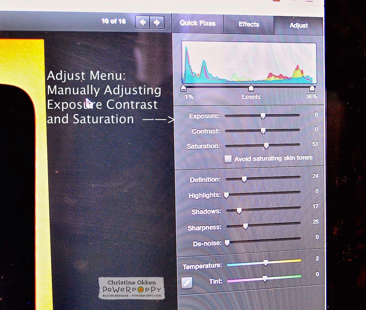
If using the Enhance button doesn’t get the effect that you’re looking for, in iPhoto go to the Adjust Menu and you’ll see a colour bar graph and then 3 slides for Exposure, Contrast and Saturation. You can adjust the arrows on each side of the colour bar graph and also adjust the slides for Exposure, Contrast and Saturation. Adjusting all of those slides manually allows you to give your photo the colouring and contrast you’re looking for. As well, on the bottom area in that same menu you can see Temperature and Tint slides. If your photo is too blue or yellow, you can make adjustments here.
And again - if you don’t like how your adjustments turned out - you can just click Undo on the bottom right of your screen, and it will back up to where you were previously.

Other Adjustments: As I said in the first photography tutorial, I really like my whites in photos and backgrounds to be true white. Even after edited, most people will find that their photos appear darker on their blog. I know there’s some technical reason for that (probably to do with resolution, pixels and some other crazy computer speak), so I usually brighten up my photos a notch or two. In the Effects Menu I press the Lighten button once or twice to brighten the photo. This increases the overall brighteness of the card on the screen.

Next, if my photo still has some shadows in the background I’ll go into the Adjust Menu Screen and slide up the Shadows slide. This removes some of the background shadows.

Final Touches: Now I’ll start making final adjustments. I like my photos to look crisp on screen, so in the Adjust Menu I’ll slide the sharpness up a little so there’s a crispness to the details. I don’t adjust this too far because I want the photo to look natural - not overally edited.

In combination with the Sharpness I’ll also slide the Definition slide up a little too.

Then finally if there are any imperfections in the background (like if my background has a smudge or is dirty or has some dust that I didn’t notice I’ll use the Retouch button in the Adjust Menu and a little circle will come up with your cursor in the screen (you can slide the circle to be smaller or larger). I’ll just click the circle on the area in the background where there was dirt to clean it up.

So overall, I like how this looks on the screen. Next I’ll watermark my card photo and publish it to my blog.

Here is how the edited photo looks. I really love how the layer of vellum softens the effect of the colours around the sentiment.

Here’s a final closeup.
I hope you have some new ideas of how you can make your photos show off all of your hard creative work! Thanks for joining me again today!
5 comments:
Gorgeous card! Nice tutuorial, thank you.
Thank you so much, Christine! I learned many iPhoto features that were new to me in today's tutorial. Hope you can share tips for creating a Watermark in Part 3. Your card is just lovely! Thanks for helping all of us 'bloom' in today's tutorial! ♡
Christine......Thank you so much for your Photography Part 1 and Photo Editing Part 2 series. It's plain to see that a lot of thought and time went into these wonderful tutorials to make it easier for us to understand. I just want to tell you that I have learned so much from you and I appreciate all the effort you have put into this. BTW, this card is absolutely beautiful, as are all of your cards. The inspiration you give to me, and probably others each time you make a card, is in-measurable.
Kerry Piader (kerry2)
Gorgeous card, Christine! And thanks for the helpful information about editing photos! I agree that you put a lot into these tutorials, and we appreciate them! (And I agree about having an even card edge!) Hugs!
Post a Comment