Showing posts with label Lilac Time. Show all posts

Tuesday

Creative Confetti: Quick Color!


Hello all! Are you ready for a fun and speedy challenge this week? I will give you a clue, if you checked in yesterday to my Inspire Me Monday, you might already have an idea what this week's challenge entails!


HOW TO PLAY: Choose a design, technique or layout that adds a bit of quick color to your creation. This is not the week to spend hours upon hours coloring. Show us the ways you add a quick splash of color!

Need a little inspiration? Of course, my tutorial HERE yesterday is a great place to start, but that's not the only way you can take part in this challenge! Here are some other ideas below to spark a little creativity!


On to my creations! 


If you click over HERE, you'll see a step-by-step on how I did this but I will give you a hint! I used stencil brushes and then, just dabbing them in the ink, and then dabbing on the paper to give my images a quick splash of color! For both cards, I used Memento Bamboo leaves to stamp my image for a softer than black base. I used the stamp sets Simply Camellias and then the clear set (retired) Lilac Time. This image is available in digital form though in the set French Lilac.

So, now it's your turn! Use a fun technique to add quick color to your card, then when you're done, enter your creation using the linky below. Every link is one more shot at a $25 gift code to the Power Poppy Shop! 

Before we go, with a new month comes a brand new winner! After all the names were thrown into the virtual hat from our April Creative Confetti Challenge, Random.org drew the number...


And that means the winner is.....

* * * * ESSIE of ES Cards! * * * *

Woot Woot! Essie, all you need to to do claim your prize is to email us at bloom@powerpoppy.com and Marcy will get your gift code right to you! With the sale still underway, your winnings have a little extra buying power! ;-) 

Before we go, you have to see Essie's beautiful creation! 


Essie used Power Poppy's digital stamp called Pansies and in her Instagram post she said, "Power Poppy helps me love flowers even when I am (stuck) indoors!" We agree Essie! But with spring here, that shouldn't be the case for long! As you can see by scrolling through Marcella's IG feed, it's good medicine to be out in the midst of all those spring flowers! Click HERE and you'll see what I mean!  

Well folks, thanks so much for stopping by! I hope the sun is shining in your neck of the woods or, at the very least, in your hearts! 

Happy creating!


You are invited to the Inlinkz link party!
Click here to enter

Friday

Bloomie Friday and..... A WEEKEND STAMP STEAL!


Well hello there Power Poppy fans, this time of year is my absolute favorite because in a wee bit, the flowers that I see above will be sprouting in my back yard and I truly feel there is nothing like the smell of lilacs! It's glorious! That's why today's post is a super special treat! Why? Because lilacs are taking center stage for our latest Weekend Stamp Steal! All you need to do is take a trip over to the Power Poppy Shop to check it all out!


Shop now through Monday at midnight central, you can nab these sweet-smelling blossoms and use them to create with reckless abandon!


Lilac Time clear stamp set

An old fashioned flower gets a fun and fabulous update in our Lilac Time clear polymer stamp set! You’ll find yourself turning to this set to give any project an air of relaxation and joy. The Lilac vignette has a vintage pitcher, a good book overflowing with lilac flowers, and citrus fruits on a handkerchief, and it colors up to be a very sweet scene indeed.


If it’s a digi you prefer, we love these lush buds that you can handpick — and download in an instant.


French Lilac digital download

Inspired by one of spring’s most memorable scents, this plume of French Lilacs is ready to be brought into vivid color! French Lilacs is a digital stamp set, illustrated with love by Marcella Hawley. This lilting lilac image is simply lovely whether it’s positioned upright, sideways, OR rotated completely upsidedown, as if dangling from the tree. Accompanied by a sweet lil ladybug, just for fun, and includes the versatile “Thinking of You” sentiment.


Lilac & Lemons digital download

This digital set takes the lilac vignette with a vintage pitcher and bits of lemon and makes it one you can instantly enjoy in this digital download. Pair it with this beautifully scripted sentiment and you have a great combo to send the warmest wishes to someone who is facing a new and exciting change in life.

. . . . . . . . . . . . . . . . . . . . . . . . . . . . . . 

For inspiration, here are a few of our Bloom Brigade favorites using these images (and others too!) for beautiful, soothing cards...


Loved seeing you here today for our Stamp Steal and Bloom Brigade Parade! Be sure to come back and see us soon!

~Julie 


Monday

Inspire Me Monday with Faux Linen!


Hi all and Happy Monday to you! I am here on this Inspire Me Monday with a short and sweet, easy-as-can-be background technique that adds a splash of texture in a jiffy! In fact, what I am showing you today is really a refresher. It’s a technique I learned when I first started to stamp -- 15 YEARS AGO! Yep, 15 years! I often feel that as we grow and change and move through a craft, it’s a wonderful thing to go back to those things you learned when you started, revisit them, and possibly tweak them to change with the times! 

So, that’s what I’m doing with all of you today! Let’s take a trip back in time to learn or re-learn the Faux Linen Background...

HERE’S WHAT YOU NEED

  • Glossy cardstock
  • Pigment or Solvent-based Ink
  • Sandpaper
  • Sponge
  • Orchids Rock Stamp Set
  • Lilac Time Stamp Set
  • Decorative papers and embellishments of choice

STEP 1: Taking a glossy piece of card stock, use your sandpaper and sand in one direction, moving horizontally, and then turning your paper and sanding in a vertical line just like the arrows below show. 


STEP 2: Using your ink of choice, sponge ink over top. I used Shabby Shutters Distress Ink for a really nice and soft look. After I was done, I went over top of the ink with Brilliance Gold because I wanted a fun, metallic sheen. You’ll see that more in the finished photos!


STEP 4: While I loved the linen look that I so easily achieved, I wanted to add another layer of dimension with a little background stamp. 


STEP 5: I stamped the sentiment using Versafine Black Onyx in the lower right corner. I chose this ink because it is one that is a super vivid black and it also dries on glossy surfaces. Even though you sanded a lot of the shine off the paper, it isn’t super porous. You can also see that when I turn the paper toward the light, the gold accents do shimmer a wee bit! ;-) It is truly a fun and elegant look in real life!


FINAL STEP: From here, you can use your faux linen background however you like! I chose this technique because orchids have a Far East feel for me and with the linen background, I thought it would bring on the mood of a Shoji Screen -- textured, light, and airy! 


And here’s one last look with a close up so that you can see not only the sheen but the texture this technique creates as well! 


Thanks so much for stopping by on this Inspire Me Monday! I hope you like my step-by-step look at one easy way to add interest and texture to your cards! Like I said, It’s one that I learned more than a decade ago and it’s one I am glad I dug out of my bag of tricks to share with all of YOU!

Have a fabulous week and we’ll see you back here soon! 

~Julie

Inspire Me Monday - Photo Editing Part 2


Hello Power Poppy Friends!  It’s Christine with my monthly Inspire Me Monday Tutorial.  Today I’m back with Part Two of my Photography series looking at how to bring your card photos to life for online galleries and blogs.   Part 1 of this Series is found HERE.  Today we’ll be looking at Photo Editing, an important piece in showing off your hard work on-screen that you invested in creating a card.  

I’ll be showing you how I edit my photos in iPhoto because I have Mac computer.  It’s a free photo editing software program that comes with Mac computers.  There are much more sophisticated programs out there (like Lightroom and Photoshop), but I wanted to show you that you can still make helpful edits without using professional software.  If you have a PC there are other free programs you can use like Picasa and Gimp that can get you similar results.  When I had a PC I used Picasa, and I know that our own Ally is great with Gimp.  

So let’s start with a card I created with a combination of Power Poppy goodies;  I’ll show you step by step how I edit my photos to get them blog ready.  

The card was created with our new and amazing Flowering Branches digi (for the sentiment) and then I stamped around the sentiment with various Power Poppy polymer sets:  Daffodils, Dynamic Duos:  Peonies and Tulips, and Lilac Time.  It’s my own spring garden!  


Here is my photo straight out of the camera.  On my first part of this series I talked about how to make the most of your photography so you can check that tutorial for those steps.  I want to show you how I get it from this stage to blog ready with iPhoto.    

You can see by this photo that the background is still a little dark, the photo is slightly crooked, the card needs cropping and the flowers look a little washed out (not how the card looks in person).  My whole goal in editing is to make the photo look as close to how it is in real life  - on screen.  


First step....check the Brightness of your computer screen!  It seems so simple, but you can’t get a realistic representation of your photo if the brightness on your screen is too low.  Check on your computer how you can adjust the brightness.  On mine it’s on my keyboard, top left.  

Next - remember that on most software programs there is always a button to undo or restore your photo back to the original state, so if you make a mistake in editing you can just start again.  No worries.  


A lot of photo editing is also preference.  I wanted to make sure you hear that :).  Not everyone does or prefers things the same way, and you can see different editing styles by going to different blogs.  I’m going to show you some of my personal preferences.

I’ll be honest, one of my personal pet peeves is crooked photos.  It makes me get twitchy :)  So, one of my first steps after loading my photos is to straighten them.  At least one of my edges - either the top edge or the left edge is always straightened to align with the horizontal or vertical plane.


In iPhoto editing software you’ll find three tab menus on the upper right of your screen.  Quick Fixes, Effects, and Adjust.  Each has their own menu of selections in those screens.  

For instance, in Quick Fixes you’ll find a place to rotate your photo, enhance your photo, fix red-eye (people shots), straighten your photos, crop and retouch.  

Select Straighten from the Quick Fixes menu and a set of grid lines will appear in your screen.  Slide the slide to straighten the edges of your photo the way you want it to appear on-screen.  


See to me, the orientation of this photo now is so much better.  I don’t have the twitchies anymore.  :)


Next Step - Cropping.  This is one of those personal preference things - some people prefer wider cropping with a lot of white space around their card.  I prefer a medium crop, about an inch on each side of my photo so that you have white space that is soothing around your card, and your attention can be on the details of the card.  

In the Quick Fixes Menu you can click the Crop button and you can crop your photo either to specific constraints, or by dragging the outside corners in, generally I just pull my corners in to create even space around my card.  


Above is my design with the cropping done.  If I didn’t like how the cropping looked, on the bottom of the screen in the right corner there is an “undo” button that I could use to go back to the pre-cropped picture.  


Next is an important step to me,   Enhancing Your Photo.  There are a couple of ways you can accomplish this in iPhoto.  The first is a quick one, but I’ll be honest - it doesn’t always enhance perfectly, so I’ll also describe another way of doing it.  

In the Quick Fixes Menu you’ll see an Enhance button.  When you click on it, your computer will automatically adjust the exposure, contrast, and saturation of the image.   Generally it does a pretty good job.  I always test it to see how it turns out.  Sometimes however it gets the results WAY off, so then I have to undo and do the adjustments manually.  When it works though - its a great quick fix.  


What you’re looking for is realistic colours on your card, good overall saturation and contrast.  


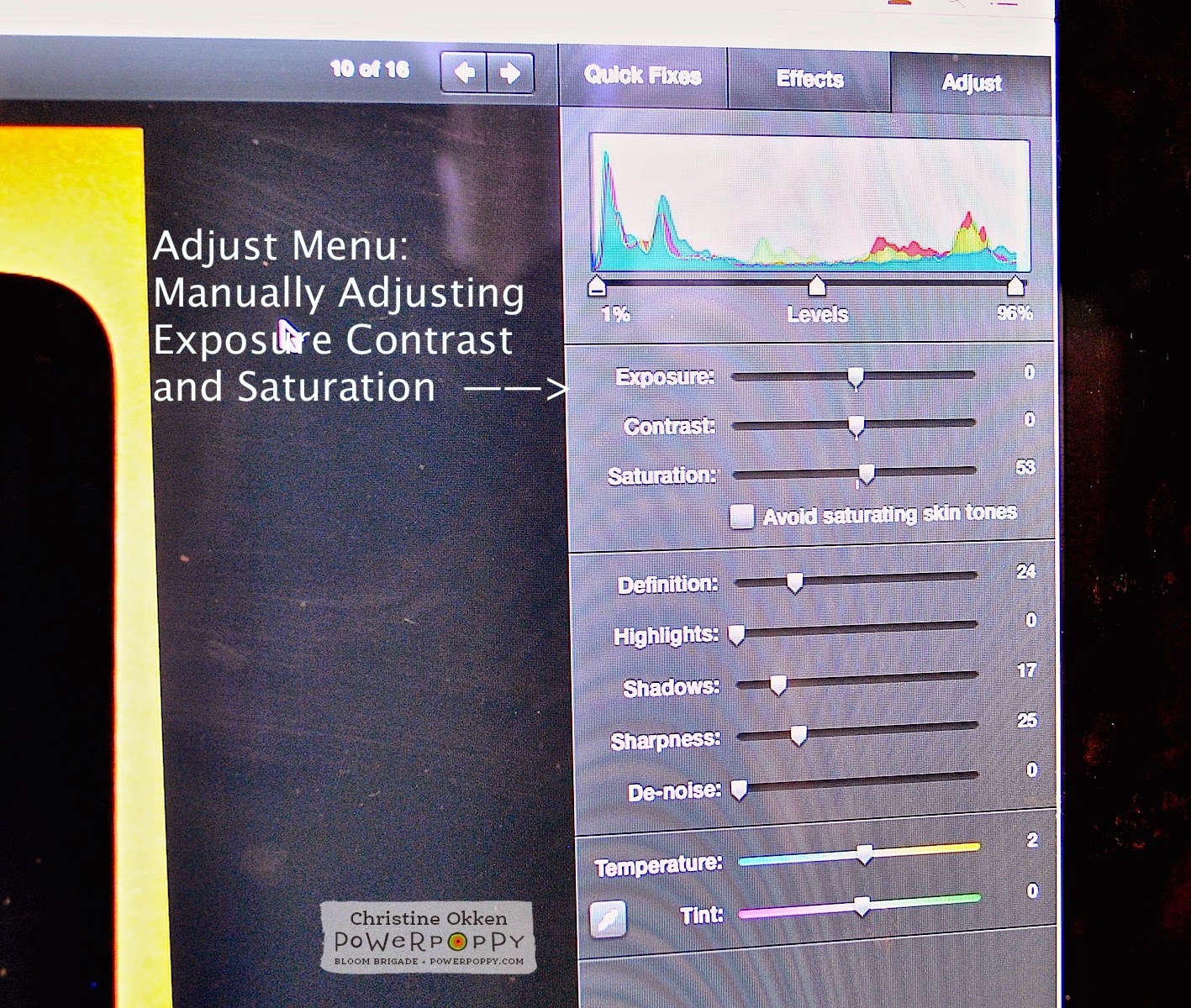
If using the Enhance button doesn’t get the effect that you’re looking for, in iPhoto go to the Adjust Menu and you’ll see a colour bar graph and then 3 slides for Exposure, Contrast and Saturation.  You can adjust the arrows on each side of the colour bar graph and also adjust the slides for Exposure, Contrast and Saturation.  Adjusting all of those slides manually allows you to give your photo the colouring and contrast you’re looking for.  As well, on the bottom area in that same menu you can see Temperature and Tint slides.  If your photo is too blue or yellow, you can make adjustments here.  

And again - if you don’t like how your adjustments turned out - you can just click Undo on the bottom right of your screen, and it will back up to where you were previously.  


Other Adjustments:  As I said in the first photography tutorial, I really like my whites in photos and backgrounds to be true white.  Even after edited, most people will find that their photos appear darker on their blog.  I know there’s some technical reason for that (probably to do with resolution, pixels and some other crazy computer speak), so I usually brighten up my photos a notch or two.  In the Effects Menu I press the Lighten button once or twice to brighten the photo.  This increases the overall brighteness of the card on the screen.  


Next, if my photo still has some shadows in the background I’ll go into the Adjust Menu Screen and slide up the Shadows slide.  This removes some of the background shadows.  


Final Touches:  Now I’ll start making final adjustments.  I like my photos to look crisp on screen, so in the Adjust Menu I’ll slide the sharpness up a little so there’s a crispness to the details.  I don’t adjust this too far because I want the photo to look natural - not overally edited.  


In combination with the Sharpness I’ll also slide the Definition slide up a little too.  


Then finally if there are any imperfections in the background (like if my background has a smudge or is dirty or has some dust that I didn’t notice I’ll use the Retouch button in the Adjust Menu and a little circle will come up with your cursor in the screen  (you can slide the circle to be smaller or larger).  I’ll just click the circle on the area in the background where there was dirt to clean it up.  


So overall,  I like how this looks on the screen.  Next I’ll watermark my card photo and publish it to my blog.  


Here is how the edited photo looks.  I really love how the layer of vellum softens the effect of the colours around the sentiment.  


Here’s a final closeup.  

I hope you have some new ideas of how you can make your photos show off all of your hard creative work!     Thanks for joining me again today!    


Sunday

A glimpse of April’s release - today!
Well, hello there! First of all, I want to say thank you to everyone for the wonderful notes you’ve sent and comments you’ve left wishing Power Poppy a Happy Birthday, and for participating in the treasure hunt-surprise party thrown by the Bloom Brigade. (It’s not too late to get in on it, and you might win $100 gift certificate in our store - click here!) I continue to marvel at the number of folks we are touching with our message and our stamp designs, and who in turn touch more folks with the cards they make!

It’s a really good feeling, and I do so appreciate you all sharing your happy vibes with us!!

OK - I have the suspicious many of you are awaiting what we have in store for you with our April release. I let you in on a little sneaky peek in the e-newsletter a few weeks ago...


Can you see the frothy blooms blasting out of that pitcher (see, tucked under my camouflage of markers, papers, and ribbon)? Folks went gaga for our French Lilac digi, and that made me very happy because you know, I just wasn’t finished with Lilacs yet. In fact, I actually drew a few other images for this set and couldn’t fit them all onto a 4 x 6" stamp set canvas! They will just live in my sketchbook for a while. But really, who can get enough lilacs?

Not this lady!

As a matter of fact, I’ve tried to grow lilacs on more than one occasion, and unfortunately, I didn’t have the ample daylight sun and space that Lilacs need to thrive (most space filled up by peonies!). But, I am entranced by the inspired lilac hybrids of Father Fiala, and I would reallllly love to have that lush scent in my yard come spring. And, not to get started on too big of a tangent, but let me show you a few of the Lilacs introduced to the world by this renowned and beloved hybridizer. The lilacs shown below can be ordered by mailorder from my favorite, favorite, favorite source for unique perennials and very special trees and shrubs, the lovely family-owned Klehm’s Song Sparrow Farm and Nursery in Wisconsin.

'Little Boy Blue' by Father John Fiala, Available by mailorder from Klehm’s Song Sparrow Farm and Nursery

'Fiala’s Remembrance' by Father John Fiala, Available by mailorder from Klehm’s Song Sparrow Farm and Nursery

http://www.songsparrow.com/catalog/plantdetails.cfm?ID=547&type=WOODY,&pagetype=plantdetails
'Atheline Wilbur' by Father John Fiala. Available by mailorder from Klehm’s Song Sparrow Farm and Nursery

Here’s a quick bio of the hybridizer Father Fiala, written by Roy G. Klehm. I designed and illustrated Klehm’s catalogs for many years, and Roy told me lovely stories about the man behind these plants, so I appreciate you indulging me in sharing this part of the plant world with you! Klehm’s has more than 20 varieties of hybrid lilacs — go find more inspiration for your coloring, or even better, plant one outside your window — CLICK HERE! :)

Now I think I might have to go pick up a bouquet of these from the flower market, they are going to be all I can think about today, and they’re aren’t even close to blooming yet!

Doh! I did go on a lilac tangent. Because today’s post is about peeking at my new stamp set, isn’t it... SO! Presenting a preview of our newest clear stamp offering, one that I think you will turn to again and again to usher in spring, and share a sense of “enjoying the moment” by slowing down and breathing in the goodness of life: It’s Lilac Time!

http://powerpoppy.com/products/lilac-time

Come and see the lilac-y loveliness that our Bloom Brigade has created for today. You may find yourself needing to feel surrounded by the calming spring scent of lilacs, or maybe you’ll order up this set so you can color these up ANY TIME! Even after they finish blooming in the garden...

GO BLOOMIES, GO!

Allison Cope
Christine Okken
Cindy Lawrence
Julie Koerber
Kathy Jones
Katie Sims
Leslie Miller
Stacy Morgan


We’ll see you back here tomorrow... we have more to share and I’m going to tell you now, I’m trying to make it really hard for you to resist any of these sets. I put my heart into each of them! (It’s my way.) Have a spectacular day!