Showing posts with label Cuppa Buttercups. Show all posts

Monday

Inspire Me Monday: Some Tips to Create in a Jiffy!


Hello everyone and happy Monday! It's time for another Inspire Me Monday and today, I have some fun, easy and relatively quick cards that I made to slip into the mail to send to my daughter at college. But, these little numbers are really all occasion cards that you could have on standby to send in a jiffy!

I started by going through some of my favorite digital stamps from Power Poppy and narrowing them down to images that would be "pick me ups" and happy illustrations. I decided on Wish You Luck, Asters Abuzz and Cuppa Buttercups

So how are these creations quick? I'll share some of the tips & tricks I used to keep it simple! 

First, I started by opening all of them up in my Photoshop Elements and putting them on a printable page just for ease and then, second, while they were all on the same page, I used different dies to cut out each image. 


Once I had my images die cut, I decided to make my card in reverse for ease. I call it backward but maybe this is how you create all the time? Let me know if you do because, honestly, it cut down on the time I normally take picking up and putting down so many different decorative card stocks until I settle on "just the right one!" For some reason, when the image isn't colored, it's easier to choose? Hhhhmmm.... maybe!

Oops! I almost forgot! With the Wish You Luck image, you'll notice the original has the stems included in the image and I wanted to create just a circle of clover -- so I opened up the image and then used the magic eraser to erase the tied stems! 

Here's a peek at the original illustration! 


Okay, back to my tips and tricks! I went about creating my card bases before I even put marker to paper....


I created these three layouts in less than a half hour (and honestly, probably less time than that). I simply picked papers that looked appealing to me instead of trying to perfectly match them to the vibe or the color of the Copic markers that I used. 

Now, the reason why I wanted to do it this way was because my daughter plays college softball and since we can't always make the away games, we sit in front of our TV and watch her for doubleheaders on Saturday and Sunday afternoons. That's perfect coloring time in between innings! ;-) 


WISH YOU LUCK - Card #1

With midterms and finals always looming, I decided to use this image to pop in the mail when she needs a little encouragement. As a nursing major, it seems like every test is "do or die" and so a little love from mom can't hurt, can it?


While this card might seem a little "loud"-- I think it's happy and the patterns are fresh and fun! Color up the image with Copic markers, add a sentiment strip and some bling and.... done! 

Here's a closeup for you! 


ASTERS ABUZZ - Card #2

This creation is just a little reminder to stay positive and when life gets you down, re-write the script and make your own happy. It's an important lesson, right? 


And, here's a little closeup! You can see that I did add a little sparkle to the bee's wings! 


CUPPA BUTTERCUPS - Card #3

I love this last card because you can pop a card like this in the mail any time for any reason! 


And so, after some coloring while watching softball, here's all three together! It was funny, after coloring an image, I'd run to my craft room and assemble and take a photo then run back to the couch to do it again! I have to say it was a fun way to create -- no stress or fussing at all like I normally do! :-)


I hope you had fun sharing a little time with me today and maybe you'll give these little tricks a try -- picking a handful of digital images and putting them on a page, die-cutting them in one fell swoop and then creating each card's layout before you color! It sure helped me! 

Thanks for stopping by! Have a fabulous and creative week! 


Inspire Me Monday: Word Play!


Hello all and welcome to another edition of Inspire Me Monday!  One thing I love about digital stamps is the ability to play with them and arrange them in a new way. In the past, I've shown you how to use digital images as both backgrounds and accents and today, we are going to get a little refresher course on how to use digital images to play with words! I've done this technique with all occasion cards, with holiday creations and today, we're going to do this with a bit of a juicy summer theme! 

Let's take a look at what we'll be creating today! 

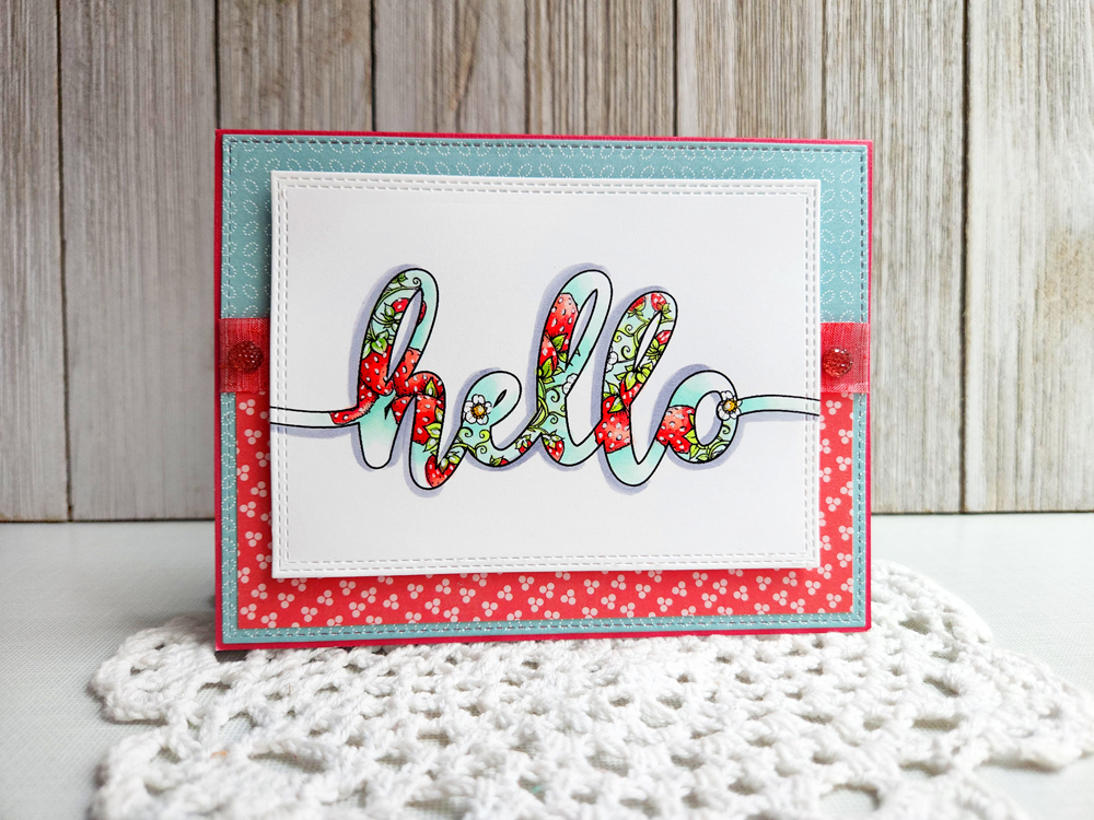
Just a sweet and simple creation that screams summer and has a pop of cheery color! So, let's get started on creating this juicy little number!

To start, I used Adobe Photoshop Elements as my photo editing software but alot of these techniques can be done on similiar editing programs. I opened up the program and decided that I would use the word "hello" as my starting point! I created a canvas that measured 6 inches wide by 3 inches tall. I typed the word "hello" in the font Hello Regular in 150 point size. It's a free font that you can find for free HERE. 


After I typed out the word, I added a thin stroke around the word. 


Then, I flattened the image to create a background...


From here, I used the eraser tool to get rid of the white area internally within the word.


Now it's time for a little berry fun! I opened up the strawberry file from the Power Poppy digital stamp set called Cherries and Berries. 


Now all you need to do is drag and drop the image onto your word canvas. 


I also duplicated the berry file multiple times and then brought the word to be the front layer. And, at this point, I had fun just moving the different berries all over so that it would flow through the "hello." 


Afterward, I printed off my image and colored it up using Copic markers. I used R20, R32, R35, and R37 for the berries. YG03 and YG61 for the leaves and then used G0000 and BG10 for a little extra pop of color around the berries. I added some white gel pen to the seeds to help them pop a bit. I also added a little bit of Stickles to the centers of my strawberry flowers. 

And, after layering it all up, this is my finished card! 


As I mentioned at the start of this post, this isn't the first time I've played around with words and digital images. I thought I'd share some of my past cards just to show you the possibilities!


For this card above, I created the word LOVE and then used the digital set Graceful Still Life to create a flow of dogwood flowers around the word. 


And, above, I used the set Cuppa Buttercups behind this fun "Hi!"  I love just how cheery and colorful this one turned out to be! 

And there you have it! With digital stamps, there are so many possibilities -- so many more than sizing and printing! Techniques like these help you to create cards for any occasion, using some of your favorite illustrations as inspiration! 

I hope you give this a try! Until next time, 


Tuesday

Creative Confetti: Not a Card!


Hello friends and happy Tuesday! I have a fun little project to share and it's one that sparked this week's Creative Confetti Challenge (not the other way around!) I am not sure if you are in a family mask crisis but, at our house, we are! What do I mean by that? Well, I literally have made close to 100 masks since March and while I have given away 90% of them, my family is not at a loss. We have plenty. But, you know what? No one can remember to take one with when we venture out. I have three in my purse, two in my car, one in my workout bag but my family is another story. So, I decided to help refresh some memories here with this project! ;-) 

And, so we have this week's challenge!

HOW TO PLAY: This week's challenge is as simple as it sounds -- create something, just not a card! How easy is that?

On to my creation... (with the family mask crisis in mind!)


With a little digital manipulation, I created this sign above just for those friendly reminders! ;-) I used Power Poppy's digital stamp set, Cuppa Buttercups. NOTE: Due to demand, we’ve added this graphic to the Cuppa Buttercups digital download. Free if you’ve already purchased it, and now part of the whole set for just $5.


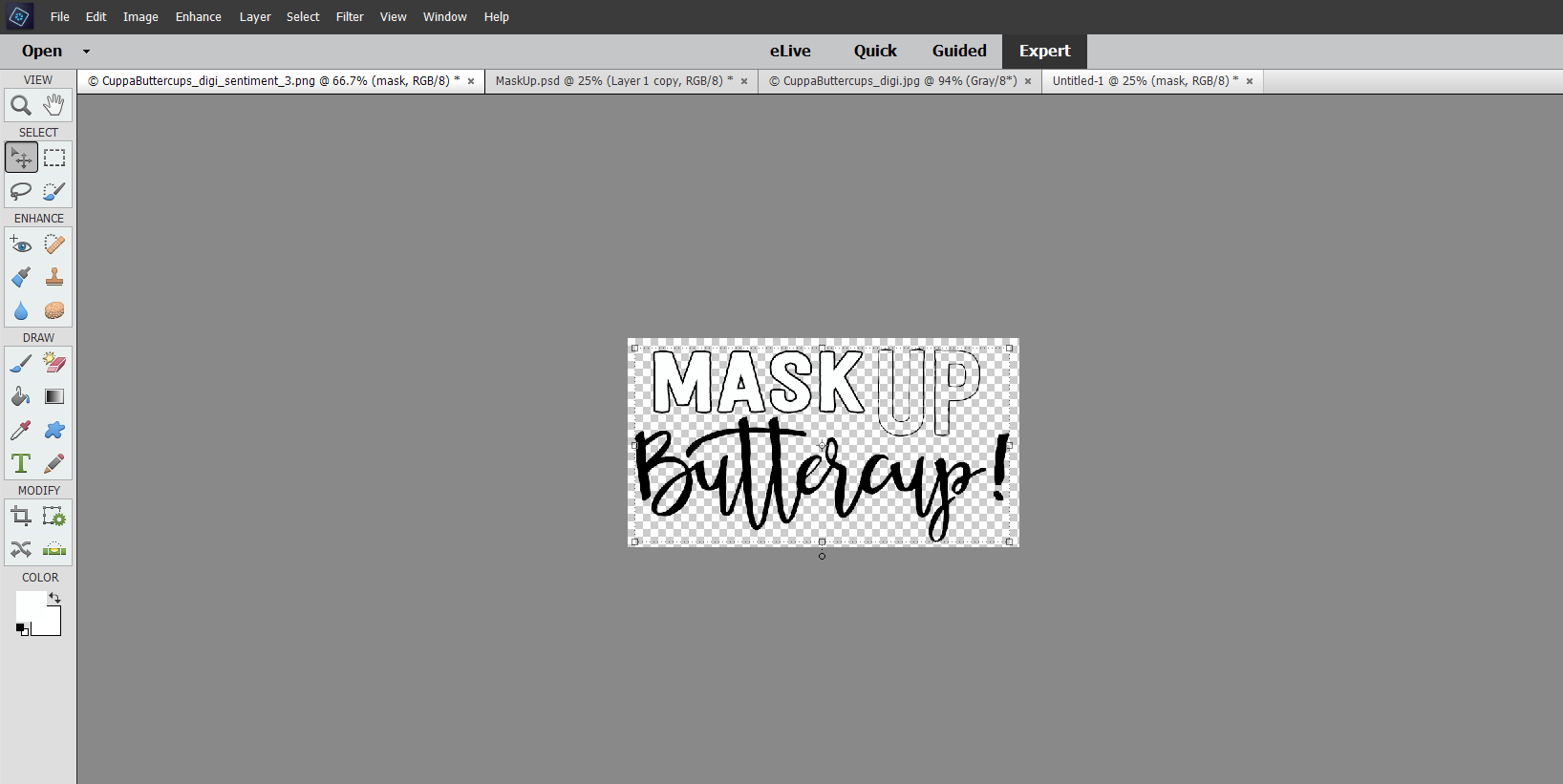
Inside this set is the sentiment, "What's Up Buttercup?" -- well, I wanted to replace the word "What's" with the word, "Mask". So, thanks to my eraser tool on PhotoShop Elements, I got busy taking out the word.


In its place, I added the word Mask in a block font (Festivo Letters) and I created it with a white font. From there, I added a super-thin "stroke" around the outside so that I would have the same outlined font that the word "Up" has.


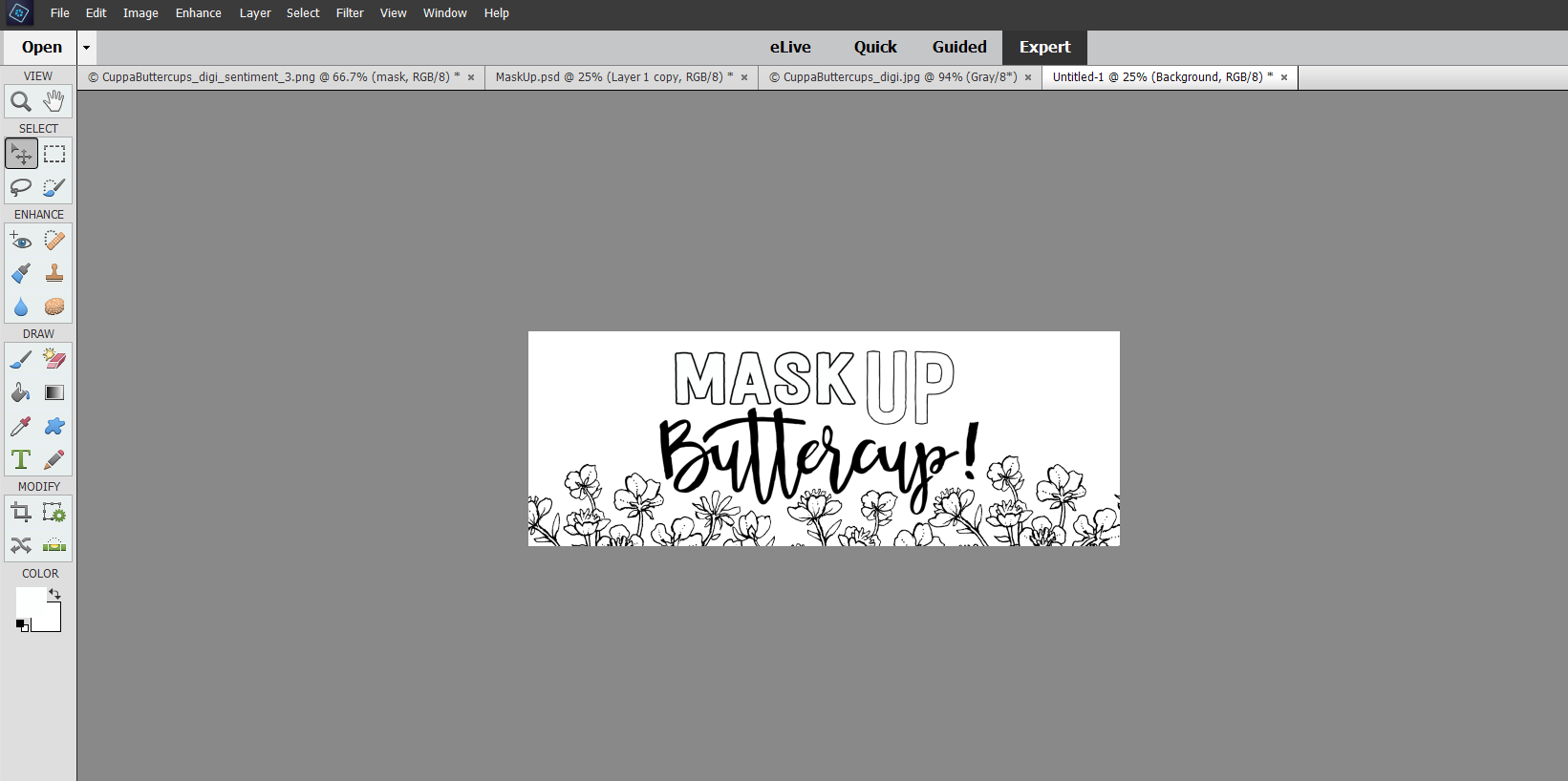
Next, I opened up the floral cup in the set and removed the background using the Magic Eraser tool. From here, knowing that my cardboard was 8-34" by 3-1/2", I created my canvas to measure 1/2" less all the way around - 8-1/2 by 3". I knew I wanted to add a piece of decorative paper in between my sign and the base.

Then, I just layered all the elements on top, dragging and dropping until I got the right configuration! As you can see, I only used the tippy tops of the flowers. I wanted them to ebb and flow around the lettering and these little buttercup flowers did just that!

 
So, how did I create that silver backdrop without silver paper? I used one of my favorite tricks!


I dabbed Versamark ink all over the edges until I had at least 1/2" covered from the edge and then covered with silver embossing powder and then heat set.


Once I layered all my pieces, I added some silver grommets and then got to coloring! 


And, with the help of a hook and some Command Strips.... it's now hung on the door, ready to remind everyone who leaves to head out into the brave, bold world that they need a mask! ;-)


And there you have it my friends!

Want to join me this week? Simply create, post and then link up using the linky below! As we always say, if you get those fingers inky and play along, each and every link is an opportunity to win a $25 gift code to the Power Poppy Shop!

Until next time!


You are invited to the Inlinkz link party!

Click here to enter

Monday

Inspire Me Monday: A Little Word Play!


Hi all and welcome to another episode of Inspire Me Monday! Today, I am going to go digital for our tutorial today and show you how you can take digital sentiments or words and make them more of a centerpiece in your stamped cards and creations.

So, let's get started! Last week for our Hues to Use, I showcased a mash-up of Power Poppy's Graceful Still Life with a word that I whipped up using PhotoShop Elements. This, below, was my card!

CARD #1 


So, want to see how I created it? I started by using a heavy font to type out the word LOVE. I used the font Heavitas and got it free here on dafont.com.


From there, I added a box around the word LOVE by clicking this icon (highlighted off to the left on the tool bar) and stretching the box to cover most of my digital canvas. After I filled the rectangle with a white layer, I added a "stroke," basically an outline by clicking on that effect that you can see  on the right-hand side of the screen. I did this because I knew I wanted my image to be framed in a way. Keep in mind, I am sharing the details for Photoshop Elements (PSE) but these tools are rather common in photo editing software. While PSE is a rather inexpensive software you buy (you can check it out HERE), GIMP is a free software that can do a lot of these things as well. Click HERE to check it out! 

Here's what the image looks like after I placed the box around the word...


From there, I opened up the branch image from Graceful Still Life and removed the background just by clicking the eraser tool on the background. From there, I started to play around with placement and layered it over top my word. 


I also realized that I didn't want my lettering to stay black, so on that layer, I changed the font color to white (simply click on the text icon, highlight the word, click on the color box down on the lefthand side, and then ink drop a new color) and added a stroke effect around the letters as well, so I would have more of an open-line look.


After I found the placement, I took the single branch, clicked on the image tab, clicked on Rotate and then rotated the branch horizontally, so that I could get a second image facing the other way...


And then, I dragged and dropped this image over my word on the other side...


Here's where the eraser tool really comes into play! After I had my branches set exactly where I wanted them, I realized that I had to use the lines of my letters as a guide to erase sections of the branch so that it looked as though my branch was falling in front of my word in some places and behind it in others. It might be helpful to reduce the opacity of the image so that you can see the letter underneath.


You can see that over the "O", I am starting to erase that layer. I also erased the part of the flower that was laying over the "V". I kept going until I had what I felt was a balance. And, when I was, I ended up printing this one my laser printer so that I could make this creation gilded with some Deco Foil. See?


From there, I colored this one up with Copics, making sure to add depth to those letters and the backdrop as well! Ta da!

HERE'S THE GOOD NEWS! While I just showed you step-by-step how to create this look, Marcella decided to share this image as a part of the Graceful Still Life set. If you already purchased this image, this file will be available in your PowerPoppy.com account, under your purchased digital downloads. If you haven't ordered this set yet, this image will be included when you order. Thanks Marcy! :-)

CARD #2

For the next creation, I wanted to use one of Power Poppy's sentiments and show you how you can take a digital mash-up to the next level. I used the Power Poppy's Chinese Lantern digital stamp set sentiment "Hi!" and blew it up so that it measured roughly 3" by 3". From there, I merged the layers and then, using the Magic Eraser Background Tool, I got rid of the white space on the inside of the word by just clicking on the inside of each letter. See?


Then, using Power Poppy's Cuppa Buttercups digital stamp set, I layered the image behind the word "Hi!"  I dragged the image of the cup a few times letting the flowers only show, making sure the flowers were behind my top layer.


And this is what my card looked like after I colored up the letters and added some accents!


And here's a closeup of the letters so you can see how I colored them up!


CARD #3
For my last creation, I didn't have to go far to find even more inspiration. I used one of the other sentiments from the Chinese Lantern Digital Set "You make me so happy." I loved the chunky nature of this image and knew I could use it in a different way as well!

So, after opening up the image in PSE, I erased the background, and then changed the color of the font from black to white. All you need to do in order to change the color is click on Enhance tab and then click on Adjust Color and Adjust Hue/Saturation...


From there, you simply adjust the lightness until you're at +100.


From there, I added a stroke around the lettering using the same effect that I did in our first card. And, here's what it looked like afterward...


While I love the look of this image as it is, I knew I wanted to layer it with a fun image behind. So, I opened up the Sweet Pea Show digital stamp set. And put it in the background. 


After I printed, I colored up the whole thing and had fun doing it! I wanted the lettering to look almost like an ombre effect. And here's a peek at how it turned out!


And here's a closeup...


And here's a peek at all three cards!


I know that some of what I shared is a little bit more on the tricky side but hopefully, seeing what's possible will help you explore your photo editing software and try new things! Layer sentiments, add backdrops, or even create your own! If you do, be sure to add a link in the comments section on this post to show us what you've done! 

Thanks for stopping by today! Be sure to swing back tomorrow for a whole new Hues to Use to kick start some colorful creativity in your crafting spaces!

Until then,

~Julie