
Hello Power Poppy friends! It’s Christine here bringing you a little inspiration today. Do you ever feel like you get stuck in a rut when you’re creating? Stamp the same way, colour the same way....today I have some ideas that might get your "inspiration thinker" moving in a different direction.
I normally pick an image, stamp it onto XPress It Blending card stock and then colour with Copics. But, what if you chose something else to stamp and colour on...something non-white? Here are my 4 card experiments, colouring on paper other than white!
1. Patterned Paper - Embossing and Watercoloring

I’ve been on an Inktense Pencils and watercolouring kick lately, which has been really fun. I like these pencils a great deal because they give such vibrant colour, wash in so beautifully, still retain their vibrance, and they require very little water to blend. This means you can use other types of paper rather than just watercolouring card stock.
I decided to stamp the rose from Power Poppy’s My English Rose stamp set onto apatterned paper that was full of text. I embossed the roses in white over the text, and then gave them some colour with the Inktense Pencils. With stamping and colouring over text, you want a colouring medium that will give you nice deep colour coverage, so that the text is still visable, but you really see more of the colour than the text.

This is what it looked like as I was colouring/watercolouring. On the top rose you can see I’ve washed in that first layer of red (I’ll add more colours as I go), but on the bottom you can see how very little pencil lines you need on the paper. I barely have to add any water, just a damp brush and it blends really well, and because you don’t have to add a lot of water it doesn’t pill the paper either. Inktense Pencils are actually ink, so if you wash in your colour and then let it dry, it’s permanent. That means you can add other colours over top or other treatments and your colours won’t get muddy. I’m finding that to be a great feature.

Here’s a closeup of the finished design. You can see I added some other deeper red and blues into the roses and leaves. I love how the resist of the embossing gives it a subtle outline, and the text still peeks through the colouring too.

This next design is similar in that it also uses patterned paper, but this time I found a soft neutral vining-pattern in my paper stash. It pairs really well with the flowers from our Poppies Set.

This is the colouring after the first coat of orange is washed in, I’ve added some deeper reds that I’ll wash in and I’m about to work on the first wash of the greens on the leaves. There’s quite a bit of texture in this patterned paper, almost like a watercolour paper without the thickness.

The subtle pattern in the paper changes the feeling of the design in a fun way.
I hope this will have you looking at your patterned paper in a new way as a potential colouring paper. Just look for more neutral designs with subtle patterns and experiment. Copics would also work really well as a colouring medium with patterned paper, if you’d like to try them out. I would suggest having some scrap paper underneath your patterned paper as Copics may bleed through the lighter weight.
2. Colouring on Coloured Cardstock
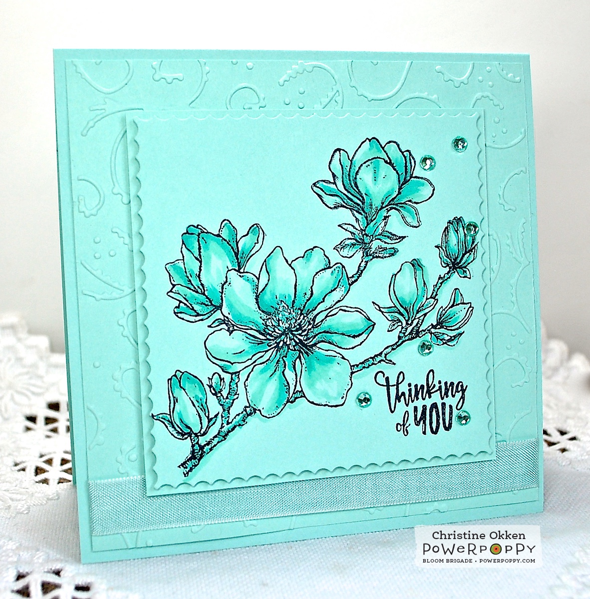
Colouring doesn’t just have to be on white card stock...why not pick a lighter shade of card stock and stamp and colour on it? I created this lovely monochromatic bluey-green design, stamping the gorgeous Planning for Magnolias branch onto the Pool Party card stock. Then I added in some soft matching colouring just a tone deeper than the paper (BG11, BG13, G00). Your base colour is essentially done for you by using the card stock as the lightest shade. All it takes to finish this one is a layer that’s been embossed to provide a little texture and subtle contrast, seam binding and some sequins in the same shade. I think it has a lovely peaceful feel.

Kraft paper is also another great colour to colour on (wow that’s a funny mouthful!). I often colour it with prismacolour pencils, but Copics work great on Kraft card stock too. It gives a richer tone...and automatically warms it up. Here I’ve printed one of my favourite Power Poppy digital images, Sunflower Power onto Kraft and then added Copics. I find with colouring on Kraft you have to add deeper shades than you would normally to get the colour you’d like, but it all really adds to the rustic charm.

Some buttons, twine and a sentiment from Dynamic Duos - Peonies and Tulips add to the earthy appeal, and below you can see the Copics I used for the sunflower.

So there you have a little inspiration for your Monday, I hope it encourages you to go and dig through your papers and test them out! Thanks for joining me today!
18 comments:
What pretty card examples, and I love the different ways to color that are shown! Thanks for the inspiration!
Oh, Christine, what a fabulous Inspire Me Monday post! I love each example and will definitely experiment using each of these methods. I don't have any Inktense pencils, but I've heard so many positive things about them. And I love that you can add another color once the first layer is dry...that's very appealing! Love each and every card...they are beautiful in their own right! Thanks for taking so much time with this post and giving us all these wonderful ideas and gorgeous samples! Love them all! Hugs, sweet friend, and have a great week!
Fabulous cards and great tips. Thanks for all the inspiration.
Fabulous cards and great tips. Thanks for all the inspiration.
YOWZA! All so beautiful! Love the different looks!
Beautiful cards!! Your coloring looks fabulous!!
Great tutorial, Christine! Thanks for sharing your beautiful cards and wonderful tips!
Great ideas and your cards are beautiful as always. Thanks so much.
Now these are so amazing Christine. Oh such inspiration. I love all these examples. Oh my.
Wowsers Christine! Look at all those amazing cards! Absolutely stunning my friend!
Beautiful cards!! Your coloring looks is beeautiful!
Stunning cards. I am wondering if one could achieve the same result somehow with digital stamps. Love these ideas.xxx
Mission accomplished with these beautiful cards....my mind is churning with possibilities from my own stash. I think we all need a little shake now and then. Thanks for the wonderful kick start!
Fabulous. I particularly enjoyed the English Rose demo as I have recently bought that set.
Shirl
Just so beautiful all the cards! thank you for sharing with us
Lovely, lovely, lovely. Very inspirational and great examples.
These cards are absolutely stunning and oh so inspirational...thank you!
Your inspiration is so wonderful. But: I do wish you would jot down your card sizes. I am new to cards, digis and all, even though I've accumulated a healthy collection of Power Poppy images ... but I never know how big to make my cardstock choices. I don't want to copy anyone's creations, but card sizes would be so helpful for this beginner.
Thanks so much for all you do!
Tina
Post a Comment