

Universal shading is a concept that you need to absorb and understand in order to add life and dimension to your coloring projects. And. pssst... this concept makes coloring so much easier! So, allow me to share a few tips using Power Poppy's digital stamp set Maize for Days.


TIP 2: Just as I did with the husks, I continue to find less important objects and give them the same dull treatment. Here, I've colored the ribbon and bittersweet with blue-gray BV Copics to keep them from stealing attention away from the colorful corn coming next. To tie everything together, I repeat some of that blue-gray in the corn.

TIP 3: I'm starting to add more colors to the corn but I'm being clever about it. I don't want the corn to be an obnoxious, eye-popping riot of color, so I simplify the color palette. I've chosen 4 kernel colors and created a light and dark version of each. This way I have 8 kernel colors but they feel coordinated, cohesive, and professional.

TIP 4: I've saved the least realistic corn color until last. I don't need a lot of pink to make a statement.

TIP 5: Working my way through the husks now, adding a vein texture and pushing the shady areas deeper. Notice my color selection here, would you have shaded tan husks with a violet pencil? Brown shade doesn't have to be brown!
 TIP 6: Copic colorers get trapped into thinking that every color deserves it's own shade color combination. That really complicates the coloring process but it also leads to flat coloring when you choose a pretty shade color rather than a realistic shade color. Real shade is rarely pretty. Trying to keep that pink or yellow corn beautiful in the shade will flatten the depth!


TIP 4: I've saved the least realistic corn color until last. I don't need a lot of pink to make a statement.
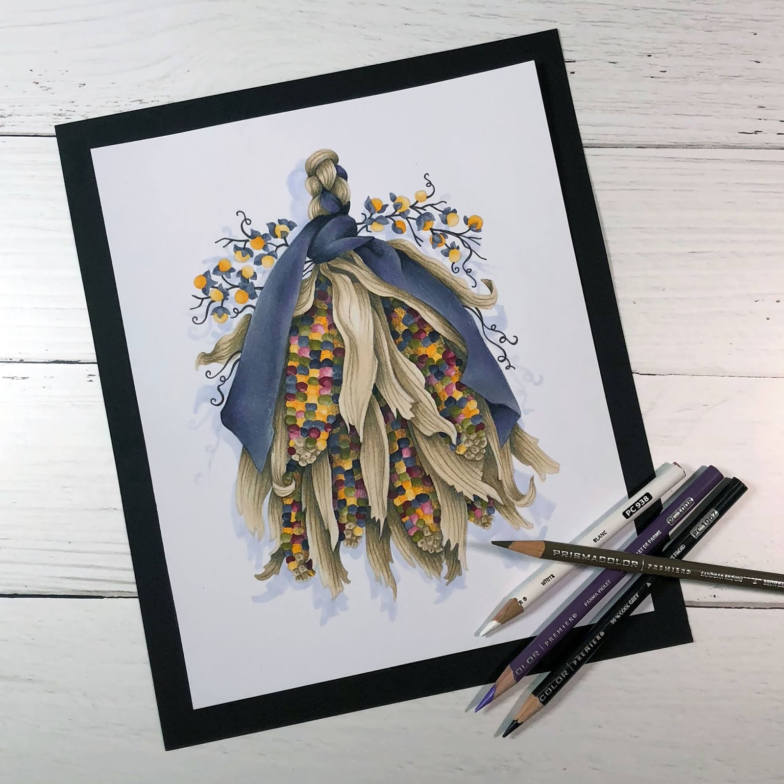
TIP 5: Working my way through the husks now, adding a vein texture and pushing the shady areas deeper. Notice my color selection here, would you have shaded tan husks with a violet pencil? Brown shade doesn't have to be brown!

If you want a few more real time ideas on how to pull off realistic coloring with universal shading, you're in luck! On Friday, October 12th at 11 a.m. EST, I'll be hosting a live stream class delving deeper into these theories. And there's more good news, students who sign up receive 20% off the digital version of Power Poppy's Maize for Days.

Click HERE to learn more about this intermediate to advanced class and check out the supply list. Don't worry, if you can't make the live stream, there is a recording you can play immediately after the broadcast ends which you can watch as many times as you like until April 1, 2019. I hope you join me!
Thanks for stopping by & happy coloring!

8 comments:
Gorgeous! Thanks for walking us through the process. I will never be able to do something like this so I choose simple images. But I love looking as the work of those of you who have real talent. Thanks for sharing!
Love how you can make such a complicated image sound easy !! Thanks
Wow! Love seeing how you work your magic!
I love your final image, and your instructions along the way were highly understandable. If I hadn't given up my career (single parent) to take care of my daughter with several brain cancers, I would join into your classes because of what I've seen here today. Good luck with all your endeavors through your artistic journey.
Amy, this is such a great discussion of color selection. I am so looking forward to watching and learning on Oct. 12. Thank goodness for the video library of 6 months... So much I want to color and so little time!! (And, by the way, to anyone who has not seen Amy teach video style, she does an "amaizing" lesson!)
The first time I saw this stamp, my mind went blank thinking I couldn’t color this well. So when I saw your artistry I literally gasped! I bought the stamp and I’m prepping for the livestream!!
that is so gorgeous! I love the subtle colors.
Beautiful. Looking forward to the live-stream. I have learned so much from watching Amy that I decided to start over and take her Marker Painting Foundation class. What a wealth of knowledge!!!
Post a Comment