I love to color Power Poppy digital stamps with Copic Markers and colored pencils. But I’m a coloring instructor so I draw and color daily. Your hobby is my day job.
My hobby? I l bake bread. I’m nerdy, so when I bake bread, I geek-out. Old recipes, odd ingredients... I’ve even cultured my own yeast. I enjoy baking the same way you enjoy coloring. It’s relaxing fun.
But here’s the difference: when I make bread, I don’t staple the recipe to every single slice. I don’t announce with a bullhorn “Hey everybody, before you take a bite of my bread, please note that I used Gold Medal Flour and Morton's Salt!”
But in coloring? You advertise your supplies all the time.
And you don’t even realize it.
Hello, my name is Amy Shulke. I’m the illustrator and art instructor over at VanillaArts.com. Today, let's talk about Stamp Blindness and how to cure it.
Over the past several months here at Power Poppy, we’ve explored how Artistic Coloring differs from traditional coloring, how to take the first step to adding artistry to your projects, and even why you should try coloring as big as your printer will allow.
But there’s one little thing that most colorers never think about when they switch to realistic coloring.
And yet it’s incredibly important to artistry.
You are blind and you don’t even realize it
Whether you use physical stamps or digitals, the stamping process is the first step of every project. It’s like breathing or blinking, you don’t even think about stamping.
Ahhhh… You are the fish who doesn’t realize he’s wet.
You’ve handled stamps so much that you’re blind to them.
You spend 100% of your time thinking about the space inside the lines. What color should I use? Where does the shade go?
You look at other people’s coloring projects and you focus 100% on what they did inside the lines. How many markers did they use? Where did they put the shade?
But the rest of the world doesn’t stamp.
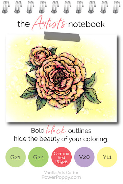
It doesn’t matter how pretty you color. All we see are your big fat honkin’ stamp lines.
We see the stamp lines you don’t even notice.
And I hate to break it to you, those big black stamp lines are the difference between:
My mom colors some stuff.
and
My mom is an amazing artist!
I’m not saying all stamp lines are bad
There is a time and place for effective black stamp lines. Good line art is beautiful. Bold outlines can make a strong artistic statement.
But black ink should not be your automatic reflex.
Black lines overwhelm most coloring projects. My Sunburst project here wouldn’t be nearly as delicate or feminine if everything were outlined in thick black ink.
No-Line, Invisible Line, Barely-There, or Naked As a Jaybird Stamping… whatever you want to call it…
Every day should be a no line day.
Here are four tips for making the transition to No-Line as easy as possible.
1. Gradually Go Lighter
I recommend printing in a gray or pink ink. Stamp or print as soft and pale as possible...
But don’t go cold turkey all at once!
For ink pads, gradually work your way from black, to gray, to a paler gray. For digital stamps, use your opacity slider. Incrementally move the percentage lower. Give yourself several projects to make the transition.
Don’t jump from black to barely-there in one project.
Black outlines are like training wheels. It takes time to get used to the feeling of less linework. You
don’t know how much you’ve been relying on black lines to carry the image until they’re gone. So don’t shock yourself, fade them out slowly.
2. Edges Require More Thought
Black lines encourage sloppy coloring. Sometimes you color just up to the line, sometimes you color up onto the line. You only care if you go beyond the lines, right? Because that's the only time your edges really show.
That security blanket is gone with no line coloring.
Not only will you have to color neatly now, you also have some decisions to make.
When a stamp has very thick lines, you must decide where one object stops and the other starts.
In Tree Peony, every petal forces me to decide where to stop one petal and where to start the next— should I color just up to the line or should I color over it?
There is no right or wrong answer, it’s all up to your taste. But now for the first time, you’re forced to think about it.
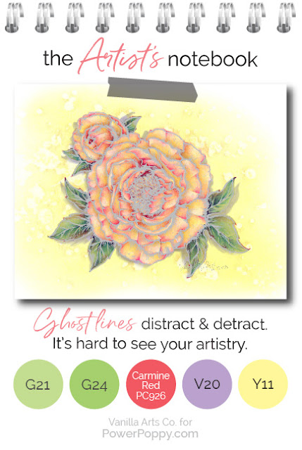
3. Don’t Leave Ghost Lines
This doesn’t happen with everyone but let me point it out, just in case.
Some black-line colorers are very neat and tidy. They’ve spent years coloring right up to the edge of the black line and they never, never, never go over it.
Then they switch to gray lines and do the same thing. It doesn’t look good.
In No-Line coloring, if you don’t hide the lines with color, then it’s not really No-Line coloring, is it?
4. Print a reference stamp
Many people are afraid of No-Line coloring because the color usually hides the original stamp lines.
Then you get lost.
As I colored the leaves on Tree Peony, I lost the veins. I could see a few of them but most were gone. Marcella's veins are a beautiful detail, I really didn't want to lose them!
I always keep a copy of the uncolored original stamp by my side.
When I feel like I’ve lost the shape or a detail, I can easily refer back to Marcella’s original drawing. I may not add it back exactly the way Marcella drew it, but I can restore the general feeling.
So here’s my Artist’s Notebook challenge for you this month...
Dig out that soft gray ink pad that scares you. Find the Opacity settings on your computer and turn it down a notch or two.
Make your next Power Poppy impression paler than usual.
Start learning to color with neat, crisp edges that you make yourself rather than letting the stamp lines hide your oopsies.
Start thinking about the shape of the object. Understand the petals, stamens, and stem of the a flower instead of relying on Power Poppy to tell people which parts are what.
Start interpreting your stamps as art. You be the artist, you be the story teller!
Want to color Power Poppy’s Tree Peony with me?
My Sunburst class is part of the Vanilla Livestream series for intermediate to advanced Copic colorers. This lesson covers how to add warmth and radiance to your flowers using a yellow underpainting technique. We’re using Copic Markers and colored pencils but I’ve stolen this technique from watercolorists and it’s so much fun! We’re painting with Copics!
You can find out more about Vanilla Livestream classes here.
And I’ll see you back here next month for another glance into my Artist’s Notebook!
Previous Artist's Notebook articles:
What is Artistic Coloring?Add Realistic Texture
Don't Be Afraid of Large Projects!


4 comments:
I'll be, never thought about this and you're so right, what a huge difference in the black and light gray. Wow gorgeous
Thank you so much for all this information!!!!
I have coloured not so long ago my first flower without black lines. I stamped them light pink because I didn't want to see the outlines when I was finished. And I loved it. sure it's less easy and I had a blackline besides me but it was so rewarding to see how the flower turned out. I will colour more like this.
Thank you so much for this great post Amy and all the tips.
Stay safe and have a wonderful day.
Absolutely Informative post! Thanks SO much for sharing these.
Post a Comment