Showing posts with label Colored Pencil. Show all posts

Monday

inspire Me Monday: Copic Base Layers

Hello, my Power Poppy Friends! It is my turn to share some inspiration with you. I started out wanting to share something with an autumn theme, but it is as far from autumn as you can get where I live! We are in the triple digit temperatures for the second week in a row here in inland southern California! And, with no end it sight! It is normal for here, so I am told, but I am not used to this heat. We have been here for one year, and...wow...it's HOT! 

I decided to keep my originally planned image, but to make a simple change at the end, as you will see.
Now, for the technique I chose this week: Copic Base Layers. Or, as some people call it, under-painting. I am not sharing true under-painting, as it is a lot more complicated. What I decided to share is something called "basing" or "base layering." This is a popular technique in adult coloring groups. Many folks use water-based markers or water coloring, to put down a first layer on coloring pages, then they will add colored pencil on top. Since I am using a digital image and my choice of paper, I am using Copic alcohol markers.

Let's get started!
First, print the apples image from the Apples in Season digital stamp set onto white cardstock suitable for Copic coloring. I use Hammermill 100 pound (271 gsm) Premium Color Copy Cover for most of my Copic projects, but you may use whichever paper is your favorite. I am using a black line version and have printed the image at approximately 5" x 7". 

Next choose your markers, one for each main color in  the image. I chose a Copic R14 for the apples, YG05 for the leaves, and RV02 for the flower buds. I chose colors that were between the medium and light tone that I would pick if I were coloring a full Copic piece.
Use the three markers to base (or under-paint) the images. I chose to not color the flowers that I wanted to be mostly white, nor the branch, which will be brown. I did a nice layer of ink with each color and then allowed the ink to dry.
Next choose a set of colored pencils that are a middle hardness which will work well if your cardstock is quite smooth. The pencils need to be soft (or waxy) enough to blend, but you don't want to burnish and fill in the tooth of the paper too quickly. Remember, smooth cardstock has very little tooth (texture). If the pencils are too hard, they will just sort of skim over the surface of this very smooth paper.
I chose a set of pencils called Schpirerr Farben, which are marketed as an oil pencil, but seems to be in the middle between oil and wax. The pencils are a medium softness and quite vibrant. I used the pencils to add details and shading to my inked images. 

My set of pencils has 96 colors. Below are the colors I used.

Apples: 240 True Love, 650 Ruby Brown, 130 Burnt Sienna
Leaves: 090 Golden Yellow, 560 Apple Green, 520 Green, 510 Moss Green
Flowers: 012 Ivory, 260 Carnation, 280 Rose, 290 Fuchsia Pink
Branch and stems: 668 Espresso, 660 Brown

Because we fist added the alcohol ink layer, we don't need to lay down as much pencil to cover the white of the paper! We can add more layers of color and more detail because we are not needing to fill up the tooth (texture) of the paper with the pencil. 
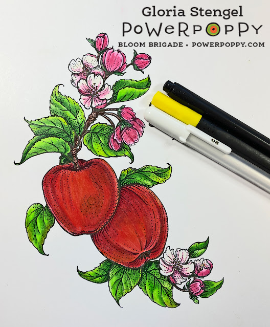
I used a few fine line pens and a white gel pen just for some tiny details on the flowers. 
Normally an image of this size, coloring fully with Copics, would take me two to three hours to complete, maybe longer. If I use only pencils it may take me as many as 8 or more hours to complete. 

Using this technique, it took me approximately 35 minutes to finish this coloring project! Base layering with Copic covered the white of the paper and the pencils added shading, highlights, and dimension! 
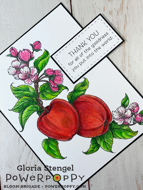
Now for the change-up. I realized that you won't see buds, flowers, and fruit on an apple tree at the same time. Plus the addition of the flowers made this image decidedly NOT autumnal. So, I had to cover up the sentiment that I had pre-printed onto my image. 

I printed a different sentiment onto the same type of cardstock. I chose the sentiment from the Folklore Flora digital stamp package.  I simply used a die cut to trim out the sentiment, then added a black mat with cardstock. A little glue, and presto! The original sentiment is all covered up! 
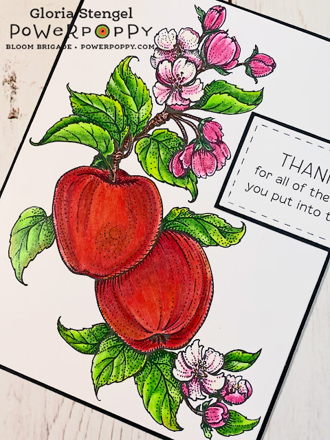
I hope you enjoyed learning about base layering and that you will give it a try, especially on larger images. It really does speed up the coloring process! 

Keep in mind that alcohol markers will ALWAYS bleed through your paper! If you wish to try this technique in a coloring book, make sure you are using a single-sided page and that you protect the following pages from the ink bleed through. 
Power Poppy Products Used:
Apples in Season digital stamp set
Folklore Flora digital stamp package

Other Products Used: 
Copic markers
Schpirerr Farben colored pencils
Arteza fine line pens
Sakure gelly roll pen
White cardstock
Black cardstock


Inspire Me Monday: Good Ol' Summertime!

Hello, Power Poppy Pals! I hope this finds you well and enjoying your summer! It is hot where I live, which is normal. We are approaching our one year anniversary in our new location and I realize that HOT is the way it is here in summer..and spring...and fall!   

Today is my turn to share the weekly inspiration. I decided to take inspiration from the summer, and my days visiting the beach when we lived only 8 miles from the ocean! We lived there for 16 years, and I confess I did not appreciate it the way I should have...especially now that I live adjacent to the desert...same sand...no water! 
I printed the main image from the Seaside Sweetness Digital Stamp Set onto tan cardstock to make a 5 1/2" x 5 1/2" card, with a white card base.
This image can be printed with and without the glass dome cover, as shown above. I decided to color the one without glass. I chose colored pencils again this month. I have such love of colored pencils...I cannot deny it! 
I chose the Arteza Expert brand of pencils, which were so-so on this smooth cardstock. They are fine for a small, quick image, but I would not use them on such smooth paper (Neenah Desert Storm) for a larger project as the wax builds up pretty fast! I would recommend a harder pencil such as Faber-Castell  Polychromos on this particular paper.
I colored the image and the sand and surf with the pencils, but I used a light layer of chalk pastel for the background. I decided to use a fun circle format, sort of like a fancy paper plate, for the main image. I chose a check paper to mimic a napkin, and my beach picnic card is finished! 

I adore this little vignette, plus it is so summery! I think coloring up a bunch of small images for cards or tags is just the ticket for a hot summer day! 

If you are needing a quick card, I highly recommend some of the small images such as this one from the Seaside Sweetness Digital Stamp Set, or from the companion digital sets Nest is Best, Cuppa Cupcake, Single Orchid, or Tiny Treasures. 

I added a sentiment from the Sweet Simple Things Digital Stamp Set. The images from this set are also perfect for summer time!
Thanks for joining us for Inspire Me Monday! Make sure to come back every Monday to see new inspiration!
If you have yet to play in the Blossom Challenge: Christmas in July, you still have a few more weeks to join! 

Power Poppy Products Used:

Seaside Sweetness Digital Stamp Set
Sweet Simple Things Digital Stamp Set

Other Products Used: 

White, dark blue, and tan cardstock, check printed paper, colored pencils, chalk pastel, white gel pen, adhesive

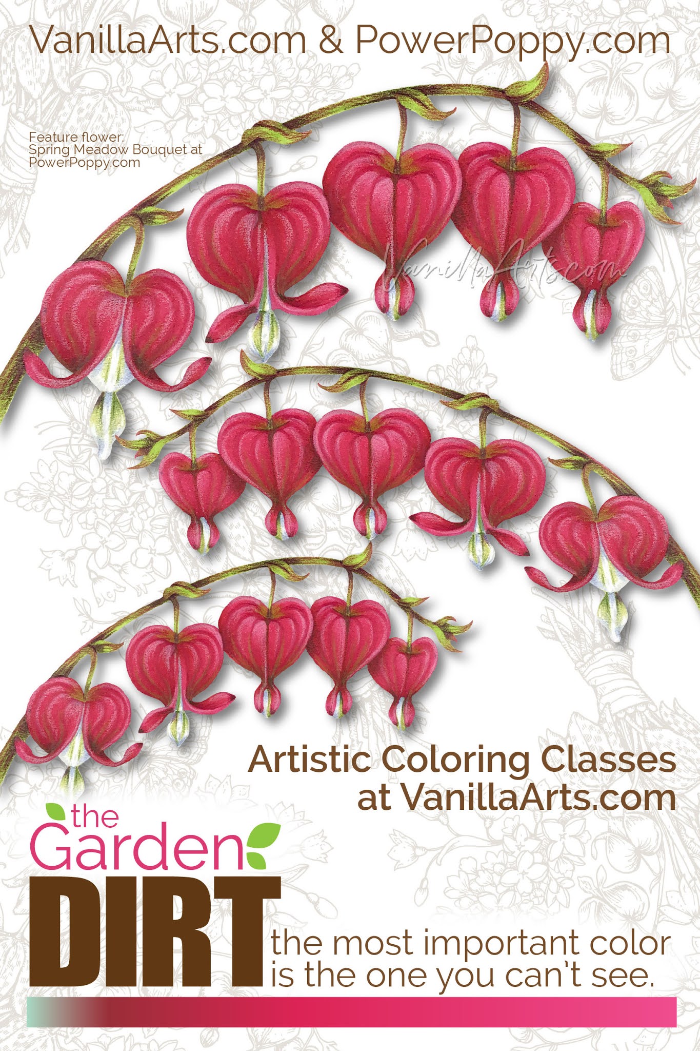
Garden Dirt: Bleeding Hearts, a Swatch for Underpainting with Copic Marker


Amy from VanillaArts.com helps you add realism to Copic Marker blends by underpainting with complementary colors. Pale green marker creates natural looking shade underneath magenta markers for a beautiful Bleeding Hearts flowers. | PowerPoppy.com | #copicmarker #realisticcoloring #underpainting

Let's color one more heart project!

I know Valentine's Day is technically over but honestly, I'd color heart shapes all year if students would let me.

Last month, I shared with you the Vital Rose digital stamp, colored with red Copic Markers and die-cut into a heart shape. This month, let's tackle hot pink and one of the sweetest species of flowers I've ever seen.

Hello, my name is Amy Shulke and I'm the illustrator and art instructor over at VanillaArts.com. Welcome to another article in my color swatch blending combination series here at Power Poppy-- The Garden Dirt.

Why dirt? I know it's not the most attractive name but that's what we do in realistic coloring. We take beautiful colors of Copic Marker and colored pencil and blend them together to make yucky, dirty colors. You can't grow flowers without a bit of dirt and you can't color realistic flowers without dirty color.

I've got a whole series of artistic coloring articles here at the Power Poppy blog. Here's a link to read more.


Amy from VanillaArts.com helps you add realism to Copic Marker blends by underpainting with complementary colors. Pale green marker creates natural looking shade underneath magenta markers for a beautiful Bleeding Hearts flowers. | PowerPoppy.com | #copicmarker #realisticcoloring #underpainting


Bleeding Hearts are one of my favorite flowers!


Actually, at my house, we call them weeds.

My yard is tree covered and almost full shade everywhere; I can barely grow grass. For years, we had nothing but Hosta, random ferns, and scattered Lily of the Valley but then a little pinkish-greenish scrawny looking weed popped up, out of nowhere. 

If something's brave enough to try living in my near-night conditions, I'm certainly not going to tell it no, so I let the weird little guy grow a while. Eventually the stalk bent over and sprouted the cutest little heart shapes. 

BEST WEED EVER!!!!

When I found myself looking for something to color for this month's Dirt article, I thought of my beautiful little weeds and wondered if Marcella had ever drawn them.

I'm a digital stamp girl, so I isolated the Bleeding Hearts from the Spring Meadow Bouquet to share with you today. 

She also has a few Bleeding Hearts tucked into the Springtime Love Roundel stamp here

Today's swatch will work with either version.


Amy from VanillaArts.com helps you add realism to Copic Marker blends by underpainting with complementary colors. Pale green marker creates natural looking shade underneath magenta markers for a beautiful Bleeding Hearts flowers. | PowerPoppy.com | #copicmarker #realisticcoloring #underpainting


Green under Red Violet makes a shady pink


Remember, realistic shady colors are not usually beauty contest winners.

Go ahead, look around you right now. Find something pretty on your desk or in the room beyond and really look at the color of the shady side. Surprised? The color of real shade is always a bit ugly. In art, we call shady colors "neutralized" or "desaturated". They're not the vibrant, gorgeous colors you see in traditional Copic Marker blending combinations.

Green sits opposite of magenta on the color wheel which makes the G marker family a natural choice to underpaint RV markers. I was shocked at how little green I needed to add murkiness to RV29. 

G02 was a bit strong, so I ended up using G00 but I really wish Copic made a G01.

In the Bleeding Hearts here, I added G00 where one heart overlaps another heart, where the stem inserts at the top, and down at the bottom where the heart cinches inward. Then I layered RV29, R35, and RV25 over the top of the green to complete the blend.

I printed my hearts large, the smallest heart is almost 1 inch wide. If you color a smaller version, you can skip the R35 in the blend.

Green under magenta sounds weird but it's what makes my Bleeding Hearts look rounded, layered, and pretty darned cute.

Amy from VanillaArts.com helps you add realism to Copic Marker blends by underpainting with complementary colors. Pale green marker creates natural looking shade underneath magenta markers for a beautiful Bleeding Hearts flowers. | PowerPoppy.com | #copicmarker #realisticcoloring #underpainting


Let's color flowers together


I love coloring Power Poppy bouquets! Today's Bleeding Hearts project uses the same techniques I demonstrate in this class using Marcella's Bowl of Beauty stamp and in this class using Marcella's Daffodil Bouquet stamp

We use different blending combinations and colors in each class but we always underpaint for depth and dimension.

All Vanilla Workshop classes are immediate access. Work at your own pace, color it as many times as you want, with no expiration date. The techniques are great for any Power Poppy digital stamp.

Have fun experimenting with green under magenta and I'll meet you back here next month with another colorful bit of Garden Dirt.