Hello there, friends. It’s Marcella here today, and I thought it would be fun to share ideas for adding painterly details to your coloring. What do I mean by “painterly details”? Think of decorative qualities such as color, texture, line stroke — the little style extras that make your work feel unique and artistic. From stippling to ink washes, there are so many cool things to try, in fact you’re incorporating a few into your work already, I’m sure.
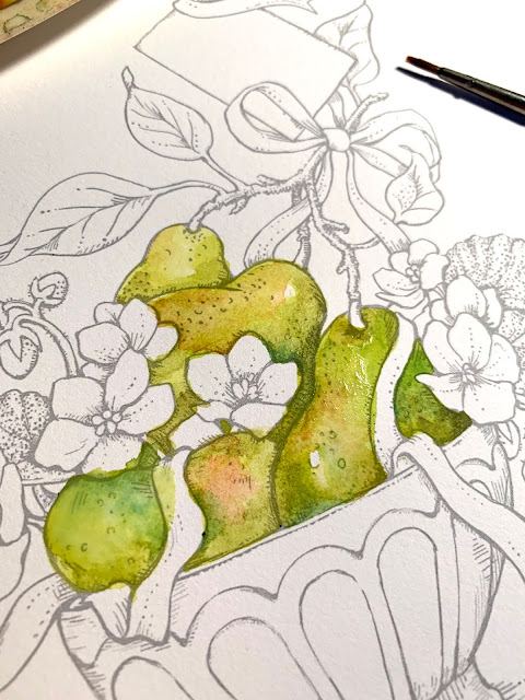
Today I’m coloring my new digital download, My Favorite Pair, released just this week. I’ve been dying to dig into it with watercolor and gouache paints, so I squeezed a few colors onto my messy paint palette and got to work. How will I add painterly details? Let’s start with some history.
 |
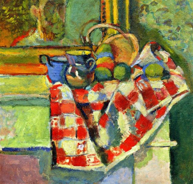
| Henri Matisse, Still Life with Checked Tablecloth, 1903. Source: WikiArt |
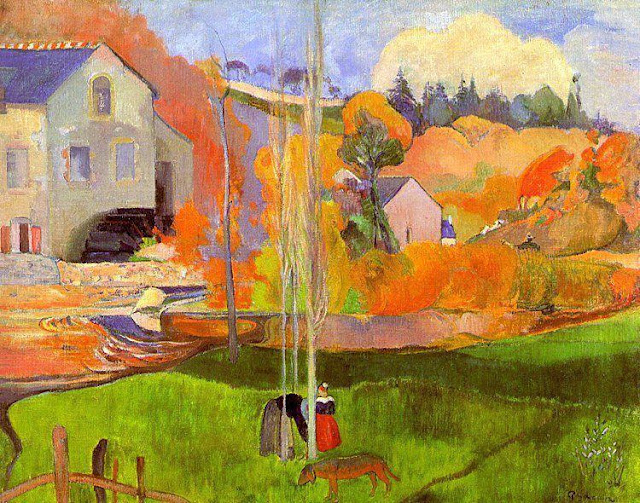
There are zillions of artists whose work you can follow for painterly inspiration — and having many choices can be daunting. For today, I suggest referencing the work of Henri Matisse, Paul Gauguin, Edouard Vuillard, Paul Cezanne — painters of the Impressionism and Post-Impressionism movements. Each artist could handily paint landscapes, still lifes, and portraits as realistically as you’d like, but their work became more exciting, interesting, and alive when they explored breaking through the traditional rules of painting. We can steal little ideas from their breakthroughs, and possibly have breakthroughs of our own.
 |
| Paul Gaugin, A Breton Landscape, 1894. Source: WikiArt |
 |
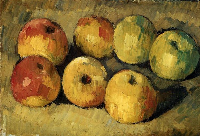
| Paul Cezanne, Apples, 1878. Source: WikiArt |
Controlling the brushstroke was an important part of the Impressionist artist's process. Notice how in Cezanne’s Apples, his strokes are short and thick, repetitive, almost feverish stabs of color. The impression from the overall work still reflects light and shadow, but because of Cezanne's use of thick, staccato brushstrokes, the apples have a movement and richness that is unique and interesting. I mean, it’s still a painting of apples. But it's a more interesting painting of apples because of the painterly details.
2. Start with the familiar
I’m not trying to frighten you with these Impressionist paintings — but hope you’ll add to your arsenal of techniques and references. I am not one to drop everything and switch up my painting style. I have a look that feels comfortable to me, and while I do try to stretch myself at times to keep things fresh, I tend to slip back into my familiar style. Hence... I started painting my pears with washes of green watercolor tinged with a pink blush...
More layers, and adding color to the bowl and flowers — I am still in my familiar style at this point. I’ve started getting very dark with what Kathy Racoosin calls the “nooks and crannies” — what an apt term — the little spaces that, when colored extremely dark/dull, bring out a real sense of depth to the rest of the piece.
I decided for a rich purple for the ribbon. I started with a more medium lavender tone, and then added shadows with intense violet and then highlights with white mixed with lavender.
I then went to town on the nooks and crannies, using a blend of very dark blue, purple, and a touch of Van Dyke brown to bring out the form of the various elements. With everything “colored in” at this point, I was feeling pretty good about things... and decided to go on to bed before making any odd color decisions due to sleepiness, or dropping my wet paintbrush onto the canvas because my hand was tired. :)
3. When in doubt, sleep on it
Waking up refreshed, the next step of adding painterly details jumped out at me. Add turquoise!
Strokes of turquoise were added the pears, the ribbon, leaves, and shadow areas in my “painterly details” phase. (Notice in the Matisse painting at the beginning of his post, how he has brought in those tangy colors around the pears!) See how my tiny turquoise dabs bring a bit of zing to the painting?
When you look up close, you can see that in some areas I’ve blended my colors, and in others, I’ve deliberately left brushstrokes showing (note the leaves and ribbon). I feel areas like this reflect the artist’s hand. A thoughtful, yet freeing process of deciding which ares to give a little more attitude, a little attention. Remember, I’m not going for realism (not sure I can even paint all the realistically if I tried). I am going for a painterly look with a bit of whimsy.
I put in a washy background of yellow, blue, turquoise, chartreuse.... very light washes over and over. I added thin horizontal lines behind and beneath the bowl to add texture and more painterly detail.
After the background was put in, I loved the sunny feeling of the yellowy glow so much, I decided to dab it around the main content of the painting, too. A dab of yellow on each pear. Dabs on all the leaves, even a bit on the purple ribbon. But it really shows up nicely on the bowl. As if sun is splashing across it.
And.... that is it for me today. I’d love to see you all adding painterly details inspired by any artists that speak to you. It is a great exercise in experiencing color and one step further in deepening your artistry. XOXOXO!!


10 comments:
Just wow. This is why I love your digis... can make them big for watercoloring. I need more watercolor, less Copics. Fantastic, Marcy!
Wow is right, Marcy! I absolutely loved reading your post and seeing all your examples with your explanation and then seeing how you've transformed this exquisite digi and made it come alive in truly "Marcella" style! I LOVE it and hope you'll post more like this one. So inspiring, and I also have to try watercoloring. Such a tough one for me to draw "out of the lines" - LOL! Loved it, sweet Marcy! Thank you! xoxo
I love this!
Gorgeous detailing...The artistic detailing are just marvelous and so your coloring. Love it totally, Marcella!
I love this so much Marcella! I would really love it if you put together an online class that will teach us more watercolor ing of your digits. I would honestly pay for such a class. Also I am totally new to this world of digits. Can you explain how to buy digits and how to download them and what wc paper to buy to run through the printer. Also helpful would be how to print the image so you don't see harsh black lines and what printer ink to use that will not bleed when watercolor ing over the images lines. I think it would be fabulous to be able to learn from you in a step by step fashion and I think lots of gals would jump on board as well. Please think about it? Hugs Veronica from Canada Vrohm@shaw.ca
Wow this is just gorgeous!
It's realy wow, I love how you have painted this and how you can come to painting like this with a twist of the masters and a lot of yourself. Thank you so much for this great post.
How beautifully done. The coloring is absolutely fantastic. Love the whole look. The pears and even the leaves great shading .
Oh Marcella... this was SUCH an inspiring post! I have not been able to do much coloring lately but I have GOT to try this technique asap! I LOVE how this came out.... a masterpiece for sure!!!
very inspiring, gorgeous work of art! ♥
Post a Comment