Showing posts with label Colored Pencils. Show all posts

Monday

Inspire Me Monday: The Perfect Paper

Hello, my flower-loving friends! I hope you are enjoying the return of Inspire Me Monday! If you have yet to play in the monthly Blossom Challenge, there is still time to join the May challenge, "April Showers Bring May Flowers"! The challenge closes at NOON on June 17th. See all the details HERE.  

Today is my turn to share the weekly inspiration. I wanted to inspire you to think outside the box...the paper box that is! If you are part of any coloring or card making groups on social media, then you know that one of the most asked questions is, "What is the PERFECT paper to use for my coloring?" That is not an easy question to answer because the true answer is, it depends. It depends on what you wish to accomplish, what your coloring medium is, what stamps you are using, what your skill level is, and more. The truth is, there is NO perfect paper that fits every artist or every need. 

I decided to try a few experiments to see what I could do with alcohol markers, colored pencils, and digital stamps from Power Poppy...on non standard paper! Namely...on scrapbooking paper. Because, let's face it, I have a huge boatload of scrapbooking paper!
I decided to print some Power Poppy stamps onto SCRAPBOOKING PAPER. And not only scrapbooking paper, but TEXTURED scrapbooking paper. (I used various papers from Authentique, but any heavy-weight, slightly textured paper should work.) I printed each image to to fit onto paper that was cut to 8" x 10". 

Note: To make sure the paper would run through my printer without jamming, I taped the scrapbook paper to an 8 1/2" x 11" sheet of printer paper. I had no issues with my printer accepting the thicker scrapbook paper by doing that simple trick. 

Now, we are always told that you cannot use Copics on paper other than marker paper because you will not get good results, the ink will bleed, and all sorts of other dire things will happen. And all those things can happen, but it is only paper and ink! Why not have a play to see what happens?! If it doesn't work out, it only costs you a few dollars in paper and ink, and a little time.
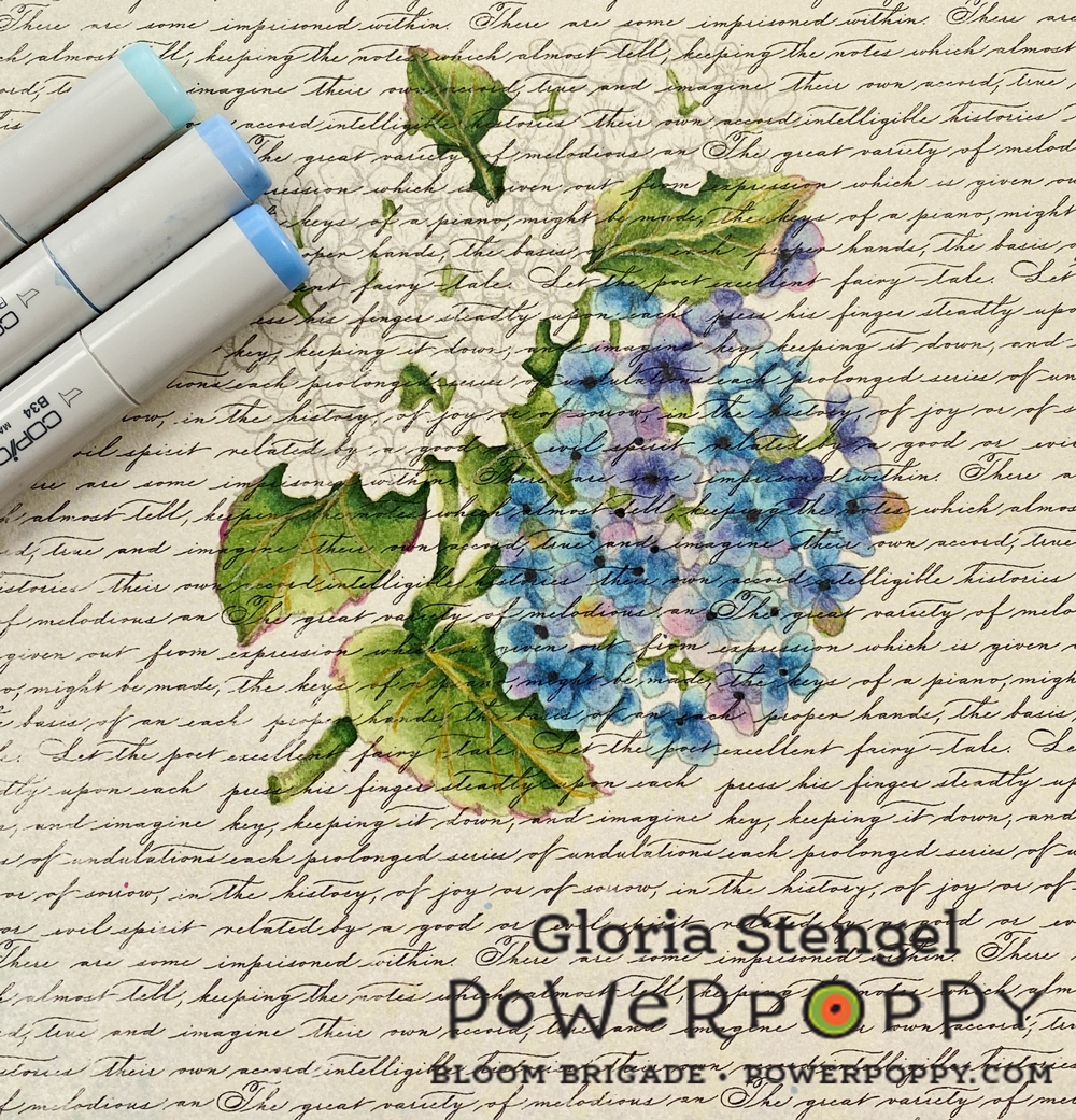
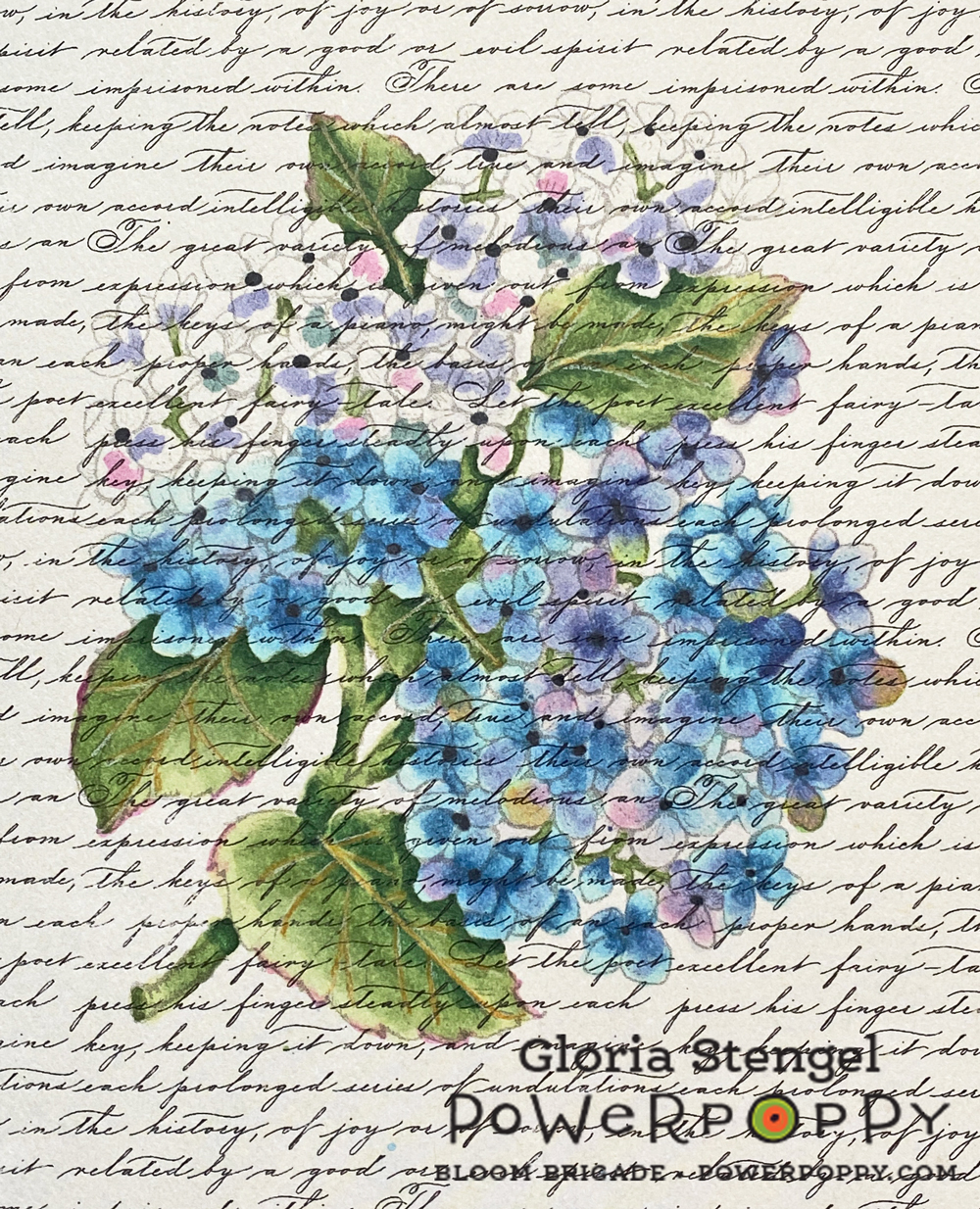
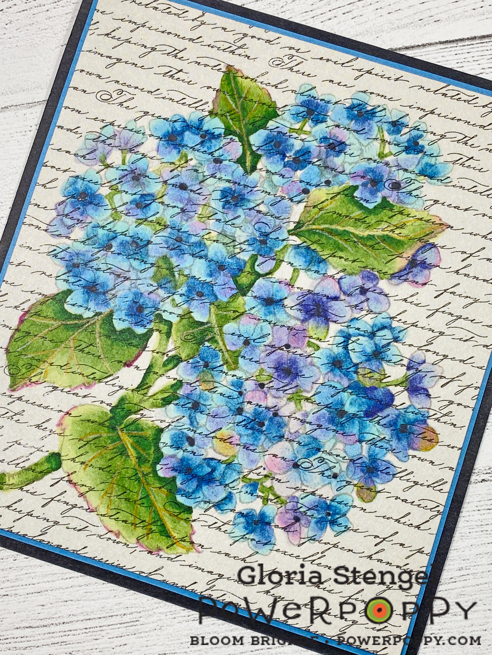
I printed the Hydrangea Hype Digital Stamp Set image at approximately 4 1/2" x 5 1/2" onto a piece of Authentique Glamour One (double-sided) textured, decorative paper. I love how the text pattern seems to overlay the printed image.

I used a very light gray line which was really difficult to see on this paper. I do wish I had printed the "black line" rather than the "no line" version, but in the end....wait and see...
I began to color with Copic markers, and the paper did feel like it pulled the marker a bit, and it felt like the paper soaked up a little more ink than regular marker paper. But, happily there was almost no bleeding of the color outside the lines! What magic is this?! Any bleeding that happened was masked by the busy print and texture of the paper! Plus, the no-line printing of the stamped image also helped to disguise any bleeding that did happen.
I kept adding color and blending. The ink did not blend exactly the way it does on marker paper, but it was looking very much like water color! The no-line printing with the gray lines makes the lines disappear, especially on this text background!
I roughly scribbled in color, then went back over to shade and blend. I did not do as much shading or fine detail work as I normally do because I wanted to keep the water color look. Plus, I did not want to risk the paper getting too soaked with ink.

I used the following Copic colors: BV31, BV04, BV02, BV000, BG70, B34, B21, B000, G28, G24, G21, G20, RV52, RV34, RV19, C9, Colorless blender. I also drew in the leaf veins with a Prismacolor Goldenrod colored pencil.
Using this technique was very fast compared to my normal way of coloring with Copics on marker paper! I am not at all skilled with water coloring, which made me super happy to achieve a water color substitute with a medium with which I am much more skilled and familiar! 
I ended up double-matting the piece as a picture suitable for framing rather than turning it into a card. I could have added a sentiment and created a card out of it just as easily. 

Since Copic markers are a more transparent medium they allow the background to show through the coloring. I think the text background makes the finished piece look a lot like a vintage postcard or a vintage botanical water color print!

Next, I turned my attention to my Prismacolor pencils. I have mentioned before that I am not a huge fan of Prismacolor colored pencils because they are so soft and waxy. However...
I printed the flower wreath from Peony Love Digital Stamp Set at approximately 7" x 7" onto Authentique Party One textured, decorative paper. (Make sure you have the textured version of this paper as Authentique made both a textured and a smooth version of some of their paper collections.)

This time I printed the "black line" version of the image to make it easier to see the lines. This is a really intricate image, printed onto paper with a background print...and my eyes are kind of old! {smile}
The sentiment in the center of the wreath is from the Geraniums Digital Stamp Set. Once again, I love the "built in" background of the scrapbooking paper! Printing directly onto the printed paper was so interesting! Because the colored pencils are a much more opaque medium, the background gets colored over and only shows on the actual project background! 
The Prismacolor Premier colored pencils are a dream to work with on this textured paper! I normally prefer an oil-based, harder lead colored pencil so that I can layer the color. However, this paper is very "toothy" which would mean layering for dog's years! With the Prismacolor pencils, I could lay down a thicker layer of wax and then blend it, easily filling in the tooth of the paper (tooth = texture).
I am overjoyed at how bright and vibrant the colors look on this slightly ivory paper! I have used the following Prismacolor Premier pencils, from the 150 set: 

Dark pink flowers: Scarlet Lake, Blush Pink, Carmine  Red,  Pink, Deco Pink, Hot Pink, Process Red, Magenta, White
Light pink flowers: Blush Pink, Pink, Hot Pink, Deco Pink, White
Red flowers: Scarlet Lake, Crimson Lake, Tuscan Red, Mahogany Red, Deco Pink, White, Black
Peach flowers: Sunburst Yellow, Salmon Pink, Light Peach, Peach, Nectar, Mineral Orange, White, Sepia
Yellow flowers: Goldenrod, Yellowed Orange, Canary Yellow, Yellow Ochre, Deco Yellow, Cream, Light Umber
Flower centers: Spanish Orange, Light Umber, Yellowed Orange, Goldenrod, Canary Yellow, White
Leaves: Limepeel, Chartreuse, Apple Green, Prussian Green, Olive Green
Shadows and highlights: Indanthrone Blue, Black, Sepia, Cream, White
I am still working on this piece, so it will remain a Work In Progress (WIP) until the next time! But it is turning out pretty well, don't you think?!
Thanks for joining us for Inspire Me Monday! Make sure to come back every Monday to see new inspiration!

Power Poppy Products Used:
Hydrangea Hype Digital Stamp Set
Peony Love Digital Stamp Set
Geraniums Digital Stamp Set

Other Products Used: Copic markers, Prismacolor colored pencils, Authentiuqe printed paper,  cardstock

Inspire Me Monday: Confession Time!


HEY FRIENDS! I'm back today for Inspire Me Monday with something really different for me. And I'm going to start with a confession: I've been bored lately with my Copic markers. GASP! I know, but it's true. 

I'm sure I'm not the only one for whom the past year was tough. But as things open up around here, I'm feeling a weird combination of languishing, but at the same time wanting to find a new way to express myself creatively. So it was time to try something different.

Actually, I think I'm bored lately with cardmaking in general. Or maybe just overwhelmed. I feel like I have two of everything and it doesn't help that I suffer from full set syndrome. In addition to having a full set of Copic markers, I also have three full sets of colored pencils - Prismacolor Premier, Faber Castel Polychromos, and Caran d'Ache Luminance. Full sets! And I rarely use them, mainly because I've struggled finding a paper that I like. So I decided to set my Copics aside for now and experiment with my numerous colored pencil sets.

Like Copic markers, you can't just use any old paper with colored pencils and expect good results. Here you'll want a paper with a bit of tooth that can grab the pigment off the pencils. Paper is such a personal choice and I tested A LOT of papers before I found a pencil/paper combination that I liked. 

My current favorite combination is Prismacolor pencils with Stonehenge Drawing Paper, especially the toned papers. The paper is 100% cotton with a slight tooth. I tend to have a heavy hand (I need to work on that!), but the paper can handle several layers of color, which is what gives colored pencil drawings their rich color and blend. I bought one of the Stonehenge Multi Pads which includes papers in warm white, natural, cream, fawn, and pearl gray. Although I started with the white paper, I found it easier to work with the pearl gray paper. 

So to be really different - I pull a holiday stamp - Season's Greenings. I love the Santa image and I never got around to coloring it when the stamp was released. Since I was using the polymer set, I stamped the image with VersaFine ink. For those of you who prefer digital, the image is also available in the Planta Claus digital stamp set

First, I'll show you my finished card.

And here's what I learned along the way:

  • Allow lots of time to color. This is going to take a lot longer than coloring the same image with Copic markers. So settle in and enjoy the process.
  • Experiment with some of the toned papers. As a Copic colorist, I tend to automatically reach for white paper, but colored pencils provide a perfect excuse to try out other colors.
  • Work in layers. For the first layer, I tend to block out where I want the shadows and highlights and use the subsequent layers to refine placement and blend the colors.
  • Keep a light hand. If you press too hard on the first layer, you'll flatten the tooth and the paper won't be able to take on additional layers.
  • If your hand is getting cramp or sore, you are gripping the pencil too hard so loosen your grip. If you hold the pencil further back rather than close to the point, you will automatically lighten up on your grip and pressure on the paper.
  • I prefer a sharp pencil so I had to experiment to find a good pencil sharpener that created the point I wanted. So don't be surprised if you have to test more than one sharpener to get the perfect point for you.
  • Most of all, just have fun. Experiment with pencil combinations. You can always find suggestions on Pinterest, but use those as a starting point. You'll get to know your pencils better if you just grab some and experiment with the blends.
Thanks for joining me today! I haven't ditched my Copics entirely so be sure you check out my Power Poppy coloring videos on YouTube.

Nancy


SUPPLIES
  • StampSeason's Greenings Clear Polymer Stamp Set. Image also available as Planta Claus digital stamp set
  • Paper: Stonehenge Drawing Paper (I have the 9"x12" Multi Pad)
  • Ink: VersaFine Clare in Nocturne
  • Prismacolor Premier Pencils
    • Greens: Spring Green (PC913), Apple Green (PC912), Grass Green (PC090)
    • Reds: Carmine Red (PC926), Crimson Red (PC924), Crimson Lake (PC925), Tuscan Red (PC932)
    • Yellows: Canary Yellow (PC916), Yellowed Orange (PC1002), Mineral Orange (PC1033)
    • Greys: 30% French Grey (PC1070), 50% French Gray (PC1072), 70% French Gray (PC1074)

Garden Dirt: Copic Marker Swatches for Power Poppy Stamps, Red Rose


Add realism to Copic Marker blends by underpainting with complementary or opposite colors. Turquoise BG marker creates natural looking shade underneath warm scarlet markers for a beautiful Valentine’s red rose. | VanillaArts.com | #copicmarker #realisticcoloring #underpainting

Are you coloring hearts and flowers yet?

Yes, it's that time of year when our thoughts turn to roses, bouquets, and heart shaped boxes full of treats.

It's also the time when I pull out my red Copic Markers and colored pencils.

Valentine's Day is when Power Poppy stamps really shine! So many blossoms to choose from, perfect for declarations of love, devotion, or even simple friendship.

Hello, my name is Amy Shulke and I'm the illustrator and art instructor over at VanillaArts.com. Welcome to another article in my blending combination series here at Power Poppy-- The Garden Dirt.

Why dirt? I know, it sounds like gardening tips or gossip-- but really, it's about dirty color. I layer odd colors underneath bright and happy colors to make the murky, muddy colors necessary for realistic depth and dimension.

I've got a whole series of artistic coloring articles here at the Power Poppy Blog. Here's a quick link to read more.


Add realism to Copic Marker blends by underpainting with complementary or opposite colors. Turquoise BG marker creates natural looking shade underneath warm scarlet markers for a beautiful Valentine’s red rose. | VanillaArts.com | #copicmarker #realisticcoloring #underpainting


I love red Copic Markers!


Not just for Valentine's Day; I'll take any excuse to pull out and play with my favorite colors.

I happen to really love red and turquoise color palettes. Red and blue-green sit opposite of each other on the color wheel which makes them "complementary". It's a yin-yang thing, red makes turquoise feel turquoisier and vice versa.

This same complementary relationship doesn't just work for color palettes, it also works for underpainting. Mixing red with turquoise sounds strange but together, they create the wonderful neutral color you'll see in the shady recesses of rose blossoms.

Add realism to Copic Marker blends by underpainting with complementary or opposite colors. Turquoise BG marker creates natural looking shade underneath warm scarlet markers for a beautiful Valentine’s red rose. | VanillaArts.com | #copicmarker #realisticcoloring #underpainting


By the way, the image here is Power Poppy's Vital Rose digital stamp which I've printed nice and large, then die cut the fully colored rose into a crisp heart shape.

Power Poppy has several rose images available and many will work as a die-cut. I recommend the digital version so that you can size it precisely to fit your unique heart die.

But back to the color swatch here, I started with BG05, placing it into the shadiest, darkest crevices of the rose, then layered warm reds on top. The golden color isn't just on the petal undersides, you'll also see it kissing just the edges of each red petal.

Red over turquoise sounds yucky but wowzers! It makes for a gorgeous rose!

Add realism to Copic Marker blends by underpainting with complementary or opposite colors. Turquoise BG marker creates natural looking shade underneath warm scarlet markers for a beautiful Valentine’s red rose. | VanillaArts.com | #copicmarker #realisticcoloring #underpainting


Let's color roses together!

Today's cut-heart rose project was the class sample from one of my online Marker Painting Workshops. Rosie Gets the Blues is a beginner's challenge level online class.

This class is available now with no wait. Work at your own pace, color it as many times as you want, no expiration.

Rosie Gets the Blues uses Power Poppy’s stunning Vital Rose digital stamp. We use a combination of Copic Markers plus Prismacolor Soft Core colored pencils to underpaint the red rose with gorgeous turquoise.

You can find out more about my Rosie Gets the Blues class here.

And I'll meet you back here on the blog next month with another colorful bit of Garden Dirt.

Garden Dirt: Merriest Berries, Copic Marker Swatches for Power Poppy Stamps


Deck the Halls with Copic Coloring!


Way back in 2017, I taught a little local Copic Marker and colored pencil class using Power Poppy's Merriest Berries stamp

I remember it fondly because the class fell smack-dab in the midst of the Christmas crazy time and everyone came to class completely frazzled. Who still has gifts to buy? Who really should be home baking right now? Who still doesn't even have their tree decorated?

Coloring can be very calming. While it won't decorate the tree for you, color can soothe your cares away.

So this month, when the tasks feel overwhelming, tell that creepy elf on the shelf to go bug someone else. 

Sit down and color for a while. You'll be glad you did!

By the way, my name is Amy Shulke and I'm the illustrator and art instructor over at VanillaArts.com. You can check out some of my previous articles on the Power Poppy blog here.

My specialty is hiding secret special colors underneath my Copic blending combinations in a process called Underpainting. This is how I create extra depth, dimension, and realism in my coloring projects and class samples.


Let's color festive & dimensional holly leaves!


Today I'm sharing that original version of Merriest Berries with you. Even though I colored it long ago, it's still a project that makes me smile.

You can find the Merriest Berries digital stamp in the Power Poppy shop here but don't over look all the other beautiful holly images Marcella has created. My Garden Dirt recipe can be used on any of them but if you're looking for a quick, last-minute Christmas project try the digital version of Hollyberries. It's sweet and simple!

Garden Dirt? Yep, that's how I think of the secret colors I use to make Power Poppy images really pop. It's the secret underpainting that you'd never know was there if I didn't share the secret here each month.


Under-painting and over-painting?


Hang on, this holly recipe is much easier than it sounds!

Now keep in mind, I always color dark to light. ALWAYS!

Start with Copic B34 and lay that color into your deepest holly zones. Any place that something overlaps a holly leaf or where the leaf is coming out of the cluster? Those are great candidate zones for the magic blue marker.

Then use YG67 to flick over the top of the blue, coming out slightly beyond. You're only 2 steps into the underpainting process and already you should be seeing two distinct greens. The blue under YG makes a deep and shady green. It's a shade of green Copic doesn't even make!

Then finish the blend with YG63 using it to smooth everything out.

Once dried, I kiss the points of each holly leaf with a bit of Prismacolor Premier Colored Pencil in PC1030 Raspberrry. This hint of deep red adds interest and complexity to an otherwise standard looking green leaf. Red draws your eyes and makes the leaves something special.

So that's the Garden Dirt for December:
  • B34 as underpaint for YG greens
  • Raspberry pencil as overpaint, decorating the edges
Together this four color blending combination will make your holly very festive!


Want to color Merriest Berries with me?


As I mentioned, I colored this image quite a while ago. I don't even have a recorded class version to share with you.

But I didn't want to leave you hanging without some help!

I've put together a super-helpful Merriest Berries coloring guide for Copic Marker at a beginner to intermediate level range. This booklet has an easy to follow recipe guide, a color map, the original photo references, plus lots of step by step info.

It's everything but the stamp... which you can instant download here.

Have a very Merry Christmas everyone and Happy Holidays too. 

I know it's standard and almost trite to wish each other peace and joy during this season... but this year? Boy, we really need it. I hope you have the best celebrations possible.

And I'll see you back here on the Power Poppy blog in January for another Garden Dirt color tip!


Garden Dirt: Copic Marker Swatches for Power Poppy Stamps, Pumpkins


It's pumpkin spice season!


Pumpkins and Pears is one of my all-time favorite stamps from Power Poppy.

Today, I've got an unusual underpaint recipe for coloring an heirloom ghost-pumpkin variety with both Copic Markers and Prismacolor colored pencils. 

Hello, my name is Amy Shulke and I’m the illustrator and art instructor at VanillaArts.com. Welcome to another edition of my blending combination series here at Power Poppy-- The Garden Dirt

Why dirt? Because underpainting is a method that relies on layering clean bright colors over the top of contrasting or complementary colors. We're making the dirty colors necessary for realistic looking depth and dimension.

I’ve got a whole series of artistic coloring articles here at the Power Poppy blog; here’s a quick link to a bunch of my previous articles.


Let's color a speckled pumpkin


Today I’m showing you a close-up of one lumpy, bumpy pumpkin. Yes, I was the strange kid who always picked out the misshapen, un-perfect pumpkins with weird tinges of green at the top or funky warts on the side. It drove my mother nuts! 

Marcella's Pumpkins & Pears stamp has three pumpkins to color but you can see that just this one fellow makes a really nice composition for a harvest card. It also wouldn't be hard to add a Jack o' Lantern face to it!

You can find other Power Poppy pumpkin stamps here. This recipe would work on any of them!


The secret to my dimensional pumpkin is the gray marker... and then a green pencil


Where’s the gray? Where's the green?

The gray marker is UNDER the red, orange, and yellow pencils in the deepest valleys between each lobe of the pumpkin. You can kinda see a bit of the gray peeking out up top near the stem but that same gray Copic marker runs all the way down each valley.

The gray desaturates the bright colored pencils, toning them down and making them shady.

Its dirty color and this dingy, slightly unappealing color is what our brains interpret as shade. If this pumpkin were bright orange, bright red, and bright yellow, it would look terribly flat.

Real shade is really dirty.

Then to amplify some of the deep crevices, I came back with a Kelp Green pencil. You can see a little bit of the green up by the stem too but where the green really kicks into overdrive is in the valleys at the very bottom of the pumpkin as well as behind the pears.

Green over red over orange over yellow over gray?

Yep. It sounds like madness but it looks amazing!

Underpainting and desaturated color takes a bit of getting used to. The technique feels weird at first and the color looks even weirder… let’s call realistic shade an acquired taste. 

But once you get used to the color of real shade, you start to see it everywhere, all around you! Your entire life, you’ve been surrounded by murky colors, you just never noticed them.

Don't be afraid to add a little dirt to your next project. It's fantastic!


Want to color Power Poppy’s “Pumpkins and Pears” with me? 


Silvered Pumpkins is part of the my Marker Painting Workshops series of online classes for intermediate to advanced Copic colorers. 

This class is available now with no wait. Work at your own pace, color it as many times as you want, no expiration.

Silvered Pumpkins uses Power Poppy’s beautiful Pumpkins and Pears digital stamp set.

We use a combination of Copic Markers, and Prismacolor Soft Core colored pencils, with accents and splatters of Finetec Metallic Watercolors for an antique mercury glass feel.

You can find out more about the Silvered Pumpkin online class here.

And I’ll see you back here next month for another fun color swatch!

Garden Dirt: Copic Marker Swatches for Power Poppy Stamps


Add realism to Copic Marker blends by underpainting with complementary or opposite colors. Power Poppy’s guest author Amy Shulke from VanillaArts.com offers fresh perspectives on blending combinations. I Green neutralizes vibrant YR markers, perfect for shading orange fruit. | VanillaArts.com | #copicmarker #realisticcoloring #underpainting

Ready for a Citrus Punch?


Aloe and Oranges is a brand new digital stamp arriving this week at Power Poppy.

I’m here today with a bright, zesty, and totally unconventional Copic Marker blending combination to help you color it.

Hello, my name is Amy Shulke and I’m the illustrator and art instructor at VanillaArts.com. Welcome to my new feature series here at the blog; I’m calling this The Garden Dirt. 

Why dirt? We’ll get to that in a minute.

But first, I’ve got a whole series of artistic coloring articles here at the Power Poppy blog; here’s a quick link to a bunch of my previous articles.


Add realism to Copic Marker blends by underpainting with complementary or opposite colors. Power Poppy’s guest author Amy Shulke from VanillaArts.com offers fresh perspectives on blending combinations. I Green neutralizes vibrant YR markers, perfect for shading orange fruit. | VanillaArts.com | #copicmarker #realisticcoloring #underpainting

Let's color an orange!


Today I’m showing you a close-up, tight shot of just one glorious orange. The entire Aloe and Oranges stamp has a lot more to color. This digital image will be available in the Power Poppy shop soon!

Confession time: I ate at least a half box of clementines during the week I worked on the full digital image. 

Fun fact: a trash can full of clementine peels makes your craft room smell divine!

I think this is the best orange in the digital stamp, it’s a juicy cut cross-section showing off the cute orange segments. It's perfect for fun texture details. I’ve colored the orange with a combination of Copic Markers and Prismacolor Premier Pencils.

So why would I name my color swatches after yucky dirty dirt?

Take a closer look. This isn’t just any old Copic color swatch.

In my freelance illustration work, I use a shading technique called Underpainting. I teach Copic Marker classes using this same technique. Instead of using a light, medium, and dark orange marker to color oranges or clementines, I deliberately throw in a clashing color to create a more realistic shade color.


Add realism to Copic Marker blends by underpainting with complementary or opposite colors. Power Poppy’s guest author Amy Shulke from VanillaArts.com offers fresh perspectives on blending combinations. I Green neutralizes vibrant YR markers, perfect for shading orange fruit. | VanillaArts.com | #copicmarker #realisticcoloring #underpainting

The secret to my very dimensional orange rind is the green marker.


Where’s the green?

It’s UNDER the orange. That’s why we call this method underpainting. We’re using green to create the muddy, neutralized shade color that you’ll see on real oranges in real life.

Garden Dirt? Yep, we’re making dirty color!

Now to make this swatch work, you need to work dark to light. 

I know, I do everything backwards!

Start by adding YG63 with very light strokes to the shadiest areas of the orange rind. Don’t press too hard; you don’t need a lot of green to make this work. We want a little mud, not a swampy mess!

Then go over the YG63 with YR68, hiding the green completely. Let your orange strokes come out beyond the green strikes to create 2 colors— a dirty orange and a clean orange. Remember, no green is left uncoated! No-one should ever know it’s there. The rest of the world will think you used an ugly brick colored marker.

Now blend with the Y38 and Y35 just as you normally would.

Underpainting takes a bit of getting used to. The technique feels weird at first and the color looks even weirder… let’s call realistic shade an acquired taste. 

The funny thing is that once you get used to the color of real shade, you start to see it everywhere, all around you! Your entire life, you’ve been surrounded by murky colors, you just never noticed them.


Add realism to Copic Marker blends by underpainting with complementary or opposite colors. Power Poppy’s guest author Amy Shulke from VanillaArts.com offers fresh perspectives on blending combinations. I Green neutralizes vibrant YR markers, perfect for shading orange fruit. | VanillaArts.com | #copicmarker #realisticcoloring #underpainting

Want to color Power Poppy’s “Aloe and Oranges” with me? 


Citrus Punch is part of the my Marker Painting Workshops series of online classes for intermediate to advanced Copic colorers. We broadcast the class live to show you real coloring in real time. I also take questions from the student audience. After the broadcast, you can watch and rewatch the class as many times as you want.

Can’t make the live session? No problem! We record and lightly edit every class. Purchase recorded Workshops at your convenience and enjoy anytime access.

Citrus Punch uses Power Poppy’s beautiful Aloe and Oranges digital stamp set.

You can find out more about Marker Painting Workshops here.

And I’ll see you back here next month for another fun color swatch!

Tuesday

Creative Confetti: Color Your Image on Colored Cardstock

Hello! I think this is my first time hosting the Creative Confetti Challenge. I wanted to inspire you to great heights, but I have been distracted with a visit from my adult children. My son came for the long Labor Day weekend, but my daughter came for a WEEK! Plus, my college-age son started online classes this last week. I have been enjoying the "kids" and not spending as much time in my studio.

However, I hope that you enjoy the challenge this week. I had fun making the samples!


HOW TO PLAY: Stamp or print a Power Poppy Stamps image onto COLORED CARDSTOCK!  Then, color away! Use ANY color cardstock, as long as it's NOT white.

On to my creations! 


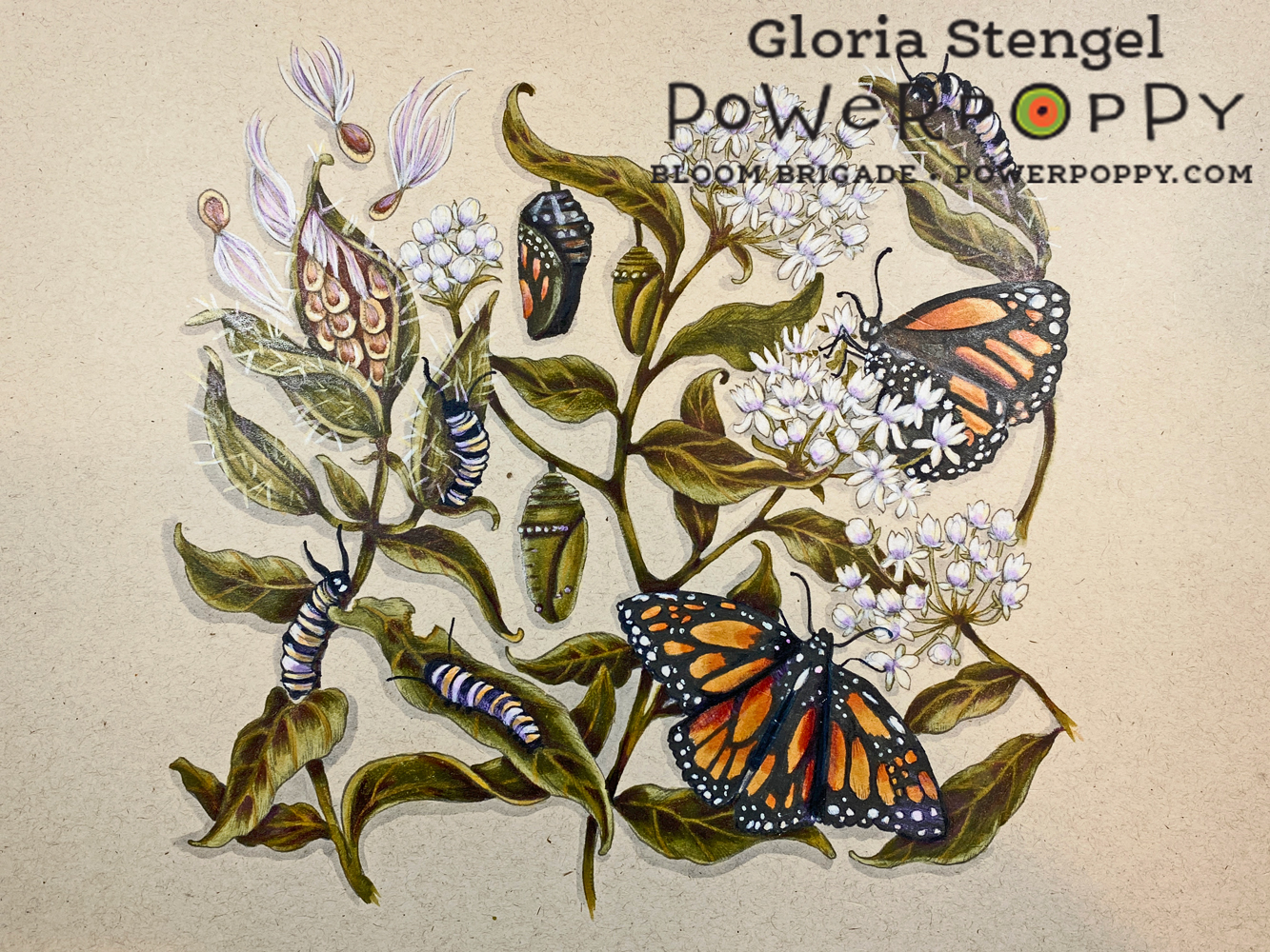
The project that started me thinking about coloring on colored cardstock was this class from Vanilla Arts called Illustrated Monarch

The class was to color the Monarchs and Milkweed image onto tan cardstock. I had a lot of fun coloring on the tan paper with Copics and Prismacolor pencils. 

The tan cardstock was light enough that the Copic markers looked fine, if muted, and the colored pencil looked AMAZNG!

So...I thought...what OTHER colors could I print onto and color?!?


I chose a few images to print onto a few colors of cardstock. I found that if I wanted to color an image onto very dark cardstock such as black or navy blue, I would have to somehow trace the image with a white pencil or use a similar technique. The printed image did not show up quite enough to allow me to see the lines, especially on a detailed image. Also, Copic markers are too transparent to show up on super dark cardstock.

I asked my artist daughter about using colored paper and she said the standard colors she used were white, off white or cream, tan, and gray. But, I was sure that light blue, pink, even red would work! I tried a few different papers and colors and learned lots of things!

This is another example of playing around before you start an actual project. Be prepared to "waste" a little printer ink and a few sheets of cardstock! It's worth it to experiment!

I learned that you need to test the paper with the medium you wish to use. I printed this sunflower image from Sunflower Power onto cream linen cardstock. I had hoped to use watercolor pencils for the image, but the paper was too thin to accept the water! I also found out that while the Copics looked amazing, they "oozed" too much on the linen cardstock (no surprise there). The colored pencils loved this lightly textured paper!

In my discovery I learned that you also need to allow Copics to DRY before you can see how the color really looks on colored paper. 
I had my heart set on using Copics on this sky blue cardstock, but they wanted to bleed. Any attempt to push the color back with the blender only made a "drool" line on the paper! The paper had a bit of a rough texture, and no coating so the alcohol ink just wanted to soak in and wick out! 

The colored pencils loved this paper! And they looked amazing on the blue background! I had found my perfect match!
I printed the Chinese Lantern image onto the sky blue cardstock at about 7" x 5".  I printed the lines in pale gray as well. I colored the image with Prismacolor Colored Pencils, which worked beautifully!

I hope you enjoyed my versions of the challenge for this week! If you want to join me and show off some of your Power Poppy Projects, please be sure to share what you come up with by using the linky below! Every entry -- no matter what the week -- is thrown into a virtual hat for our random drawing at the end of the month for a $25 gift code to the Power Poppy Shop! 

Have a great week! I can't wait to see what you create! 


You are invited to the Inlinkz link party!

Click here to enter

Monday

Garden Dirt: Copic Marker Swatches for Power Poppy Stamps (Oranges or Clementines)


Add realism to Copic Marker blends by underpainting with complementary or opposite colors. Power Poppy’s guest author Amy Shulke from VanillaArts.com offers fresh perspectives on blending combinations. I Green neutralizes vibrant YR markers, perfect for shading orange fruit. | VanillaArts.com | #copicmarker #realisticcoloring #underpainting

Ready for a Citrus Punch?


Aloe and Oranges is a brand new digital stamp arriving this week at Power Poppy.

I’m here today with a bright, zesty, and totally unconventional Copic Marker blending combination to help you color it.

Hello, my name is Amy Shulke and I’m the illustrator and art instructor at VanillaArts.com. Welcome to my new feature series here at the blog; I’m calling this The Garden Dirt. 

Why dirt? We’ll get to that in a minute.

But first, I’ve got a whole series of artistic coloring articles here at the Power Poppy blog; here’s a quick link to a bunch of my previous articles.


Add realism to Copic Marker blends by underpainting with complementary or opposite colors. Power Poppy’s guest author Amy Shulke from VanillaArts.com offers fresh perspectives on blending combinations. I Green neutralizes vibrant YR markers, perfect for shading orange fruit. | VanillaArts.com | #copicmarker #realisticcoloring #underpainting

Let's color an orange!


Today I’m showing you a close-up, tight shot of just one glorious orange. The entire Aloe and Oranges stamp has a lot more to color. This digital image will be available in the Power Poppy shop soon!

Confession time: I ate at least a half box of clementines during the week I worked on the full digital image. 

Fun fact: a trash can full of clementine peels makes your craft room smell divine!

I think this is the best orange in the digital stamp, it’s a juicy cut cross-section showing off the cute orange segments. It's perfect for fun texture details. I’ve colored the orange with a combination of Copic Markers and Prismacolor Premier Pencils.

So why would I name my color swatches after yucky dirty dirt?

Take a closer look. This isn’t just any old Copic color swatch.

In my freelance illustration work, I use a shading technique called Underpainting. I teach Copic Marker classes using this same technique. Instead of using a light, medium, and dark orange marker to color oranges or clementines, I deliberately throw in a clashing color to create a more realistic shade color.


Add realism to Copic Marker blends by underpainting with complementary or opposite colors. Power Poppy’s guest author Amy Shulke from VanillaArts.com offers fresh perspectives on blending combinations. I Green neutralizes vibrant YR markers, perfect for shading orange fruit. | VanillaArts.com | #copicmarker #realisticcoloring #underpainting

The secret to my very dimensional orange rind is the green marker.


Where’s the green?

It’s UNDER the orange. That’s why we call this method underpainting. We’re using green to create the muddy, neutralized shade color that you’ll see on real oranges in real life.

Garden Dirt? Yep, we’re making dirty color!

Now to make this swatch work, you need to work dark to light. 

I know, I do everything backwards!

Start by adding YG63 with very light strokes to the shadiest areas of the orange rind. Don’t press too hard; you don’t need a lot of green to make this work. We want a little mud, not a swampy mess!

Then go over the YG63 with YR68, hiding the green completely. Let your orange strokes come out beyond the green strikes to create 2 colors— a dirty orange and a clean orange. Remember, no green is left uncoated! No-one should ever know it’s there. The rest of the world will think you used an ugly brick colored marker.

Now blend with the Y38 and Y35 just as you normally would.

Underpainting takes a bit of getting used to. The technique feels weird at first and the color looks even weirder… let’s call realistic shade an acquired taste. 

The funny thing is that once you get used to the color of real shade, you start to see it everywhere, all around you! Your entire life, you’ve been surrounded by murky colors, you just never noticed them.


Add realism to Copic Marker blends by underpainting with complementary or opposite colors. Power Poppy’s guest author Amy Shulke from VanillaArts.com offers fresh perspectives on blending combinations. I Green neutralizes vibrant YR markers, perfect for shading orange fruit. | VanillaArts.com | #copicmarker #realisticcoloring #underpainting

Want to color Power Poppy’s “Aloe and Oranges” with me? 


Citrus Punch is part of the my Marker Painting Workshops series of online classes for intermediate to advanced Copic colorers. We broadcast the class live to show you real coloring in real time. I also take questions from the student audience. After the broadcast, you can watch and rewatch the class as many times as you want.

Can’t make the live session? No problem! We record and lightly edit every class. Purchase recorded Workshops at your convenience and enjoy anytime access.

Citrus Punch uses Power Poppy’s beautiful Aloe and Oranges digital stamp set.

You can find out more about Marker Painting Workshops here.

And I’ll see you back here next month for another fun color swatch!