Showing posts with label Power Poppy. Show all posts

Monday

The Blossom Challenge: Sponge Bath!


Hi Power Poppy fans!  It’s Christine bringing you another fun "The Blossom Challenge” for the month.  I’m feeling especially Springy this month, and ready for all the fun colour that’s soon to come.  So, this month’s Challenge has the theme “Sponge Bath”, and its all about using your sponging tools to bring smooth inky colour to your designs.  

I’ve got two cards to show you today that showcase different ways to sponge ink.  


First off is this beauty from Power Poppy called Spring Border One.  I adore this image and its sweet border style of blooms.  All the flowers are coloured with Copics, and I stamped the large tulip twice so I could add it to the left of the arrangement to balance out my how the flowers appear in front of the arched die cut windows.  


For my sponging technique I used a simple background technique, using Tumbled Glass Distress Oxide Ink on the card base, splattering it with water, and then splattering again with white ink.  Such an easy way to add a background to a scene.  It’s one of my favourite properties of Oxide ink, when you see how great it reacts to water.  


Perfect for a little note for a friend.  

Next I’ve used another gorgeous Spring image from Power Poppy called Daffodil Bouquet.  


For this design I utilized a stencil to create a backdrop for this amazing bouquet of daffodils and muscari (grape hyacinth).  Once my bouquet was coloured with Copics, I used some pale pink cardstock and a diamond stencil with soft shades of peachy pink (Tattered Rose, Victorian Velvet, Picked Raspberry and Seedless Preserves).  Using coloured cardstock and stencilling over top gives you a base colour that you don’t have to add with ink.  


I also lightly sponged the embossing of the die cut frame which allows it to tie in to the colour and accents the embossing slightly.  The sentiment is from Power Poppy’s Peony Muse polymer set. 
 

Those bright pops of colour really shine!  


Now WHO was our winner last month?  Random.org picked Camille (Short on Ideas)with her beautiful Black-Eyed Susans reimagined by the sea!  Camille, contact Marcy at bloom@powerpoppy.com  


Now we’re extending the Challenge to you!  It’s Sponge Bath time!  Use your sponges or blending tools to add inky colour to any part of your design.  You could simply distress the edges of your paper with ink, blend multi-colour or ombre backgrounds, or use stencils to create a background or layer to your design.  All you need to do is use at least one Power Poppy image to be included in the challenge.  

Link your entries below, you can play as many times as you like!  Challenge closes April 15 at 11 pm MTN. 

You are invited to the Inlinkz link party!

Click here to enter

Inspire Me Monday: Bold and Bright

Hello and Happy Independence Day to my fellow American friends! The United States of America is 246 years old today! I hope everyone is having a happy and safe holiday!   

Today is my turn to share the weekly inspiration. And I am sorry that you are not getting a patriotic project! If you want to see some 4th of July inspired projects, do a search on the blog to see what we've done in the past! Instead, I am sharing some BOLD AND BRIGHT inspiration, perfect for summer-time creating!

I think some folks shy away from bold, bright colors and use more pastel or muted tones. I totally understand. That Copic R89 is DARK, am I right?! But once you embrace the concept of bold color, and bold color contrasts, you will see your work come live in a new and different way! 

Last time I shared a Work In  Progress (WIP) with you, using lots of bold color. (See that post HERE.) I finally finished it in time to use for our inspiration today!
I printed the flower wreath from the Peony Love Digital Stamp Set at approximately 7" x 7" onto textured, decorative paper and colored the image with Prismacolor Premiere Colored Pencils. (The sentiment in the center of the wreath is from the Geraniums Digital Stamp Set.)
I love all those bold reds, bright pinks, deep greens, and then the restful peach and yellow tones! This big wreath image was so fun to color, and boy did I wear out my red and pink pencils!
Don't be afraid of your dark, bold, bright markers, pencils, or paints! Use them! It may take some time to get the hang of the darker colors, but it IS only paper and ink/pencil/paint, after all. 

If you need more BOLD AND BRIGHT projects, here are some of my past creations using bold reds, bright blues and yellows, saturated greens and oranges!
This card is just a "punch in the eye" bold and bright masterpiece! I used the Tea Cake with Strawberries digital set, the gifts are from the Party Essentials digital set, and the sentiment from the Layer Cake digital set. To see how I put all those images together, see the post HERE. This image is colored with Copic markers.

Nothing says summer like in-season berries!
This is the digital image called Berry It(The sentiment is from the Juicy Strawberries digital set.) Details HERE. Once again, I chose deep reds and greens for the image, using Copic markers.
Red is always on my list as a bold and bright color! But that electric blue! WOW! This is another Copic project. This image is Ferns and FungiDetails HERE.
Fresh fruit is always in fashion for summer! This Aloe and Oranges partial image was turned into a card. Details HERE. I colored this with a combination of Copic markers and Brutfuner Wanshui colored pencils. 

And just because I didn't want to disappoint...
Here is some red, white, and blue! I used  Everything's Rosy digital stamp set and dark red and blue Copic markers for this one! Details HERE.

Thanks for joining us for Inspire Me Monday! Make sure to come back every Monday to see new inspiration!

Power Poppy Products Used:
Peony Love Digital Stamp Set
Geraniums Digital Stamp Set

Other Products Used: Prismacolor colored pencils, Authentiuqe printed paper,  cardstock

Inspire Me Monday: The Perfect Paper

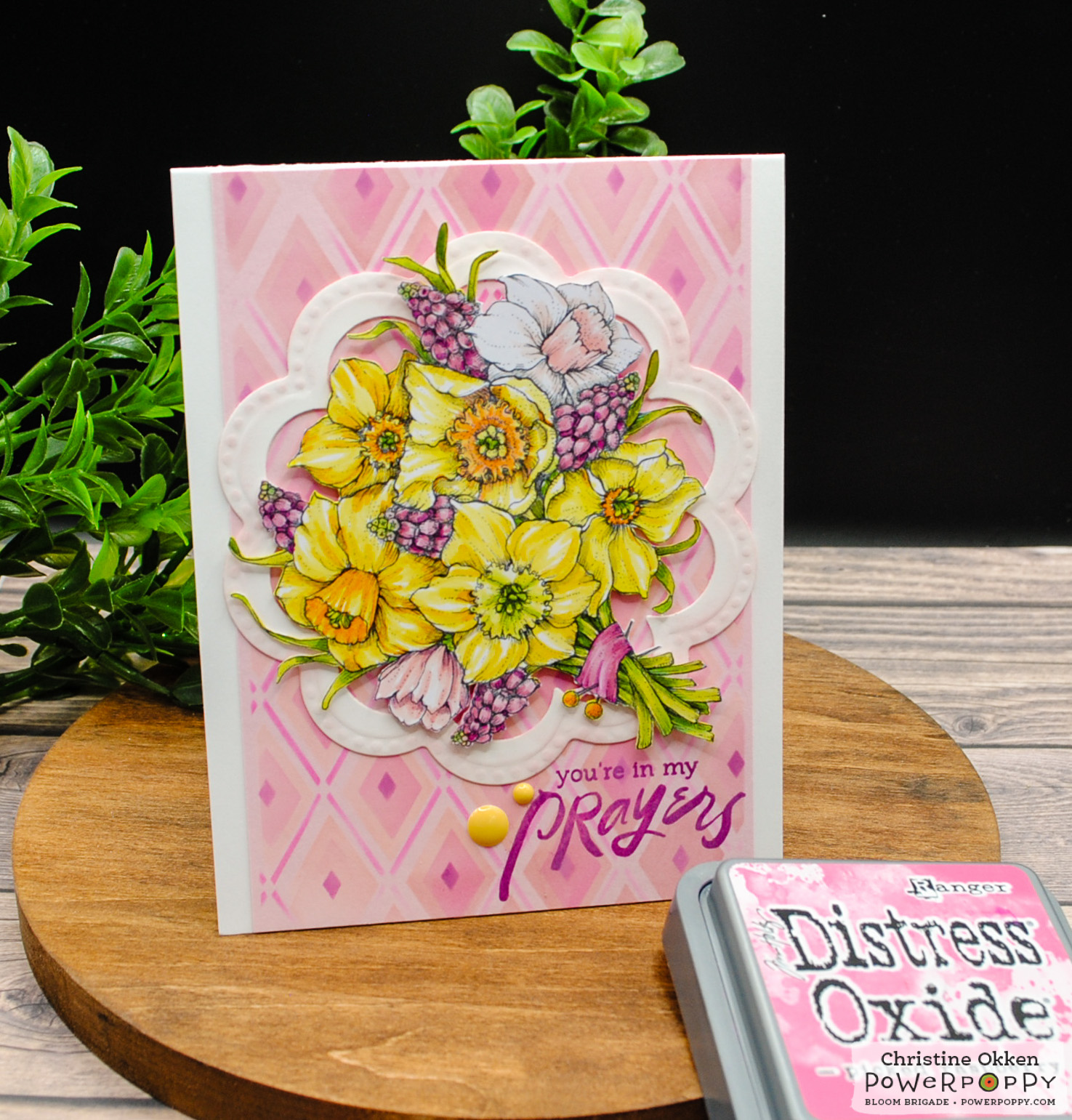
Hello, my flower-loving friends! I hope you are enjoying the return of Inspire Me Monday! If you have yet to play in the monthly Blossom Challenge, there is still time to join the May challenge, "April Showers Bring May Flowers"! The challenge closes at NOON on June 17th. See all the details HERE.  

Today is my turn to share the weekly inspiration. I wanted to inspire you to think outside the box...the paper box that is! If you are part of any coloring or card making groups on social media, then you know that one of the most asked questions is, "What is the PERFECT paper to use for my coloring?" That is not an easy question to answer because the true answer is, it depends. It depends on what you wish to accomplish, what your coloring medium is, what stamps you are using, what your skill level is, and more. The truth is, there is NO perfect paper that fits every artist or every need. 

I decided to try a few experiments to see what I could do with alcohol markers, colored pencils, and digital stamps from Power Poppy...on non standard paper! Namely...on scrapbooking paper. Because, let's face it, I have a huge boatload of scrapbooking paper!
I decided to print some Power Poppy stamps onto SCRAPBOOKING PAPER. And not only scrapbooking paper, but TEXTURED scrapbooking paper. (I used various papers from Authentique, but any heavy-weight, slightly textured paper should work.) I printed each image to to fit onto paper that was cut to 8" x 10". 

Note: To make sure the paper would run through my printer without jamming, I taped the scrapbook paper to an 8 1/2" x 11" sheet of printer paper. I had no issues with my printer accepting the thicker scrapbook paper by doing that simple trick. 

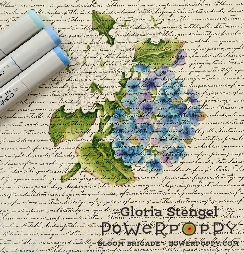
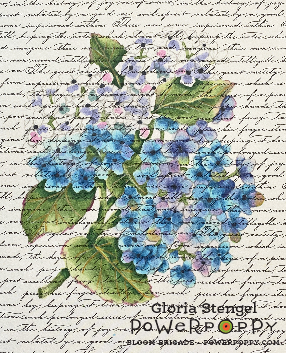
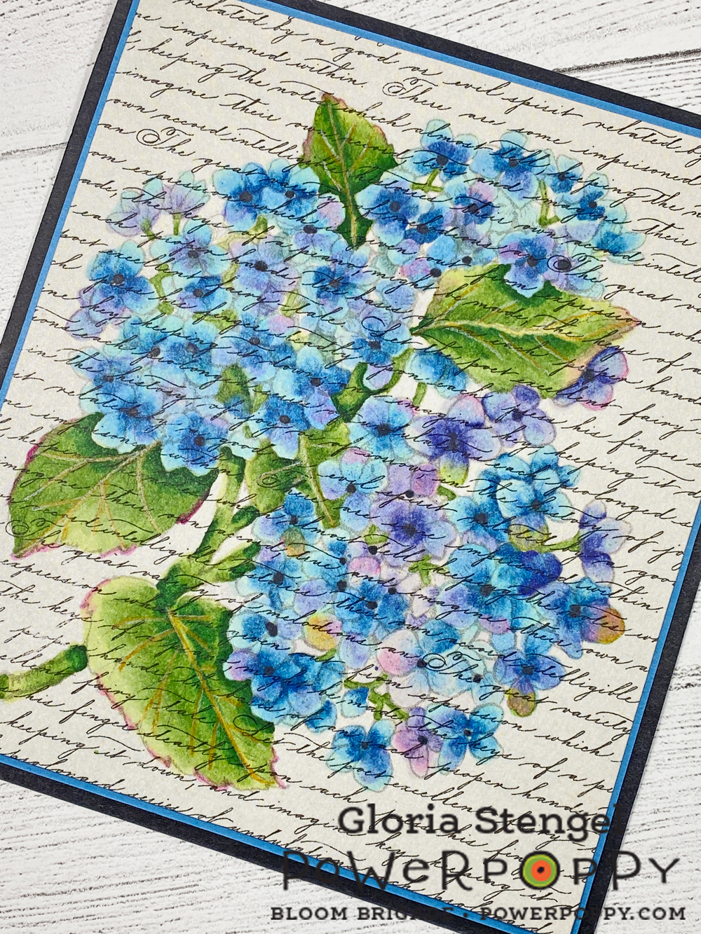
Now, we are always told that you cannot use Copics on paper other than marker paper because you will not get good results, the ink will bleed, and all sorts of other dire things will happen. And all those things can happen, but it is only paper and ink! Why not have a play to see what happens?! If it doesn't work out, it only costs you a few dollars in paper and ink, and a little time.
I printed the Hydrangea Hype Digital Stamp Set image at approximately 4 1/2" x 5 1/2" onto a piece of Authentique Glamour One (double-sided) textured, decorative paper. I love how the text pattern seems to overlay the printed image.

I used a very light gray line which was really difficult to see on this paper. I do wish I had printed the "black line" rather than the "no line" version, but in the end....wait and see...
I began to color with Copic markers, and the paper did feel like it pulled the marker a bit, and it felt like the paper soaked up a little more ink than regular marker paper. But, happily there was almost no bleeding of the color outside the lines! What magic is this?! Any bleeding that happened was masked by the busy print and texture of the paper! Plus, the no-line printing of the stamped image also helped to disguise any bleeding that did happen.
I kept adding color and blending. The ink did not blend exactly the way it does on marker paper, but it was looking very much like water color! The no-line printing with the gray lines makes the lines disappear, especially on this text background!
I roughly scribbled in color, then went back over to shade and blend. I did not do as much shading or fine detail work as I normally do because I wanted to keep the water color look. Plus, I did not want to risk the paper getting too soaked with ink.

I used the following Copic colors: BV31, BV04, BV02, BV000, BG70, B34, B21, B000, G28, G24, G21, G20, RV52, RV34, RV19, C9, Colorless blender. I also drew in the leaf veins with a Prismacolor Goldenrod colored pencil.
Using this technique was very fast compared to my normal way of coloring with Copics on marker paper! I am not at all skilled with water coloring, which made me super happy to achieve a water color substitute with a medium with which I am much more skilled and familiar! 
I ended up double-matting the piece as a picture suitable for framing rather than turning it into a card. I could have added a sentiment and created a card out of it just as easily. 

Since Copic markers are a more transparent medium they allow the background to show through the coloring. I think the text background makes the finished piece look a lot like a vintage postcard or a vintage botanical water color print!

Next, I turned my attention to my Prismacolor pencils. I have mentioned before that I am not a huge fan of Prismacolor colored pencils because they are so soft and waxy. However...
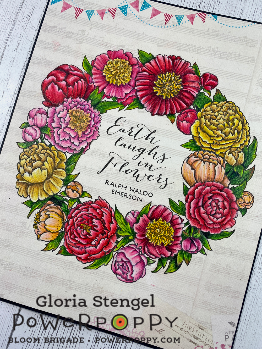
I printed the flower wreath from Peony Love Digital Stamp Set at approximately 7" x 7" onto Authentique Party One textured, decorative paper. (Make sure you have the textured version of this paper as Authentique made both a textured and a smooth version of some of their paper collections.)

This time I printed the "black line" version of the image to make it easier to see the lines. This is a really intricate image, printed onto paper with a background print...and my eyes are kind of old! {smile}
The sentiment in the center of the wreath is from the Geraniums Digital Stamp Set. Once again, I love the "built in" background of the scrapbooking paper! Printing directly onto the printed paper was so interesting! Because the colored pencils are a much more opaque medium, the background gets colored over and only shows on the actual project background! 
The Prismacolor Premier colored pencils are a dream to work with on this textured paper! I normally prefer an oil-based, harder lead colored pencil so that I can layer the color. However, this paper is very "toothy" which would mean layering for dog's years! With the Prismacolor pencils, I could lay down a thicker layer of wax and then blend it, easily filling in the tooth of the paper (tooth = texture).
I am overjoyed at how bright and vibrant the colors look on this slightly ivory paper! I have used the following Prismacolor Premier pencils, from the 150 set: 

Dark pink flowers: Scarlet Lake, Blush Pink, Carmine  Red,  Pink, Deco Pink, Hot Pink, Process Red, Magenta, White
Light pink flowers: Blush Pink, Pink, Hot Pink, Deco Pink, White
Red flowers: Scarlet Lake, Crimson Lake, Tuscan Red, Mahogany Red, Deco Pink, White, Black
Peach flowers: Sunburst Yellow, Salmon Pink, Light Peach, Peach, Nectar, Mineral Orange, White, Sepia
Yellow flowers: Goldenrod, Yellowed Orange, Canary Yellow, Yellow Ochre, Deco Yellow, Cream, Light Umber
Flower centers: Spanish Orange, Light Umber, Yellowed Orange, Goldenrod, Canary Yellow, White
Leaves: Limepeel, Chartreuse, Apple Green, Prussian Green, Olive Green
Shadows and highlights: Indanthrone Blue, Black, Sepia, Cream, White
I am still working on this piece, so it will remain a Work In Progress (WIP) until the next time! But it is turning out pretty well, don't you think?!

Thanks for joining us for Inspire Me Monday! Make sure to come back every Monday to see new inspiration!

Power Poppy Products Used:
Hydrangea Hype Digital Stamp Set
Peony Love Digital Stamp Set
Geraniums Digital Stamp Set

Other Products Used: Copic markers, Prismacolor colored pencils, Authentiuqe printed paper,  cardstock

Inspire Me Monday: Wintertime Wishes


Hello! Welcome to 2021 and the first Inspire Me Monday of the New Year! My inspiration idea is two-fold. First, I want to inspire you to use some of your Christmas and holiday stamps in non-holiday creations such as thank you notes, birthday cards, and thinking of you gifts. Second, I want to inspire you to USE YOUR PRODUCTS!

I have created a "cool" winter-theme card that could be a birthday card, a thinking of you card, or a thank you note. I used the digital Mittens and Merriment image and a sentiment from the Cozy Cupfuls clear stamp set. Both of these stamp sets are Christmas/holiday style, but both can be used for wintertime wishes!
I printed the image at slightly smaller than 5 1/2" x 4 1/4" using the no-line version. I ended up creating an oval card rather than the standard rectangle. the finished card is 7" x 5 1/4".  The sentiment was stamped in watermark ink and heat embossed with white embossing powder.

To create a wintertime vibe, I used lots of blues, lavender, white, and cool green rather than the tones normally used for Christmas. I have a very pink idea for this image that will be perfect for Valentine's Day!
Now, let's talk about my favorite topic: using your supplies! I am part of many coloring groups on social media, and so many people spend more time buying supplies than actually using them! Myself included! Many folks feel that if they just had "top of the line" supplies they would be a better artist. That is simply not true! Use what you have! Play! Practice! Enjoy the process! Learn! You really do not need a $300 set of pencils to color a great picture!

This image was printed on paper that cost $10.49 for 250 sheets! This is a white cardstock (80lb Vellum Bristol, 175gsm) that is a "normal" weight for cardmaking and has a bit of texture ("tooth" in coloring terms). There is nothing special about this paper! In fact, it is not even my favorite paper, but it is inexpensive, so I can use it up without thinking twice!
The colored pencils I used cost $25.49 for 168 pencils! That is about 15 cents a pencil! (Prismacolor Premiere pencils cost about 63 cents per pencil, for comparison.) The pencils are a VERY budget-friendly, oil-based colored pencil, which work well on my slightly toothy paper! We are in business! 
Because these pencils are a bit on the harder side they hold a fine point for tiny details. They are oil-based, which allowed me to add layers plus the fine details on top of already colored sections. Which is how I colored the ribbon. However, I could also just use a three-color blend, which is how I colored the leaves.
With a blending stump and a bit of blending solution, I was able to color the background with just two pencils! I added a bit of white gel pen to the puff balls and the background. I also allowed the texture of the paper to aid in making the mittens have texture, looking like they were made of yarn.
I did not use any of my more expensive coloring products on this card. I kept true to my own style of coloring and card making, despite using my "cheap" stuff! And I enjoyed myself very much! Which is the most important thing! 
Do not wait to have fun with your coloring supplies! If you have inexpensive tools, you can still color and use all the coloring techniques you are learning! Plus, is you use a lot of paper just experimenting, you only lost $10 of supplies. If you grind up a few pencils, you can buy a whole new set for under $30. If you use some of the student-grade pencils, you can spend even less! I have s set of Crayola pencils that I love to use. (I may show you those next time!)
I confess, I do love my expensive pencils and my Copic markers, but I don't think I have to always use them. I also like to mix and match my supplies. It is true that sometimes the pricey option gives better results, but I am a firm believer in staying within your budget. Learning good techniques is far more important than the price of your supplies!

I hope you are inspired to grab an image and some supplies and just color for the joy of it! Come visit me any time at Scraps of Life Blog!

Note:
Paper used: Springhill White 8.5” x 11” Cardstock, 80lb Vellum Bristol, 175gsm, 250 Sheets (approx. $10.49 USD)
Colored pencils used: Wanshui 168 oil pencils (approx. $25.49 USD)


Tuesday

12 Days of Christmas Challenge ~ Day 8: Joy to the World Bouquet


Welcome to Day 8 of the 12 Days of Christmas December Challenge Event! It's Gloria with you today! 

I am so lucky to be able to share the lovely Joy to the World Bouquet stamp set with you! This is my absolute favorite of the entire Quiet Christmas Release!
For my release project I used the digital version of this set (See Below), but for today's project I decided to use the clear version. I don't stamp very often these days, so it was fun to actually get out some inks and have a play...and boy did I play!
I had fully expected to color this image with Copic markers or with colored pencils. But, when I shared my original project with some folks, they all said, "That is very pretty, but I don't/can't color like that!" So I thought, maybe there are lots of folks who don't enjoy coloring or don't have the time to devote to coloring a complicated image like this one.
I would like for everyone to feel that they can make this image shine! This image IS stunning colored with markers, pencils, or watercolor paints. But, I think it is just as stunning with a more simple inked background!
I created a bunch of backgrounds FIRST, then allowed them to dry before stamping. For some of the backgrounds, I blended distress ink and other dye inks onto white cardstock panels with a blender brush
For other panels, I used a wet technique. I smudged the distress into onto my craft mat, added water, then smooshed the paper around in the ink. I did several layers, drying in between color families.
After allowing the ink to dry, I stamped onto the panels with various inks and embossed with various powders. Some of the examples turned out very well...others did not. But, that is the point of having a play! Sometimes it works, sometimes it doesn't.
I chose a few panels that I thought looked the best, and decided to try to make some cards with them. I wanted to keep the cards pretty simple, and I wanted them to be mostly flat for easy mailing.
I ended up making three cards, but I put the rest of the panels aside for further projects.
This card is my favorite of all the cards I made! I used the "wet" ink technique to drag a white cardstock panel through different colors of pink ink. I allowed the ink to dry then repeated the process with blue ink and with a deep magenta ink.
I love the speckled look of the paper! After the ink was dry, I stamped the image onto the panel with black permanent ink, which also needed to dry! (Watching ink dry is boring!)
I printed the sentiment from the Forest Finds digital stamp set onto another piece of white cardstock. I used a die template to cut out the sentiment, making sure to line the die up with the bottom edge. 

I then used the same die to cut my image panel to fit the top portion of the white panel. I added ribbon and a few enamel dots before attaching the finished panel to the black card base. I created a card base that is roughly 6" x 4 3/4", which is not a very standard size! I will have to make an envelope to fit! 

The next two cards were made using the "dry" ink method.
This version has a background of distress inks added to white cardstock using a blender brush. I layered on various pink and lavender inks and allowed them to dry.
I stamped the image onto the panel with watermark ink, and then heat embossed with sparkly black embossing powder! I stamped the sentiment with black dye ink.
You can see how the embossing powder sparkles. It is black powder with iridescent flecks in it. I flicked on some white paint to add some "snow," and the card is finished! This is a standard A2 card, and flat for easy mailing!
I also wanted to try a blue and white version, so I repeated the process of using a blender brush to add various blue inks to a white panel. 
I stamped with watermark ink and heat embossed with white embossing powder. This is a very detailed image, so you need to use a very fine embossing powder.
I almost wish I had stamped the sentiment in a blue ink, rather than black. I created another A2 card, plus I added some sparkly enamel dots to the card front.

You can print the digital version at any size you with. For my original project, I printed the image at just smaller than 10" X 8"!
You can see how different the image looks at a larger size, and all colored in with markers and pencils. To see this version, click HERE.

Remember, the 12 Days of Christmas December Challenge continues through December 12th!
Don't forget to check out all the festive fun on our Day 1 post on the Power Poppy Blog, HERE.

Merry Christmas!