
Hello, my flower-loving friends! I hope you are enjoying the return of Inspire Me Monday! If you have yet to play in the monthly Blossom Challenge, there is still time to join the May challenge, "April Showers Bring May Flowers"! The challenge closes at NOON on June 17th. See all the details HERE.

I decided to try a few experiments to see what I could do with alcohol markers, colored pencils, and digital stamps from Power Poppy...on non standard paper! Namely...on scrapbooking paper. Because, let's face it, I have a huge boatload of scrapbooking paper!
 I decided to print some Power Poppy stamps onto SCRAPBOOKING PAPER. And not only scrapbooking paper, but TEXTURED scrapbooking paper. (I used various papers from Authentique, but any heavy-weight, slightly textured paper should work.) I printed each image to to fit onto paper that was cut to 8" x 10".
 I kept adding color and blending. The ink did not blend exactly the way it does on marker paper, but it was looking very much like water color! The no-line printing with the gray lines makes the lines disappear, especially on this text background!

Note: To make sure the paper would run through my printer without jamming, I taped the scrapbook paper to an 8 1/2" x 11" sheet of printer paper. I had no issues with my printer accepting the thicker scrapbook paper by doing that simple trick.
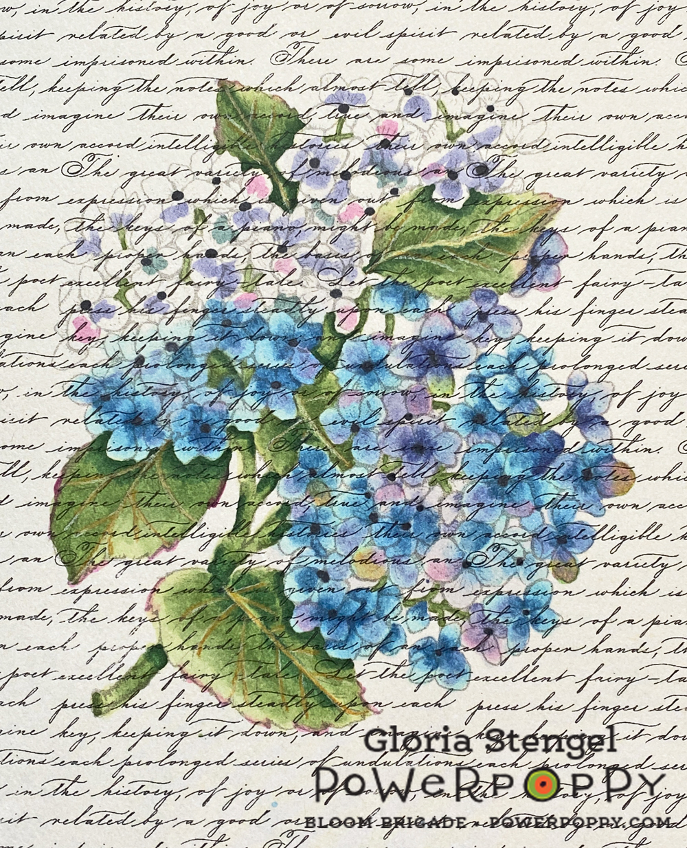
Now, we are always told that you cannot use Copics on paper other than marker paper because you will not get good results, the ink will bleed, and all sorts of other dire things will happen. And all those things can happen, but it is only paper and ink! Why not have a play to see what happens?! If it doesn't work out, it only costs you a few dollars in paper and ink, and a little time. I printed the Hydrangea Hype Digital Stamp Set image at approximately 4 1/2" x 5 1/2" onto a piece of Authentique Glamour One (double-sided) textured, decorative paper. I love how the text pattern seems to overlay the printed image.
 I began to color with Copic markers, and the paper did feel like it pulled the marker a bit, and it felt like the paper soaked up a little more ink than regular marker paper. But, happily there was almost no bleeding of the color outside the lines! What magic is this?! Any bleeding that happened was masked by the busy print and texture of the paper! Plus, the no-line printing of the stamped image also helped to disguise any bleeding that did happen.

I used a very light gray line which was really difficult to see on this paper. I do wish I had printed the "black line" rather than the "no line" version, but in the end....wait and see...

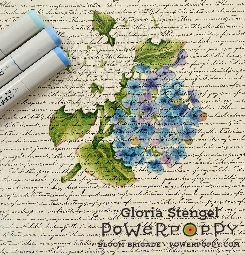
I used the following Copic colors: BV31, BV04, BV02, BV000, BG70, B34, B21, B000, G28, G24, G21, G20, RV52, RV34, RV19, C9, Colorless blender. I also drew in the leaf veins with a Prismacolor Goldenrod colored pencil.


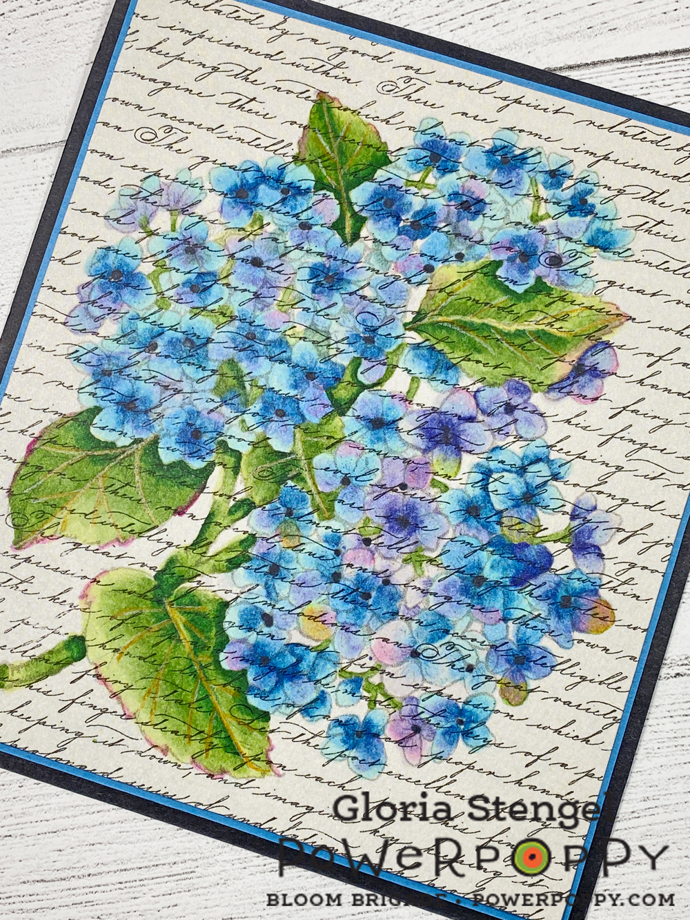
Since Copic markers are a more transparent medium they allow the background to show through the coloring. I think the text background makes the finished piece look a lot like a vintage postcard or a vintage botanical water color print!
 I printed the flower wreath from Peony Love Digital Stamp Set at approximately 7" x 7" onto Authentique Party One textured, decorative paper. (Make sure you have the textured version of this paper as Authentique made both a textured and a smooth version of some of their paper collections.)
Next, I turned my attention to my Prismacolor pencils. I have mentioned before that I am not a huge fan of Prismacolor colored pencils because they are so soft and waxy. However...

This time I printed the "black line" version of the image to make it easier to see the lines. This is a really intricate image, printed onto paper with a background print...and my eyes are kind of old! {smile}

The sentiment in the center of the wreath is from the Geraniums Digital Stamp Set. Once again, I love the "built in" background of the scrapbooking paper! Printing directly onto the printed paper was so interesting! Because the colored pencils are a much more opaque medium, the background gets colored over and only shows on the actual project background!

The Prismacolor Premier colored pencils are a dream to work with on this textured paper! I normally prefer an oil-based, harder lead colored pencil so that I can layer the color. However, this paper is very "toothy" which would mean layering for dog's years! With the Prismacolor pencils, I could lay down a thicker layer of wax and then blend it, easily filling in the tooth of the paper (tooth = texture).

Dark pink flowers: Scarlet Lake, Blush Pink, Carmine Red, Pink, Deco Pink, Hot Pink, Process Red, Magenta, White
Light pink flowers: Blush Pink, Pink, Hot Pink, Deco Pink, White
 I am still working on this piece, so it will remain a Work In Progress (WIP) until the next time! But it is turning out pretty well, don't you think?!
Red flowers: Scarlet Lake, Crimson Lake, Tuscan Red, Mahogany Red, Deco Pink, White, Black
Peach flowers: Sunburst Yellow, Salmon Pink, Light Peach, Peach, Nectar, Mineral Orange, White, Sepia
Yellow flowers: Goldenrod, Yellowed Orange, Canary Yellow, Yellow Ochre, Deco Yellow, Cream, Light Umber
Flower centers: Spanish Orange, Light Umber, Yellowed Orange, Goldenrod, Canary Yellow, White
Leaves: Limepeel, Chartreuse, Apple Green, Prussian Green, Olive Green
Shadows and highlights: Indanthrone Blue, Black, Sepia, Cream, White

Thanks for joining us for Inspire Me Monday! Make sure to come back every Monday to see new inspiration!

Power Poppy Products Used:
Hydrangea Hype Digital Stamp Set
Peony Love Digital Stamp Set
Geraniums Digital Stamp Set
Other Products Used: Copic markers, Prismacolor colored pencils, Authentiuqe printed paper, cardstock
12 comments:
These are SUCH inspiring projects... you know I am partial to the PEONIES of course, but WOW WOW WOW both of these examples are extremely cool!! Thank you so much, Gloria!
Gloria, your coloring is beyond beautiful! I'm agog!
Love that Inspire Me Monday is back. I enjoy each post and learn something new. I have a laser printer, so I might try your idea of placing the scrapbook paper with the regular printer paper. It is only paper, so it could be fun to try.
Both cards are Gorgeous! Fabulous coloring of the hydrangea... so soft.
This idea is so sweet!
Such a dreamy old-fashioned looking technique Gloria. You are a master with pencils! My eyes are kind of old too :)
I always enjoy your posts and learn much, thanks! xoxo
I just wanted to look on the blog because I didn't had the mailing in my box yet when it came in, it was later than usually (got it today and it's Wednesday here) I thought only snail mail was slow LOL But so glad to see the mail come in.
Fabulous post Gloria, love your expirimenting.
The Copic colouring looks indeed like watercolour and viintage, stunning!
Love also your pencil colouring, I love the bright colours and yes sometimes it's just the paper that you use to fell in love again with your medium.
Thank you so much for this fabulous post, stay safe and have a wonderful day.
Have to say, this lovely technique gave my languishing mojo a royal nudge where it counts. The hydrangea/script piece is spectacular! Thanks for the wake-up call!
it looks fabulous on the printed paper, I say it is worth a try and like you said we have plenty of it :)
Gloria, this is such a great idea! Your examples are so inspiring! tfs-stay well.
Absolutely brilliant! Great examples and ideas of how to think a little "out of the box". I too struggle with the watercolour look... I always add too much colour; this no-lines and printed background combo may even let ME achieve it, must try. Thanks for your very detailed description also, very helpful
Post a Comment