Showing posts with label My English Rose. Show all posts

Sunday

Inspire Me Monday: YouTube LIVE Watercolor Painting

Howdy everyone!  Allison Cope here!

Today we're going to do something a little different!  Later today I'm going to go LIVE on YouTube (HERE) with a watercoloring project for a last minute Valentine's Day card.

You will also be able to see it after the live as well on the same link above.

Please join me at 2:00pm EST on YouTube and we'll have some fun together!

https://www.youtube.com/watch?v=eNQ7ocOYn3o&t=40s

See you then!

~ Ally ~

Monday

Inspire Me Monday Rewind!

Hi all and happy Monday to each and every one of you! I hope the sun is shining in your neck of the woods. Here, under the big sky of Montana, it's rainy but I decided I would make sure the sun was shining in my heart. So, there you go!

Maybe I am feeling a little schmoopy because Valentine's Day is right around the corner. In light of this day of love, we decided to cue up some of our favorite tutorials that put this holiday in the spotlight. All are a little different and ALL inspire! So, let's get to it!

1. Box Up Some Love! 


This first one is a sweet little tutorial to create in a flash to deliver up a few little goodies. The good news is that you can make this box as big or small as you like depending on the size of strips of paper that you use. Click HERE for the tutorial!

2.  Accessorize with a Little Love! 


Have a teen or tween who loves their phone as much as you? Hehe! Well, show them you love them by giving this little tutorial by Ally Cope a go for a personalized cell phone look! When they tweet, snap or post, they will have to look at all the love you created just for them! Click HERE for the tutorial!

3. Wow Them with Vellum!

Take a ride with Christine Okken as she leads a whirlwind tour on all the ways you can use vellum on your cards or creations. This tutorial isn't specifically geared toward Valentine's Day but she has more than a couple samples of creations that would definitely fit the bill for a card for your love! Click HERE to see what she whipped up!

4. English Rose Remix! 

Have you ever looked at a digital stamp and thought, "I like it but I'd like it more if that leaf didn't do that or that sentiment wasn't on it?" Well, I surely have. Thank goodness for editing software that lets us take our digital stamps to a different level. Click over to THIS tutorial to see how I took the digital stamp La Vie En Rose and made it my own with this creation above!

So, no matter what approach you want to take, we kind of have it covered with this round up of tutorials above! We have a box, an altered gift, a little splash of vellum or a digital remix! We hope you click on over to give at least one of them a try! If you do, be sure to share a link in the comments section so we can all see!

Have a happy week full of LOVE! 


Tuesday

Creative Confetti: Background Check!


Hello folks and welcome to another little inspirational party here on the ole Power Poppy blog! Just as we do almost every Tuesday, I'm throwing up some creative ideas to see just how they fall into your oh-so-artsy hands! 

Did you see Amy Shulke of Vanilla Arts guest post yesterday? Well, she rocked it and shared all kinds of tips on creating backgrounds not as an afterthought, but as a launching point to your creativity! I LOVED seeing all her examples and the rationale behind each and every one! If you missed Inspire Me Monday -- rewind and check it out HERE! Why? Because we wanted to use some of her pointers to inspire YOU to rethink the way you think about backgrounds! Check out this week's Creative Confetti! 


HOW TO PLAY: It's as simple as making sure your background really sings and helps give depth and dimension to your stamped image. Like I said, visit Amy's tutorial HERE and it will all make sense! We want to break out of our background boxes and make sure the color we add is for a reason and has a purpose in bringing our image to life! 

Moving on to my creation!


So, to start my creation, I decided to go with a dark and moody feel. Not sure why. Maybe it's because we just had a rain storm recently and I loved looking at the depth of those grey clouds and just how powerful they looked? Not sure!

So, to create my background, I started by stamping the rose from My English Rose on a full page removable label. Just a note, this stamp is out of stock right now but you can always use the La Vie En Rose digital stamp and erase the background notecard! For tips on manipulating digis, check out THIS tutorial! To use a digital stamp for this process, you would print the image twice - once on a full sheet removable label and then once on your main paper that you will later color up.


 After fussy cutting and putting the mask over my stamped image on my main panel of paper, I then masked off my border. It's my favorite kind! I just rip Post-It Notes and let the rips go any which way to create a wonky border.


Then, let the sponging begin!


Just a note, while I pulled out the Black Soot Distress Ink, I really didn't use it. I tested it on a scrap and it was just too dark. So, the other two were the main colors. After I sponged on the inks, I splashed on some water to create the little watermarks. I pulled off the mask and then got to coloring! I used a mix of YR shades and YG for the leaves. You can see, to ground my image, I followed Amy's advice and added some shading behind the flower to cast a shadow. I used C1 and C3 to get this look. Here's a little close-up for you!


And here's a peek at my sentiment that I stamped using Versamark ink and embossed with white detail embossing powder.


And that, my friends, is it!

So, now it's your turn! Don't be backwards with your backgrounds! Follow Amy's advice HERE for some real standout creations! And then, when you're done, make sure to link up your creation below so that we can all see! Keep in mind, like I mentioned, one lucky stamper will win a $25 gift code to the Power Poppy Shop!


Happy Creating!

~Julie
a.k.a. The Creative Confetti Thrower

You are invited to the Inlinkz link party!
Click here to enter

Monday

Inspire Me Monday ~ Colouring on Coloured Paper

Happy Monday to you all!  I’m Allison Cope and I’m your hostess today for Inspire Me Monday.

Today I’m going to be heat embossing on coloured cardstock and then colouring in my images using Polychromos Pencils.  This technique is very easy and takes a relatively short time to colour.  I decided to use the beautiful “Peony Muse” stamp set for my images and then the “My English Rose” stamp set for my sentiment.

 Come and join me at my crafty desk today for a fun and easy tutorial.

https://www.youtube.com/watch?v=VNnXNaFXlbk

Here’s a quick peek of the final card again…


I hope you’ve enjoyed this simply tutorial today and give a try sometime soon.  Happy creating!

~ Ally ~

Tuesday

Creative Confetti: Simply Resistible!

Hello folks and welcome to another fun-filled edition of Creative Confetti! Julie here, your trustee Creative Confetti thrower! Today, we are going to take a trip back in time to .... yesterday! If you missed our Inspire Me Monday Rewind & Unwind, you are going to want to click HERE and visit the tutorial that we pulled from our creative archives and see what it is all about. Why? Because that very technique is at the heart of our challenge today!

So, let's get to it! 


HOW TO PLAY: Simply use the resist technique we spotlighted in our Inspire Me Monday this week HERE or use another resist technique to create something with us this week! If you need a little more inspiration, all you need to do is click HERE! I went over to Splitcoaststampers to see what kind of resist tutorials they had and, man, they have a lot! Tons to pick from! 

So if you tuned in yesterday or checked it out through the link today, you know that when I first did this tutorial, I used a Christmas set -- Power Poppy's Poinsettia set.  Well, I thought it would be nice to take this tutorial for another test drive and, instead, make it a birthday creation! I wanted to use most of the same supplies, just put a new spin on it! And so.... that's what I did! 


Just like in the first tutorial, I used Versamark ink and white embossing powder, only this time, I reached for the stamp set My English Rose.  After stamping and embossing with fine detail powder, I used my Distress Markers and did the palette pick up technique where you scribble marker on a palette and then pick it up using a water brush. This gives it a more subdued look, more of a watercolor wash.  

I also created a border, like I did in my first card using Post-It Notes and then colored the edge with a light Copic marker. I used RV0000 and R0000. 


After I was done, I did iron my image like in the first card -- using NO steam and sandwiched between two pieces of typing paper until all the embossing powder was essentially melted off my creation. You can't tell, but this image is completely flat and so, when the white powder is melted, it vanishes and looks like a true resist!

After I was done, I stamped the sentiment from the Artistic Bouquet set using Versafine Onyx Black Ink. After that, mat it all up, add some rhinestones and... ta da! Finished!

So, what resist technique will you try? Once you're done, don't forget to link up your creation below so that we can all see and be amazed! ;-) Remember, each time you enter is one more chance at a $25 trip to the Power Poppy Shop! Who wouldn't want that?

Thanks for stopping by everyone & happy creating!

~Julie
a.k.a. Creative Confetti Thrower


You are invited to the Inlinkz link party!
Click here to enter

Monday

Inspire Me Monday: Accessorize!


Howdy and Happy Monday all!  I'm Allison Cope and I'm your hostess this week for Inspire Me Monday.

Over the years I have owned a few personal accessories that I was able to decorate.  I once owned a photo purse that had a clear pocket to slip smaller sized layouts into.  It was cool but eventually I wore out the straps and it had to go.  Sad day...

I broke my phone in the fall and decided to upgrade my Android phone so I went and bought a new Samsung 7.  I was able to actually find a durable clear plastic box for it too – which for some reason, I was never able to find for my older Android.  I  knew just what I was going to do with it too… DECORATE IT!

So today I’m sharing with you the process of decorating my phone case.

So join me at my creative desk and find out how you too can ACCESSORIZE!


Isn't it amazing what you can do with stamps... lol!

I used the gorgeous “My English Rose” clear stamp set and here’s a closer look at the end product…


Here are all the Copic markers I used...


If you have an questions, please don’t hesitate to leave them in the comment section below.

Thanks for stopping by!  I hope you enjoy browsing our blogs today!

~ Ally ~


Stamps: Power Poppy (My English Rose)
Cardstock: X-Press It Cardstock (White)
Inks: Memento (Tuxedo Black), Copic Markers (Leaves: YG61, YG63, YG67, Y21  Roses: YR000, R21, R81, R85, BG: R20

Stencil:  Tim Holtz (Latticework)
Tools: Copic Air Brush System

Friday

Flowers & Fizz!

Happy Friday Peeps! If you wondered what our post title is all about, it's about YOU and the tour we took around the World Wide Web, searching for inspiration! There were lots of you who chose to let your presence blossom, others shared their talents with the clink of a glass! So, as we do every Friday, let's take a gander at just some of the oh-so-fabulous creative inspiration we found along the way! 

CHEERS TO YOU!

This first creation is one we spotted on Instagram over @SiNeiaDesigns, which is actually a sister duo -- Sofia & Andreia -- who create and post together! We absolutely love the gilded bits on this card made using Power Poppy's Dream Wedding stamp set. It's definitely one worth celebrating!


SUNNY DAYS

Normally, I like to feature cards that I've spotted over the last week, but this beauty below captured my attention in such a way that I thought I'd share this "new to me" card that Rita Wright posted a few months back using Power Poppy's Sunshine of My Life digital stamp set! I love the depth of color and the sweet and simple design!


LOVE-LY!!!

Patti Willey is always good for a head-turner of a card and this one is no exception! Goodness, look at that coloring session she had using Power Poppy's My English Rose stamp set! Those lovely layers! The depth in shading! Well, I tell you, I admire all of it!


WATERCOLOR WONDER

Now, to one of my all-time favorite stampers in the whole entire universe. This lady knows her way around a stamp room and this happy little daffodil just shows her watercolor prowess! Leslie Miller said she experimented printing this digital stamp -- Dancing with Daffodils -- on watercolor paper. Well, this doesn't look like a test run, it's a masterpiece! 


We found Leslie's creation above in the linky list for this little challenge that was ushered in last Friday! 


You can check out all the details on this month's Winter Blooms Power & Spark Challenge by clicking HERE! Read up on the rules, click through our list of possible flowers to give color and life to and then... play along with us!

DO YOU LOVE SURPRISES?

I DO! And, here’s one little surprise to share -- just in case you missed it on Power Poppy's brand spankin’ new Facebook page! 


Squeeeee! I can't wait, can you? I mean, who doesn't LOVE a little sprinkling of Sweet Peas drawn up by the whimsical hand of Ms. Marcella? Tune back in on January 15th -- Sunday -- to see what the Instant Gardeners created with it before you run over to the Power Poppy Shop to snag this digital stamp set for yourself!

Now it’s time to turn things over to our beloved Bloomies to see how they washed their world with color this week!


Thanks for stopping by and spending a bit of your day with us! Be sure to tune back in when we'll share another fabulous Inspire Me Monday to kick off your creative week!

~Julie

Monday

Inspire Me Monday: Inspiration is Everywhere!

Happy Monday everyone!  I’m Allison Cope, your hostess for Inspire Me Monday this week!

This week I’m going to share some pieces of inspiration with you and how I turned them into creative and fun card ideas.

If you are like most crafters, you browse the web, other crafters blogs and especially investigate Pinterest for things to give us a creative awakening.  Not only do I look at other crafters cards on Pinterest but I look at design, fashion, food and all kinds of different areas looking for images to spark that creative endeavour.

So I went through my Pinterest board entitled “Inspiration” and I came up with 3 very different pins to get inspiration from, to begin the card making process.

Teal Floral Cake


https://www.pinterest.com/pin/25332816628358934/

One of the first images I came across was this stunning teal coloured cake with bright yellow, white and soft grey blooms.  I just couldn’t resist drawing inspiration from not only the teal colour but also from the motion of the blooms laid out across the layers of cake.

So I began my card by stamping the larger cluster of Hens & Chicks from the “Sassy Succulents” stamp set.  I added in a few single succulents too. I tried to mimic the movement created by the blooms on the cake.


I created a bold teal back ground of Copic Marker for my succulents but decided to only highlight a single, large hen & chick.  I pulled some yellow from the inspirational cake florals but decided to add some hues of purples, pink and even some lime greens into the plant using Prismacolor Pencils.

I just love the flow and movement created by the succulents on this card!

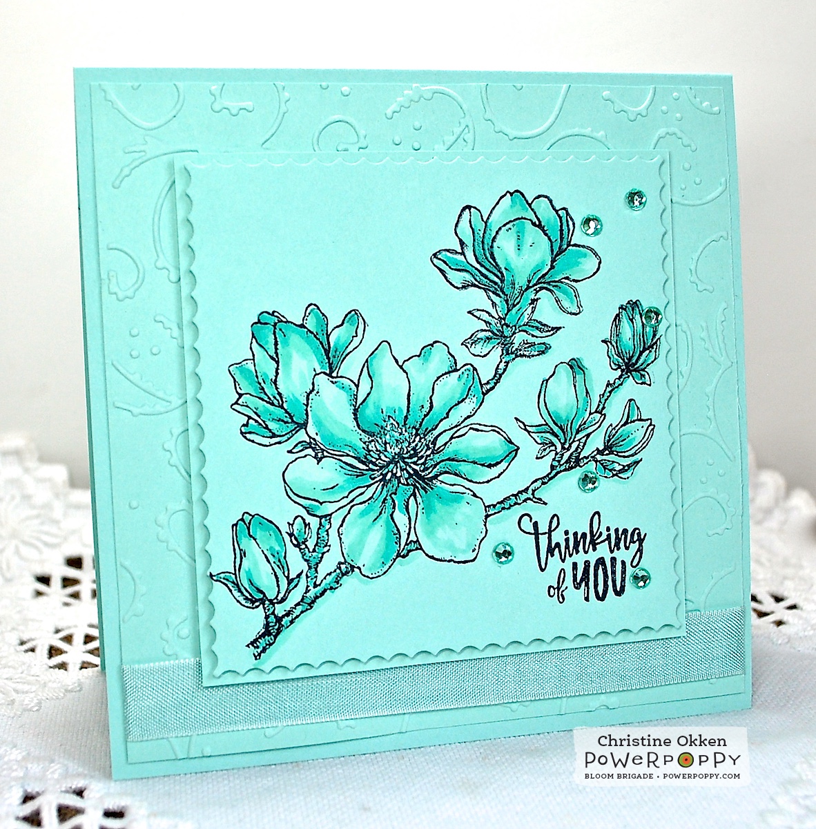
Floral & Striped Lap Top Bag


https://www.pinterest.com/pin/25332816629275781/

Next I found an image of this vivid handmade lap top bag.  The orange striped fabric just drew me in and I love the little simple yet colourful blooms on the white back ground of the top fabric.

To begin this card, I knew I wanted to use the basic design of the bag; stripes on the bottom and little blooms on the top.  So I found a fun striped paper and then pulled the teal from the strip into the colour of the blooms.

Instead of using a vertical strip like the bag, I chose to add some more whimsy to the card and put my stripes on an angle and then also make my blooms from the “Folk Heart” stamp set work the same angle.


To finish it off, I added a bold embossed sentiment from the “Big Scripts” stamp set at the bottom.

I just love how those lines of amusing little blooms just sprout from the stripes at the bottom!

Floral Skirt


https://www.pinterest.com/pin/25332816629001196/

Fashion is another way to be inspired to create!  I found this fun skirt pinned in my board and knew that the front panels would make a cool design for the front of a card.

I began by cutting two identical rectangular panels of water colour paper and stamping the single rose from the “My English Rose” stamp set randomly all over both panels. I chose to pull 4 different colours of ink from the skirt; a lighter dusty blue, a darker sky blue, a fuchsia purple and rich, dark purple.  I used all 4 colours randomly when stamping and filled them in with the same watered down inks.

I trimmed my panels to create 2 overlapping pieces with peek-a-boo points sort of like the skirt, added them to a purple card base and added a simple bow to finish it off.


Fashion inspiration has a great way of sneaking itself into our crafting lives too!

So I hope I’ve inspired you to think outside the box today and view not only the net but the sources around you.  The oddest things may spark your creative mind; a bill board, a magazine ad, a logo or even a painting hanging on a shop's wall!  Inspiration is everywhere!  Keep those eyes open!

Happy stamping & creating everyone!

~ Allison Cope ~


Supplies:

You’re Special Succulents 
Stamps: Power Poppy (Sassy Succulents)
Cardstock: Recollections (110lb White), MFT (Ripe Raspberry)
Inks: Memento (Tuxedo Black), Copic Markers, Copic Blending Solution, Prismacolor Pencils, Versamark
Embossing Powder: Stampendous! (White Detail)
Patterned Paper: MFT (Tranquil Textures 6x6)
Copics: BG32, BG13 
Prismacolors: Canary Yellow, Chartreuse, Grass Green, Carmine Red, Parma Violet, Mulberry

Sunflower Hello
Stamps: Power Poppy (Folk Heart, Big Scripts)
Cardstock: Recollections (110lb White)
Patterned Paper: MFT (Painted Prints Smitten 6x6)
Inks: Memento (Tuxedo Black), Copic Markers, Versamark
Embossing Powder: Stampendous! (White Detail)
Dies: Pretty Pink Posh (Scallop Frames)
Twine: Darice
Copics: BG10, BG09, Y15, Y17, YG01, YG17

Lavender Roses
Stamps: Power Poppy (My English Rose)
Cardstock: Arches (140lb Cold Pressed Water Color Paper), Bazzill (Sour Grape)
Inks: Simon Says Stamp (Surf Blue, Steel Blue, Wisteria, Hot Mama)
Tool: Tim Holtz (Piercing Tool)
Ribbon: Offray

Coloring On Anything Other Than White!


Hello Power Poppy friends!  It’s Christine here bringing you a little inspiration today.  Do you ever feel like you get stuck in a rut when you’re creating?  Stamp the same way, colour the same way....today I have some ideas that might get your "inspiration thinker" moving in a different direction.  

I normally pick an image, stamp it onto XPress It Blending card stock and then colour with Copics.  But, what if you chose something else to stamp and colour on...something non-white?  Here are my 4 card experiments, colouring on paper other than white!

1.   Patterned Paper - Embossing and Watercoloring


I’ve been on an Inktense Pencils and watercolouring kick lately, which has been really fun.  I like these pencils a great deal because they give such vibrant colour, wash in so beautifully, still retain their vibrance, and they require very little water to blend.  This means you can use other types of paper rather than just watercolouring card stock.  

I decided to stamp the rose from Power Poppy’s My English Rose stamp set onto apatterned paper that was full of text.  I embossed the roses in white over the text, and then gave them some colour with the Inktense Pencils.  With stamping and colouring over text, you want a colouring medium that will give you nice deep colour coverage, so that the text is still visable, but you really see more of the colour than the text.  


This is what it looked like as I was colouring/watercolouring.  On the top rose you can see I’ve washed in that first layer of red (I’ll add more colours as I go), but on the bottom you can see how very little pencil lines you need on the paper.  I barely have to add any water, just a damp brush and it blends really well, and because you don’t have to add a lot of water it doesn’t pill the paper either.  Inktense Pencils are actually ink, so if you wash in your colour and then let it dry, it’s permanent.  That means you can add other colours over top or other treatments and your colours won’t get muddy.  I’m finding that to be a great feature.  


Here’s a closeup of the finished design.  You can see I added some other deeper red and blues into the roses and leaves.   I love how the resist of the embossing gives it a subtle outline, and the text still peeks through the colouring too.  


This next design is similar in that it also uses patterned paper, but this time I found a soft neutral vining-pattern in my paper stash. It pairs really well with the flowers from our Poppies Set.  


This is the colouring after the first coat of orange is washed in, I’ve added some deeper reds that I’ll wash in and I’m about to work on the first wash of the greens on the leaves.  There’s quite a bit of texture in this patterned paper, almost like a watercolour paper without the thickness.  


The subtle pattern in the paper changes the feeling of the design in a fun way.

I hope this will have you looking at your patterned paper in a new way as a potential colouring paper. Just look for more neutral designs with subtle patterns and experiment.  Copics would also work really well as a colouring medium with patterned paper, if you’d like to try them out.  I would suggest having some scrap paper underneath your patterned paper as Copics may bleed through the lighter weight.  


2.  Colouring on Coloured Cardstock


Colouring doesn’t just have to be on white card stock...why not pick a lighter shade of card stock and stamp and colour on it?  I created this lovely monochromatic bluey-green design, stamping the gorgeous Planning for Magnolias branch onto the Pool Party card stock.    Then I added in some soft matching colouring just a tone deeper than the paper (BG11, BG13, G00).  Your base colour is essentially done for you by using the card stock as the lightest shade.  All it takes to finish this one is a layer that’s been embossed to provide a little texture and subtle contrast, seam binding and some sequins in the same shade.  I think it has a lovely peaceful feel.  


Kraft paper is also another great colour to colour on (wow that’s a funny mouthful!).  I often colour it  with prismacolour pencils, but Copics work great on Kraft card stock too.  It gives a richer tone...and automatically warms it up.  Here I’ve printed one of my favourite Power Poppy digital images,  Sunflower Power onto Kraft and then added Copics.  I find with colouring on Kraft you have to add deeper shades than you would normally to get the colour you’d like, but it all really adds to the rustic charm.  


Some buttons, twine and a sentiment from Dynamic Duos - Peonies and Tulips add to the earthy appeal, and below you can see the Copics I used for the sunflower.  


So there you have a little inspiration for your Monday, I hope it encourages you to go and dig through your papers and test them out!  Thanks for joining me today!