Showing posts with label Graceful Still Life. Show all posts

Monday

Inspire Me Monday: Word Play!


Hello all and welcome to another edition of Inspire Me Monday!  One thing I love about digital stamps is the ability to play with them and arrange them in a new way. In the past, I've shown you how to use digital images as both backgrounds and accents and today, we are going to get a little refresher course on how to use digital images to play with words! I've done this technique with all occasion cards, with holiday creations and today, we're going to do this with a bit of a juicy summer theme! 

Let's take a look at what we'll be creating today! 

Just a sweet and simple creation that screams summer and has a pop of cheery color! So, let's get started on creating this juicy little number!

To start, I used Adobe Photoshop Elements as my photo editing software but alot of these techniques can be done on similiar editing programs. I opened up the program and decided that I would use the word "hello" as my starting point! I created a canvas that measured 6 inches wide by 3 inches tall. I typed the word "hello" in the font Hello Regular in 150 point size. It's a free font that you can find for free HERE. 


After I typed out the word, I added a thin stroke around the word. 


Then, I flattened the image to create a background...


From here, I used the eraser tool to get rid of the white area internally within the word.


Now it's time for a little berry fun! I opened up the strawberry file from the Power Poppy digital stamp set called Cherries and Berries. 


Now all you need to do is drag and drop the image onto your word canvas. 


I also duplicated the berry file multiple times and then brought the word to be the front layer. And, at this point, I had fun just moving the different berries all over so that it would flow through the "hello." 


Afterward, I printed off my image and colored it up using Copic markers. I used R20, R32, R35, and R37 for the berries. YG03 and YG61 for the leaves and then used G0000 and BG10 for a little extra pop of color around the berries. I added some white gel pen to the seeds to help them pop a bit. I also added a little bit of Stickles to the centers of my strawberry flowers. 

And, after layering it all up, this is my finished card! 


As I mentioned at the start of this post, this isn't the first time I've played around with words and digital images. I thought I'd share some of my past cards just to show you the possibilities!


For this card above, I created the word LOVE and then used the digital set Graceful Still Life to create a flow of dogwood flowers around the word. 


And, above, I used the set Cuppa Buttercups behind this fun "Hi!"  I love just how cheery and colorful this one turned out to be! 

And there you have it! With digital stamps, there are so many possibilities -- so many more than sizing and printing! Techniques like these help you to create cards for any occasion, using some of your favorite illustrations as inspiration! 

I hope you give this a try! Until next time, 


Inspire Me Monday: A Little Word Play!


Hi all and welcome to another episode of Inspire Me Monday! Today, I am going to go digital for our tutorial today and show you how you can take digital sentiments or words and make them more of a centerpiece in your stamped cards and creations.

So, let's get started! Last week for our Hues to Use, I showcased a mash-up of Power Poppy's Graceful Still Life with a word that I whipped up using PhotoShop Elements. This, below, was my card!

CARD #1 


So, want to see how I created it? I started by using a heavy font to type out the word LOVE. I used the font Heavitas and got it free here on dafont.com.


From there, I added a box around the word LOVE by clicking this icon (highlighted off to the left on the tool bar) and stretching the box to cover most of my digital canvas. After I filled the rectangle with a white layer, I added a "stroke," basically an outline by clicking on that effect that you can see  on the right-hand side of the screen. I did this because I knew I wanted my image to be framed in a way. Keep in mind, I am sharing the details for Photoshop Elements (PSE) but these tools are rather common in photo editing software. While PSE is a rather inexpensive software you buy (you can check it out HERE), GIMP is a free software that can do a lot of these things as well. Click HERE to check it out! 

Here's what the image looks like after I placed the box around the word...


From there, I opened up the branch image from Graceful Still Life and removed the background just by clicking the eraser tool on the background. From there, I started to play around with placement and layered it over top my word. 


I also realized that I didn't want my lettering to stay black, so on that layer, I changed the font color to white (simply click on the text icon, highlight the word, click on the color box down on the lefthand side, and then ink drop a new color) and added a stroke effect around the letters as well, so I would have more of an open-line look.


After I found the placement, I took the single branch, clicked on the image tab, clicked on Rotate and then rotated the branch horizontally, so that I could get a second image facing the other way...


And then, I dragged and dropped this image over my word on the other side...


Here's where the eraser tool really comes into play! After I had my branches set exactly where I wanted them, I realized that I had to use the lines of my letters as a guide to erase sections of the branch so that it looked as though my branch was falling in front of my word in some places and behind it in others. It might be helpful to reduce the opacity of the image so that you can see the letter underneath.


You can see that over the "O", I am starting to erase that layer. I also erased the part of the flower that was laying over the "V". I kept going until I had what I felt was a balance. And, when I was, I ended up printing this one my laser printer so that I could make this creation gilded with some Deco Foil. See?


From there, I colored this one up with Copics, making sure to add depth to those letters and the backdrop as well! Ta da!

HERE'S THE GOOD NEWS! While I just showed you step-by-step how to create this look, Marcella decided to share this image as a part of the Graceful Still Life set. If you already purchased this image, this file will be available in your PowerPoppy.com account, under your purchased digital downloads. If you haven't ordered this set yet, this image will be included when you order. Thanks Marcy! :-)

CARD #2

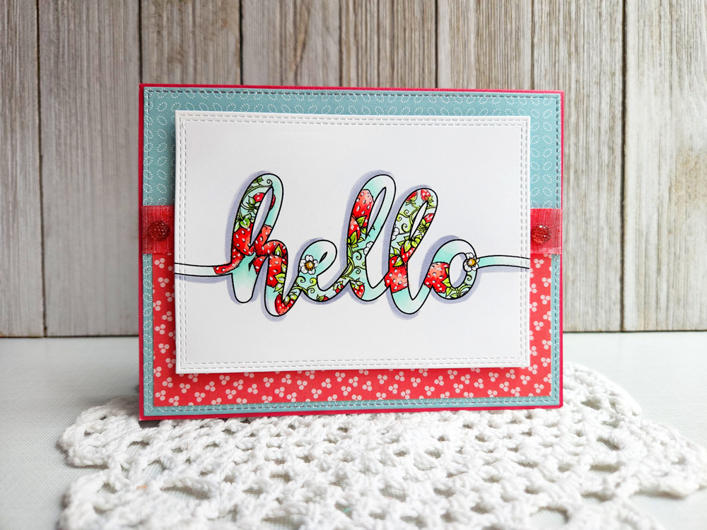
For the next creation, I wanted to use one of Power Poppy's sentiments and show you how you can take a digital mash-up to the next level. I used the Power Poppy's Chinese Lantern digital stamp set sentiment "Hi!" and blew it up so that it measured roughly 3" by 3". From there, I merged the layers and then, using the Magic Eraser Background Tool, I got rid of the white space on the inside of the word by just clicking on the inside of each letter. See?


Then, using Power Poppy's Cuppa Buttercups digital stamp set, I layered the image behind the word "Hi!"  I dragged the image of the cup a few times letting the flowers only show, making sure the flowers were behind my top layer.


And this is what my card looked like after I colored up the letters and added some accents!


And here's a closeup of the letters so you can see how I colored them up!


CARD #3
For my last creation, I didn't have to go far to find even more inspiration. I used one of the other sentiments from the Chinese Lantern Digital Set "You make me so happy." I loved the chunky nature of this image and knew I could use it in a different way as well!

So, after opening up the image in PSE, I erased the background, and then changed the color of the font from black to white. All you need to do in order to change the color is click on Enhance tab and then click on Adjust Color and Adjust Hue/Saturation...


From there, you simply adjust the lightness until you're at +100.


From there, I added a stroke around the lettering using the same effect that I did in our first card. And, here's what it looked like afterward...


While I love the look of this image as it is, I knew I wanted to layer it with a fun image behind. So, I opened up the Sweet Pea Show digital stamp set. And put it in the background. 


After I printed, I colored up the whole thing and had fun doing it! I wanted the lettering to look almost like an ombre effect. And here's a peek at how it turned out!


And here's a closeup...


And here's a peek at all three cards!


I know that some of what I shared is a little bit more on the tricky side but hopefully, seeing what's possible will help you explore your photo editing software and try new things! Layer sentiments, add backdrops, or even create your own! If you do, be sure to add a link in the comments section on this post to show us what you've done! 

Thanks for stopping by today! Be sure to swing back tomorrow for a whole new Hues to Use to kick start some colorful creativity in your crafting spaces!

Until then,

~Julie

Tuesday

Gilded Hues!

Hello sweet peeps & welcome to yet another set of color cues that are ripe to use for all of your creative and crafty endeavors! Today, I not only have the hues for your viewing pleasure, but a sneaky peek of a fun little technique that I am going to share for Power Poppy's next Inspire Me Monday! So... so much to stay tuned for!

First, let's check out the color palette for this week's.....

So, what's this little sight above? Well, according to the fabulous Ms. Marcy, it's a photo she snapped just a few weeks ago showcasing the Yellow Bishop's Hat and Virginia Bluebells that were sprouting up all over her "terrarium" a.k.a. her backyard garden! Don't they just look like they are reaching up to the camera to say "Well, hello there?" ;-)

SO, HOW DO YOU PLAY ALONG? Well, my friends, it is as easy as 1-2-3! Simply use all three colors in your next creation and then, don't forget to link up your fine work using the linky below! Just that simple! 

Today, I am sharing a little bit of an experiment using Deco Foil, Copics, and a little digital manipulation! If you want the full low down on how I created this card, you'll have to stay tuned for a step-by-step tutorial coming your way next Monday. But, for now, here's a peek at what I whipped up using the color palette above! 


So, as you can see, I took Power Poppy's Graceful Still Life and did a little "surgery" on it before I colored it up with Copic Markers. Word art is really big in stamping right now and I knew I wanted to try my hand at doing some digitally. After I was done creating this image, I grabbed my Copic markers and used these ones below to color it up! I really wanted to create an image with an antique feel so, most of the colors are dusty in tone! The earth tones were used to color up the letters and bring out that sandy color in the color palette. The flowers are the purple in this week's hues and my card base is the lighter shade of purple in the Hues to Use!


And, here's a closeup so that you can see how I used the Deco Foil! I will say, I didn't let my laminator warm up long enough and you can see that the coverage of my foil isn't perfect. In real life, you can't tell there are spots missing -- it looks really crisp -- but in this photo-- you can see them!


And that, my friends, is it! Like I mentioned, be sure to come back and see how I created this card and a few others! And be sure to put these colors into play and join me for this week's Hues to Use! You never know when a card or creation might have us asking you to guest host this weekly challenge! Wouldn't that be fun?

So get those fingers inky and join me!
~Julie


Friday

Thank Goodness it's FRI-YAY!!!!!

Hello, sweet peeps! What's going on in your neck of the woods? We here at Power Poppy are jam-packed with good vibes so get ready for a fast moving, high powered, combustion of creativity with the latest edition of....


With the official first day of spring just a week away, I have the FEEE-VAH folks -- a bit of spring fever! That's why when I was strolling through my Instagram feed, my heart skipped a beat with this one by Karen HERE using Power Poppy's stamp set Go Wild. Don't you just love the huge blast of color and the clean design?  I sure do! Good vibes Karen -- Good Vibes! 


I don't know about you, but I absolutely love progress shots showing coloring in action. They all remind me of my "happy place," when I can take a deep breath, grab my favorite coloring medium and... color. So, that's why I picked this little snapshot HERE by Kathy Jones using Power Poppy's Graceful Still Life.  Ahhh... love! I can't wait to see how Kathy finishes up this little colorful wonder!


Good Vibe #3 is all about the Power Pup! It's been a bit since we've seen the notorious Mr. Tibbs in action. This one shows him out with one of his fearless leaders, Doug. I am not sure which is more regal, the rich-in-history St. Louis statue in Forest Park... or the four-legged gentleman Mr. Tibbs! I don't know about you but I just really wish I could crash through the computer screen to get a little cuddle from the Power Pup himself!


Tomorrow is the big day when we can pretend that we are all a wee bit Irish! So, why not let the luck 'o the Irish rule the day and snap up one of Power Poppy's luck-inspired digital stamp sets??? Did you see this lovely set  --- Wish You Luck --- is on sale now through tomorrow for just a buck and 25 cents? Yep, you heard me right -- $1.25! You can't even buy a coffee for that! Hit the Power Poppy Shop before the sale ends on this digi designed to bring nothing but good vibes!! And, if you're looking for some ways to use this fun stamp set, Ally did a video showing how she colored up this set and even has a schnazzy little Irish tune underneath her coloring tutorial! Click HERE to check it out!


This last little snippet just made me happy at first sight. Look at that little baby succulent. It appears as if it is just "reaching" for the sunshine to soak it all in! Christine Okken shot this little guy, who just happens to be hers. So, soak up the happy and reach for the sunshine in your own lives -- #moregoodvibes! 


Well sweet peeps -- how's that for some good vibes? Hopefully, you'll leave here smiling just a little bit more than you were before you came this way! 

We have a few... just for YOU!  First up, have you checked out our monthly Power & Spark Challenge? This one is hosted by the fabulous Ally Cope! All you need to do is dig into your fabric stash and be... inspired! Check out the challenge HERE that could send you to the Power Poppy Shop as the winner of a $50 Shopping Spree! Yipppppeeee! 

And, of course, you can always get in on the action with our weekly Hues to Use. This week, we pulled the lid off on a new trio of colors that are springy and fun and just begging to be used the next time you hit your crafting space! Click HERE to see for yourself!


And fine folks, it's that time when we turn things over to the ever-fabulous Bloomies, who would love nothing more than for you to hop on over to their place on the web to see what beautiful things they've whipped up to share with YOU!


Thanks for popping in! Enjoy your weekend and we'll be back here real soon to share a little kick of creativity to brighten your day!

~Julie 

Wednesday

February's Instant Garden Digital Stamp: Graceful Still Life

It’s always an exciting day for me when we release new images, whether they are clear stamps or our “digis” — the files you can download from our website and then print out and color. I absolutely love watching them come to life from craft tables around the world. Today we have a really fun digi set, and it has a little story about how it came to be.

Around our house, basically any shelf, tabletop, and windowsill is fair game for a still life. The act of putting different objects together brings me a deep sense of joy! Whether it’s on paper, or in reality!  In concocting the image for our February release, I envisioned a simple still life of a vintage tea pot resting on a stack of books (always gotta have stacks of books!), with a little sunhat nearby. The teapot would have a few clippings from the garden, and for this image I decided on springy collection of Roses and Dogwood branches. And here is what I drew, I call it Graceful Still Life...


Pretty fun, eh? I was happy with how it turned out, and shared the set with those fabulous Instant Gardeners, my digital release design team, so that they could make cards to inspire everyone. I was thinking about how the designers would color up the roses, how they might approach the color scheme for the books, and wondering what exciting combinations would arise. 

Then a card was presented that threw me for a wonderful loop and changed the course of the set!


Just take a look at this card by Jessie Banks. That clever girl!! She zoomed in to the Graceful Still Life image with an eye on those Dogwoods and thought, I want a card that’s all about the flowering branches. Isn’t this watercolor gorgeous?

After I saw Jessie’s card, I knew I had to offer the Dogwood branches all by themselves! So that’s just what we did. This digital download includes the still life image, a sentiment for the inside of the card (or check out Broni Holcombe’s post to see the sentiment get top billing!) AND the Dogwoods sized up to work on the full card front. I love being open to spontaneity!


Now, if you want to run over and grab Graceful Still Life, it’s in the shop right now, ready for you to take it to the next level. But I think something even more fun to do is to go see what those genius Instant Gardeners have made with this set — I know they will inspire and delight you, and help get those creative wheels turning... let’s go look!


Thank you so much for stopping over at the blog today! And just a quick note to remind you that we’ll be having an exciting release of new clear stamps in March, and I cannot WAIT to show them to you!