Showing posts with label Monarchs and Milkweed. Show all posts

Tuesday

Creative Confetti: Color Your Image on Colored Cardstock

Hello! I think this is my first time hosting the Creative Confetti Challenge. I wanted to inspire you to great heights, but I have been distracted with a visit from my adult children. My son came for the long Labor Day weekend, but my daughter came for a WEEK! Plus, my college-age son started online classes this last week. I have been enjoying the "kids" and not spending as much time in my studio.

However, I hope that you enjoy the challenge this week. I had fun making the samples!


HOW TO PLAY: Stamp or print a Power Poppy Stamps image onto COLORED CARDSTOCK!  Then, color away! Use ANY color cardstock, as long as it's NOT white.

On to my creations! 


The project that started me thinking about coloring on colored cardstock was this class from Vanilla Arts called Illustrated Monarch

The class was to color the Monarchs and Milkweed image onto tan cardstock. I had a lot of fun coloring on the tan paper with Copics and Prismacolor pencils. 

The tan cardstock was light enough that the Copic markers looked fine, if muted, and the colored pencil looked AMAZNG!

So...I thought...what OTHER colors could I print onto and color?!?


I chose a few images to print onto a few colors of cardstock. I found that if I wanted to color an image onto very dark cardstock such as black or navy blue, I would have to somehow trace the image with a white pencil or use a similar technique. The printed image did not show up quite enough to allow me to see the lines, especially on a detailed image. Also, Copic markers are too transparent to show up on super dark cardstock.

I asked my artist daughter about using colored paper and she said the standard colors she used were white, off white or cream, tan, and gray. But, I was sure that light blue, pink, even red would work! I tried a few different papers and colors and learned lots of things!

This is another example of playing around before you start an actual project. Be prepared to "waste" a little printer ink and a few sheets of cardstock! It's worth it to experiment!

I learned that you need to test the paper with the medium you wish to use. I printed this sunflower image from Sunflower Power onto cream linen cardstock. I had hoped to use watercolor pencils for the image, but the paper was too thin to accept the water! I also found out that while the Copics looked amazing, they "oozed" too much on the linen cardstock (no surprise there). The colored pencils loved this lightly textured paper!

In my discovery I learned that you also need to allow Copics to DRY before you can see how the color really looks on colored paper. 
I had my heart set on using Copics on this sky blue cardstock, but they wanted to bleed. Any attempt to push the color back with the blender only made a "drool" line on the paper! The paper had a bit of a rough texture, and no coating so the alcohol ink just wanted to soak in and wick out! 

The colored pencils loved this paper! And they looked amazing on the blue background! I had found my perfect match!
I printed the Chinese Lantern image onto the sky blue cardstock at about 7" x 5".  I printed the lines in pale gray as well. I colored the image with Prismacolor Colored Pencils, which worked beautifully!

I hope you enjoyed my versions of the challenge for this week! If you want to join me and show off some of your Power Poppy Projects, please be sure to share what you come up with by using the linky below! Every entry -- no matter what the week -- is thrown into a virtual hat for our random drawing at the end of the month for a $25 gift code to the Power Poppy Shop! 

Have a great week! I can't wait to see what you create! 


You are invited to the Inlinkz link party!

Click here to enter

Monday

Artist’s Notebook: How to Create Rich & Complex Color (Monarchs and Milkweed)

Want to improve your Copic Marker or colored pencil with more sophisticated color and blending combinations? Power Poppy’s guest author Amy Shulke from VanillaArts.com offers artistic coloring tips for Copic Markers or colored pencil. | VanillaArts.com | #realistic #howtocolor #copic


Color that makes your heart thump louder.

That’s why we love coloring, right? Bold and beautiful color.

So why do we chicken-out when it comes to our Copic Marker or colored pencil selections? Not only do we use the same colors over and over again but we use the same colors over the top of each other.

We love color but we’re afraid to actually use it.

I know it’s scary, but let’s talk about how to get crazy. Let’s be bold and wild!

Rich and vibrant color? Who doesn’t want more of that?

Want to improve your Copic Marker or colored pencil with more sophisticated color and blending combinations? Power Poppy’s guest author Amy Shulke from VanillaArts.com offers artistic coloring tips for Copic Markers or colored pencil. | VanillaArts.com | #realistic #howtocolor #copic

Hello, my name is Amy Shulke and I’m the illustrator and art instructor at VanillaArts.com. I’ve got a whole series of artistic coloring articles here at the Power Poppy blog; here’s a quick link to a bunch of my previous articles.

Today’s project uses Marcella’s amazing Monarchs and Milkweed digital stamp. I’ve colored it with a combination of Copic Markers and Prismacolor Premier Pencils on Stonehenge Kraft paper.

Yes, you can use Copic Markers on brown Kraft paper. That’s part of what we’ll be talking about today. The sandy brown paper is helping to set the mood for a sweltering summer scene. The Kraft paper makes my color choices look richer more complex.


Want to improve your Copic Marker or colored pencil with more sophisticated color and blending combinations? Power Poppy’s guest author Amy Shulke from VanillaArts.com offers artistic coloring tips for Copic Markers or colored pencil. | VanillaArts.com | #realistic #howtocolor #copic

Light, Medium, and Dark

As a coloring newbie, you didn’t really know what to do, so you fell back on grade school crayon habits. You colored the center of a daisy with one yellow marker or pencil. The petals were one solid color of pink. The leaves were one green.

It was fun but you quickly noticed it looked flat.

So you searched for “dimensional coloring” and found tons of online tutorials about shading with blending combinations. Blending combinations combine a light, medium, and dark marker or pencil. You learned to use combinations to add a bit of dimension to your projects.

But now what?

Now that you’ve got the combo concept mastered, why do your projects still look candy-colored?

Are you still missing something? Is there some next step beyond blending?

Yes, but the internet doesn’t talk much about the next step, does it?

Maybe you should find better blending combinations?

Or maybe you need more color? You could add more colors to the simple light-medium-dark blending combination. How about light, light-medium, medium, dark-medium, and dark?

Should you layer on another medium? A different kind of colored pencil? Watercolor? Pan Pastels?

Stop!


The deep, interesting, and complex color you’re searching for is already at your fingertips. You’ve had the tools all along.


Instead of finding new coloring tutorials, let’s look at how artists create sophisticated color.


Want to improve your Copic Marker or colored pencil with more sophisticated color and blending combinations? Power Poppy’s guest author Amy Shulke from VanillaArts.com offers artistic coloring tips for Copic Markers or colored pencil. | VanillaArts.com | #realistic #howtocolor #copic

"Add some Phthalo Blue to this Alizarin Crimson and a touch of Burnt Sienna..."


Think back to watching Bob Ross paint on PBS.

Did Bob ever say:

“Okay friends, let’s pick up this tube of ultramarine blue and squeeze it right here on to the canvas. Get a really big blob! Now spread it all around until you come to the edge of a tree or the mountain. Yes, let’s make that summer sky one big solid expanse of pure ultramarine blue!”

We loved watching Bob mix brand new colors on his big wooden palette. He’d start with green, he added a bit of violet, then a touch of sienna, and he’d lighten it up with white...

Or he’d start with a weird pinkish brownish color that he originally made for tree trunks, but then he’d add blue to create the perfect color for river rocks.

Bob knew the artist’s secret: 

Pure color is pretty... but color mixtures are what makes the show-stopping beauty.


Want to improve your Copic Marker or colored pencil with more sophisticated color and blending combinations? Power Poppy’s guest author Amy Shulke from VanillaArts.com offers artistic coloring tips for Copic Markers or colored pencil. | VanillaArts.com | #realistic #howtocolor #copic

Shading green with more green

The reason why your projects look candy colored is because of the light-medium-dark blending combination process.
Unlike Bob Ross, you’re using color straight out of the tube.

You’re shading a green leaf with more of the same green.

A blending combination of YG21 - YG23 - YG25 is all the same green. It’s all YG20-something. Green on green on green on green.

Sure, you’re blending. But that’s the problem.


Psssttt… confession time. 

My green leaves here use layers of yellow green marker over gray violet marker. That’s something Bob Ross would do.

Then there are no green pencils on top of the marker. I’ve used a warm purple, goldenrod, and cream pencils. And it’s all going over the top of a krafty-brown colored paper which neutralizes and softens the look of everything I’ve used.

I’m not doing green on green on green.


If you want complex sophisticated color, you’ve got to add more to your leaves than green.


Want to improve your Copic Marker or colored pencil with more sophisticated color and blending combinations? Power Poppy’s guest author Amy Shulke from VanillaArts.com offers artistic coloring tips for Copic Markers or colored pencil. | VanillaArts.com | #realistic #howtocolor #copic

The colors I use are not the colors you see


The trick to upping your color game? Move away from the blending mindset. Blends are nice but light-medium-dark blending combinations are holding you back.

Think aboutlayering instead of blending.

Your markers and pencils are just ingredients, not the final color.

Brownies are made from flour, eggs, butter, and cocoa powder. But nobody wants to eat a brownie one spoonful of flour at a time. The magic happens when you make something new out of standard ingredients.

Right now, you’re not baking.

With blending combinations of green-green-green, you’re not creating anything new. You’re just displaying your greens next to each other.

Mix, stir, and layer your markers and pencils to create new colors. New colors that aren’t made in any factory. That’s the key to eye-popping, mind-blowing, creative color.


Green on green on green will always look like plain old green.


But violet under green with goldenrod on top?

Now you’re Bob Ross!


Want to improve your Copic Marker or colored pencil with more sophisticated color and blending combinations? Power Poppy’s guest author Amy Shulke from VanillaArts.com offers artistic coloring tips for Copic Markers or colored pencil. | VanillaArts.com | #realistic #howtocolor #copic

It’s only paper!


But wait, you ask... how do I do this?

Where are the tutorials or recipes for sophisticated color mixes?

Psssttt... artistic color is the result of experimentation, not tutorials.

If you want to color a Monarch butterfly, instead of scouring the internet for someone else’s Monarch tutorial, try finding a photo of a Monarch with colors that make you smile. What colors do YOU see in the photograph? Which markers or pencils look like Monarch colors to you?

Then make a few test swatches. Try some markers or pencils and see what they look like together. If it works, great! You just invented your own unique Monarch recipe. 
If not, try again.

It’s just ink. It’s only paper.

There’s no pressure here, just play and learn.

If you can blend, then you already have the skills! You know enough about markers or pencils to create your own combinations!


So here’s my Artist’s Notebook challenge for you this month...

Want to improve your Copic Marker or colored pencil with more sophisticated color and blending combinations? Power Poppy’s guest author Amy Shulke from VanillaArts.com offers artistic coloring tips for Copic Markers or colored pencil. | VanillaArts.com | #realistic #howtocolor #copic
Play with your colors. Test them out in new combinations.

Fly. Be free!

Keep in mind, freedom is sometimes a little scary. That’s okay. Acknowledge the fear remind yourself that we’re just coloring. It’s only ink, it’s only paper.

Relax and play.

Want a little boost to get you started?

If you’re not sure where to start, my Undercover Swatch series is completely free and full of wonderful quirky color combinations that are all richer and more interesting than anything you’ll create using the light-medium-dark theory. My dear friend Elena makes the Undercover swatches and two years ago, she was just like you-- new to markers and no clue what to do. She learned and now she’s helping you experiment too!

Once you’re confident about underpainting with crazy colors, experiment with crazy overcolors.
I used a gray violet marker under the green marker, so then I played with a few violet pencils to see what looked good over the top.

No combination is too weird! In this rose class using Power Poppy’s Vital Rose stamp, we went nuts with turquoise markers and pencils. There’s turquoise under the red, under the green, and then turquoise pencils over the top of it all. It’s wild and it’s gorgeous!

Rich color is the result of playtime.
Ditch the green on green on green.

Fly! Be Free!


Want to improve your Copic Marker or colored pencil with more sophisticated color and blending combinations? Power Poppy’s guest author Amy Shulke from VanillaArts.com offers artistic coloring tips for Copic Markers or colored pencil. | VanillaArts.com | #realistic #howtocolor #copic

Want to color Power Poppy’s “Monarchs and Milkweed” with me?


Want to improve your Copic Marker or colored pencil with more sophisticated color and blending combinations? Power Poppy’s guest author Amy Shulke from VanillaArts.com offers artistic coloring tips for Copic Markers or colored pencil. | VanillaArts.com | #realistic #howtocolor #copic
My Illustrated Monarch class is part of the Vanilla Livestream series for intermediate to advanced Copic colorers. 

This lesson is near and dear to my heart. I’m sharing the education & clarity concepts I used in my technical illustration career. You can use the same techniques to create accurate animal or botanical studies that any biologist or science teacher would love.

Illustrated Monarch uses Power Poppy’s beautiful Monarchs and Milkweed digital stamp set.

You can find out more about Vanilla Livestream classes here.

And I’ll see you back here next month for another glance into my Artist’s Notebook!


Tuesday

Creative Confetti: Alter It!

Hello Power Poppy Peeps and Happy Tuesday! This week, we are going to have a little fun looking around our homes and seeing what fun things we can add a little stamping magic too! It's getting close to the season of giving and don't you just love adding a little crafty touch to gifts or ... actually making those crafty touches a gift in an of itself? Before I share too much about this challenge, take a look for yourself!


HOW TO PLAY: It's as simple as altering an item! Stamp on a box, deck out a gift bag or tag. The world is your oyster! After you are finished creating, simply link up your creation on the linky below for a chance to win....

A $25 Gift Code to the Power Poppy Shop

Isn't that fun? The good news is, the linky is up all month long, giving you lots of chances to win!

On to My Creation! 


I had this little gold journal in my craft room with the thought of altering it literally years ago. Recently, I decided to embark on not one, but two Bible studies and one will require heavy-duty notes. So, I thought, no time like the present to pull out that gold journal and start decking it out!

If you remember THIS digital tutorial, you might recognize this digital image! It's the digital stamp set Monarchs & Milkweed. When I did that little tutorial, I printed off a few extras for times just like this!


I started by coloring up the butterflies and, while I didn't take a picture of the butterflies on white, trust me, it just looked too stark! I ended up using Broken China and Stormy Sky Distress Inks to sponge ink all over my image. Yes. I was nervous. I am not the best "sponger" and so I worried I might ruin my coloring. Note to self, sponge before you color next time!  


After I was done sponging, I did take a water brush and go over the leaves and then spritzed my paper with a few water sprays to get that dappled look. Adding a brush of water to the leaves gave it that dreamy muted look that helped define the leaves a bit without color. I wanted it to look like a scene taken almost at dusk with just that bold pop of orange taking center stage.


After I was done, I took some super strong tacky tape and taped my image to my front cover, making sure to line up the tape right along that outer edge as close as I possibly could so that the edge would be tacked down quite well to prevent the sides from curling.

And here it is! The sentiment was from the stamp set Olive and Oak Expanded. I just love that Bible Verse -- one of my absolute faves!


And now, this old journal has been given new life thanks to some inks and stamps! It was a fun and quick project that will serve me very well in the weeks to come! Just a note -- if you need a little extra inspiration, I dug up a little for you so you get the gist of this challenge!

Stacy's Altered Gift Tins
Ally's Phone Case - think of this in holiday style! 

So, let's see what you can do by nipping, tucking and altering some of the fun things around your home! After you're done, don't forget to link up your creation below for the chance to win a $25 shopping trip to the Power Poppy Shop! We can't wait to see what you come up with!

Oh, and before I let you go... get ready for a Holiday Blitz! Starting TOMORROW! Check it out!


You'll want to stay tuned for new digital stamp sets, highlights of some of Power Poppy's most well-loved clear holiday sets, Black Friday specials & more!
See you back here tomorrow! 
~Julie


You are invited to the Inlinkz link party!
Click here to enter

Creative Confetti: Go Big!

Hello everyone and happy Tuesday to you all. 

Today, I decided to Go BIG for this week's Creative Confetti. Yep! You know the saying, "Go big or go home?" Well, that saying applies this week my friends! Check it out...


What sparked this challenge was actually one of YOU! Last week, with the Roll of the Dice challenge, I spotted this beauty below by Irene Rhodes. (She has other super pretty, clean and classy butterfly cards on her blog too!) I was taken by its clean design and the pop of color that just made it special! The greyed out Azaleas Forever background was stunning and I love that die cut edge too. My mind started spinning as to how I could recreate the look in my own way. And so, this challenge sprouted!


HOW TO PLAY: Use a large digital image (blow it up peeps!), a background stamp or create your own background with a series of stamps! Make it BIG and BOLD!

So, when I thought of this challenge, I started by scrolling through all the digital stamps. I knew I wanted to expand the size and make it, just like the challenge says, big and bold! And, I found THIS ONE! Power Poppy's Monarchs and Milkweed digital stamp set.

I knew, however, that I would have to do a little digital manipulation if I wanted the butterflies to be black and the background to be soft. I started with the no-line grey background.


 Then, I opened up the black version, "erasing" everything but the butterfly.


I laid down a few of the butterflies, keeping them black and really helping them, like in Irene's card, POP!


While I liked the grey, I decided maybe a bit of soft color was in order. So, using the tools in Photoshop Elements, I adjusted and "colorized" the background to a soft green. If you need a little help in how to change up the colors of your background, just click HERE for a tutorial I did on getting the most out of your digital stamps! 


From there, it's all about coloring, matting and making these big and bold creatures into a card!


I ended up coloring the butterflies up with Copic markers and used a range of orange and yellow markers just splashing on a little color here and there. I did accent with a white gel pen too! For the shaded portions, I used BV0000, BV20 and BV23. The sentiment from the set, I kept just in black to help it pop as well.

Here's a closeup...


I added a little gold cording -- I'm really into metallic cording these days -- and then attached the sentiment with a little foam tape and... ta da! Fini!

So will you go BIG & BOLD this week? I sure hope you do! Remember to link up your creation below so we can all see. Every entry is one more shot at a $25 gift code to the Power Poppy Shop! Thanks for stopping in this week!


Happy Creating!

~Julie 
a.k.a. Official Creative Confetti Thrower


You are invited to the Inlinkz link party!
Click here to enter

Summer Inspired Hues!

Hello happy stampers! Are you ready for a colorful feast for the eyes? I tell you when I look at this week's Hues to Use color-coded bit of inspiration -- My. Mouth. Literally. Waters! Seriously. One should never write a post like this when hungry. I want to jump into my computer and take a bite! 

At this point, you might be shaking your head and wondering what is wrong with me, but scroll down and you'll get a glimpse of the summer-infused goodness that is at the heart of today's Hues to Use! 


Oh, MY GOSH! Isn't that just delish looking? I am a huge lover of tomatoes and cheese and balsamic and fresh herbs. This little plate above has them all! So, with summertime officially here, why not use some of its best as fuel for a major creative blast? 

HOW TO PLAY: Simply use the three colors above in your card or creation, when done, link it up using the linky below (so we can "ooohhhh" and "ahhhh!"). It is just that simple people! It's just that simple!

Today, we have the distinct honor of having another talented guest in our midst to show off our weekly color scheme. To meet this amazing artist, we'd have to travel across the ocean to the United Arab Emirates. I've never met anyone from this neck of the woods so, what a fun little blessing it is to be able to introduce.... 


Hi Crafty peeps, This is Sathya Kala from Paperie Expressions. I am from India residing currently at UAE with my dear hubby and 9-year old son. I am a toxicologist by trade and have a pulsating desire to pursue my doctorate. Being a child of an oil painting artist, I have loved arts and crafts since my childhood. Thanks much to my Mumma and her genetic transfer of these creative streaks in me. It's what keeps me sane!

After my son turned two, I started crafting and blogging with Quilling as my passion. Slowly I branched out as a stamper, cardmaker and for the past three years, I have been enjoying the nuances of the mixed media art form. A year and a half back, I attended a brush calligraphy and watercolor florals workshop and from then on, I must say, I am smitten. Coloring with pencils is so therapeutic, and digis with pencil coloring is my go-to kind of activity whenever I have free time. I always stock up on printed digis, so I can color them up at any time. I can't wait to see Marcella’s artistic illustrations and soulful indulgence with each digital stamp set release! My happiness knew no bounds when I was offered this guest design spot. I am humbled and totally honored. Many thanks to Julie. I adore digital stamps for the fact that it renders such artistic freedom. It can resize, flip, crop and design in any fashion. Marcella’s artistically drawn lines make everyone an artist. Knowing these nuances of coloring brings out the beauty of these digis instantly.


SATHYA'S CREATION


For today’s project, I have done a wall art piece. It's also altered art with mixed media touches. Here's how I created it!

I printed off the digital stamp set Monarchs & Milkweed and used Prisma colored pencils to color it up. I roughly measured and cut a circle around the image. From there, I ruffled the edges of my paper with scissors and added some Peeled Paint Distress Ink. I took an 8" round wooden cutting board and applied crackle texture around the corners of the board. Once this dried, I added black gesso over the crackle paste. I then applied Prima waxes in two shades of green over the black gesso to reveal the crackle. I also foam mounted the colored piece and tucked bits of Spanish green moss under the edges. I added mini art stones using gel medium over the moss as a finishing touch. 

Here are a few close-ups... 


I hope you like my wall art. Thanks much to Marcella and the Power Poppy Team for this awesome opportunity to showcase my talent here.

Thank YOU Sathya for sharing. What a gorgeous work of art! I can honestly say I have never seen something like this and I truly believe that you are going to spark all kinds of wall art creations with this beauty! Who would have thought to use a cutting board as a base for a stamped creation? And can you imagine all the time and care it took to color up a digital image in that massive size in such an impressive way? Wow! I also love the brick wall Sathya hung this beauty on -- it just helps all that gorgeous coloring to POP! 

Now, my stamping friends, it is your turn to take these colors for a test drive and show us your creative prowess! We love it when you join us, link up your card and share it with our little corner of the creative world!

Until next week! Happy stamping!
~Julie 


July's Instant Garden: Monarchs & Milkweed


Hello my friends — if you came here looking for our Tuesday Hues to Use color challenge, we’ll have it back here next week with a special guest host, one of our dear customers whose work we just love! But today, we’re introducing an all-new digital stamp set, and this image is one you may be familiar with if you follow me on Instagram @marcellahawley.

This spring, I was honored to be asked to create the programs for my son Finn’s grade school graduation. While pondering what kind of imagery I wanted to use, I was sent the theme for the ceremony by the school, and it was these wonderful lyrics from the song Everything is Everything by Lauryn Hill:
Everything is everything
What is meant to be, will be
After winter, must come spring
Change, it comes eventually
Isn’t that perfect for a graduation? (The children all learned the song in chorus and sang it at the ceremony — I cried.)

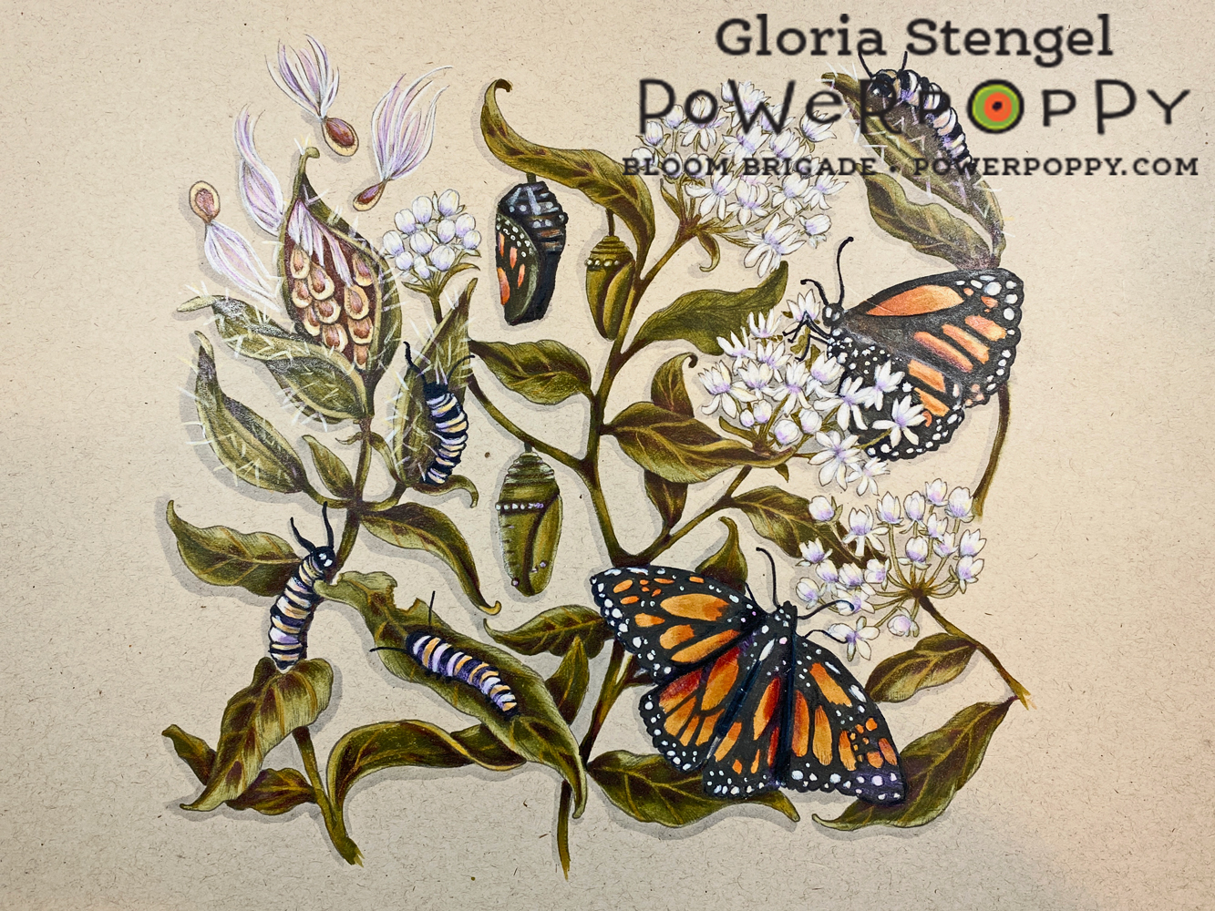
I have long admired the flower plantings that surround our school — all planted by parent and student volunteers. Earlier in the year, I captured a bevy of Monarch caterpillars crawling among the Milkweed leaves and seed pods, and it made me so excited to know we were contributing to the Monarch population!


This thought stuck with me... metamorphosis. Students moving to a new phase in their lives and becoming the people they are going to be. I started sketching....


My idea was to illustrate all the phases of Monarch development (caterpillar, chrysalis, and butterfly), and the phases of the plant on which the Monarch relies to lay its eggs — Milkweed (Asclepius). From the wonderful fall seed pods and their wispy, fluffy seeds, through buds and flowering, and back to the development of fresh green seed pods.


I sketched out the image completely and then went outside to paint it in my garden. I used watercolor and gouache paints and my trusty plastic paint palette that I’ve had since the early 90s.


I especially had fun working on the wings of the butterflies! 


All finished! Then I lettered the quote from Everything is Everything with my tiny paint brush. I scanned everything in to the computer, and created this final product:


I am proud to say that it was well received, and I was very pleased with how the program turned out! (I also hand painted every graduate’s name on the inside, which I also did when Lulu graduated three years before Finn.) I knew I wanted to revisit the original sketch and ink it up at some point for you all. Fortunately, I saved a high resolution scan of the pencil phase of my drawing, so I was able to do just that!

And now, YOU can color up this image, and the song lyrics, to create your own tableau of change. Here is Monarchs and Milkweed! It comes with a larger-scale image (6" across) that you can enlarge further or reduce, as usual, using a photo editing program on your computer. I’ve included a lighter grey image for use in no-line coloring, as well!


One of the neat things about Milkweed is that there are many varieties. I illustrated Asclepias tuberosa, which is orange. But there are LOTS of other ones, from white through yellow, orange, pink, purple. I grow three types in my garden to try to attract the Monarchs:

In my garden: Asclepias curassavica (Mexican Milkweed), A. incarnata (Swamp Milkweed) , and A. tuberosa (Butterfly Weed, Milkweed)
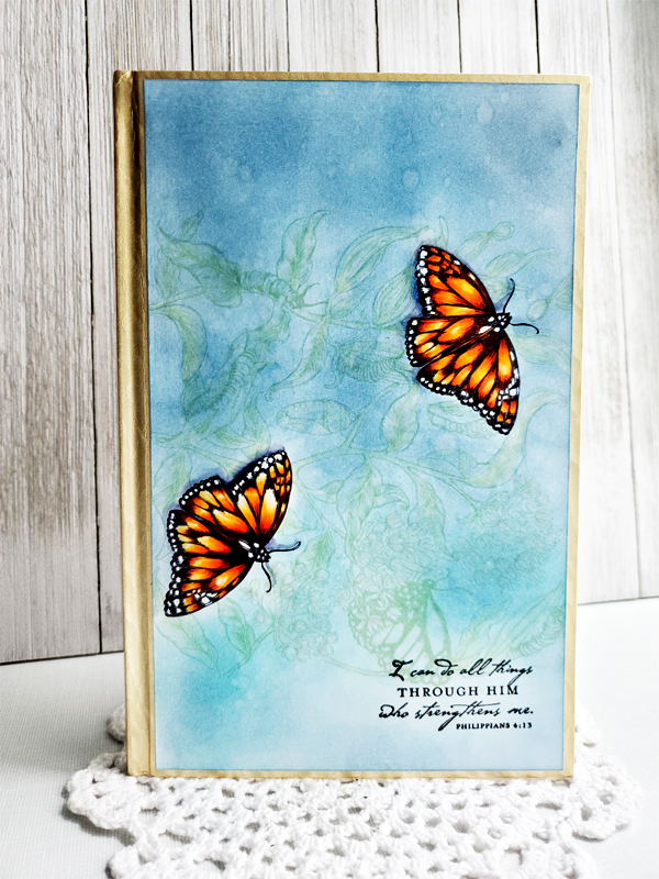
One of the neat things about this illustration, you can crop in to it and still have a very striking image, see what our Instant Gardener, Nancy Sheads created using the top right portion and an incredible layered background. What a vivid card bursting with life!


Let’s go see more of Nancy’s card, along with a pretty work in progress by Barbara Walker!


I hope you will give Monarchs and Milkweed a try — it truly is fun to work on, and when paired with the lyrics, I think is quite an encouraging message to anyone going through transition.

Come back tomorrow to begin the tour of previews for our NEW clear stamp release, the Abundance Collection. Really excited to share everything with you — I am chomping at the bit!!