Showing posts with label Dynamic Duos: Peonies & Tulips. Show all posts

Monday

Inspire Me Monday... Rewind!


Note from Power Poppy Headquarters! Every now and then, we'll take a trip back in time to revisit an older Inspire Me Monday Feature! There are so many good ones out there, sometimes it's kind.... to rewind! It gives some oldies but goodies a little extra play. 

Hello! Dina here for Inspire Me Monday. I've been having lots of fun making these 9 block cards lately! Last month on my blog I shared some cards that looked like quilt squares - today I'd like to show you how I created a little mosaic using a stamped image. Take a look at my finished card, and then I'll walk you through the process of putting it together!


I started by cutting out 9 squares from adhesive-backed label paper. You could use a punch or paper trimmer for this step, but I love these handy Grid Works dies from Sizzix - 9 precise squares (7/8") in one pass.


I removed the backing from the squares and lined them up on another backing sheet, side by side, in a 3 x 3 square.


I stamped the Peonies with dye ink onto my grid...


...then colored the image with Prismacolor pencils. The square with the stem in it ended up kind of boring, so I left that uncolored and just focused on the flowers and the background.


I positioned each colored square on to an Inchie Square using tweezers - I love that tidy border around the edge!


Instead of the stem, I stamped one of the Inchies with a sentiment from the Dynamic Duos: Peonies and Tulips set... those tiny sentiments are perfect for Inchies and tags! Love them. With a mosaic design like this, you could reassemble the de-constructed image, but I chose to mix it up a bit, turning and switching the squares around until I came up with an arrangement that felt balanced to me.


Here's a closer look at the card...


... and the full project again. That card base is from my huge stash of gel prints... some of them are just TOO PRETTY to use!


Have a great week! Thanks for stopping by!

Thanks for stopping by!

Friday

Weekend Stamp Steal + Bloom Brigade Parade!


** ENABLER ALERT ** 
We have a deal to pass along featuring two of Power Poppy’s most popular images of all time. Take a look at frilly French tulips and lush bunches of posh peonies. If you don’t have these images in your artistic stash, now is the time to grab them up and save. It's time for another Power Poppy’s Weekend Stamp Steal.

Shop now through Monday at midnight central, you can tiptoe through the tulips and pick a peck of posies... and save up to $5.


The wildly popular Peonies image paired with the unstoppable Tulips in ONE photopolymer stamp set? It’s so on! Add 8 spunky sentiments that work for multitudes of occasions and I think you’ll find this is a must-have set.

If it’s a resizable, editable digi you prefer, we’ve snipped a few from our Instant Garden — ready to download and color.


Tulips digital download

Pull out the markers, pastels, and paints — with a trio of fancy French Tulips you can become the Rembrandt of the crafters' roundtable. This set of digital images also comes with a specially designed sentiment that works for so many occasions. Let these tempting Tulips twist their way into your cards, and remind everyone that the smallest blessings bring the greatest joys.


Peonies digital download

Feel the Peony passion with this digital set that features a trio of frilly, fluffy blossoms PLUS a specially designed sentiment. Rich with delicate detail and LOADS of petals, I’m telling you, these Peonies practically burst off the paper and celebrate all that’s perky and good in the world! 

. . . . . . . . . . . . . . . . . . . . . . . . . . . . . . 

We know you'll love coloring up these oh-so-special signs of spring. The Bloom Brigade sure did. Need a little peek at some of their creations?


Shop the WEEKEND STAMP STEAL now and save up to $5 on these classic images.

--- --- --- --- --- --- --- --- --- --- ---
Since it’s Friday, get ready for another Bloom Brigade Parade, folks. These fine designers have been at it again, ready to wow you with their creations! So, stop on by and say “hi” to....


Loved seeing you here today. Be sure to come back and see us on Monday an all-new tutorial.

~Julie 

Monday

Backgrounds and Borders ~ Using Power Poppy images in unexpected ways


Hello Power Poppy friends!! Tosh here today to inspire you to use Power Poppy images in unexpected ways.  I have 4 projects to share with you, so make yourself comfortable and follow along.

My first includes a stamp from the Play Ball set that really got me thinking.  When I saw the baseball stitches stamp, I thought...why can't I just use one side of the stamp and make it look like a blanket stitch?  I was explaining to my dear friend Katie (who just happens to be a Power Poppy Bloomie) that I wanted to use the flowers in the heart vase from the Folk Heart set with the blanket stitch, and that I wanted it to look like a quilt panel.  She asked if I'd ever seen Redwork quilts.  Well, I hadn't, so I checked out Pinterest, and found some fabulous examples.  And yes...that was exactly the look I was going for.  Here are a couple of links to some beautiful Redwork quilts that I used for inspiration:  Rosalie Quinlan Designs, Rosalie Quinlan Designs 2


I started by diecutting a square and stamping only half of the "baseball stitches" onto the edges using Love Letter Memento Ink.  Doesn't that look just like a blanket stitch?  I got giddy after seeing how it turned out.


I then decided I wanted a scalloped border.  So I traced the square die onto cardstock, and stamped the small heart, from Power Poppy's Good Thinking Love Notes set, around the entire square, just leaving to two top "bumps" from the heart showing.


Don't they look awesome together?  I was so happy with how it turned out.  I added a few extras to really give it the "quilt panel" feel too:  I scored and burnished the Folk Heart image to make it pop.  I also burnished the whole back side of the panel to give it texture like it was fabric.

I then embossed the background to give the feel of quilt stitching, and actually sewed around some of the edges and panels.


Next up is my tulip card.  I had some fun creating a "shabby elegant" border using the tire treads from the Power Poppy Move The Soul set.  I started by stamping the tulips from the Dynamic Duos: Peonies and Tulips set with Tuxedo Black Memento ink onto X-Press It cardstock and coloring it with Copics.  I then embossed an oval shape around them using an oval die and a diecutting machine.  Then I took the tire treads and stamped them randomly around the oval using Versamark ink.  Lastly, I rubbed the Versamark pad over the edges to give a frame to the whole image and embossed it all with gold embossing powder.  I really love the "shabby elegance" that the tire treads gave the frame.


Now, you've probably seen many variations of this next card.  I just took 3 different sentiments from the Power Poppy Nice Things to Say stamp set, and stamped them onto a precut rectangle that I taped off the edges of, so I could maintain the border.  


After stamping the sentiments, I photocopied it onto black cardstock so I could Minc it with gold foil.  (For some background information on how I use the Minc Machine, click HERE.)  I love how clean and crisp it turned out.  To finish it off, I added a "So Happy For You" sentiment from the Dream Wedding set, as well as a couple of gold cardsock punched flowers.

Below is a look at how I taped off and stamped the panel before Stamping it.


And finally, my last card.  This one was just plain fun!!  I took the "smoke" image from the Power Poppy Move the Soul set and randomly stamped it with three different Ranger Distress Ink colors:  Peacock Feathers, Twisted Citron and Squeezed Lemonade.  After I had my background, I splattered some diluted black acrylic paint over it and stamped the "hello" sentiment from Power Poppy's Big Scripts set.  Aren't those "splotches" fun?!?!?


Whew...right!?!?!  That is finally it.  I had some fun using these stamps in unique ways, and I hope I've inspired you to look at some of your images in different ways!

Thanks for sticking with this long post!

   Happy Stamping!!

Friday

February Challenge: Say YES to NO Lines

Hello Peeps and welcome to another wildly creative and wonderful Friday here on the Power Poppy Blog. Not only do we have fun things to share, we have a brand new challenge to kick off the month, hosted by the lovely, and warm-hearted Cindy Lawrence. So, let's share those details first!


HOW TO PLAY: If you've ever reached for your coloring medium of choice in the hope that the stamped lines below would fade into the background, then this little challenge is just for YOU! No Lines coloring allows your stamped image to appear more like an original drawing or watercolor, and it’s all about stamping or printing the image in a light ink and avoiding dark lines.

Here’s what Ms. Cindy had to share about her challenge “Say YES to NO Lines!” She was even sweet enough to offer a few tips if you've never tried this fabulous technique before!

To color an image using the ‘No Lines Coloring’ technique, stamp or print your image in a light color.  I try to choose a color that makes sense with my image.  For example, if I’m coloring an image of a person, I’ll use a light skin tone or tan ink. For floral images, I often use a pale green, particularly if they have a lot of leaves. I find it also helps to stamp the image again in a black ink on another piece of paper. You can use this image as your reference while you're coloring the lightly stamped image.
When I color up the image, I will often use my lightest ink color to lay out where I’m going to put my shadows and highlights first. This allows you to plan your image without fully committing right away. Next, I color dark to light from the shadows out towards the highlight areas. I find this easier when doing the ‘No Lines Coloring’ technique. You may find the light to dark technique works best for you.

Keep in mind, as you color it is going to look pretty bad before it looks good. It will have an ugly stage for sure. Don't give up on it! I promise it will get better!

Not being able to see the lines of the image presents a little more of a challenge than usual, but it is so worth it for the beautiful painterly look you get in the end. I hope you have fun with it!

Thanks, Cindy! I have to admit, I have never used this technique, so the challenge is ON in my own stamp room as well.

THE OFFICIAL RULES:

  • Use Power Poppy stamps if you have them. If not, it is a great way to win some! 
  • Link your creation below using our Linky (please use the exact URL from your post instead of a generic blog address.)
  • Please mention Power Poppy in YOUR blog or gallery post with a link back to THIS challenge
  • Winner will receive a free clear or three digital stamp sets of their choice from the Power Poppy Shop
  • Enter as many cards as you’d like, as long as they fit the theme of the challenge!
  • Deadline to enter is February 28 @ 8:00 PM EST. At that point, we’ll draw the winner randomly and make the announcement right here on the first Friday in March.

Here’s the full peek at Cindy’s full-of-blue hues creation:


Goodness gracious, that is a feast for the eyes, isn't it? If you want to read up on “how” Cindy created this look, just hop on over to her blog using the link list below! Cindy used Power Poppy's digital stamp set Tulips in Hobnail Pitcher to create this look. If you'd like a few tips on how to change the color of digital stamps after you've snatched them up, just click HERE to one of our tutorials on the topic!

Moving right along! Now that you have all this inspiration and insight, it's time to reach into our bag of tricks to see who won our Power & Spark Winter Blooms Challenge from January! 

We had 49 players last month submitting 56 beautiful entries -- Wowza! There were so many lovely ones, I swear I might have had to pick my jaw up off the floor more than a few times! Random.org threw all those entries into its little random generator and the winner it drew was.....


That means the lucky stamper is....

***BARBARA CAMPBELL*** 

And here's a peek at her absolutely fabulous creation using Power Poppy's Glistening Paperwhites!  


Congrats, Barbara! Your card is so very clever, lively, and well executed. Just a wintertime dream, really! Simply email us at bloom@powerpoppy.com and let us know which clear stamp set or three digital stamp sets you'd like us to send your way.

Before we hand things over to our Bloomies, there were a few Power & Spark entries that deserve a major SHOUT OUT. First up, Nancy Kirk shared an amazing way to get a watercolor look with Copic markers using at least one material most of us have around the house! Here's a peek at her cards and you can catch her video tutorial HERE!


And second, Laine Webb made a gorgeous ribbon-accented box using Power Poppy's Dynamic Duos: Peonies & Tulips. Click HERE for a step-by-step tutorial on how to create this beautiful little gift in and of itself. Just delightful, Laine, we enjoy your work immensely.


Now it’s time to turn things over to our classy and sassy members of the Bloom Brigade to see what they’ve whipped up today for your viewing pleasure! I am 100% sure you'll see even more inspiration for this month's Say YES to No Lines Power & Spark Challenge...


Thanks for stopping by and spending a little bit of your day with us!

We’ll see you here on Sunday with a freshly remixed digi from Marcella’s archives... it’s sure to put some joy in your day with flowers that have a sunshiney personality all their own.

THEN: Tune in on Inspire Me Monday when Guest Designer Corinne Jones joins us to share insights into how she gets all that depth in her Copic Coloring. See you soon!

~Julie

P.S. We know some of you have been having troubles linking up your creations for the past Power & Spark Challenges, especially if you live an ocean away from the U.S. Please try again. We think have figured out the problem, so please see the notes below about how you enter in your link information, it is a bit picky about how the web address is entered -- allowing everyone to share with JOY!

If you continue to have issues, please drop an email to bloom@powerpoppy.com and we will help you get your entry posted! We LOVE seeing your beautiful work, peeps!


Monday

Inspire Me Monday: Pop Up Box Tutorial

Howdy all!  Welcome to the Power Poppy blog!  I'm your hostess, Allison Cope, for today's edition of Inspire Me Monday.
Today I’m going to share with you how to make a fun and relatively simple “Pop Up Box” card.

Grab a cup of your favorite beverage and join me at my scrappy desk...


Click HERE to download the card base, braces and decorative panel dimensions.

Here’s a few quick looks at my two Pop Up Box cards today...
Copics: BV23, BV31, BG10, BG11, Y000, Y00, Y11, Y13, YG23, YR000, YR00, YR12 

Copics: C0, C1, C2, C4, R0000, R000, R00, Y0000, YR0000, YR000

Thanks for stopping by today!  I hope you enjoyed my creative journey today! 

~ Ally ~


Supplies:
Tulip Birthday
stamps: Power Poppy (Dynamic Duos: Peonies & Tulips, Short Stacks, My English Rose)
cardstock:  Recollections #110 White Cardstock, Bazzill (Sawdust)
patterned paper: Penny Black (Painted Blooms)
ink: Memento (Grey Flannel), Copic Markers, Sakura (Glaze Pen)
die: MFT (Stitched Ovals), Spellbinders (Scalloped Circles, Ribbon Banners), Cheery Lynn Designs (Polynesian Sails Mini, Expandable Tiny Borders), Pretty Pink Posh (Picket Fence)
corner rounder:  EKSuccess.


Love Roses
stamps: Power Poppy (My English Rose, Azalea)
cardstock:  Recollections #110 White Cardstock, Bazzill (Marshmallow), Vellum
patterned paper: Penny Black (Gentle Whisper)
ink: Memento (Grey Flannel), Simon Says Stamp (Twirling Tutu), Copic Markers, Versamark, Sakura (Glaze Pen)
die: MFT (Stitched Circles, Stitched Ovals), Cheery Lynn Designs (Polynesian Sails Mini, Expandable Tiny Borders), Pretty Pink Posh (Picket Fence)

embossing powder:  Micheal's (clear)
corner rounder:  EKSuccess.

Inspire Me Monday: Showcasing Vellum


Hi Power Poppy friends!  Today it’s Christine bringing you a little fun for your Monday.  We’re going to do a whirlwind tour through the possibilities that using vellum brings for your card making. I’ve got five cards to show you with different applications.  Let’s jump in!


Vellum is such a perfect material for so many effects.  It adds that slightly-opaque yet slightly-transparent layer, which in turn gives you a dreamy or softened effect that’s really pretty.  There are so many ways to use it!

1.  Colouring on Vellum


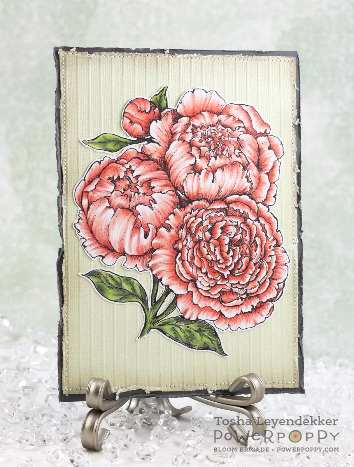
A gorgeous effect that works on vellum is colouring.  Because it has a bit of a slick coating on it, it’s very different from colouring on regular paper.  One way I like to use it is to emboss an image on the front of the vellum, and then colour on the back.  There’s two reasons for this, one - Copics shouldn’t touch embossing lines as it will clog your nibs, and two because it blends very differently than on regular paper so using that opaque nature of vellum allows you to disguise some of those marker lines by colouring on the back.   Here I’ve embossed the lovely peonies from Dynamic Duos: Peonies & Tulips with white embossing powder on vellum.  


Here you can see the back of my vellum from the card above where I’ve coloured.  The markers really do blend well on vellum, but you definitely get a stroky sort of look.  But once you turn the vellum over, that really gets muted and it still looks great.  So, there’s two benefits to this, one, you don’t have to be as particular about your blending and strokes, and two you get to use really bold colours and they’re muted slightly on the side of the vellum that is showing.  


Here you can see the difference in what the right-side-up side looks like.  


And here’s a close-up of the finished design with a lovely word die, sparkling ribbon and rhinestones. Always a lovely way to use vellum, and a great style to have in your creative toolbox.  

2.  Softening Coloured Images


I love bold colours, I can’t help myself.  I love colouring with bold colours too!  But, there are times when you want to create a mood or tone that’s softer.  A layer of vellum is the perfect touch.  I knew I wanted to make these gorgeous Ranunculus flowers into a card that could be used for a sympathy or thinking of you theme.  Well, bold orange really doesn’t work for that does it?   


Just layering vellum over the design shows how it softens and mutes the boldness of the colouring that’s perfect for the theme of the card I’m creating.  

Here’s the finished card design with the added sentiment and framing. It’s like we’ve gone from shouting to whispering.  


Perfectly peaceful.  

3.  Layering Vellum 


Another neat way to use vellum is to layer it to make a great statement.  Here I’ve used Power Poppy’s Sassy Succulents set and heat embossed three layers of the hen and chicks image.  Then I carefully cut out progressively smaller areas of the image so that I could stack them together and create dimension.  The one thing that’s important to note about vellum is that because of it’s transparent nature, you have to watch how you adhere it.  Whatever you use will often show through. So you can tell that I’ve disguised the pop dots between the layers with some enamel dots.  With vellum you have to be a bit creative on how to adhere it in a way that doesn’t show.  


That dimension is so great, and the transparency of the vellum still shows through some of the green of the cardstock.  

4.  Vellum Accents


Vellum is perfect for those little touches to accent a card.  Here I’ve created a design with two Power Poppy sets, Good Thinking:  Love Notes, and a brand NEW digi releasing today called Follow Your Heart.  I gave this one a bit of a scrappy-collage feel with embossing paste hearts, words and images and then that pretty vellum mini-envelope and heart.  


Vellum accents could be any little elements that add that extra interest.  Think die cut leaves, hearts or flowers etc.  

5.  Vellum Sentiments


Lastly, I have a very Clean and Simple design that demonstrates how vellum is perfect for adding soft sentiments to your designs.  On this Valentiney card I’ve embossed Big Scripts onto vellum and made a sentiment panel.  It serves another purpose because it also softens that section of the designer paper - just like it would a coloured image underneath.  I’ve sewn the vellum on to hold it in place, but also added little bits of adhesive underneath my accents so it won’t be seen.  


One thing that’s very important to note about embossing on vellum is that because it’s such a staticky material, I always use my embossing buddy on the vellum before I emboss.  It prevents the embossing powder from sticking where it shouldn’t.  I consider it a must working with embossing on vellum.  

Oh, there’s just so many ways you could use vellum on your cards!  I’ve only covered a few, but I hope you play with this lovely style of paper and see for yourself how versatile it is!  Thanks for joining me today!  

Christine