Showing posts with label Big Scripts. Show all posts

Monday

The Blossom Challenge Goes Sentimental


Hello Friends and Welcome to the August edition of the The Blossom Challenge.  I’m Christine bringing you this month’s The Blossom Challenge, and we’re Going Sentimental, focussing on Power Poppy’s beautiful selection of sentiments.  

Today I’m bringing you two inspiration cards with Sentiments as the focus.  

First up is a design I made for a recent wedding.  


For a lot of years my husband and I were youth pastors and it’s been fun to see our former students get married over the years.  This wedding was a delightful one with the bride from Indian-Canadian descent and the groom from British-Canadian descent, the mix of cultures and colours at the wedding was gorgeous.  This palette reflects the colours in the wedding of orange, pink, coral and red.  I’ve utilized two beautiful Power Poppy sets,  Hummingbird Paradise as the beautiful floral frame, and then one of my ALL TIME favourite polymer sets from Power Poppy Big Scripts.  Did you know that this set features hand drawn sentiments by Marcy?  I just love her scripty writing.  

To highlight the sentiment I embossed it on white cardstock, then sponged warm shades of Distress Oxide Ink, Seedless Preserves and Abandoned Coral around it, wiping the ink off the sentiment once it was done.  The floral frame is fussy cut out in a windowed design.  

Next up is a Clean and Simple design.  


Dear friends of ours move away today to another city in the province.  We are going to miss them terribly.  Over the years we’ve watched them grow from a newly married couple to a family of four.  We’ve shared a love of creativity and the mountains, so this design is a bit of a nod to our friendship, and the fact that they are moving closer to the Rockies.  Similar to the first card, I created a background of a sunset sky using Distres Oxide Inks: Tumbled Glass, Wilted Violet, Abandoned Coral and Seedless Preserves, spashed some water on the background, then embossed this awsome encouraging sentiment from Power Poppy M-Powering Words (currently sold out in polymer) onto the beautiful colour of the background.  I used a framed arch die to accent the sentiment, and then hand drew in a silhouette of our favourite mountain range in Canmore, Alberta, the Three Sisters, filling it in with a black Sharpie, and added a punch-cut sparkly paper moon.  

Now how about some phenomenal Sentimental inspiration from The Bloom Brigade?  


and Me, Christine!

Now it’s your turn Power Poppy friends!  Your challenge this month is to create something “Sentimental”  where the focus is on the sentiment.  We’re inviting you to think about creative backgrounds, stencilling, framing the sentiment with other sets, or creative uses of patterned paper and dies.  You can use any Power Poppy set as part of your design to be in the running for our monthly prize!  

To sweeten the deal Marcy has discounted a number of her Fall themed Sentiment sets (and a few extras) for you HERE.  Did you know there are also two sets in the sentimental family that are FREE?!  I Can Do All Things and Let It Be.  We’re making it easy for you to play along!  

Add your link at the bottom of the post for your chance to win a $20 Gift Code to the Power Poppy Store!

Would you like to know who last month’s The Blossom Challenge: Christmas In July winner is?    Random.org picked Amanda!  Congratulations Amanda!   Please email Marcy at bloom@powerpoppy.com to collect your gift code!  

Looking forward to seeeing all of your Sentimental Creations!

You are invited to the Inlinkz link party!

Click here to enter

Tuesday

Creative Confetti: Let's Take 10!


Hello Power Poppy Fans! Since we are in the thick of fall and a lot of us are still getting used to more structure and trying to enjoy this beautiful season, I thought we'd try to focus on a kind of card that we could ALL learn to create. What card is that? The quickie kind of cards that are fun to whip up but don't exactly look like you just took 10 minutes to assemble! And that, my friends, is what this week's Creative Confetti Challenge is all about! 


HOW TO PLAY: Create a card in a jiffy with a more clean and simple design -- one that's easy to mass-produce and can be created and mailed in the same hour! 

Let's get on to my creation! 


You can see above that my MISTI stamping tool and Power Poppy's Big Scripts stamp set (on sale now for $9.99)  are two things at the center of my 10-minute card. I also decided to focus on my colors - card stock, ink, embellishments - before I got to creating. I wanted to make sure that everything was a perfect match before I got creating. 


Once I narrowed that all down, I lined up my cardstock in the MISTI and then, after every color, I wiped off my stamp and moved my paper down three lines on my MISTI, keeping my paper vertically even as I went. These inks are all really old colors. Do you remember Vivid! ink? Well, I have the whole line with reinkers and I swear, I have had them for close to 20 years. I remember when I started stamping saving up to buy a few ink pads a month to build up my collection. ;-) Ahhh... memories!
Here's a closeup! You can see, when I was done with the linear stamping, I die cut my wonky rectangle and trimmed the coordinating cardstock to give me 1/8" around the outside. Add some decorative polka dot paper, add a sentiment from the Poppy XL clear set. Add some sequins and... ta da! Done!


This one is an easy peasy design that you can do in almost any color scheme to let a friend know that you are thinking about her! Sometimes the message is more important than the time it took to create a handmade card, don't you think?

So, why don't you try your hand at a quickie card and join me this week? Remember, each and every link up with our linky below is one more chance at a $25 gift certificate to the Power Poppy Shop! So, let's see what you've got!

Until next time!
~Julie

You are invited to the Inlinkz link party!
Click here to enter

INTRODUCING.... Hues to Use!


Hello Peeps —Top of the mornin’ to you all!  You know those colors that just SING to your heart? The ones that make that small corner of your mouth just start to move upward -— so much so, that before you know it you're in a full-blown SMILE mode? Well folks, Tuesdays at ‘The Blog’ are about to get a whole lot more colorful and creative!

WHY, YOU ASK?

Because we are about to unleash a color intervention with our brand new feature.....


We’ll take a trigger from Marcella’s own Instagram and spark a wash of color with our HUES TO USE post each Tuesday! I have to say the graphic above just makes me giggle. Only Marcella would pull over to snap a photo of a motel sign —just because the typography moved her! ;-) Just in case you wondered, this mid-century motel on US 62 looks like colorful pieces of candy nestled among the trees and comes complete with an Almond Joy waiting for you on your pillow! Want to get closer to town? Take the trolly service to historic downtown Eureka Springs, Arkansas a mile away. If you’re up for a real challenge, the Joy Motel is actually up for sale! This candy-coated retro goodness could be yours...

Well, after you make that call, get your fingers inky and share these bright and jaunty shades of cool water, antique rust and beam o' sunshine! What are those shades, you say? Just use the photo as your guide and have a little fun in the process!

And just to kick off Tuesday’s “Hues to Use” festivities, here’s a peek at the two — yep two — cards that I made!

CARD #1


Well, when you think sunshine, who can refuse the splash of happy found in Power Poppy's digital stamp set Cuppa Buttercups? I just had to use this little number for this challenge. I colored it up with Copic markers and used Y13, Y00, YR04, YR09, G24, G20, BG11, BG10, BG000 and BV00 and BV0000 to shade underneath the cup. Mat it up with some punchy Stampin' Up papers, add some embellies and bam — done! 

Here’s a close-up! You can’t see it really, but each center of each flower has a little razzle dazzle added thanks to glitter glue! 


CARD #2


For this second card, I was lucky enough to find some arrow decorative paper (also Stampin' Up) in just the right colors to play off the Joy Motel's snappy arrow sign! You can see, this is mostly just an explosion of decorative paper mixed with the Power Poppy stamp set Big Scripts!  I created the drop shadow effect by stamping the word “Hello” first in Morocco Memento Ink and then, I cleaned my stamp and then shifted my stamp and inked it with Straw Vivid ink. Because the stamp is clear, it was easy to see the offset before my ink even hit the paper!

Here's a closeup so you can see what I am talking about! 


And that, my friends, is it! I hope you use these three peppy shades when you create this week! If you do, be sure to link up your creation so I can have a lookie at your craftiness! Can't wait to see YOUR take on HUES TO USE! ;-) Link up your card below and keep the inspiration going!


See you back here real soon!
~Julie

Monday

Backgrounds and Borders ~ Using Power Poppy images in unexpected ways


Hello Power Poppy friends!! Tosh here today to inspire you to use Power Poppy images in unexpected ways.  I have 4 projects to share with you, so make yourself comfortable and follow along.

My first includes a stamp from the Play Ball set that really got me thinking.  When I saw the baseball stitches stamp, I thought...why can't I just use one side of the stamp and make it look like a blanket stitch?  I was explaining to my dear friend Katie (who just happens to be a Power Poppy Bloomie) that I wanted to use the flowers in the heart vase from the Folk Heart set with the blanket stitch, and that I wanted it to look like a quilt panel.  She asked if I'd ever seen Redwork quilts.  Well, I hadn't, so I checked out Pinterest, and found some fabulous examples.  And yes...that was exactly the look I was going for.  Here are a couple of links to some beautiful Redwork quilts that I used for inspiration:  Rosalie Quinlan Designs, Rosalie Quinlan Designs 2


I started by diecutting a square and stamping only half of the "baseball stitches" onto the edges using Love Letter Memento Ink.  Doesn't that look just like a blanket stitch?  I got giddy after seeing how it turned out.


I then decided I wanted a scalloped border.  So I traced the square die onto cardstock, and stamped the small heart, from Power Poppy's Good Thinking Love Notes set, around the entire square, just leaving to two top "bumps" from the heart showing.


Don't they look awesome together?  I was so happy with how it turned out.  I added a few extras to really give it the "quilt panel" feel too:  I scored and burnished the Folk Heart image to make it pop.  I also burnished the whole back side of the panel to give it texture like it was fabric.

I then embossed the background to give the feel of quilt stitching, and actually sewed around some of the edges and panels.


Next up is my tulip card.  I had some fun creating a "shabby elegant" border using the tire treads from the Power Poppy Move The Soul set.  I started by stamping the tulips from the Dynamic Duos: Peonies and Tulips set with Tuxedo Black Memento ink onto X-Press It cardstock and coloring it with Copics.  I then embossed an oval shape around them using an oval die and a diecutting machine.  Then I took the tire treads and stamped them randomly around the oval using Versamark ink.  Lastly, I rubbed the Versamark pad over the edges to give a frame to the whole image and embossed it all with gold embossing powder.  I really love the "shabby elegance" that the tire treads gave the frame.


Now, you've probably seen many variations of this next card.  I just took 3 different sentiments from the Power Poppy Nice Things to Say stamp set, and stamped them onto a precut rectangle that I taped off the edges of, so I could maintain the border.  


After stamping the sentiments, I photocopied it onto black cardstock so I could Minc it with gold foil.  (For some background information on how I use the Minc Machine, click HERE.)  I love how clean and crisp it turned out.  To finish it off, I added a "So Happy For You" sentiment from the Dream Wedding set, as well as a couple of gold cardsock punched flowers.

Below is a look at how I taped off and stamped the panel before Stamping it.


And finally, my last card.  This one was just plain fun!!  I took the "smoke" image from the Power Poppy Move the Soul set and randomly stamped it with three different Ranger Distress Ink colors:  Peacock Feathers, Twisted Citron and Squeezed Lemonade.  After I had my background, I splattered some diluted black acrylic paint over it and stamped the "hello" sentiment from Power Poppy's Big Scripts set.  Aren't those "splotches" fun?!?!?


Whew...right!?!?!  That is finally it.  I had some fun using these stamps in unique ways, and I hope I've inspired you to look at some of your images in different ways!

Thanks for sticking with this long post!

   Happy Stamping!!

Inspire Me Monday: Sentiments in the Spotlight!


Hello all! Julie here with another “episode” of Inspire Me Monday!

How many times have you made a card, and then had to cross everything you had in the hopes that your card arrived at its destination in one piece? Well, today I am not only going to show you a few cards that are very mail-friendly, they use a different kind of thought process that puts your sentiments in the spotlight!

Here's a peek at what we are making! The decking out will come later -- so you'll have to stick with me to see how this all turns out! ;-)


Every single one of those above is a single layer. Fun right? So, let me share some of what I did to create these looks!

ONE BIG HELLO! 

For the first card, I started by stamping the word "hello" from the Big Scripts stamp set. Then, I took a clear ruler and a fine tip black marker to make the lines above and below my sentiment. I will say that I did run the marker over the ruler a couple times, just to make sure the line was solid and not broken in any way.


Afterward, I added some dimension thanks to a paper piercer and template. I think it just helped make this area stand out a bit!


Now the fun begins! I used a Post-It note to mask my sentiment section...


Then, I took the Ranunculus from the Dynamic Duos: Foxglove and Ranunculus stamp set and stamped it above the black line using blank ink and then moved the Post-It to cover the other direction and then I stamped the lower portion of the ranunculus bunch to make it look like the bunch was shooting out from underneath my sentiment section. See?


And, after it was all colored up with Copic markers, I layered it on some distressed looking pink decorative paper and added some minor accents with glitter glue and rounded corners.


LOVE & THANKS

For the next card, I wanted to use some of my dies as stencils. This rectangle die is a super simple shape but just think of the shapes you could use as word windows! Any shape and every shape!! All it would take is a steady hand with your fine-tipped marker!


I started by stamping my sentiment, then secured the die using bits of washi tape. I traced the inner part of the die using the same fine-tipped black marker. 

Ta da!


From there, I made a mask of that box simply by tracing the inner part of the die onto a Post-It Note and cutting it out....


After that, I stamped the branch from Power Poppy's Happy Crabapple clear stamp set several times over top until I covered the entire front of the 4" by 5.25" piece! I colored with Copic markers, matted it up and here's a peek at the finished card! As you can see, I accented the inner portion of the box with some ivory Copic Markers and some paper piercing, just to make that pop a little bit more. I also -- which you can't see really well -- accented my flower centers with a wee bit of glitter glue to make it sparkle. While I have three layers, this one is still extremely "mail friendly!" 


SENDING LOVE

This last card I whipped up by creating a little sentiment window with a punch! I started by stamping the sentiment from the Dynamic Duos: Glads and Gerberas. Then, I matched it up with just the right circle punch and created a mask by punching a circle out of the top sticky part of a Post-It Note, covering the sentie! You can see, I set this up in my Misti Stamping Tool and there's a reason for that! 


I am going to start by stamping the Gerbera Daisies from the set over top in black...


 Now, the fun part! Because I used my Misti, I am going to remove that mask, clean off my stamp and ink it up using a faint pink ink (Memento Angel Pink) and stamp right over the top! 


You can barely see the pink, but in real life it just gives it that extra bit of dimension! From there, I punched the circle out of a heavier card stock and let my fine-tipped pen do some work again as you can see in my finished card!


While I added some glittery enamel dots, those little guys are still pretty flat making this another card I can pop in the mail without a worry! So there you have it -- three ways to make your sentiments stand out -- with Post-It Notes, Punches and Dies! 

Thanks for popping in and joining me for another Inspire Me Monday! I hope you dig through your supplies and see what you might be able to use to put your sentiments in the spotlight!!!

Have a fabulously creative week!
~Julie


Inspire Me Monday: Inspiration is Everywhere!

Happy Monday everyone!  I’m Allison Cope, your hostess for Inspire Me Monday this week!

This week I’m going to share some pieces of inspiration with you and how I turned them into creative and fun card ideas.

If you are like most crafters, you browse the web, other crafters blogs and especially investigate Pinterest for things to give us a creative awakening.  Not only do I look at other crafters cards on Pinterest but I look at design, fashion, food and all kinds of different areas looking for images to spark that creative endeavour.

So I went through my Pinterest board entitled “Inspiration” and I came up with 3 very different pins to get inspiration from, to begin the card making process.

Teal Floral Cake


https://www.pinterest.com/pin/25332816628358934/

One of the first images I came across was this stunning teal coloured cake with bright yellow, white and soft grey blooms.  I just couldn’t resist drawing inspiration from not only the teal colour but also from the motion of the blooms laid out across the layers of cake.

So I began my card by stamping the larger cluster of Hens & Chicks from the “Sassy Succulents” stamp set.  I added in a few single succulents too. I tried to mimic the movement created by the blooms on the cake.


I created a bold teal back ground of Copic Marker for my succulents but decided to only highlight a single, large hen & chick.  I pulled some yellow from the inspirational cake florals but decided to add some hues of purples, pink and even some lime greens into the plant using Prismacolor Pencils.

I just love the flow and movement created by the succulents on this card!

Floral & Striped Lap Top Bag


https://www.pinterest.com/pin/25332816629275781/

Next I found an image of this vivid handmade lap top bag.  The orange striped fabric just drew me in and I love the little simple yet colourful blooms on the white back ground of the top fabric.

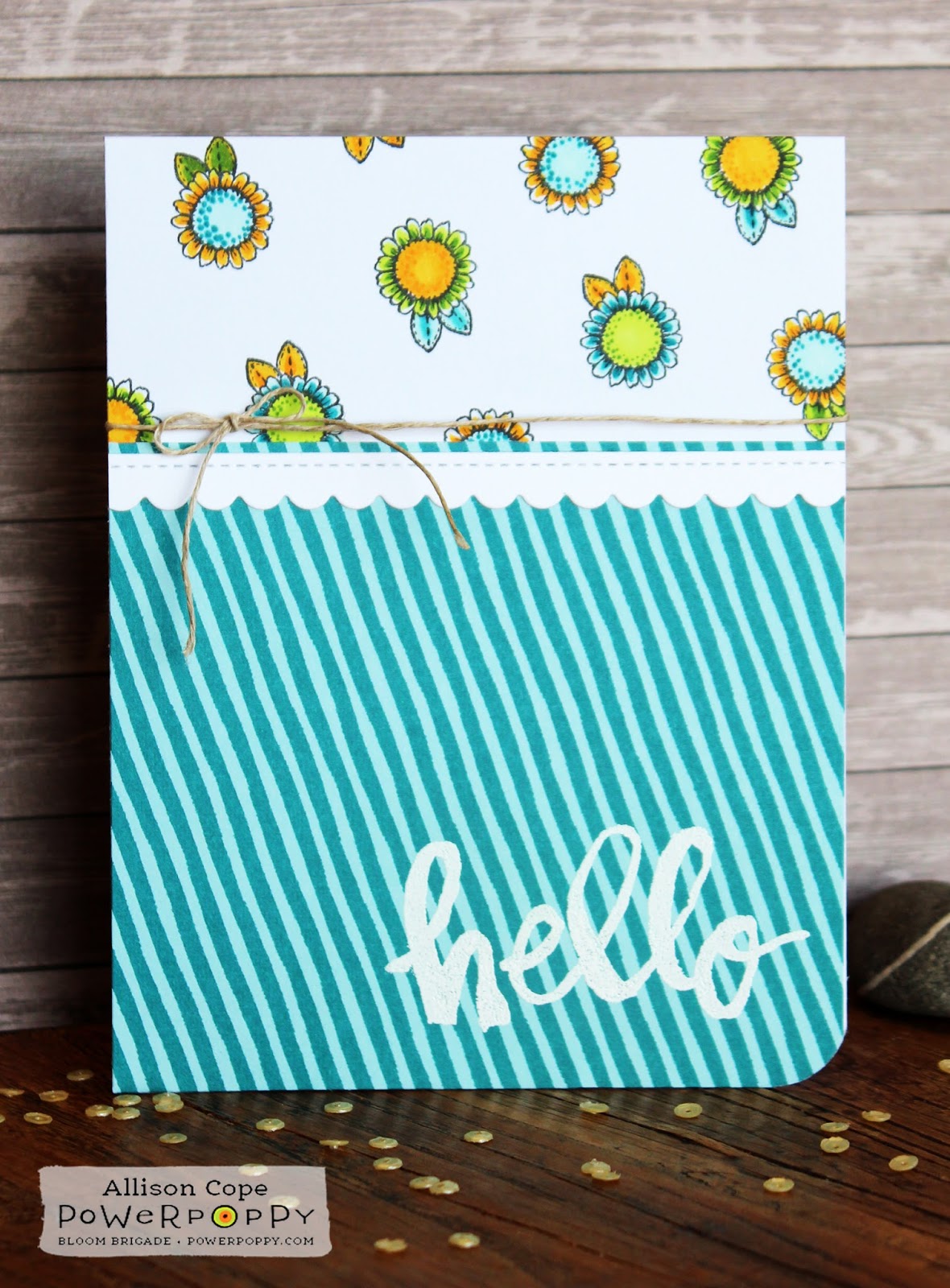
To begin this card, I knew I wanted to use the basic design of the bag; stripes on the bottom and little blooms on the top.  So I found a fun striped paper and then pulled the teal from the strip into the colour of the blooms.

Instead of using a vertical strip like the bag, I chose to add some more whimsy to the card and put my stripes on an angle and then also make my blooms from the “Folk Heart” stamp set work the same angle.


To finish it off, I added a bold embossed sentiment from the “Big Scripts” stamp set at the bottom.

I just love how those lines of amusing little blooms just sprout from the stripes at the bottom!

Floral Skirt


https://www.pinterest.com/pin/25332816629001196/

Fashion is another way to be inspired to create!  I found this fun skirt pinned in my board and knew that the front panels would make a cool design for the front of a card.

I began by cutting two identical rectangular panels of water colour paper and stamping the single rose from the “My English Rose” stamp set randomly all over both panels. I chose to pull 4 different colours of ink from the skirt; a lighter dusty blue, a darker sky blue, a fuchsia purple and rich, dark purple.  I used all 4 colours randomly when stamping and filled them in with the same watered down inks.

I trimmed my panels to create 2 overlapping pieces with peek-a-boo points sort of like the skirt, added them to a purple card base and added a simple bow to finish it off.


Fashion inspiration has a great way of sneaking itself into our crafting lives too!

So I hope I’ve inspired you to think outside the box today and view not only the net but the sources around you.  The oddest things may spark your creative mind; a bill board, a magazine ad, a logo or even a painting hanging on a shop's wall!  Inspiration is everywhere!  Keep those eyes open!

Happy stamping & creating everyone!

~ Allison Cope ~


Supplies:

You’re Special Succulents 
Stamps: Power Poppy (Sassy Succulents)
Cardstock: Recollections (110lb White), MFT (Ripe Raspberry)
Inks: Memento (Tuxedo Black), Copic Markers, Copic Blending Solution, Prismacolor Pencils, Versamark
Embossing Powder: Stampendous! (White Detail)
Patterned Paper: MFT (Tranquil Textures 6x6)
Copics: BG32, BG13 
Prismacolors: Canary Yellow, Chartreuse, Grass Green, Carmine Red, Parma Violet, Mulberry

Sunflower Hello
Stamps: Power Poppy (Folk Heart, Big Scripts)
Cardstock: Recollections (110lb White)
Patterned Paper: MFT (Painted Prints Smitten 6x6)
Inks: Memento (Tuxedo Black), Copic Markers, Versamark
Embossing Powder: Stampendous! (White Detail)
Dies: Pretty Pink Posh (Scallop Frames)
Twine: Darice
Copics: BG10, BG09, Y15, Y17, YG01, YG17

Lavender Roses
Stamps: Power Poppy (My English Rose)
Cardstock: Arches (140lb Cold Pressed Water Color Paper), Bazzill (Sour Grape)
Inks: Simon Says Stamp (Surf Blue, Steel Blue, Wisteria, Hot Mama)
Tool: Tim Holtz (Piercing Tool)
Ribbon: Offray