

Hi all and welcome to Inspire Me Monday with yours truly.... Julie! Long ago... when I was teaching classes at my local stamp store, one of my favorite classes was to unveil new stamps and then lead a class to show people three or four ways to use that image. I thought it would be fun to not only have a new stamp but be inspired to create with it in a multitude of ways!

Card #1
For my first card, I wanted it to be somewhat straight up and simple. I printed this image pretty much full size, so it would cover a full card front. Then... I picked up my Copics and went to town!

After I colored my base image, I decided I wanted to make the sentiment somewhat of a focal point. So, I printed and isolated one of the daffodils on the far left side and cut and colored just that portion so that I could pop it up and set it on top of my sentiment for a little added dimension. See?

Card #2
Moving on! I have always been a sucker for a monochromatic card. I think they can be done in a way that keeps some dimension and interest. For some reason, I feel one color seems to have that peaceful and serene feel.
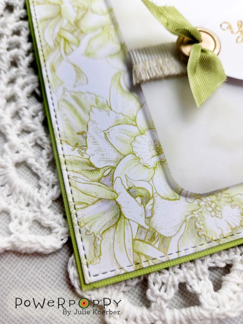
Here's a little bit of a closeup to show that I did color up the flowers just adding a little dimension with Copic Markers. I used just two colors -- G20 and BV0000. I really like how it turned out! From there, I added a vellum die cut, some gilded fringe ribbon and a sentiment that was embossed using detail gold embossing powder. Add a button and some ribbon and... voila!
I should mention with this card and the first, I did use a stitched edge rectangle that is very close to the size of my card front, allowing just a sliver of the card base to show beneath it.
Card #3
This last card is one of the no-line options offered in the set. I have to tell you, I always get nervous coloring no-line images. You have to think about the depth you are adding and doing it in a way that still looks soft and inviting. I ended up coloring up the image and then adding some depth using a fine tip Staedtler Triplus marker.


So, there you have it! One beautiful image done up in three very different ways! Let me know if a tutorial like this is helpful. I plan to join you every second Monday of the month so we can keep up this tradition if you like!
Thanks so much for stopping by. I hope you have a beautiful and creative week!
Until next time,
Julie
9 comments:
Beautiful new image for Spring! LOVE your group of cards, Julie. Fabulous coloring!
Wow! Excellent set of cards, Julie! So beautiful! Inspire Me Monday is going to be FANTASTIC!
What a great comeback for you and Power Poppy!So good to get some inspiration.
Gorgeous! Your coloring is fabulous, but I do really like the card idea in the light green with minimal coloring. I might have to try that sometime but with a physical stamp and ink. Thanks for sharing!
These are kit very! And that monochromatic card…I can’t wait to try that!
Jules....such beauty! You always do sets like this so well, I love variety of ways you showed off this image. And I agree that the PS Elements design is just amazing! Those touches of purple are perfect!
Oh my goodness!! This image is beautifully colored, you truly brought these gorgeous blooms to life, Julie.
Thank you for sharing.
Stay healthy and safe.
Maria.
Three stunners Julie!!!
Wow Julie these cards are stunning! So glad to see you back.
I only received the mailing yesterday (11 May), I don't know why I got it so late, but I'm so glad I received it. I missed the great Power Poppy posts.
And what a beautiful new stamp set!
I love all three of your stunning cards but my favorite is the light green monochromatic one.
Thank you so much for sharing your inspiration, stay safe and have a wonderful day.
Post a Comment