

Hi, my name is Catherine Anderson. Welcome to Power Poppy’s Inspire Me Monday…and my very first blog post! (This is so exciting! Is my typing shaking? Shhh-h! Don’t tell. It’s a secret!)

Are you ready for Father’s Day yet? Moms are easy, right? Flowers, flowers, flowers. We women never get tired of beautiful blossoms. But what about those Dads in our lives? Well don’t worry, we’ve got you covered! Marcella has my FAVORITE guy stamps and today I’d love to show you how you can combine three of her best digis into one fabulous card for that first man in your life.
Fly Guy Background Image
Let’s start with this winner, “Fly Guy.” What red-blooded man doesn’t love to tramp around in nature, playing with icky worms and hooks in an attempt to catch “the BIG one”…which usually gets away? Well, not anymore, friends! Today is Dad's lucky day and he’s reeling in that monster for supper. (I know, I know, we usually have to order pizza after a day of foraging for food…)
The finished size of my card is 6” x 7” so I enlarged the “Fly Guy” digi to 120%. I printed the design in light grey on Cryogen Curious Metallic 89# white cardstock. I LOVE this stuff! It has a subtle sparkle and is great for Copics, yet has enough tooth for colored pencils.
No-Line Printing Tip: I’m no computer geek, but on my Mac even I can do this! Go to “Tools” on the top bar, then click on “Adjust Color.” A box will pop up that allows you to adjust the exposure and contrast levels until you get the lines dark enough to see, but light enough to disappear once colored.
No-Line Printing Tip: I’m no computer geek, but on my Mac even I can do this! Go to “Tools” on the top bar, then click on “Adjust Color.” A box will pop up that allows you to adjust the exposure and contrast levels until you get the lines dark enough to see, but light enough to disappear once colored.

Mask the man, rocks and water with “X-Press It Mask It” low tack matte masking film. Using regular Distress Inks, color the sky with “Tumbled Glass” and then deepen with “Evergreen Bough” along the shoreline and behind the man to give the aura of a woodland setting.

How to handle the water seemed like a bit of a quandary. I have a degree in Graphic Design, but everything I know about Copic Markers I learned from Amy Shulke over at Vanilla Arts. She’s AMY-AZING! But, alas, Amy hasn’t taught a Patreon class about water since I joined. However, she did wisely advise us to start with the hardest thing first, because if you screw it up, there is less to throw away. Thus I started with the reflection. And you know what? It was easy-peasy! Don’t fret about the process or bother to draw it out ahead of time. Just swish some of the colors from the various aspects of the man’s figure onto the cardstock. It doesn’t have to be very accurate…just enough to give a sense of the guy. Reflections in moving water are supposed to be distorted. TIP FOR TRANSLUCENT WATER: Continue color of the hip waders and rocks slightly below the water line so it looks translucent instead of murky.
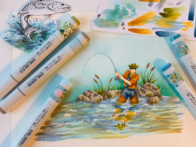
Next I swished my colors for the water around (and gently) over the reflection. This helps to blend the two areas together. Color over the fish that comes with the “Fly Guy” digi as we will be using a different image for this card. Leave some white cardstock peeping through for highlights. Don’t over think the water process…it’s very quick and easy. The only thing you really need to keep in mind is to swish horizontally. (Unless you happen to be illustrating Moses and the parting of the Red Sea. Then vertical flicks would be appropriate!)

Leaping Trout
Next I tackled the fish (no pun intended!). The spectacular digital stamp used here is “Leaping Trout” and it was also printed on the same Cryogen Curious Metallic Cardstock. The goal was to create a sense of struggle between man and fish, so I enlarged the trout image to 120%.

DESIGN TIP FOR COMBINING STAMPS: Audition several sizes by printing them on regular copy paper first. Roughly cut them out and compare sizes with your background image. In this case, I wanted the man in the distance and the fish to look like he is bursting out of the scene. Therefore, I wasn’t timid with size.


Want to know where I learned that trick? From my husband! John is an avid saltwater fisherman and last year he caught a gorgeous grouper. When I took the picture, John held the fish way out from his body. Suddenly this 8 lb. grouper looked three times bigger! Last month John caught a 65”, 48 lb. mahi-mahi off the coast of Key West. He was so exhausted after the fight that there was no dangling that baby way out on his fingertips. It actually was as big as it looks!
After coloring the “Leaping Trout”, I gave the whole fish a coat of “Wink of Stella” in clear. Have you ever tried that stuff? Oh, my! Love at first wink!!! So perfect to make that rainbow trout glisten!

The Reel Deal Tag
Ever wonder where on earth to use that FYG1 Fluorescent Yellow Copic marker? You bought it to complete your set, but it’s been sitting reproachfully in your case ever since, feeling a little ignored. Well, dust that marker off and use it for the fishing line in this manly image! The fishing hat scene and “Happy Father’s Day” sentiments were both created using Marcella’s digital stamp, “Reel Deal." (I hand lettered the “Fish Story" sentiment on the front of the card and the “Whole Wide World" one on the tag.) The hat image was printed at 80% in order to fit the 3 ¼” x 6 ¼” tag.
Copic Markers and Prismacolor Pencils
Part of the fun is picking your own colors and employing what supplies you have on hand. However, if you are curious about what I used, scroll down to the bottom for a detailed list.
 The Fly Lure
The lure action is a fun detail when the fish bounces on his Wobble Spring! Cut about 3/8" from the end of a feather and put a dab of glue on top of the spine. With a strand of red embroidery floss, make a tiny loop which will later attach to a jump ring. Add a bit more glue and wrap two strands of red embroidery floss just around the top. Secure with a little more glue on the back. Hook a couple of jump rings onto the top loop and then punch a tiny hole in the fish’s jaw. I thought I had jump rings in my stash, but I didn’t and so made my own by cutting up a dangle earring fastening.
The Bulrushes
 Or cattails…whatever you call them in your neck of the woods! I grew up In Prince Edward Island, Canada and there they are known as "bulrushes." When I moved to New York, nobody knew what I was talking about because they call them "cattails." But I am pretty sure that the Islanders are right. Nobody ever heard of the story, “Baby Moses in the Cattails. And if its good enough for the Bible, it’s good enough for me! By the way, this is a La La Land Crafts die, called, mistakenly ahem, “Cattails.”(...must be New Yorkers) You know how bulrushes get fluffy? Cut the fuzz off the bottom of a feather and glue it to the back of the die cut to mimic this perfectly!
Folding Box Card
Jennifer McGuire has an excellent tutorial video of how to make a folding box card, here:

Adapting her basic instructions, I cut two (6” x 9”) pieces of solar white Neenah 110# cardstock. Using “Frayed Burlap” Distress Ink, I applied color to completely cover one side of each piece of white cardstock. On the other side, color was applied to just the first inch or so of each end. Don’t worry about getting it all even…the finish should look rough because it is supposed to be burlap, not velvet.
With “Vintage Photo” Distress Ink, stencil the burlap design over the “Frayed Burlap” ink.


On one piece of the burlap cardstock, cut a centered opening with a rectangular die, 4 ¾” x 5 ¾”. Using the Score-Pal, crease fold lines at ½" and 1” on each of the long ends. Using your bone folder, accordion pleat these creases.
 Front Mat
With olive cardstock, cut a 6” x 6 7/8” mat, then remove a 4 ½” x 5 ½” rectangle from the center. Glue behind card front. Cut a 2 ½” x 1 ¼” piece of cardstock to glue into the lower left corner, behind the mat. This will later be a sturdy attachment site for the Wobble Spring (Hampton Art).
Dimensional Front Sentiment
I hand lettered this sentiment on a piece of cardstock 3/8” x 3 ¼”. Lay the strip upside down on a foam mat, then spritz lightly with water. With a ball stylus, gently make a zigzag stroke down the length, pressing softly into the foam. This will slightly cup the cardstock. Let dry, then glue just the ends in place.


Creating the Tag Pocket
Use the leftover rectangle cut from the burlap card front. Score creases ¼” in from both long sides and one short side. Cut the two bottom corners off diagonally to reduce bulk for gluing. Crease the three edges towards the back side. With a black marker draw stitches around the pocket edges and hemline. Set pocket aside. It will later be glued onto the back of the card.
Assembling the Card
Position card front opening over background scene and, once satisfied with the placement, trace top and bottom edges. Trim scene to 6” x 6 7/8”. Glue onto inside of back cover.

To create floating tabs for the scene, cut cardstock strips 3/8” x 4". The top strip will hold some die cut pine boughs (La La Land Crafts, “Winter Branches"). Color it with Distress Ink in "Tumbled Glass,” to match the sky. Die cut pine boughs and glue in desired position. Trim excess cardstock strip. For the strip that will float a single bulrush, color it in the same way you did the water so it will blend in with the background if the card is viewed at a side angle. Glue these strips onto the top and bottom of the card hinge, right side.

Glue front hinges to back hinges. Position "Leaping Trout” so that it looks like it is on the fisherman’s line. Attach Wobble Spring (Hampton Art) with fish. Glue one pine bough directly onto background image, upper left corner, then glue two boughs and a bare branch on the front right corner of card. Glue three bulrushes behind the lower right mat opening. Position tag pocket on back and glue in place. Bravo, you did it!!!
Give your Dad a big hug from me!
Catherine XO

Copic and Prismacolors (unless otherwise noted):
FLY GUY:
Jacket and Hip Waders
BV23 (underpaint), E99, YR27, YR24 (PC931 Dark Purple, PC901 Indigo, PC1084
Ginger Root)
Skin: BV20 (underpaint), E11, E21, E00 (PC1026 Greyed Lavender, PC928 Blush
Pink)
Hair: Dark Brown Staedtler Triplus
Sunglasses: W9, W7
Denim Overalls: B99, B97, B93, W3 (PC901 Indigo)
Shirt and Hat: YG99, YG97, YG95 (PC901 Indigo, PC1084 Ginger Root)
Reflection of Man in Water: Use one color from each of the various elements of his main image.
I chose YR24, E11, B97, YG95, W7
Water: W5 (underpaint), E84, BG72, B95, B00 and a little YG93 to green it up a bit. (Squiggles of
Sakura Gelly roll Glaze and Stardust pens.)
Grass: (PC109 Prussian Green)
Bullrushes: Staedtler Triplus in Lt. Brown (looks rust) and olive green. For thicker areas of
stalks, you may wish to use YG99, YG97 and YG95.
Fishing Reel and Net Frame: N4, N2. Black Staedtler Triplus in crevices of reel. (PC901 Indigo,
White Sakura Gelly Roll pen)
Net: White Sakura Gelly Roll pen (PC936 Slate Grey)
Fishing Pole: Lt. Brown, Lt. Grey and Dark Grey Staedtler Triplus
Fishing Line: Sakura White Gelly Roll pen (Note: I only did the top part of the line as I wanted it
to lead to my larger fish, not the original trout in the “Fly Guy” digi.)
Rocks: W7, W5, W3 (PC1076 90% French Grey, PC1084 Ginger Root, PC1034 Golden Rod,
PC936 Slate Grey)
LEAPING TROUT
Water: W5, BG72, B95, YG93, B00, Dark Green Staedtler Triplus for splash
lines (Sakura Gelly Roll Stardust and Glaze pens)
Fish Eye: Black and Yellowish Orange Staedtler Triplus, White Sakura Gelly Roll pen
Inside Mouth: E93, E11
Fins: YG95, R02, E51 on some tips
Body: B95 (underpaint), YG67, YG95, E51, R02, R05, R01, E50, W1, W3 (PC931 Dark Purple,
PC901 Indigo, PC1072 50% French Grey, PC938 white, PC923 Scarlet Lake, White Sakura
Gelly Roll pen)
Side Speckles: W5, W3, Dark Grey and Lt. Grey Staedtler Triplus
Wink of Stella, clear: over whole body
REEL DEAL TAG
Grass: W3 (underpaint), YG63, YG61 (PC901 Indigo, PC109 Prussian Green)
Fishing Rod:
(Cork) E55, E33, E31 (PC931 Dark Purple, PC901 Indigo, PC938 white)
(Wooden) BV23 underpaint, E99, YR27 (PC931 Dark Purple, PC901 Indigo, PC938 white)
(Loops) Lt. Brown Staedtler Triplus
(Metal) N7, N5, N3
Reel: N7, N5, N3 (PC931 Dark Purple, PC936 Slate Grey, PC938 white)
Fishing Line: B000 (underpaint), FYG1 (PC1004 Yellow Chartreuse, PC1026 Greyed
Lavender)
Hat: B95 (underpaint), YG67, YG95 (PC901 Indigo, PC938 white, PC1084 Ginger Root)
Hat Band: E55, E33, E31 (PC1076 90% French Grey)
Grommets: Black Staedtler Triplus
Fly Lures: various Staedtler Triplus
Edges: Antiqued with Distress Ink "Old Paper"
16 comments:
This is incredible, Catherine! Your coloring and the details are fabulous. Thanks for the tutorial as well!
It's beautiful Catherine. And I absolutely LOVE your water technique!!!
Wow! What an amazing card! You have taken Marcella's stamps to a whole new level!
WOW! You have amazing crazy talent!
Wow Pattie this is awesome!! Good job, I love it!
This is amazing. You have some serious skills. Thanks for sharing.
So talented! 😊. That is so well done and nicely explained.
WOWZERS! What an awesome fishing creation!
Fabulous! I enjoyed seeing the step-by-step process you used to achieve this beauty!
Wow.. I am not a big reader of the blog posts but I wanted to see how you made that amazing reflection and water (made water..hehe)! And oh my goodness, ok I loved your coloring but I throughly enjoyed your writing! The puns and the fun.. unless I am parting the red sea.. haha. The tips on leavingb the white space and printing the images on photo paper. Thank YOU for sharing your knowledge and your talent of making one laugh just by reading! I LOVED everything about it.
Thank you Catherine for this great tutorial! I can't believe this is your first blogpost. You are a natural!!! Great coloring and card design. Love it all!!!
Wow! I got tired just reading this! Used to take time for all this fun work until I started selling my cards and had to resort to quicker cards. But I need to get back to some beautiful work like this. Very sweet card for Dad... Love the little tips throughout your tutorial... Thanks for the inspiration.
Wow, these are awesome Catherine. Thank you so much for the inspiration.
I'll join the crowd and go wow your coloring is amazing you do beautiful work
Absolutely amazing, and the tutorial was fabulous. I look forward to more.
OH MY STARS!!!! This card is just amazing and your instructions were perfection! Love your coloring and your writing style!
Post a Comment