

Have you ever found yourself half-heartedly scrolling through Pinterest, only to hit upon a coloring project that made you slam on the brakes and hold your breath? Once you look closer at the project, you’re blown away by the Copic Marker technique or maybe the texture created by colored pencils or watercolor…
As coloring fanatics, we’d like to think we're drawn to the technical skill and amazing technique. We know great coloring when we see it.
But honestly, what grabs your attention in the first two seconds has nothing to do with skill, technique, or even artistry.
It’s the color palette.
A good color palette is essential to creating an amazing coloring project. Without an attractive and cohesive color palette, no amount of talent or nifty coloring tricks can push your project from mediocre to WOW!
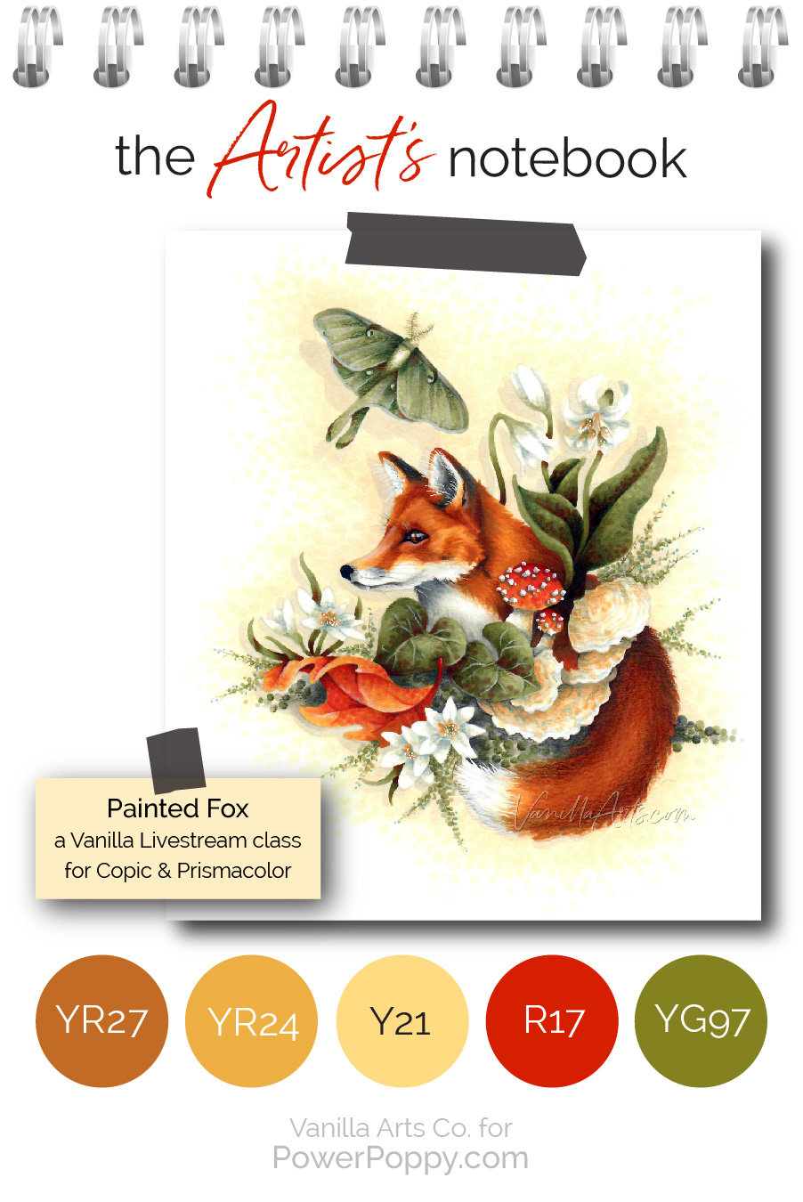
Hello, my name is Amy Shulke and I’m the illustrator and art instructor over at VanillaArts.com. Today I’d like to show you behind the scenes of my latest coloring project, Painted Fox.

Let’s look closer at the color decisions I made for my Painted Fox project. These are things that fine artists do all the time because of training and experience, but they’re easy little concepts! No magic skills required; all it takes is a little extra thinking time. You can apply the same tricks to improve your next coloring project!
Every great project starts with a great color palette.
Even though I draw my own digital stamps, one of the reasons why I teach an advanced class every month using Power Poppy stamps is because Marcella’s illustrations are full of interesting and accurate details which inspire great color palettes.
When you look closely at Power Poppy's The Fox & The Moth digital stamp, you’ll spot real flora and fauna. If you don’t know what species of flower or animal she’s drawn, Marcella often lists the names in the stamp description in her shop. A quick internet search will turn up tons of great photo references that match the items in her drawing.
Photo hunting is the first thing I do when I get my hands on a new Power Poppy stamp. For The Fox & The Moth, I looked for red foxes, oak leaves, any kind of round capped mushrooms, and even shelf fungus.

Here’s the fox photograph which set the color story for my Painted Fox project. Yes, color tells a story. Every color I use in this project helps to describe the feeling of a crisp autumn day. I didn’t invent these colors myself, I didn’t use a color palette website, and I certainly didn’t pick the markers randomly from my Copic caddy. The colors I use came directly from the photograph here.
If a photograph makes you stop and stare, then it’s wise to borrow the colors for your own project.

When a stamp is this lovingly detailed, you don’t need a fancy background to spice it up. What I noticed about the various fox photos I found is that while we think of foxes as being orange, they’re actually golden and russet tones. I’ve chosen a very pale version of the fox fur color and smooshed it into the background. I’ll repeat this golden tint again whenever I encounter a white object in the stamp.
Repeating the same colors makes your coloring look orderly, cohesive, and professional.

I spend most of my time working on the fox. He is the star of the show, so he deserves the most attention and detail. But as I add the greenery around him, I pick up foxy golds and reds with the nib of my green marker and paint that into the leaves. With Copics, painted color can sometimes take a few minutes to develop and become more obvious. I know it sounds strange but adding red and russet into green can look spectacular. Mother Nature does it every autumn and you can do it too!

I continue telling the color story with colored pencils.
Each of my foxy pencils is a bit lighter or a smidge darker than one of my Copic Markers. And notice that everything in the digital stamp stays within the color story. If I suddenly introduced a hot pink flower to the image, that would shatter the spell we’re casting.Now wait a minute.
Before you write this off as way-too-hard…
“Sure, this works for Amy because she’s artistic. Meanwhile I can barely blend two markers without cussing.”
Don’t think like that!
I may be using advanced coloring techniques here but that’s not why this image sings. Skill has nothing to do with it!
The reason why this project grabs your attention is the color palette.

You could color the fox in simple three-color blends with barely any detail. The color would still attract viewers. Remember, you don’t see skill until you pause and look closer. It’s the color palette which initially grabs your attention and it’s the color that makes the heart go pitter patter.
Technique is always secondary to the color palette.
An eye catching color palette can make the worst coloring look better. And no amount of talent can rescue an unattractive palette.That’s what makes color the great equalizer. Even the newest of newbies can find and use a great color palette!
So here’s my Artist’s Notebook challenge for you this month:
All it takes is a little extra web-surfing before you start your next project.Find and use a stunning photo reference to set a color story for your next coloring project.
Don’t just be generally inspired by the photograph. Actually let the photo determine the colors you use. And remember, don’t add to it! Save the random purple flower or pink mushroom idea for a different project with a pink or purple color story.
Do you want to color Power Poppy’s The Fox & The Moth with me?

The Painted Fox lesson covers how to actually use your big binder full of techniques and tutorials that you’ve been keeping for years. Let’s apply these tips wisely, to enhance projects the artist’s way. You can find out more about Vanilla Livestream classes here.
For more articles on artistic coloring and lots of free resources, check out VanillaArts.com. You can watch free coloring demonstrations on my YouTube channel.
And hey, I’ll see you back here next month for another glance into my Artist’s Notebook!

3 comments:
Thanks for this amazing post. Really great advice here.
Great post, I learn always a lot just by reading your tips and tricks. Although I don't have Copic markers or othter alcohol markers, I think your posts can work for any kind of colour medium.
thank you so much and have a great week!
cool, thanks for the ideas and this is really spectacular!
Post a Comment