Showing posts sorted by relevance for query amy shulke. Sort by date Show all posts

Monday

Artist's Notebook: Are You Stamp-Blind? 4 Tips to Open Your Eyes & Improve Your Coloring

Want to improve your Copic Marker or colored pencil coloring? Power Poppy’s guest author Amy Shulke from VanillaArts.com offers artistic coloring tips for Copic Markers or colored pencil. | VanillaArts.com | #realistic #howtocolor #copic

I love to color Power Poppy digital stamps with Copic Markers and colored pencils. But I’m a coloring instructor so I draw and color daily. Your hobby is my day job.

My hobby? I l bake bread. I’m nerdy, so when I bake bread, I geek-out. Old recipes, odd ingredients... I’ve even cultured my own yeast. I enjoy baking the same way you enjoy coloring. It’s relaxing fun.

But here’s the difference: when I make bread, I don’t staple the recipe to every single slice. I don’t announce with a bullhorn “Hey everybody, before you take a bite of my bread, please note that I used Gold Medal Flour and Morton's Salt!”

But in coloring? You advertise your supplies all the time.

And you don’t even realize it.

Want to improve your Copic Marker or colored pencil coloring? Power Poppy’s guest author Amy Shulke from VanillaArts.com offers artistic coloring tips for Copic Markers or colored pencil. | VanillaArts.com | #realistic #howtocolor #copic

Hello, my name is Amy Shulke. I’m the illustrator and art instructor over at VanillaArts.com. Today, let's talk about Stamp Blindness and how to cure it.

Over the past several months here at Power Poppy, we’ve explored how Artistic Coloring differs from traditional coloring, how to take the first step to adding artistry to your projects, and even why you should try coloring as big as your printer will allow.

But there’s one little thing that most colorers never think about when they switch to realistic coloring.

And yet it’s incredibly important to artistry.


Want to improve your Copic Marker or colored pencil coloring? Power Poppy’s guest author Amy Shulke from VanillaArts.com offers artistic coloring tips for Copic Markers or colored pencil. | VanillaArts.com | #realistic #howtocolor #copic

You are blind and you don’t even realize it


Whether you use physical stamps or digitals, the stamping process is the first step of every project. It’s like breathing or blinking, you don’t even think about stamping.

Ahhhh… You are the fish who doesn’t realize he’s wet.

You’ve handled stamps so much that you’re blind to them.

You spend 100% of your time thinking about the space inside the lines. What color should I use? Where does the shade go?

You look at other people’s coloring projects and you focus 100% on what they did inside the lines. How many markers did they use? Where did they put the shade?

But the rest of the world doesn’t stamp.

It doesn’t matter how pretty you color. All we see are your big fat honkin’ stamp lines.

We see the stamp lines you don’t even notice.

And I hate to break it to you, those big black stamp lines are the difference between:

My mom colors some stuff.

and

My mom is an amazing artist!


Want to improve your Copic Marker or colored pencil coloring? Power Poppy’s guest author Amy Shulke from VanillaArts.com offers artistic coloring tips for Copic Markers or colored pencil. | VanillaArts.com | #realistic #howtocolor #copic


I’m not saying all stamp lines are bad


There is a time and place for effective black stamp lines. Good line art is beautiful. Bold outlines can make a strong artistic statement.

But black ink should not be your automatic reflex.

Black lines overwhelm most coloring projects. My Sunburst project here wouldn’t be nearly as delicate or feminine if everything were outlined in thick black ink.

No-Line, Invisible Line, Barely-There, or Naked As a Jaybird Stamping… whatever you want to call it…

Every day should be a no line day.


Here are four tips for making the transition to No-Line as easy as possible.


Want to improve your Copic Marker or colored pencil coloring? Power Poppy’s guest author Amy Shulke from VanillaArts.com offers artistic coloring tips for Copic Markers or colored pencil. | VanillaArts.com | #realistic #howtocolor #copic

1. Gradually Go Lighter


I recommend printing in a gray or pink ink. Stamp or print as soft and pale as possible...

But don’t go cold turkey all at once!

For ink pads, gradually work your way from black, to gray, to a paler gray. For digital stamps, use your opacity slider. Incrementally move the percentage lower. Give yourself several projects to make the transition.

Don’t jump from black to barely-there in one project.

Black outlines are like training wheels. It takes time to get used to the feeling of less linework. You
don’t know how much you’ve been relying on black lines to carry the image until they’re gone. So don’t shock yourself, fade them out slowly.


Want to improve your Copic Marker or colored pencil coloring? Power Poppy’s guest author Amy Shulke from VanillaArts.com offers artistic coloring tips for Copic Markers or colored pencil. | VanillaArts.com | #realistic #howtocolor #copic


2. Edges Require More Thought


Black lines encourage sloppy coloring. Sometimes you color just up to the line, sometimes you color up onto the line. You only care if you go beyond the lines, right? Because that's the only time your edges really show.

That security blanket is gone with no line coloring.

Not only will you have to color neatly now, you also have some decisions to make.

When a stamp has very thick lines, you must decide where one object stops and the other starts.

In Tree Peony, every petal forces me to decide where to stop one petal and where to start the next— should I color just up to the line or should I color over it?

There is no right or wrong answer, it’s all up to your taste. But now for the first time, you’re forced to think about it.


Want to improve your Copic Marker or colored pencil coloring? Power Poppy’s guest author Amy Shulke from VanillaArts.com offers artistic coloring tips for Copic Markers or colored pencil. | VanillaArts.com | #realistic #howtocolor #copic

3. Don’t Leave Ghost Lines


This doesn’t happen with everyone but let me point it out, just in case.

Some black-line colorers are very neat and tidy. They’ve spent years coloring right up to the edge of the black line and they never, never, never go over it.

Then they switch to gray lines and do the same thing. It doesn’t look good.

In No-Line coloring, if you don’t hide the lines with color, then it’s not really No-Line coloring, is it?


Want to improve your Copic Marker or colored pencil coloring? Power Poppy’s guest author Amy Shulke from VanillaArts.com offers artistic coloring tips for Copic Markers or colored pencil. | VanillaArts.com | #realistic #howtocolor #copic

4. Print a reference stamp


Many people are afraid of No-Line coloring because the color usually hides the original stamp lines.

Then you get lost.

As I colored the leaves on Tree Peony, I lost the veins. I could see a few of them but most were gone. Marcella's veins are a beautiful detail, I really didn't want to lose them!

I always keep a copy of the uncolored original stamp by my side.

When I feel like I’ve lost the shape or a detail, I can easily refer back to Marcella’s original drawing. I may not add it back exactly the way Marcella drew it, but I can restore the general feeling.

Want to improve your Copic Marker or colored pencil coloring? Power Poppy’s guest author Amy Shulke from VanillaArts.com offers artistic coloring tips for Copic Markers or colored pencil. | VanillaArts.com | #realistic #howtocolor #copic


So here’s my Artist’s Notebook challenge for you this month...


Want to improve your Copic Marker or colored pencil coloring? Power Poppy’s guest author Amy Shulke from VanillaArts.com offers artistic coloring tips for Copic Markers or colored pencil. | VanillaArts.com | #realistic #howtocolor #copic
Dig out that soft gray ink pad that scares you. Find the Opacity settings on your computer and turn it down a notch or two.

Make your next Power Poppy impression paler than usual.

Start learning to color with neat, crisp edges that you make yourself rather than letting the stamp lines hide your oopsies.

Start thinking about the shape of the object. Understand the petals, stamens, and stem of the a flower instead of relying on Power Poppy to tell people which parts are what.

Start interpreting your stamps as art. You be the artist, you be the story teller!


Want to improve your Copic Marker or colored pencil coloring? Power Poppy’s guest author Amy Shulke from VanillaArts.com offers artistic coloring tips for Copic Markers or colored pencil. | VanillaArts.com | #realistic #howtocolor #copic

Want to color Power Poppy’s Tree Peony with me?


My Sunburst class is part of the Vanilla Livestream series for intermediate to advanced Copic colorers. This lesson covers how to add warmth and radiance to your flowers using a yellow underpainting technique. We’re using Copic Markers and colored pencils but I’ve stolen this technique from watercolorists and it’s so much fun! We’re painting with Copics!

You can find out more about Vanilla Livestream classes here.

And I’ll see you back here next month for another glance into my Artist’s Notebook!

Previous Artist's Notebook articles:

What is Artistic Coloring?
Add Realistic Texture
Don't Be Afraid of Large Projects!

Artist’s Notebook: It Doesn’t Take a Lot of Color to Create a Rainbow (Hellebores)


Want to improve your Copic Marker or colored pencil coloring? Power Poppy’s guest author Amy Shulke from VanillaArts.com offers artistic coloring tips for Copic Markers or colored pencil. | VanillaArts.com | #realistic #howtocolor #copic
You love color.

I love color.

Marcella loves color.

We’re all here following the Power Poppy blog because we love to color gorgeous stamps with beautiful Copic Markers, colored pencils, watercolor, or other creative media.

It’s all about the color. The more color the better!

But I’m always a little sad when I see tutorials or classes that use a mile long list of supplies. And I’m even sadder when I read online posts from people who sincerely want to start coloring but they’ve talked themselves out of it, because they don’t have enough colors yet.

Folks, you don’t need to own the whole rainbow.

In fact, it’s better if you don’t.

Want to improve your Copic Marker or colored pencil coloring? Power Poppy’s guest author Amy Shulke from VanillaArts.com offers artistic coloring tips for Copic Markers or colored pencil. | VanillaArts.com | #realistic #howtocolor #copic


Hello, my name is Amy Shulke and I’m the illustrator and art instructor over at VanillaArts.com. Today I’d like to talk to you about cutting back on the number of colors you use in your projects.

Color minimalism actually maximizes your results.

And hey, if you want to read my previous Artist’s Notebook articles on color, you can read about color palettes here and your amazing bounty of art supplies here.

But today, I’d like to focus on how to use a small number of colors for professional results.

Because until you and I win the lottery, we’re never going to have all the colors we want.


Want to improve your Copic Marker or colored pencil coloring? Power Poppy’s guest author Amy Shulke from VanillaArts.com offers artistic coloring tips for Copic Markers or colored pencil. | VanillaArts.com | #realistic #howtocolor #copic

More is less!

It’s been an unusually long winter here in Michigan. It’s May and it’s still snowing. My Spring Rain project was born from my desperate need to have a bit of the gorgeous color I see in Marcella’s garden photographs. I’m soooo jealous!

But to get this Copic effect on Power Poppy's Hellebores digital stamp? I didn’t use every color in the rainbow.

I used blue and green with tiny touches of pink and violet.

You can get amazing results by keeping your color palette small. 

I know it’s very tempting to look at a bouquet stamp and think “Oh, I’ll color this blossom red and this flower purple and this one yellow…” In your head it sounds so pretty.

But in reality? Too many colors in an image makes it look unorganized and juvenile.

I have a couple of extensive articles on how to create and use professional looking color palettes back at my home website here. But if you want the quick summary, I typically use only three hues per color palette— that includes the background AND the green leaves.

If I can get away with a two hue color palette, that’s what I prefer.

Minimal color palettes provide maximum wow.


Want to improve your Copic Marker or colored pencil coloring? Power Poppy’s guest author Amy Shulke from VanillaArts.com offers artistic coloring tips for Copic Markers or colored pencil. | VanillaArts.com | #realistic #howtocolor #copic

What is the focal point?

Okay, let’s talk about ingredients for a moment.

Copic Marker fans use blending combinations, usually trios (light, medium, dark) for every item in the project. This blending combination theory has spread to colored pencils now too— even though traditionally, pencil artists have never used pencils this way.

There’s also a weird assumption that if you’re more advanced, you should add more colors to the combo. In advanced coloring, I’ve seen people use five or even six markers in a blending combination.

So by that formula, my challenge level Spring Rain project should use at least twenty markers?

Nope. I used eight… and two of them are completely optional.

I have one major rule for all my coloring: Celebrate the focal point.

The focal point is the shining star of the image. In Power Poppy stamps, the focal point is always the biggest, most beautiful blossom.  I want people to look at the focal point first and then even if their eye wanders to the minor elements, I want them drawn back to the celebrity bloom before they’re done.

To insure that my focal point remains the main attraction, I don’t waste time coloring all of the lesser elements with the same time and attention.

The leaves are bit players so I use fewer markers on them. The background is supposed to be in the background; it gets less detail and fewer markers.

I even apply this hierarchy to the blossoms, spending more time, more ink, and a lot more attention to detail on the big blooms than I do on small flowers or buds.

Your viewers can tell which areas you’ve nursed to perfection.

Keep their eyes on the focal point.


Want to improve your Copic Marker or colored pencil coloring? Power Poppy’s guest author Amy Shulke from VanillaArts.com offers artistic coloring tips for Copic Markers or colored pencil. | VanillaArts.com | #realistic #howtocolor #copic

Let one color dominate

In Spring Rain, the pink pops.

That’s because it’s surrounded by a ton of blue.

80% of this image has some form of blue. Even the shadow and leaves are blended and shaded with layers of blue.  If I had given the pink half of the area it would have set up a visual competition between blue and pink. 50/50 means nobody wins.

When colors fight, it distracts the viewer and detracts from the beauty of your coloring.

By letting the blue totally dominate the image, the pink now seems more special.


Want to improve your Copic Marker or colored pencil coloring? Power Poppy’s guest author Amy Shulke from VanillaArts.com offers artistic coloring tips for Copic Markers or colored pencil. | VanillaArts.com | #realistic #howtocolor #copic

Repeat the same colors across the whole image

Blue, violet, pink, and green… Every item in the entire Spring Rain image has blue, violet, pink, and green on it.

And if you look closely, you’ll see this same kind of color borrowing most of my projects. This is what we call color cohesiveness and it does amazing things for the overall impression and quality of your coloring.

It’s a professional level detail to repeat the same colors throughout a project.

The leaves here belong with these hellebore petals. They don't look like they were borrowed from some random sunflower or rose. These leaves could only come from the same plant that grew these petals. They belong together. They match.

This color harmony costs you nothing; you’re already using the markers or pencils on the petals, so why not kiss your leaves or even the background with hints of the same colors?

We’re adding a rainbow without adding anything new.


Want to improve your Copic Marker or colored pencil coloring? Power Poppy’s guest author Amy Shulke from VanillaArts.com offers artistic coloring tips for Copic Markers or colored pencil. | VanillaArts.com | #realistic #howtocolor #copic


So here’s my Artist’s Notebook challenge for you this month...

Want to improve your Copic Marker or colored pencil coloring? Power Poppy’s guest author Amy Shulke from VanillaArts.com offers artistic coloring tips for Copic Markers or colored pencil. | VanillaArts.com | #realistic #howtocolor #copic

Give more time to the thinking process before you start to color. By narrowing down the color palette ahead of time, the look of your projects will improve, even if your skill remains the same.

Start paring down your massive supply lists. Do you really need five greens to color a leaf?

Be wise about how you divide color. Don’t detract from a focal point super-star blossom but do share bits of color between the flower and its leaves.

And for those of you making cards, your decorative papers count as color too. They’re part of the final composition so make sure that you’re not accidentally setting up a color imbalance during the card assembly phase.


Want to improve your Copic Marker or colored pencil coloring? Power Poppy’s guest author Amy Shulke from VanillaArts.com offers artistic coloring tips for Copic Markers or colored pencil. | VanillaArts.com | #realistic #howtocolor #copic

Want to color Power Poppy’s Hellebores with me? 

My Spring Rain class is part of the Vanilla Livestream series for intermediate to advanced Copic colorers. This lesson covers how to use color pouring and negative painting techniques (borrowed from watercolor classes) to create bold, dynamic, and loose marker paintings.

You can find out more about Vanilla Livestream classes here.

And I’ll see you back here next month for another glance into my Artist’s Notebook!

Previous Artist's Notebook articles:

What is Artistic Coloring?
Add Realistic Texture
Don't Be Afraid of Large Projects!
Are You Stamp Blind?

The Artist's Notebook: What is Artistic Coloring?

What makes Artistic Coloring different than standard Copic coloring? Guest author Amy Shulke from VanillaArts.com tells you more. | PowerPoppy.com | #realistic #howtocolor #copic

Psssttt… Confession time: I spend a lot of time doing something without a name.

Yep, I spend hours coloring highly detailed projects with Copic Markers and colored pencils. They’re little paintings. Lots of other people do it too— some working with digital stamps and others with their own original line art.

You’d think there’d be a name for this… Hobby? Pastime? Obsession?

When I tell people I teach coloring classes, it doesn’t feel right. Strangers assume I mean card making or coloring books. But I’ve never made a card in my life and I haven’t owned a coloring book since grade school.

So I started telling people I teach painting classes, which feels a lot more accurate, except that it started freaking out the students. "Who, me? I’m doing what?”

For want of a better term, I call it: Artistic Coloring.


What makes Artistic Coloring different than standard Copic coloring? Guest author Amy Shulke from VanillaArts.com tells you more. | PowerPoppy.com | #realistic #howtocolor #copic


Hello, my name is Amy Shulke and I’m the illustrator and art instructor over at VanillaArts.com. Today I’d like to show you behind the scenes of my latest coloring project, All is Bright.

Hopefully, we can better define Artistic Coloring. It’s a sub-niche of something fine-artsy, almost like watercolor but crossed with illustration, the step-child of paper crafting, and cousins to card makers and art journaling… whew!

What would you call it?

See? We’re the Duckbilled Platypus of the coloring world. And hey, maybe you’ll want to join us!


What makes Artistic Coloring different than standard Copic coloring? Guest author Amy Shulke from VanillaArts.com tells you more. | PowerPoppy.com | #realistic #howtocolor #copic

1. Artistic Coloring is larger than most coloring projects.


As I said, I’m not a card maker. Die cuts and glitter powders? That’s some strange voodoo stuff.  When I do see cards, I’m always amazed at how people color such cute little itty-bitty teeny-tiny stamps.

We work large.

For All is Bright, I printed Power Poppy’s Snowy Church digital stamp large enough to fill a full sheet of 8.5 x 11” Bazzill cardstock. If I was teaching this for a retreat, I would use my oversized printer to fill a sheet of 18 x 24” Cryogen Cardstock. In artistic coloring, the size of your project is limited only by the size of your printer.

We use digital stamps or original line drawings because cling and clear stamps are not large enough to accommodate the shaping and details we add. Power Poppy digis are perfect for us!

We go big.

What makes Artistic Coloring different than standard Copic coloring? Guest author Amy Shulke from VanillaArts.com tells you more. | PowerPoppy.com | #realistic #howtocolor #copic


2. Artistic Coloring relies on photo references and observation


I've noticed that Copic fans enjoy the marker techniques-- blending, smooshing, pointillism. They're in love the physical process.

Meanwhile Artistic Colorers are in it for something a little harder to describe.

They notice more nuanced color when they look at the world around them. More than shaded edges and single light sources. They want to incorporate what they see into their coloring projects.

They’re flirting with the concepts of realism.

So we use photo references rather than tutorials. Students learn to color what they observe rather than following step by step instructions.

The cool thing about using photo references is that you can color Snowy Church many times in hundreds of variations. It wouldn’t be hard to remove the snow and add a glorious burst of apple blossoms and green grass to the image. Add a northern lakeshore or a field of sleeping sheep. It could be sunrise or sunset if we wanted.

With photo references to guide your coloring, you can color anything!


What makes Artistic Coloring different than standard Copic coloring? Guest author Amy Shulke from VanillaArts.com tells you more. | PowerPoppy.com | #realistic #howtocolor #copic

3. Artistic Coloring takes longer


If you'll allow a little snark, I’d say Artistic Coloring is basically overthinking the simple stuff and taking hours to color what most people do in five minutes.

But it’s fun!

The images are larger, so they take longer to color. And we add lots of detail which slows us down even more.

All is Bright took me about six hours to color, spread out over four days. I also spent a couple hours in the pre-planning stages, hunting down a great photo reference and testing out possible color palettes.

But it was fun.

So much fun!


4. Artistic Coloring uses mixed media


  • Copic Markers provide intense and vibrant color, but it’s hard to color thin window frames with a big fat marker.
  • Technical pens are great for crisp texture and moderate detail but they’re too small to color a whole pine tree.
  • Colored pencils make beautiful highlights and subtle color gradations but they’re painfully slow, especially on nighttime backgrounds.
  • Colorful paper can add a beautiful smooth background but that same color can dampen the vibrancy of your markers, pens, and pencils. It's hard to glow on cool colored paper!


There isn’t one medium that works best for everything. Artistic Colorers don’t mind. We pick and choose based upon the needs of the day.


What makes Artistic Coloring different than standard Copic coloring? Guest author Amy Shulke from VanillaArts.com tells you more. | PowerPoppy.com | #realistic #howtocolor #copic


5. Artistic Colorers blend but they don’t use blending combinations


Remember when I said that Artistic Colorers view color differently than most colorers?

A traditional Copic Marker tutorial might instruct you to use three different piney greens on the trees here— a light, medium, and dark green. That’s a standard Copic blending combination.

But Artistic Colorers look at shaded green and we don’t see more green in the recesses and niches, we see less green. Most of the time, Copic doesn’t even make the murky shady colors we see. We’re the group that says “G99 isn’t dark enough!”

The trees here were colored with a magenta marker layered with a green marker. The unusual mix of pink under green is called Complimentary Underpainting. Pink and green are opposites on the color wheel and together, they make the realistic muddy color that you’ll find in the shady crevices of a pine tree.

To see more unusual Copic underpaint colors, see the Vanilla Undercover series here.


What makes Artistic Coloring different than standard Copic coloring? Guest author Amy Shulke from VanillaArts.com tells you more. | PowerPoppy.com | #realistic #howtocolor #copic

6. Here’s the best part - Artistic Coloring does not require special skills to start!


I’ve mentioned many artsy words today like scale, value, and underpainting but the really cool thing about Artistic Coloring is that unlike a lot of drawing and painting classes, you don’t need any skills or talent before you start.

We use digital stamps, so there’s no drawing involved.

Most students start Artistic Coloring classes with little more than a few Copics and the desire to use them differently. It's strange, but if you walk in the door with years of coloring experience, you spend a lot of time unlearning before you start learning.

I'll be honest, my All is Bright online class is an advanced coloring lesson. It's not an entry level project. But every student in the Vanilla Livestream system started as a beginner and within a year worked their way up to this kind of challenge.

This is totally doable. You can learn to do this!


So here’s my Artist’s Notebook challenge for you this month...

What makes Artistic Coloring different than standard Copic coloring? Guest author Amy Shulke from VanillaArts.com tells you more. | PowerPoppy.com | #realistic #howtocolor #copic

But maybe it’s something you’ll want to think about into the upcoming new year.

Artistic Coloring is something that you absolutely, positively can do.

You must be willing to work larger, on projects that take longer, and with less supervision and demonstration to guide your way.

But for detail oriented people who dream of coloring digital stamps with a completely unique style and voice… whatever we call this Duckbill Platypus coloring hobby… this is the art-form for you!


What makes Artistic Coloring different than standard Copic coloring? Guest author Amy Shulke from VanillaArts.com tells you more. | PowerPoppy.com | #realistic #howtocolor #copic

Want to color Power Poppy’s Snowy Church with me? 


My All is Bright class is part of the Vanilla Livestream series for intermediate to advanced Copic colorers. This lesson covers how to use white sparingly and intelligently for maximum depth and impact. The overuse of white gel pens and white colored pencil flattens your projects, so let’s learn how to highlight the classical way.

You can find out more about Vanilla Livestream classes here.

And hey, I’ll see you next month for another glance into my Artist’s Notebook!


Previous Artist Notebook articles:

Eye Popping Color Palettes
You Are Blessed!

Artist’s Notebook: Don’t Be Afraid of Oversized Coloring Projects

Want to improve your Copic Marker or colored pencil coloring? Power Poppy’s guest author Amy Shulke from VanillaArts.com talks about the courage to color oversized artistic coloring projects with Copic Markers or colored pencil. | VanillaArts.com | #realistic #howtocolor #copic

I love to color big projects using Copic Markers and colored pencils. To work at 8.5" x 11” or larger, I expand the size of my digital stamps to just barely fit on the largest paper my printer can handle. An oversized project allows me space to color the same way I would paint, with lots of detail and realism.

This is what I call Artistic Coloring and it’s extremely rewarding.

But what I notice when I first introduce students to oversized projects is oversized nervousness.

“Oh my, it’s gigantic! How am I supposed to color all that space? This will take forever!”

Relax, artistic coloring does require more time than quick and easy card fronts.

But that’s not a bad thing!


Want to improve your Copic Marker or colored pencil coloring? Power Poppy’s guest author Amy Shulke from VanillaArts.com talks about the courage to color oversized artistic coloring projects with Copic Markers or colored pencil. | VanillaArts.com | #realistic #howtocolor #copic

Hello, my name is Amy Shulke and I’m the illustrator and art instructor over at VanillaArts.com. Today I’d like to give you a few tips to make large size projects feel less intimidating.

In the past few months, we’ve explored how Artistic Coloring differs from traditional coloring for cards and how to take the first step to adding artistry to your projects.

But there’s still a time hurdle that discourages people from using their Power Poppy digital stamps for large scale realistic & artistic marker paintings.

Let’s eliminate the fear of time.

Because often, it’s not the size of the project that’s scaring you away, it’s your mental misconceptions about Artistic Coloring.


Want to improve your Copic Marker or colored pencil coloring? Power Poppy’s guest author Amy Shulke from VanillaArts.com talks about the courage to color oversized artistic coloring projects with Copic Markers or colored pencil. | VanillaArts.com | #realistic #howtocolor #copic

1. Working slow is good for your soul

We live in a world of overnight shipping, pocket internet, and instant texts.

Fast, fast, fast.

And because most colorers come to coloring from the card making world, you’re used to cranking out a handful of handmade cards on a Saturday afternoon.

C’mon, you know you’re a sucker for tuts marked Quick & Easy, Simple, and One Layer.

But there is joy in deeper coloring.

Coloring becomes less a hobby and more of personal journey when you take your time. When you explore your coloring images deeper, you also start to explore the depths of your heart and mind. Artistic coloring is introspective, soothing, and even zen. It’s yoga for your hands and restorative for your brain.

Discovery and self exploration are what’s missing from Tuesday Tut-a-thons and the lack of meaning is why most colorers quit coloring when a new crafty fad hits.

If you never dig deeper into the coloring process, you’re going to find yourself tying macrame’ or tole painting pepper shakers this time next year. Think back and count the crafts you did before you found your way to stamp coloring. It’s a lot, right? You must have something more valuable than trio-blending a pink piglet in a party hat to keep you coloring long term.

Speed techniques and 20 minute cards burn you out quickly.

Slow coloring feeds you for a lifetime.


Want to improve your Copic Marker or colored pencil coloring? Power Poppy’s guest author Amy Shulke from VanillaArts.com talks about the courage to color oversized artistic coloring projects with Copic Markers or colored pencil. | VanillaArts.com | #realistic #howtocolor #copic

2. The joy of detail

One of the reasons why I love working with Power Poppy is the same reason why you’re a fan of Power Poppy too:

We love detail.

Power Poppy florals are chock-full of petals, leaves, berries, birds, butterflies, and little hidden details that make us smile. We’re definitely not the kind of people that refuse to color any stamp with more than three shapes in it.

But let’s be honest: far too often you stamp in black and let Marcella handle all the pesky bits for you.

Maybe you put a pretty watercolor wash behind the petals. Or you hit only the important items with a pop of color. But most of the time, if someone were to erase the black stamp lines leaving just your color on the page, it would look like a wonky color blob.

Which is strange to me, because the joy you get from letting your eye wander across a beautifully detailed stamp is less than a tenth of the pride you feel when you color all of those details yourself.

“I did that!” is an amazing feeling!

For my Annabella’s Heart online artistic coloring class, we use the new expansion pack for the Follow Your Heart set. There are now three new heart challenges to choose from and each one is perfect for detail coloring.

Marcella draws shapes clearly and then gives you tons of little clues for texture and shadow within the shapes. Power Poppy stamps are an easy, stress-free way to savor the detail coloring process.

But you won't have room for the magical details if you don't print the digital stamps larger than card size and we won't see your details unless you print the digi in pale gray.

Trust yourself.

Some people don’t have the patience for small detail but for those of us who love little bugs on little leaves… we were born to color long and slow!


Want to improve your Copic Marker or colored pencil coloring? Power Poppy’s guest author Amy Shulke from VanillaArts.com talks about the courage to color oversized artistic coloring projects with Copic Markers or colored pencil. | VanillaArts.com | #realistic #howtocolor #copic

3. Complex doesn’t have to be hard

Okay, I’ll admit that I lost count somewhere after the 50th petal. There are a lot of petals here to color.

But as I said in the last point, we’re here at Power Poppy because we love this kind of complex stamp. Most people would take one look at it and bleep. “I can’t do that!”

That’s where you’re wrong. This is NOT an advanced project.

One petal.

If you can color one petal, you can color this stamp. It’s the same petal over and over and over and over and over and…

There’s a difference between complex and difficult.

When something is difficult, you physically have problems completing the task. You can’t perform at the level demanded; you’re unable to complete the project.

That’s different than a job with lots of simple little things to do.

Don’t let your first impression of a stamp turn you off. Don’t let the petal count dissuade you from trying something that’s actually a ton of fun.

Lots of easy looks complicated but it’s never hard.


Want to improve your Copic Marker or colored pencil coloring? Power Poppy’s guest author Amy Shulke from VanillaArts.com talks about the courage to color oversized artistic coloring projects with Copic Markers or colored pencil. | VanillaArts.com | #realistic #howtocolor #copic

4. Watch your style evolve

We’ve been marking our kid’s height inside a kitchen doorway since they were old enough to stand upright without tumbling over. My 6 foot tall son doesn’t remember being short, but we have proof.

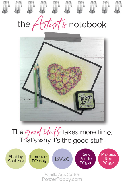
Long slow projects like this hydrangea heart are growth charts. I’m not the same artist I was when I started and I can see that here.

I started coloring at the point of the heart. I worked my way counterclockwise around the outside edge. I did the interior large florets last.

And there’s an obvious difference between my first petal and my last.

As you color big images, you get more efficient. You also discover things that look great, you stop repeating mistakes, and you learn to color better and better.

Repetitive images are strangely addicting. It’s fun to make your way back to the beginning and see how your coloring has evolved, grown, and improved.

I don’t remember being clumsy but I was.

Long slow coloring images are practice exercises but they’re far more rewarding than a page full of practice strokes. Don’t ask me to blend a row of squares and then shade a row of circles; I’d quit after two of each.

But I could color flower petals for years and still find new things to explore.


Want to improve your Copic Marker or colored pencil coloring? Power Poppy’s guest author Amy Shulke from VanillaArts.com talks about the courage to color oversized artistic coloring projects with Copic Markers or colored pencil. | VanillaArts.com | #realistic #howtocolor #copic

5. It’s okay to get bored

A lot of people look at large coloring images or the ones with lots of fiddly components and think: “how am I supposed to get that done this afternoon?”

Whoa. Back up there, lil' doggie.

Who says you’re supposed start and finish today?

I worked on Annabelle’s Heart over five days. The background in one sitting, shadows in another session. Then the florets over the next four days. A little bit here, a little bit there. Do some now, come back later…

Otherwise, I’d go nuts.

I know the romantic version of an artist is someone locked in their Paris flat painting for six days straight.

But seriously, that’s crazy. Marathons are for runners, not artists. There’s no prize for finishing it all in one sitting.

Take your time, take breaks, go do something else, live your life!

When your mind starts to wander, that’s natures little way of encouraging you to take a walk, grab lunch, and go be normal for a while.

It’s natural to get bored after the 10th petal. It’s good to stop and come back later.

The good stuff? It takes more time to color. That’s how it gets good.


Want to improve your Copic Marker or colored pencil coloring? Power Poppy’s guest author Amy Shulke from VanillaArts.com talks about the courage to color oversized artistic coloring projects with Copic Markers or colored pencil. | VanillaArts.com | #realistic #howtocolor #copic

So here’s my Artist’s Notebook challenge for you this month...


Want to improve your Copic Marker or colored pencil coloring? Power Poppy’s guest author Amy Shulke from VanillaArts.com talks about the courage to color oversized artistic coloring projects with Copic Markers or colored pencil. | VanillaArts.com | #realistic #howtocolor #copicTry coloring a Power Poppy stamp that has previously scared you.

Maybe it’s a complex stamp with six different kinds of flowers in it.

Or maybe it’s one of the simpler, single blossom images but you’ve always wanted to try it larger and color the details yourself.

Long slow coloring is a great way to learn and grow PLUS expanded length projects also feed your spirit and allow you to express your unique self.

Set aside the artificial deadlines and stop talking yourself out of big projects.

You can do this!


Want to improve your Copic Marker or colored pencil coloring? Power Poppy’s guest author Amy Shulke from VanillaArts.com talks about the courage to color oversized artistic coloring projects with Copic Markers or colored pencil. | VanillaArts.com | #realistic #howtocolor #copic

Want to color Power Poppy’s Follow Your Heart with me? 

Remember, this Hydrangea version is part of the new update to the original stamp pack, don't miss it!

My Annabelle’s Heart class is part of the Vanilla Livestream series for intermediate to advanced Copic colorers. This lesson covers the visual planes concept and shows you how to maximize dimension on three different levels using just our beginner level Push & Pull technique.

You can find out more about Vanilla Livestream classes here.

And I’ll see you back here next month for another glance into my Artist’s Notebook!


Previous Artist's Notebook articles:

What is Artistic Coloring?
Add Realistic Texture

The Artist's Notebook: Add Realistic Texture to Your Coloring

Want to improve your Copic Marker or colored pencil coloring? Power Poppy’s guest author Amy Shulke from VanillaArts.com talks about how to begin adding texture and realism to your projects. | VanillaArts.com | #realistic #howtocolor #copic


Do you want to add more life and interest in your coloring projects? When people first start coloring stamps with Copic Markers or colored pencils, they often concentrate on color.
Which marker colors should I buy? Which pencil colors should I use?
Color-color-color.  Later, as we build up a pretty good color collection, the focus shifts to blending.
What color blend should I use on the bow? What color blend should I use for the snow?

And there’s the catch: Even though you’re thinking about blending technique, it’s still all about the color-color-color.

Want to improve your Copic Marker or colored pencil coloring? Power Poppy’s guest author Amy Shulke from VanillaArts.com talks about how to begin adding texture and realism to your projects. | VanillaArts.com | #realistic #howtocolor #copic


Hello, my name is Amy Shulke and I’m the illustrator and art instructor over at VanillaArts.com. Today I’d like to show you behind the scenes of my latest coloring project, Pewter & Snow.

Last month, we explored how artistic coloring differs from traditional coloring for cards and paper crafting.

This month, let’s look how to take the first step to adding more artistry to your next coloring project. There’s more to coloring than just color-color-color, blend-blend-blend, and assorted novelty techniques.

Your Power Poppy digital stamps can be used for realistic, framable, artistic coloring projects. The kind of project that are more than coloring, they’re paintings. And you can do this.

It’s easier than you think, if you take it one baby step at a time.

It starts with making a mental shift. Let’s move beyond the colors and the blends. Let's think about texture.


Want to improve your Copic Marker or colored pencil coloring? Power Poppy’s guest author Amy Shulke from VanillaArts.com talks about how to begin adding texture and realism to your projects. | VanillaArts.com | #realistic #howtocolor #copic

First, give yourself space to color


You’ll notice above that I mentioned Power Poppy digital stamps versus the clear polymer sets.

While there are painters and illustrators who create miniature art, we typically don't teach art at small scale. "Smallin art classes is a whopping 11x14 inches!

I know working large sounds scary to cardmakers who are used to coloring two inch stamps but if you want to learn to how color with greater realism, you need more room to learn and practice.

With Power Poppy digital stamps, you are only limited by the size of your paper and printer.

For my Pewter & Snow online class, we use Mittens and Merriment, a digital version of the mitten bough from the Bough Wow Wow clear set. The polymer stamp is about 3.5 inches tall. Instead, I’ve printed the digital version at 7 inches tall.

The extra space gives us room to add the texture and shaping essential to realistic coloring.

Someday, I’d like to print a Power Poppy stamp at 18 inches tall, just to demonstrate how much more potential these images have when we give ourselves ample space for details.


Want to improve your Copic Marker or colored pencil coloring? Power Poppy’s guest author Amy Shulke from VanillaArts.com talks about how to begin adding texture and realism to your projects. | VanillaArts.com | #realistic #howtocolor #copic

Select one element to celebrate


Don’t overwhelm yourself by trying to color every object in the stamp with full realism and tons of texture.

Start small by finding the most important element and coloring it a little better than everything else around it.

In every image there is a focal point or a main object, something that is supposed to be the star of the show. It’s the largest flower in the bouquet, the church in a sparse landscape, or the mittens nestled in lots of greenery.

Luckily, most stamp artists are very clear about the focal point. It’s usually towards the center and everything else frames it. If you still can’t decide on the focal point, check the title of the stamp. Notice the name of this stamp is “Mittens and Merriment” not “Ten Snowballs plus Random Branches”.

I highly recommend choosing the main object for your texture experiments. Texture attracts attention, so it doesn’t make sense to lead everyone to the third snowball on the right.

Adding texture to the star of the show makes it starrier and showier.

Tip: A BIG mistake a lot of card colorers make is to heavily embellish snow with glitter or flocking. Snow is almost never the focal point and neither is the tiny puff ball on the end of Santa’s hat. Your best coloring gets completely ignored when you make some minor element 3-dimensional or sparkly! It's a cute cardmaking gimmick but imagine how distracting it would be if one mountain behind the Mona Lisa had sparkle snow on it.


Want to improve your Copic Marker or colored pencil coloring? Power Poppy’s guest author Amy Shulke from VanillaArts.com talks about how to begin adding texture and realism to your projects. | VanillaArts.com | #realistic #howtocolor #copic

Think about what the object is made of


This is the hardest part for colorers who have learned traditional Copic Marker methods because we’re about to break the number one coloring rule.

Copic Marker classes teach you to blend. Everything you color is blended smooth, smooth, smooth.

Which is fine if you’re coloring rubber mittens.

But who wants rubber mittens?

Mittens are warm and soft. They’re a comfort item which we remember fondly from childhood. Were grandma’s lovingly handmade mittens hard shiny plastic?

Sadly, that’s how your mittens look if you blend them smooth. Knit mittens are not reflective glass or high gloss vinyl. They’re matte wool and nubbly knots. When you blend things smooth, you make them look plastic and generic.

You move beyond coloring and become an artist when you add memories and grandma’s love to the stamp.

But what if you’re coloring a stamp that doesn’t trigger memories for you? What if there was a pair of snowshoes behind the mittens and greenery here? Most of us have never seen real snowshoes much less used them.

Luckily, we have Mr. Google. There are a ton of photo references online just waiting for you. I typically find photos for everything, even if it’s something I’ve touched a million times. So for my Pewter & Snow livestream lesson, I give students photo references for mittens, fur cuffs, snowballs, pewter, boxwood, ribbon, and even rustic wooden boards.

Photo references aren’t just for color and shape, they’re full of texture information too.

Want to improve your Copic Marker or colored pencil coloring? Power Poppy’s guest author Amy Shulke from VanillaArts.com talks about how to begin adding texture and realism to your projects. | VanillaArts.com | #realistic #howtocolor #copic

Pay attention to edges


Have you ever talked with a woman wearing heavy makeup that ends abruptly at her jawline?

It’s disconcerting because everything above the Mason Dixon line is pure Kardashian and below, she’s pale and blotchy. Like it or not, your eyes keep going back to line.

You can’t create an illusion if it stops dead at the edge.

Most people ignore the outline of a mitten. You’re worried about the blend, so you tend to concentrate on the center of the shape, because that’s where the blend is the most obvious.

But I want you to close your eyes and imagine running your fingers over grandmother’s mittens. What does it feel like?

Knitting is bumpy, you can feel ridges and rises.

Which means that the outside edge of knitted mittens would also have ridges and rises.

One of the things I really appreciate about Marcella’s illustrations is that she takes the time to include accurate lumpy bumpy edges. I just asked Mr. Google to show me some other mitten stamps and most have straight sides.

Do not smooth out the edges of your mittens or other bumpy objects. And if the stamp has crisp edges, you can restore missing texture by coloring over the outline.

As I colored the areas around the mittens here, I was very careful not to smooth away the rough edges. It makes my mittens look softer, fluffier, knitted, and real.


Want to improve your Copic Marker or colored pencil coloring? Power Poppy’s guest author Amy Shulke from VanillaArts.com talks about how to begin adding texture and realism to your projects. | VanillaArts.com | #realistic #howtocolor #copic

Use your marker or pencil to mimic the texture


Smooth blending has it’s place but not when you’re tying to capture lumpy, bumpy, reticulated, or grainy texture.


  • The mittens are knitted, so my pencil strokes are short and V shaped, just like a knit stitch. If I wanted them to look purled, I would have made short lateral hash strokes.
  • On the fur cuffs, I switched from my usual slow stroke to super-quick flicks that leap outside the stamp lines. It gives that area a fluffy look that begs to be touched.
  • The pewter heart was colored slow and smoothly but I came back with light skipping strokes to damage and tarnish the surface into something well-worn and antique.
  • Snowballs are grainy, so I danced my marker and pens over the surface in a dotted pointillism pattern. Grainy texture comes from grainy marks.
  • Boxwood is a thick glossy leaf so I pressed harder and added sharp highlights and harsh lowlights.
  • For the wood grain, I used long, slender, casual strokes. I ran the strokes in the direction the grain flows.
  • And on the ribbon, I initially blended the tails smooth in order to get the dimensional waves and folds but then I came back with short crosswise hatching to simulate the ridges of grosgrain ribbon. It’s subtle but it adds to the tactile nature of the project.


Every object in this image was colored with a completely different mindset and stroke pattern.

You do your art a disservice when you treat everything the same.


Want to improve your Copic Marker or colored pencil coloring? Power Poppy’s guest author Amy Shulke from VanillaArts.com talks about how to begin adding texture and realism to your projects. | VanillaArts.com | #realistic #howtocolor #copic

So here’s my Artist’s Notebook challenge for you this month...


Want to improve your Copic Marker or colored pencil coloring? Power Poppy’s guest author Amy Shulke from VanillaArts.com talks about how to begin adding texture and realism to your projects. | VanillaArts.com | #realistic #howtocolor #copic
Add texture to one object.

Find the focal point and spend the bulk of your time working there. Experiment to make your markers or pencils dance, simulating the grain, fiber, or pattern of real texture.

When you have more experience and as you gain confidence not-blending everything, start to develop texture in other areas.

I deliberately went overboard with this Pewter & Snow project. I layered texture over texture as I would in my own personal artwork. It's designed to challenge intermediate and advanced level students; sometimes I have to work pretty hard to keep them busy.

But no matter what your skill level, you can add a wee bit more texture and tad more thought to your next project. Baby steps lead to bigger steps... but you’ll go nowhere if you’re on smooth autopilot.


Artistic, textural, and realistic coloring is something that you can learn to do.

You’ve blended enough. Let’s try something new.


Want to color Power Poppy’s Mittens and Merriment with me?

My Pewter & Snow class is part of the Vanilla Livestream series for intermediate to advanced Copic colorers.

This lesson covers how to use texture both generously and intelligently to create the look and feel of real objects. I’m offering a wide range of textures here in this one image but we’ll also cover the steps on how to invent your own custom textures.

You can find out more about Vanilla Livestream classes here.

And I’ll see you back here next month for another glance into my Artist’s Notebook!


Previous Artist Notebook articles:

What is Artistic Coloring?