Tuesday

Can’t stop, won’t stop ... gushing about Daffodils

Daffodils are blooming all over St. Louis, and even though I am overwhelmed with deadlines for this, that, and about fifteen other things, I WILL TAKE TIME TO GUSH ABOUT THE DAFFODILS. And smell them. Admire them. I will study them. I will hold them by their straight stems and stare deeply into their coronas. I will snip several of them, carry ’em into the house, and then do these things all over again, as they look a little different when they are in the house - brighter and poppier and possibly even more beautiful. Here is a bouquet I trimmed last spring in the rain, and then enjoyed for days inside.


Try it sometime. Cut those flowers. Bring them inside or to work with you. Watch and marvel as your day edges up a notch in awesomeness. Or better yet, bring them to a neighbor’s house, and let them enjoy the glow of nature.

After the daffodils are finished, or heck, even while they are blooming, wouldn’t it be wonderful to capture the beauty of a mix of them, and keep it in your cards and creations for days, weeks, years? And to share that joy with your neighbors, friends, and family?

Let’s do this!!! Presenting my newest set in clear: Daffodils!

http://powerpoppy.com/products/daffodils

This set takes the highly popular (I would say I can’t keep it on the shelves, but it’s a digital image, so....) Dancing with Daffodils, presented in clear polymer. And then, a SECOND focal image that I worked and reworked, then reworked some more to get the right balance of daffodils, jonquils, and companion flowers — after erasing and retooling, I finally went with Grape Hyacinth (Muscari armeniacum). With these images I’ve given you some sentiments for those times when somebody needs a hug, and to know that you are there for them. Daffodils in clear is going to be one of those sets you just want to have in your arsenal. I can feel it. ;)

The Bloom Brigade, honestly, has outdone themselves on this one. I feel like I say that each time in some fashion, but people, how do they continue to up the ante on how cool a card can be? GO SEE WHAT I MEAN!!


TOMORROW..... everything is available in the Power Poppy Shop - AND - we’re having a massive blog hop with the entire team. What a wonderful April it will be, with all three of the Scents & Sensibility sets to color! I will try to get in on some of the coloring fun in between mulching sessions!

Monday

Tip-toe through the conservatory

My new three-set stamp collection for Power Poppy is called Scents & Sensibility, as it features images and sentiments that touch and tingle those aspects of our lives.

Yesterday we previewed a set heavily associated with the “scent” side of that equation—the fragrance of fresh Lilacs sends folks back to fond, vivid memories of childhood or of the air outside their bedroom window—but today I want to share one that really hits the sensibility side! If you can just tiptoe through the conservatory with me for a moment...


Actually, it’s the Linnean House at the Missouri Botanical Garden, the oldest greenhouse west of the Mississippi River, in continuous operation since 1882. (Mighty impressive!)


While these blooms do not hold a scent, the stunning Camellia is a flower associated with a range of themes and significance. As a matter of fact, Camellias come in shades of pink, red, and white, and each color has its own meaning! Pink flowers represent longing. Note how the flowers nod downward on a Camellia plant, almost appearing coy.


It’s not hard to see why red Camellias symbolize passion. Check out this hot number:


White Camellias stand for adoration, loveliness, and perfection. (and, if you can believe it, nary a white flower was in bloom when I visited, so you’ll need to use your imagination to conjure the most perfect white Camellia and insert it right HERE. :)

I did capture this wonderful red and white striped variety, however, so let’s gaze upon this beauty....


Both pink and red Camellias most often symbolize romantic love, the pure white flowers are thought of to express love in many forms, including the love of a parent for a child. When given to a man, camellias represent good luck!


I found all of these so very charming — and with such depth of color and variety in the way the frilly petals open to be almost pom-pomlike! So inspired in fact, I took what started out as an image for our very popular digital set, Camellias, and created an entire set, with new images and sentiments. Introducing the clear version that will infuse your cards with meaning and innate beauty: Simply Camellias!

http://powerpoppy.com/products/simply-camellias

Oh, the Bloomies have really created a showy tour for you today with Simply Camellias. And I think you’ll see that the new floaty, scripty sentiments really freshen things up! I hope you’ll take some time to travel around their blogs and see what they’ve made!

Allison Cope
Christine Okken
Cindy Lawrence
Dawn Burnworth
Julie Koerber
Kathy Jones
Katie Sims
Leslie Miller
Stacy Morgan
Tosha Leyendekker

And my dears, I do hope you’ll come back tomorrow. I am almost concerned that the juiciness of the set we’re sharing might send some of you to the fainting couch.

Sunday

A glimpse of April’s release - today!

Well, hello there! First of all, I want to say thank you to everyone for the wonderful notes you’ve sent and comments you’ve left wishing Power Poppy a Happy Birthday, and for participating in the treasure hunt-surprise party thrown by the Bloom Brigade. (It’s not too late to get in on it, and you might win $100 gift certificate in our store - click here!) I continue to marvel at the number of folks we are touching with our message and our stamp designs, and who in turn touch more folks with the cards they make!

It’s a really good feeling, and I do so appreciate you all sharing your happy vibes with us!!

OK - I have the suspicious many of you are awaiting what we have in store for you with our April release. I let you in on a little sneaky peek in the e-newsletter a few weeks ago...


Can you see the frothy blooms blasting out of that pitcher (see, tucked under my camouflage of markers, papers, and ribbon)? Folks went gaga for our French Lilac digi, and that made me very happy because you know, I just wasn’t finished with Lilacs yet. In fact, I actually drew a few other images for this set and couldn’t fit them all onto a 4 x 6" stamp set canvas! They will just live in my sketchbook for a while. But really, who can get enough lilacs?

Not this lady!

As a matter of fact, I’ve tried to grow lilacs on more than one occasion, and unfortunately, I didn’t have the ample daylight sun and space that Lilacs need to thrive (most space filled up by peonies!). But, I am entranced by the inspired lilac hybrids of Father Fiala, and I would reallllly love to have that lush scent in my yard come spring. And, not to get started on too big of a tangent, but let me show you a few of the Lilacs introduced to the world by this renowned and beloved hybridizer. The lilacs shown below can be ordered by mailorder from my favorite, favorite, favorite source for unique perennials and very special trees and shrubs, the lovely family-owned Klehm’s Song Sparrow Farm and Nursery in Wisconsin.

'Little Boy Blue' by Father John Fiala, Available by mailorder from Klehm’s Song Sparrow Farm and Nursery

'Fiala’s Remembrance' by Father John Fiala, Available by mailorder from Klehm’s Song Sparrow Farm and Nursery

http://www.songsparrow.com/catalog/plantdetails.cfm?ID=547&type=WOODY,&pagetype=plantdetails
'Atheline Wilbur' by Father John Fiala. Available by mailorder from Klehm’s Song Sparrow Farm and Nursery

Here’s a quick bio of the hybridizer Father Fiala, written by Roy G. Klehm. I designed and illustrated Klehm’s catalogs for many years, and Roy told me lovely stories about the man behind these plants, so I appreciate you indulging me in sharing this part of the plant world with you! Klehm’s has more than 20 varieties of hybrid lilacs — go find more inspiration for your coloring, or even better, plant one outside your window — CLICK HERE! :)

Now I think I might have to go pick up a bouquet of these from the flower market, they are going to be all I can think about today, and they’re aren’t even close to blooming yet!

Doh! I did go on a lilac tangent. Because today’s post is about peeking at my new stamp set, isn’t it... SO! Presenting a preview of our newest clear stamp offering, one that I think you will turn to again and again to usher in spring, and share a sense of “enjoying the moment” by slowing down and breathing in the goodness of life: It’s Lilac Time!

http://powerpoppy.com/products/lilac-time

Come and see the lilac-y loveliness that our Bloom Brigade has created for today. You may find yourself needing to feel surrounded by the calming spring scent of lilacs, or maybe you’ll order up this set so you can color these up ANY TIME! Even after they finish blooming in the garden...

GO BLOOMIES, GO!

Allison Cope
Christine Okken
Cindy Lawrence
Julie Koerber
Kathy Jones
Katie Sims
Leslie Miller
Stacy Morgan


We’ll see you back here tomorrow... we have more to share and I’m going to tell you now, I’m trying to make it really hard for you to resist any of these sets. I put my heart into each of them! (It’s my way.) Have a spectacular day!

Thursday

Look Who’s Turning One!


Hello all and welcome to a super duper extra special kind of post! Why, you ask? Well, it’s only because it is the ONE YEAR BIRTHDAY OF POWER POPPY! 365 days ago, Power Poppy brought sunshine to card makers far and wide when it opened its virtual doors and we, members of the Bloom Brigade, couldn't be more honored to be a part of this colorful, creative powerhouse!

SO WITH THIS SPECIAL DAY, WE STRIKE UP
THE BAND
AND LIGHT THAT CANDLE!

Guess what? Not only are WE full of cheer, we want YOU to get in on the celebration! How, you ask? Well, if you play along in our little game of hide and seek, you could win THIS...... 

HERE’S HOW TO PLAY!

Simply hop along the Bloom Brigade link list in search of the birthday candle like this hidden in our design teams’ posts! FYI: This candle below doesn’t count in our tally!


Then, once you’ve found all the candles hidden in our designers posts (hint: look at their cards!) and tallied up the number of candles on our Bloom Brigade Birthday Blog Hop, email us at bloom@powerpoppy.com with the total number of candles (please put Birthday Blog Hop in the subject line). Those that answer correctly will be in the running! It is just that simple. You have until next Thursday, April 2, at 5PM EST to email us! We’ll draw a name from the correct answers and announce that winner on April 3rd during our normal Bloom Brigade Friday post! Good luck and happy counting!

As a part of this celebration, the entire Bloom Brigade wanted to get in on the action to wish Power Poppy (and Marcella) a very Happy 1st Birthday! 
To see the rest of the creations and these above in their full glory, join in the PAR-TAY! Stop by the Bloom Brigades' blogs and be sure to say “hi!” Get counting those candles! Who wouldn't love a $100 gift certificate to the Power Poppy Shop!  


Thanks so much for stopping by! Just a couple announcements before we go: Did you Go for the GOLD yet? Click HERE to get in on that fun-filled challenge action. You only have 6 more days to enter!

AND THEN..... Mark your calendar for THIS SUNDAY! On that day, we’ll kickstart the sneaks for Power Poppy’s April Clear Stamp Release. Trust me when I say that you won’t want to miss one minute of that action! ;-)

HAPPY BIRTHDAY POWER POPPY!

~Julie

Monday

Inspire Me Monday - Photography Part 1


Hello Friends!  It’s Christine here for another Inspire Me Monday Tutorial. Today I’m going to be focusing on something entirely different: Photography!  

Has this ever happened to you? You work hard to create something beautiful to be able to enter it into a challenge, post in an online gallery or to your own blog, but it just doesn’t capture your work in real life. It’s frustrating. When I look back at my early photography of my cards, I see how very little I knew, and how very poorly I captured what I was creating.  So over the years I’ve done some learning and practising and I hope to pass on some of my tips to you. 

Photography is a sticking point for many of us in this online element of our crafting. How do you fix it? Do you need a fancy camera, special lights, expensive software?  

Photography is, in essence, the capture of light on film. Yes, it’s the capture of colour and detail as well, but really that’s only derived from the capture of light. These are some areas that I have found helpful to get my best captures.  Keep in mind, I’m no expert by any means!  

Set-up


Here is my set-up friends.  I keep it really simple.  This is looking at my kitchen window and counter between my sink and pantry.  I use foam-core board behind my cards as a white background and a cotton doily underneath my cards to give some texture to the base (and then little bits of the contrast of my counter peek through).  If I’m photographing a really large piece I can take another foam-core board and place it underneath the doily to give me more room to capture my creations.  I have 2 OTT lights (these are just lights that give out true white light).  I find that I use these lights even in the daytime because they give better background light and better detail light for my cards.  The larger light points toward the background and the smaller light I angle where I need it on my card.

This window faces East.  The biggest and most important element of photography is allowing the right amount of light to come into your photo.  Many people use North or South facing windows for their photography, which is probably more ideal but I don’t have a window facing those directions where I can leave a setup like this all the time.  So, because my window faces East, I don’t take morning photographs.  Too much direct light is coming in my window at that time of day.  Direct light sounds like it would be great - but what it ends up doing is washing out details and then creating too many shadows in the background.  Take a look at this next photo.  


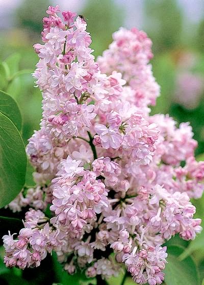
This is a morning shot of my card using Power Poppy’s new Dancing with Daffodils image.  Oh this image is just so pretty - but the photo looks washed out along the top of the design and the shadows in the background look terrible.  No matter where I would position it, the direct light is just too much here.  

The same would go for having an image with light coming from behind it (backlit).  So, say, right against a window.  Because your camera captures LIGHT, it will capture the light from outside your window and not your card. Your card will turn out shadowy with a nice view of your outdoors.  Not at all what you want.  

The very best kind of natural light is diffused light.  So, as soon as the sun peeks around the corner of my house, I’m good to go.  Or, if I we have an overcast day where the sun is behind good cloud cover, then I can often take morning shots.  


Here you can see straight on what my set up looks like.  I think if I were facing south or north I might be able to get away without the OTT lights but, I always like it better when I use them.  I bought my lights at Michaels or Staples I think, I waited till they were 1/2 price to make it affordable.  Other styles of lights cast different shadows (yellow or blue), and then it leaves a colour cast on your photographs that’s really hard to work with, so I recommend OTT lights, or just diffused natural light.  With these lights I can also take photos at night.  Some people use filters on their lights (even a piece of tissue paper helps). But I’ve found that my lights aren’t so bright to have to need it.  

No matter what kind of camera you have, giving your photography a better set-up can make all the difference in what kind of pictures you’ll be able to capture.  

Camera

The next big question is always, now what kind of camera do I need?  I spent many years using a point and shoot camera, using it on the macro detail (tiny flower picture) setting, and though it wasn’t perfect photography - I still did alright.  So, if you’re there, that’s perfectly ok! Hopefully the set up tips I just showed will help you.  

But, for those of you wanting something more....a few years ago we invested in a DSLR camera.  Mine is an entry level DSLR - A Nikon D3000, and for my card photography, I actually use the base lens that came with the camera.  It’s an f3.5  18 - 55mm lens.   For a long time I didn’t have a clue how to use the camera because there are so many buttons and settings, so I just used it on the macro detail (tiny flower picture) setting for my cards.  Well, honestly that’s just a glorified point and shoot camera (my photography instructor called all of those “cute” picture settings EVIL :) LOL).  So, over time I started setting my camera on Manual, and learning more all those settings.  I have a LOT of friends who are photographers so I could ask a lot of questions.  But the very BEST thing to do for me was practise.  That’s the great thing about digital film, you could take hundreds of pictures and no one’s the wiser.  This past fall when I took a photography course I learned a lot that made me even more comfortable.  I’m more of a hands on learner than an online learner so it was good to invest that much time with an instructor.  


So, now I’ll try to pass on a few things that I learned in the class that made a difference for me.  


Helpful Settings 

If you have a DSLR camera here are two settings I have found that have improved my card photography.  

1.  The Histogram

No, it’s not some weird allergy monitor, the histogram is a bar-graph on your camera that you can look at to see the real light details your camera is capturing.  

This is one of the very first things our photography instructor had us adjust in the course.  

Most of us look at the digital screen on our cameras, think our photo looks good, and then when we get it on our blog wonder why it’s so dark.  The histogram tells you in bar-graph form the amount of dark or shadow details in your image (on the left of the graph),  the mid-tone details (in the center of the graph) and the bright or highlight details in your picture (on the right of the graph - righty-brighty).  Looking at your histogram after you take a picture gives you much better accurate information on how your picture will come out.  You’ll see what I mean as I explain more.  


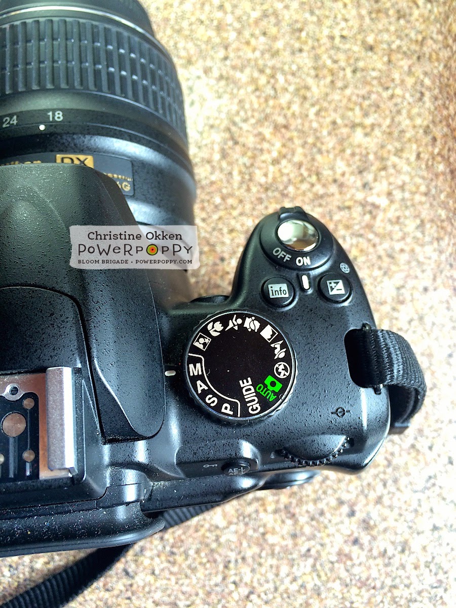
The first step he had us do was to go into our menu on the screen on the back of our DSLR cameras.  Not all cameras are set up to show the histogram of your photos right off the bat, so you have to turn on a couple of settings.  I’m using a Nikon, so I can’t speak for every camera, but you’ll need to consult your camera’s manual or do some playing.  

I’m in my Playback Menu as you can see by that little blue triangle on the top left.  You’ll have to excuse these photos of my camera.  I’m literally holding the camera with one hand and shooting photos with my iPhone with the other hand :)

Next I choose Display Mode in that menu, that will take you to a screen where you can choose the detailed photo info for all your pictures.  


I select Highlights and RGB histogram and say OK.  

Something I really value is a well-lit photo.  I want my whites to look white, my details to be crisp and my overall photo to be really bright.  The histogram tells me how I’m doing in capturing that.  


So, after I take a picture I press PLAY on the back of my screen.  Then to move around in that screen I use those down or up little arrows around the OK dial on the back of the camera (over on the middle right above the little garbage can).  A screen with a coloured graph might show up, keep pressing your arrow until you see a screen like above.  This will show you the photo you’ve just taken and the bar graph to the right.  You can also see the settings I used to take this shot,  Manual Mode, shutter speed of 1/250 of a second, an f stop of 6.3, and ISO 400, etc.   All of those elements do MEAN something, they are part of the triangle of settings  you’re trying to balance to take a good shot, but for right now, I just want you to look at the bar graph.  

As I told you a histogram measures dark shadows (left on the graph), mid range tones (center of the graph) and highlights (right in the graph).  Because I want to have a nice, brightly lit photo, I want my histograph bars to be primarily RIGHT.  Not touching the far right line because that means it’s overexposed, but nearer to that right side.  I know by looking at this histogram how my photo is coming out.  If I need to make adjustments I go from there.  


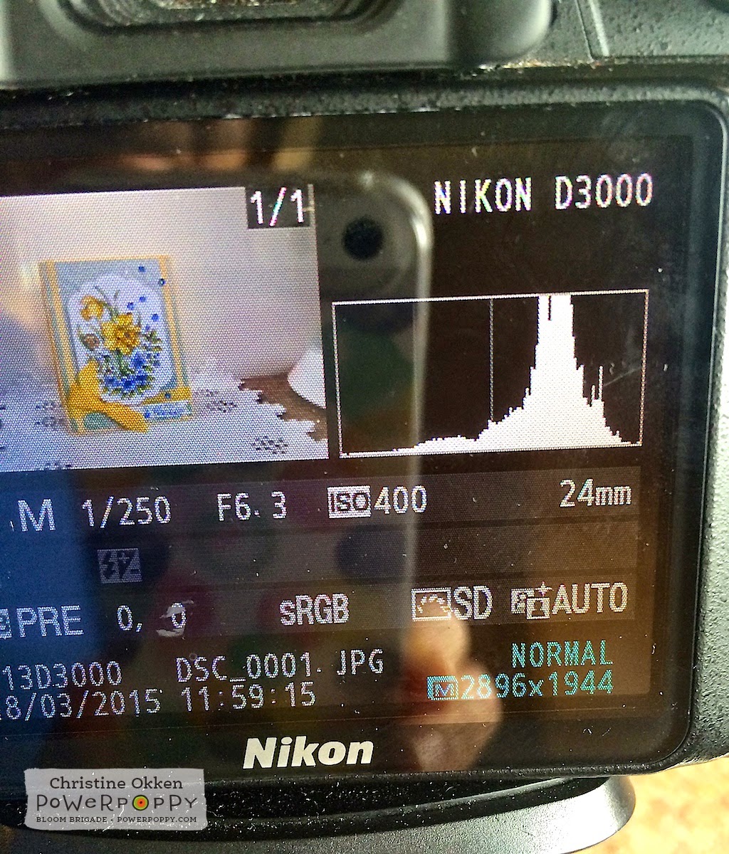
If my histogram is too much in the mids or lows of the graph, I’d either adjust my shutter speed to be faster, adjust my f-stop, or increase my ISO, or some combination of those three elements till I get a histogram I like.  That way I’ll be allowing more light into my photo.  Each of these adjustments has implications to the photo, that’s why it’s all about the balance.  

More to know:

For those of you who want to be a little techy and dive in deeper.....here’s a super quick explanation of those three elements.  APERTURE, SHUTTER SPEED and ISO were explained to me like a bucket.  You can’t control the rain (light), but you can control the size of the bucket, how long it is out in the rain and the quantity of rain you want to collect (how much light you’re collecting)

Aperture (or the f-stop number), controls the AREA through which light can enter the camera through your lens (the width of the bucket).  The lower the f-stop number the wider the bucket is open and the smaller the area of focus, the higher the f-stop number the smaller the area is open and the larger the area of focus.  I found this setting the most difficult to understand...but when you get it you can really influence the amount of blur in the background, and the slice of focus your camera captures.    

Shutter Speed (how fast your shutter stays open or the length of time till it closes) controls how long our shutter is open exposing the sensor to light.  So, how long the "bucket is left out in the rain".  The faster the shutter is set, the quicker the bucket is exposed to the rain and “taken in”.  Slower shutter means more time in the rain.  

ISO Speed (like film speed) controls how sensitive your camera’s sensor is to a given amount of light.  The quantity of “rain" we want to collect.  This one was also described like a microphone.  The higher the ISO the more noise your camera will capture.  So, lower ISO settings capture less “noise” and higher ISO’s capture more noise (that’s why some pictures can look grainy).  On a sunny day, outside, I’d have an ISO of 100, inside I’d probably choose 400 or higher.  

Ok... I know that’s a lot to take in if it’s new for you.  Maybe I’ll do a future tutorial explaining this a bit better if you’re interested!  


Now before you go saying hey that’s too techy for me, a histogram can even help you when you’re shooting with that little detail shot setting (flower picture on the top dial).  This photo was shot with the detail setting rather than in manual and I can still see how this would turn out.  As you can see it captures more mid tones and lower tones rather than highlights.  I’d have to influence this by adding more light into the picture, so either moving my setting to a different window, or adding in more lights.  


Now, how do you adjust all of these elements in Manual setting?  Each camera is different, but on my camera, I set my ISO on a window screen in the Shooting Menu.   Then there is a dial on the back of my camera where I can adjust the Apeture (or f-stop) and the shutter speed.   (See the dial directly to the right of the Adjustment dial words on the above picture).  

On the display on my camera, I adjust my little meter that you see in the center of screen above to be about two or three little bars above the 0 on the + side.  For my cards and situation, that produces the best pictures.  

My shutter speed varies depending on the light (here it’s at 1/250 of a second, but my apeture or f-stop I usually set between f6.3 and f8.  That way I get a good amount of detail, but still a decently soft background.  Those settings will all depend on your situation where you’re taking pictures.  

Ok...before your head explodes I have one SIMPLE setting that’s really made a difference in the quality of the whites in my photos.  


2.  White Balance

As I said, I’m pretty picky about my whites in my photography.  It’s the one thing that drove me crazy when my photos would come out and the white areas would look gray.  There are a number of things you can do with a DSLR for this but one simple adjustment I learned was about setting a manual white balance.

If you’re always taking your photography in the same area, with the same background (as I am), here’s what you can do.  Note - this will only work if you’re using a white or off-white background.

Set up your photography area as you normally would.  Do everything with your lighting, etc, just don’t put a card in the picture area.


On your camera find the “White Balance" option.  Mine is in the Shooting Menu with the green camera picture on the left.  Select White Balance.  


Next select - Preset Manual


Your next screen will ask you to “Use photo” or to “Measure".  You want to Measure.  Now,  fill your shooting screen entirely with your background (for me this is my white foam core).  Get your focus, and adjust your f-stop and shutter speed to the levels you’d like and then take a picture.  

Now, go back to this menu shown above and then say “Use photo”.  This will set your white balances to your particular background setting and it takes out some of that blue/yellow/or gray cast that makes it hard to get nice crisp whites.  I’ve found this to be the single best improvement in my card photography.  

Alrighty - to close off this rather newsy post, and maybe encourage you to TRY your manual settings a little more on your camera :)


Here is my card picture - straight out of the camera - no editing - shot with the Macro/Detail (flower picture setting) on my dial.


And then, here is the same card shot on Manual setting on my camera.  Exact same light, exact same situation.  No editing, straight out of the camera.  You can already see the significant improvement in the quality of the shot.  

Join me NEXT MONTH where we’ll talk about the next step in photography - photo editing!  That’s where we take it from the camera to be blog ready....and it won’t have to cost you an arm and a leg to do it :)  

Thanks for joining me! 
Christine

Friday

Shall We Dance?

Hello all and happy Friday! Today not only brings the verge of the weekend BUT..... it's the first official day of SPRING! And, in honor of this lovely transition into flowers and showers, we bring you a special Power Poppy treat!

Just in case you missed it, last Sunday the Instant Gardeners popped the top on a brand new digital stamp set that is just, dare I say, luscious! What's better than buttery, twirly, swirly daffodils? So, check this out, will you?


Petals unfurl and foliage twists and twirls in this new digital stamp set called Dancing With Daffodils illustrated with love by Marcella Hawley. Daffodils and periwinkle vines almost appear to dance as they celebrate the arrival of Spring. A swirled up snail appears ready for a good time, too! Use the “Just Because” sentiment to have a springy card on hand, or use with a more seasonal sentiment to set the perfect tone.

Today, the Bloom Brigade is showing off this beauty! And, just to whet your creative appetite, here's a little teaser courtesy of the ever-so-talented  Christine Okken!  I just love the dimension she created on the background and the extra splash of bling. It is truly SWOON WORTHY!


Guess what? Christine isn't the only one "Dancing with Daffodils" today! The rest of the Bloomies have gotten in on the act!

Allison Cope
Christine Okken
Cindy Lawrence
Dawn Burnworth
Dina Kowal
Julie Koerber
Kathy Jones
Katie Sims
Leslie Miller
Stacy Morgan
Tosha Leyendekker


And, if you are ever looking for more inspiration for this digital stamp set, it's out there! The Power Poppy Pinterest Boards have ALL of Power Poppy's stamp sets ripe with ideas to spark your creativity. Check out the Dancing With Daffodil's board HERE!


BEFORE WE GO! Don't forget about our POWER & SPARK challenge and GO FOR THE GOLD! Remember, all you need to do is use a splash of gold on your creation and.... you are in the running! So, get those fingers inky and then link up your card HERE! You can also check out the link for all the official details too! It's a small and fun price to pay for a chance at winning an extra special, fabulously fun Power Poppy stamp set!

ANOTHER QUICK NOTE! Mark your calendar for MARCH 29TH! That's when the next round of Power Poppy clear stamps will head off the production line and into the Power Poppy shop! Stay tuned for some colorful and spirited sneaky peeks from our Bloomies! Promise, it's gonna be FUN!

Have a good one!
~Julie


Pin It

Monday

Inspire Me Monday ~ Depth with Burnishing

Hello friends! Tosh here, and I am so excited to share my very first Power Poppy Inspire Me Monday Tutorial with you today.

Marcella has a delightful way of adding depth and dimension to all her designs with perfectly placed petals, leaves, shadows, highlights, and even little surprises, making her images super fun to color and create with.  Now there are a variety of ways to add dimension to a card: style of coloring, shadows and highlights or even paper tole (to cut out the same image and layer it on top with dimensional tape). All of these add dimension to a project, but today, I want to take it a step further and show you how to burnish.  It’s very subtle and extremely hard to show in photographs, so I encourage you to try this for yourself and see up close the effects this technique has. It’s not only fun, but it adds an extra little physical dimension to the image. I used two Power Poppy images to demonstrate this technique today.  The first is the newly released digital image called Dancing with Daffodils. It’s gorgeous and perfect for this technique.

First, you need to print (or stamp) your images twice onto cardstock. I used X-Press It Blending cardstock for today’s project.

Second, color your base image entirely, and only the sections of your second image that you want to use for extra dimension. You can see below how I colored mine. I experimented with a couple of color combinations on the leaves (ignore those), but I was really focused on the two daffodils, the snail, and the 4 Periwinkle blooms. 


I then diecut my main image using Labels 28 (Spellbinders),  cut out my dimensional pieces from the other colored image, and got out a foam mat and a stylus.  That's all you need for this technique.  If you don't have a foam mat, you can use a mouse pad, or a stack of magazines.


Now, all you do is trace all the outlines of the image with the smallest part of your stylus.  Be careful not to press too hard, or you can pierce your cardstock.  (I traced the entire main image as well as the cut out pieces.)  Below you can see what it looks like on the back after all the tracing is done.  If you look closely at the bottom petal of the top daffodil on the right, you can see a little bit of the burnishing.


To burnish, just take the larger side of the stylus and “color” with it in a circular motion inside the traced lines. Again, don’t press too hard, or the paper might rip.

After I finish burnishing, I flip the cardstock over and run the smaller end of the stylus over edges where I really want to show more depth. For example:  the coiled back of the snail.  Can you see how the coils pop where I traced on the lines and burnished between the traced lines on the back?


Here’s a close-up of the daffodil. I really wanted the petals to pop, as well as the center, so I worked a little more around the centers' base. 


Below is the finished product. The entire image has been burnished, so even the leaves have depth and texture, and a few sections are popped up with dimensional tape.  I finished the card off with the sweet little Just Because” sentiment, as well as some Gesso on the diecut and main panel. 


You can use this technique on virtually any image. I made my husband this San Francisco Giants card by printing out the SF logo onto cardstock and stamping the cap (from the Play Ball set) right over it and coloring it.  Then, for some added interest, I burnished it. I LOVE how the panels of the cap pop IRL.  It’s fun just to rub your fingers over it to feel the texture.


Here’s an angled view to try to give you a better look at the dimension the burnishing gives.


And here’s a straight on look. Like I said, it’s tricky to photograph the depth because it’s so subtle. I even outlined the logo so it pops a bit also.


Lastly, I finished off the inside of the card with an “All Star” banner from the Play Ball set. 


That’s it. I hope I’ve explained this technique clearly enough and have inspired you to try burnishing. It’s really easy, and adds just a little extra “pop” to your project.

  Happy Stamping!