Hi Power Poppy buddies! It’s Christine waving hello to each of you. Today I thought I’d bring you a little tutorial that borrows from a popular style of a few years ago that really borrows from a vintage practise of the 1800’s - Photo Tinting. It’s the manual colouration of a black and white photo with light tints to create realism or an artistic effect (at least that’s what wikipedia tells me!).
That idea can easily translate to stamped or digital images too. I was thinking about what Marcy said in this post, "We are instead encouraged to think in values: light, dark, and all the gradients of highlight and shadow in between.”
So, with the theme of just adding colour value (light and dark) you can easily colour up an image with just grey tones like this one below.

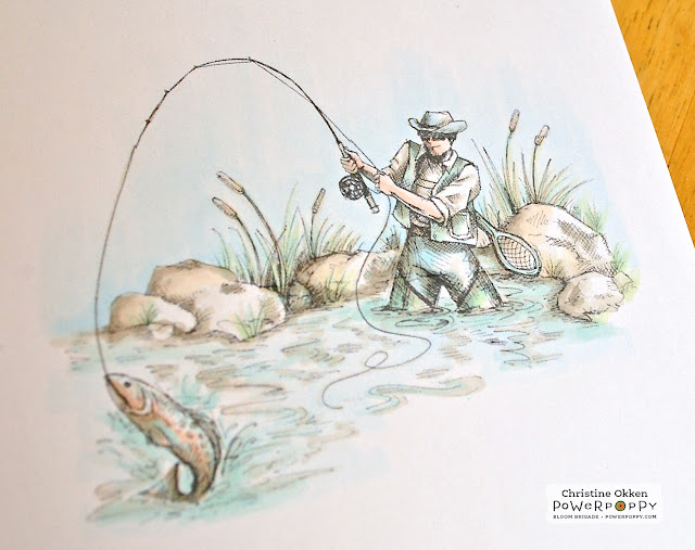
This image comes to life just by using different W Copic Markers (or any other of the cool or toner gray family). I printed out this awesome masculine digi called Fly Guy onto XPress It Blending card stock and then added warm grays in various intensity, developing the highlights and shadows. Just by adding in those shadows, the image starts to take on a 3D effect. It gives you the look of a black and white photo.
But then, to take it another step, I started adding some soft “tints” of colour.
Here I’ve given the water and the trout some colouration with the BG10 marker. I used my gray colouring as a guideline on where to add the hints of blue. In water you’d see the deepest colours on the edges and where you want to focus on something (like the splash of the fish).
Next I added in a little colour to his skin and some more colour to the trout.
Here you can see I’ve added a little B000 to his pants and the sky, some soft G20 to the grasses, and some E00 to the rocks in some of the highlighted areas. To finish off the colouring I came back with my W1, W2 and W2 markers to deepen some of the shadows. Very soft and subtle and actually really quick to colour. It works well for when you have a limited number of markers too. Your colour only comes from a soft single coloured marker and your value (shadow) comes in your gray-scale markers.
Here is the finished design and a close-up below.
And even though I’m REALLY early for next Father’s Day, here’s the inside of the card too.
Maybe this is another way for you to think about Colouring Outside the Lines like Marcy’s most recent Power & Sparklette Challenge. Did you see the prize for this one too? Crazy Awesome! The winner will receive every set in our 2016 Holiday Clear Stamp Collection when they debut in October.
Thanks for hanging out with me today!
Christine


9 comments:
Simply fabulous!!!
Awesome!! Love your coloring!
-Berina
Moxie Craftie
Christine, this is beautiful, and I love the soft colors and how you've used Marcy's thoughts about the values of color! Brilliant, and I love the end result of your card. Beautiful DP and layout, and you've even finished the inside! Thanks for a wonderful Inspire Me Monday! Hugs, sweet friend, and thanks for sharing your creative gifts with us!
I LOVE that card! Thanks for all of the details on how you did your coloring so I can try that! I've got a few special photos of my parents from 1940-41 that are tinted in that style and they are so beautiful, so your card really brought on some good memories for me.
Awesome card Christine! Maybe I can learn how to use my new alcohol markers(cheapy version,not Copics) this way.Is that stitching at the top of your card,or bakers twine? Thanks for sharing!
It looks absolutely amazing doing it this way, I love how you stitched it to the top also, Terrific!!
It looks absolutely amazing doing it this way, I love how you stitched it to the top also, Terrific!!
A stunning card!
Gorgeous!
Post a Comment