Tuesday

Inspired by... A Peony


Hello all! Welcome to the second installment of.... HUES TO USE... a little challenge of sorts where we throw three colors at you each week in hopes that these shades will give rise to some cataclysmic color expression in your very own craft room! 

Today is not even close to a stretch for us. In fact, the source of inspiration is one that melts Marcy's heart every time she sets her sights on one of these beauties!


Take a gander at this larger than life beauty -- will you? And those colors! Those colors are like buttah! I am going to call them Sugar Sweet Pink, Goldenrod and Shades of Jade. Back to that bloom, if you spotted this 'Coral Supreme' Peony on Marella's Insta-feed then you probably remember her saying something unbelievable like "this little guy is actually the size of an espresso cup!' Huh? That is a small but mighty bodacious blossom if I ever saw one! And now, you get to use this fierce floral as your "color muse" in Hues to Use! (See what I did there?)

Moving on to my own creation! I have a fast-paced double tutorial here. Super easy stuff, yet super fun as well.  For starters, here's a peek at my finished creation! 


As you can see, I used this stamp set -- Soothing Sympathy -- for my card! This was going to a friend who has been battling some serious stuff in life - not a loss per se -- but facing a medical issue with her husband that has been so heartbreaking. Since she lives in Idaho, I decided to put some prayers in a card, smack a stamp on it and send it off to her to hopefully lift her spirits a bit. You'll notice, if you look at the stamp set below, I did a bit of masking when using the small peony in the stamp set. 


So, just like how most masking begins, I grabbed a Post-It Note and stamped that Peony at the top, where the sticky portion is. And then, since I only needed to mask the top, I only cut out the stop of my mask. See?

From there, I added the mask, stamped and kept on doing this until I had a peony border all along the left side of my card....


From there, I decided that I wanted to create an effect where the sentiment "Sending Love & Light" had almost a cascading effect using two different shades of ink -- a soft shade (Angel Pink Memento) and one that stood out (Tuxedo Black Memento). So, I lined up my card front in the MISTI, securing it with the MISTI's magnets, like so!


Then, lining up my sentiment exactly where I wanted it on the acrylic portion of the MISTI, I inked it up in pink and started to stamp! 


Now, to create this cascading effect, I simply moved my paper up 3 blocks on my grid, reinked, stamped, and repeated until I had a border of pink sentiments. I knew I wanted the second to the last stamped sentiment to be black. So, I kept inking up my stamp with pink ink, stamping all the way to the bottom and leaving a space for where my black inked sentiment would sit. I moved my paper up, cleaned my stamp, inked it in black and... ta da!!!! I have that punch of black, right in that cascading row. I realize it is somewhat hard to see that soft pink, but it is there and in real life it is just that sweet and soft touch, which I thought really added to this card! 


From there, I grabbed these Copic markers and got to coloring! R81, R83, RV00, R0000, G20, G21, G24, Y13, Y35, G0000. I also added a little razzle dazzle thanks to some glitter glue to the stamens on the flower. You know I gotta have a little bling! ;-)

Here's a close-up look at the cascading sentiment....


Here's a close up of that flower to show off a bit of that masking effect....


And here's one last look at my card! 


So, grab the closest shades of Sugar Sweet Pink, Goldenrod and Shades of Jade and get that creatively colorful mojo a flowin'! I can't wait to see what you create using this trio of springtime colors!


Thanks for stopping by!
~Julie

Monday

Inspire Me Monday: Coloring Multiple Images


Hi everyone! Elizabeth Zaffarano here! Happy Memorial Day and welcome to another Inspire Me Monday!

pile of stamped, fussy cut, and copic colored poppy images. Stamps from Power poppy. 

While I’ll get into the inspiration and how-to’s for my card today,  I'm also going to share the strategies I’ve been using to tackle big coloring projects - like this big pile of poppies! So if you’ve ever needed to color a set of images over and over again—perhaps to make a set of note cards, place cards, bookmarks, or tags, but thought it’d be too difficult to keep track of colors, or would just take too long: this info is for you!

full front view of Memorial Day poppies wreath card with envelope.

Back to today’s card: When I found out that I’d be posting on Memorial Day, I immediately thought of the poppy wreaths that are used to commemorate Remembrance Day in the UK and the Commonwealth. They are floral, striking, and an appropriate image for this holiday. Quick history lesson -- The poppy became an emblem of observance after Lieutenant-Colonel John McCrae, MD penned the poem “In Flanders Fields” back in 1915 (during World War I).

So, I had my inspiration. And I had the gorgeous Poppies stamp set in mind. But to make a poppy-covered wreath, I would need to color a whole bunch of blooms!

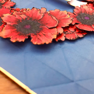
diagonal shot of poppies card for Memorial Day.  Shows shadows of background embossing and layered flowers.

First, I devised a color scheme for my flowers.  I wanted to recreate the iconic red Flanders poppies, so I found some images (right here on this blog! ), and saw that "red" poppies are actually shades of persimmon, with scarlet shadows and highlights of flame.  I pulled enough markers from my collection to cover natural variations among the petals, and then I created a labeled sampler for reference.  I usually stick it right to my coloring sheet, so it never gets lost.

copic coloring set up on clipboard with palette and color chart

I cut up some white card stock and used my MISTI to stamp at least ten of the larger poppy images from the set. I like to use a clipboard whenever I color because I find that I can hold and turn it to get the best angles for my strokes. As I chose three flowers per stamped image to color (so at least 30 flowers!), it was simpler to color first, then fussy cut. I could fit four stamped poppy clusters on the clipboard at a time.

To keep the cut cardstock pieces in place while I’m coloring, I have been using Tombow’s removable adhesive (in the green dispenser). It holds well enough and rubs off easily and completely when finished.  I have used this for stamped/die-cut images too, as I prefer to color after die-cutting.

how I temporarily adhere poppy stamped images to a base for coloring with Tombow removable adhesive

With four sets of flowers on my board, I was able to refer to earlier coloring choices as I completed sets of flowers.  So I could choose to go darker, or lighter, or redder or more orange as I worked.  In other words,  a nice amount of “poppy” variation, but staying within the range of my palette.

A side benefit of this set-up -- I was able to try out different coloring approaches, and compare them side-by-side.  For example, I colored a few flowers with an “under color” of YR000, then started in with my shadow colors (R59, R39).  For other flowers, I started with my mid-tone red (R24), then went to shadows and then highlights.  Other flowers got some final swipes of Y15 to pull out a brighter edge. Also, notice that my color palette now has more shades listed than when I started! I also ended up not using a couple of the colors I had originally chosen.

copic coloring of poppy images in progress. Featuring power poppy stamps and colored in shades of red.

The centers of the flowers were filled with dark grey (BV29) and a few dots of black (110), and a bit of maroon (R89) and deep purple (V09) at the very center. I stippled colorless blender over top to add texture and keep the centers from looking like a shadowy mass. Then I topped it all off with a white colored pencil, to bring out the fine details.

Poppy images by Power Poppy, showing stages of copic coloring  

As I finished coloring a flower cluster, I’d peel the card stock off of the clipboard, and then rub off the removable adhesive. Once I had made a stack of these colored panels, I grabbed some scissors and started fussy cutting.  As I cut a batch of flowers, I used a Memento marker to finish off the edges. 

edging a fussy cut image with a marker makes your cutting look flawless

I also took some scratch paper and started tracing some of my circle dies to get an idea of how big I wanted my poppy wreath to be. I arranged my first cut batch of flowers on the sketches so I could plan the layout for the rest of the wreath.

Memorial Day wreath base sketches with card stock wreath base and poppies

Then I cut a proper wreath base from some dark orange cardstock and adhered everything down. I used a few foam squares to add depth. Believe it or not, I only needed to cut apart two of the smaller blooms to fill in a few gaps. When I was satisfied, and everything was secure, I set the wreath aside and got to work on the remaining components of the card.

Side shot of card, showing flower depth.  Poppies for Memorial Day.

Since this was a commemorative wreath, I wanted it to have a banner and a structured and formal background. I made the banner first, by typing, printing, and foiling the first line of “In Flanders Fields,” and then using a banner die to cut it out.  The die also scored the paper, which gave a nice 3D effect.  I applied gold edging on my banner with a Krylon Gold Leafing pen. I tucked the banner among the poppies, across the middle of the wreath.

3D detail of banner, which says "In Flanders Fields the poppies blow"

For the background, I wanted sharp edges and angles that would contrast with the organic shapes present in the wreath, something reminiscent of a medal display. I started with a 6" piece of white cardstock. Since the poppies are a such a vibrant red,  I was looking for less saturated colors to use as the background. Turns out Distress Oxide ink in Faded Jeans, blended with a foam tool and very lightly spritzed with water, made the perfect matte blue to go behind my poppy wreath. I added some subtle texture by embossing the inked paper with a folder from WRMK. The repeated triangles in the design reminded me of folded flags. I trimmed the embossed square to 5 1/2”. 

Red poppies wreath on blue background, against a Navy ground.  Gold borders on card and banner.

I used the Krylon pen again to add a gold edge. I attached the wreath to this background with glue dots and then used a tape runner to adhere the whole thing to an 110# card base.

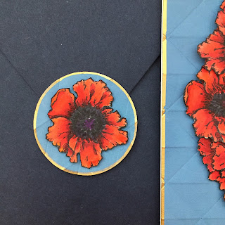
There was just one poppy bloom leftover, so I used it to make an envelope seal from a scrap of my background.

poppies envelope seal made from an extra red flower and blue background scraps. Memorial Day card.

Whew! I hope you enjoyed reading today, and are feeling more ready than ever to tackle a big coloring project, or maybe you are inspired to make a patriotic card of your own, or even play around with a flower wreath. Please, feel free to ask questions in the comments! 

Have a wonderful week!
Elizabeth 

Supplies Used:

stamps:  Power Poppy (Poppies)
markers: Copic sketch (BV29, R05, R14, R24, R29, R37, R39, R59, R89, Y15, YR000, YR07, V09, 110, 0), Memento (Tuxedo Black)
colored pencil: Faber-Castell Polychromos (white)
dies:  Simon Says Stamp (Tilted Banner die)
ink: Ranger Distress Oxide Ink (Faded Jeans), Memento (Tuxedo Black), Krylon (18kt gold leafing pen)
card stock:  Neenah Classic Crest (Solar White 80#, Solar White 110#), Paper Source (Persimmon 80# cover, Night 5.75" envelope)
embossing folder: WRMK (Next Level embossing folder - geometric)
tools: Minc mini, Minc foil (gold), MISTI, Tombow Removable adhesive, glue dots

Friday

Friday's Good Vibe 5


Well hello, sweet friends, we’re back with a dose of fun, the Good Vibe 5. Happy Friday, everybody!

No. 1 

What an awesome entry in our Power and Spark “Frame It Up!” Challenge from kerry2 on Splitcoast! Kerry really rocked a multi-level color palette with thoughtful details throughout, and the star of the show is our Cuppa Buttercups digi. The challenge ends on Wednesday... so you still have ample chances to make a few cards to enter. Did you know that you might win $50 to spend at Power Poppy? Read the challenge details here — and give it a whirl.

No. 2 


California girl Tosha Leyendekker found the most decadent bunch of sweet peas at a nearby strawberry stand, and simply had to have them! We understand completely, having fresh flowers inside can make all the difference... just walking past them on the countertop brings a lift to your spirits. Can you get out your Sweet Memories or Sweet Pea Show stamps this weekend and infuse the petals with these juicy shades? 

No. 3 


If you’re into loads of petals and oodles of coloring choices, then our Gerbera Daisies stamps are right up your alley! In clear and the digital format, Gerberas are our Weekend Stamp Steal! Check out inspiration galore using these sets. No code needed for these special offers.


No. 4 


Be sure to check out this highly watchable watercolor tutorial by our marvelous Instant Gardener, Jessie Banks. Featuring our French Lilac digi (this one also comes in clear as Lilac Time), Jessie’s techniques are ones you will want to add to your coloring arsenal.

No. 5 


As we wind down the school year with children’s graduations left and right, we think Lisa Johansen (@alcojo94 on Instagram) chose the perfect stamp for her card: Seeds of Today. The color palette of turquoise, chartreuse, and olive green are ideal compliments for the artwork, and the circular die fits this image to a tee. Beautifully done, Lisa!


It’s time to reveal the cards that the Bloom Brigade has been making this week with Power Poppy stamps — something I know we all look forward to seeing! Always such a range of stamps and techniques used, and inspiration from the heart! You are sure to find ideas for your creative weekend from these amazing ladies...


Thank you so much, Bloomies, your every creation is a delight to our eyes.

Feel free to share the images on this page on social media, and as always, we would love for you to tag us!
  • Instagram: @powerpoppy and #powerpoppy allows others to find your post
  • Facebook: @powerpoppyrocks and #powerpoppy allows others to find your post
  • Pinterest: @powerpoppyrocks and #powerpoppy allows others to find your post
- - - - - - - - - - - - - - - - - - 

A few more quick notes... did you happen to catch our new Tuesday column, Hues to Use? Go check it out and get your color-pickin’ wheels kickin’! Be sure to check back next Tuesday for a whole new palette.


MONDAY: Be sure sure sure to come back by for a very special guest that's joining us on "The Blog" to bring us another enlightening episode of Inspire Me Monday. You are not going to to want to miss this one!

And about those digis that I was hoping to release... gonna have to wait a few more days, folks, they are not QUITE ready to share with the world. COMING JUNE 5th.... which is also my birthday, tee tee, we’ll have a FEW very special digis to introduce for your coloring pleasure! Thank you for hanging on out there...

And to close, I wish you and your family a wonderful Memorial Day weekend, filled with extreme gratitude and reverence for those who have given their lives to defend our freedom and preserve our way of life.


Tuesday

INTRODUCING.... Hues to Use!


Hello Peeps —Top of the mornin’ to you all!  You know those colors that just SING to your heart? The ones that make that small corner of your mouth just start to move upward -— so much so, that before you know it you're in a full-blown SMILE mode? Well folks, Tuesdays at ‘The Blog’ are about to get a whole lot more colorful and creative!

WHY, YOU ASK?

Because we are about to unleash a color intervention with our brand new feature.....


We’ll take a trigger from Marcella’s own Instagram and spark a wash of color with our HUES TO USE post each Tuesday! I have to say the graphic above just makes me giggle. Only Marcella would pull over to snap a photo of a motel sign —just because the typography moved her! ;-) Just in case you wondered, this mid-century motel on US 62 looks like colorful pieces of candy nestled among the trees and comes complete with an Almond Joy waiting for you on your pillow! Want to get closer to town? Take the trolly service to historic downtown Eureka Springs, Arkansas a mile away. If you’re up for a real challenge, the Joy Motel is actually up for sale! This candy-coated retro goodness could be yours...

Well, after you make that call, get your fingers inky and share these bright and jaunty shades of cool water, antique rust and beam o' sunshine! What are those shades, you say? Just use the photo as your guide and have a little fun in the process!

And just to kick off Tuesday’s “Hues to Use” festivities, here’s a peek at the two — yep two — cards that I made!

CARD #1


Well, when you think sunshine, who can refuse the splash of happy found in Power Poppy's digital stamp set Cuppa Buttercups? I just had to use this little number for this challenge. I colored it up with Copic markers and used Y13, Y00, YR04, YR09, G24, G20, BG11, BG10, BG000 and BV00 and BV0000 to shade underneath the cup. Mat it up with some punchy Stampin' Up papers, add some embellies and bam — done! 

Here’s a close-up! You can’t see it really, but each center of each flower has a little razzle dazzle added thanks to glitter glue! 


CARD #2


For this second card, I was lucky enough to find some arrow decorative paper (also Stampin' Up) in just the right colors to play off the Joy Motel's snappy arrow sign! You can see, this is mostly just an explosion of decorative paper mixed with the Power Poppy stamp set Big Scripts!  I created the drop shadow effect by stamping the word “Hello” first in Morocco Memento Ink and then, I cleaned my stamp and then shifted my stamp and inked it with Straw Vivid ink. Because the stamp is clear, it was easy to see the offset before my ink even hit the paper!

Here's a closeup so you can see what I am talking about! 


And that, my friends, is it! I hope you use these three peppy shades when you create this week! If you do, be sure to link up your creation so I can have a lookie at your craftiness! Can't wait to see YOUR take on HUES TO USE! ;-) Link up your card below and keep the inspiration going!


See you back here real soon!
~Julie

Friday

Friday's Good Vibe 5


Hey there, have you noticed our new Friday format? Week two of the Good Vibe 5 has arrived, Happy Friday, everybody!

No. 1 


A favorite set for beginners and experts alike, Geraniums Take Two in clear and the resizable Geraniums digital set are our Weekend Stamp Steal! Check out inspiration galore using these sets. No code needed for these special offers.

No. 2 


A peek behind the scenes with Marcella from this week: I spent a few days returning to my painting passion, creating artwork for my son’s fifth grade graduation program. It had been some time since I’d gone from pencil directly to paint (you guys know that I normally ink things up!) and it felt so marvelous. A scene of Milkweed and Monarch caterpillars, chrysalises, and butterflies was a real joy to work on outside in my garden. See my process from pencil to the full color image on my Instagram @marcellahawley.

No. 3 


Get spiked for a high-contrast punch of color, paired with a busy monotone pattern — as Julie Koerber’s new porch pillow shows us, this match-up totally works. Try it on a card this week and see where the pairing takes you...

If you make a card inspired by this image, share with hashtag: #powerpoppymoodboard so we can find you and shower you with love. Or link up your card right here!


No. 4 


Our Power & Spark “Frame It Up!” Challenge is rolling along (heads up that the link-up glitch has been fixed and everyone can upload)! Be sure to take a few moments to visit Irene Rhodes' blog to see her beautiful Hellebores card, framed so elegantly and colored up like a dream.

No. 5 


This can be a challenge for many of us, but when we are able to dig in to the process — really fall in love with the steps it takes to “do the thing” without putting as much emphasis on the outcome — it can become a great source of joy. We only get the time we get. Each hour, each moment. Be present in that time and allow yourself to fall in love with each step. Even if your finished product isn't all you’d hoped for, you are still getting practice, gaining experience, AND you are putting a positive spin on life’s small moments. 


Let’s go see what the Bloomies have in store for us today!! I know there are some super cool cards to see....

Julie Koerber >>see Julie’s take on our Mood Board inspiration


Thank you so much, Bloomies, we love love love you!

Feel free to share the images on this page on social media, and as always, we would love for you to tag us!
  • Instagram: @powerpoppy and #powerpoppy allows others to find your post
  • Facebook: @powerpoppyrocks and #powerpoppy allows others to find your post
  • Pinterest: @powerpoppyrocks and #powerpoppy allows others to find your post

Our new Instant Garden digi has been pushed back a few days (someone was drawing Monarchs for school), so continue to keep yer eyes peeled for something flowery and fun from my drawing table! On tap for Monday, we’ll have an awesome tutorial from Jessie Banks, be sure to pop over. Big love from me to you....


Monday

Inspire Me Monday Rewind!

SPECIAL NOTE: Every now and then, look for the Power Poppy blog to rewind back to a fabulous tutorial that just needed an "extra play!" This one, created by Christine Okken back in September of 2014, was so ingenius we thought we'd schedule it for a re-run. And, we are excited to share that this stamp set, Sassy Succulents, is also back in stock! 


Hello Power Poppy Friends!  It’s Christine here with another Inspire me Monday!  

I’m always trying to think of new ways to look at what I have, new ways to creatively use my supplies and colouring mediums to create a different effect.  It makes me feel like I’m getting more “bang for my buck” from my supplies, which is always great.  Today I thought I’d show you something else you can do with your Copic Re-inkers, besides just refill your markers.


Copics and their re-inkers are alcohol based so you can achieve a gorgeous polished marble effect on vellum.  


I began with these supplies:  Power Poppy’s beautiful set Sassy Succulents cardstock vellum, VersaMark ink, an embossing buddy, gold embossing powder, Copic Blending Solution, Copic Re-inkers (here I have BG11, YG03, YG61),  some scrap paper and a clean sponge.  


The first step is to wipe the embossing buddy all over the vellum cardstock.  This is a really important step because without it, vellum will be really staticky and your embossing powder will stick everywhere you don’t want it to!  Next,  I stamped the hen and chicks image from the stamp set with VersaMark ink and embossed it all in gold.  Gold is still very trendy and I thought would work wonderfully with this technique.  


Next, make sure your vellum piece is on some scrap paper, with the embossing face down toward the scrap paper.  Then, onto your clean sponge add a couple of drops of re-inker, here I’ve used YG03.  


Now you can dab the colour from the sponge onto the vellum where you’d like it.  I wanted it to give some green to the succulents so that’s where I dabbed it.  If your sponge dries out too much, add a drop or so of Copic Blending solution and sponge away again, or add another drop of re-inker.  


Next, take your darker colour of re-inker and do the same, sponging on colour.  Because the surface of your paper is damp, the vellum will resist the colour a little and it will pool and move nicely.  What I did next was take the re-inker and add a drop here and there directly on the vellum where I wanted more concentrated colour.  Vellum very much mutes the effect of the colour so you definitely want to use stronger colours so they’ll show up.  


Then finally I added in some “background” BG11 soft bluey-green, straight  from the re-inker onto the empty areas allowing it to move and pool because the paper was damp.  This all goes quite fast.  

Once that step is done, you’ll need to let the page sit for a bit to dry.   I think I let mine dry for about 15 minutes.  It will remain slightly tacky on the colourful side, but because it is alcohol ink it shouldn’t spread or stain.  


Here’s what the finished card looks like.  You can see that I carefully added some pointillism dots on the embossed side of the vellum to tie it all together, being sure not to touch my Copic marker to the gold embossed areas so I wouldn’t damage my marker nib.  Can you see the lovely “seams” between the colours?  It has a very soft impressionistic effect.  

Something important about vellum is that because it is relatively transparent it will show any adhesive you’ve added to the finished design, so on the upper edge of the card, I’ve sewn the layers together;  then I’ve strategically placed a sentiment and accents on the card where I add adhesive underneath and the embellishments hide it.  When your vellum layer lays tightly onto a white background layer it really shows off the colouring more effectively.  


A very quick and lovely technique making a great use of your Copic Re-inkers.  Give it a try!  

Thanks for joining me today!