Tuesday

Creative Confetti: Let's throw up a sketch!


Hi folks! How's your week shaping up so far? Grand, I hope! I thought since it had been a while since we did a sketch, maybe it was time to cue up one to inspire some crafty endeavors this week!


Instead of recreating the wheel, I decided to pull up a card from my personal blog and use THAT as inspiration! To pick just one, I decided to go with the card I created closest to this date last year. And, that's where the inspiration sprouted for this week's sketch! So, after scrolling back, here's the sketch!


And here's the card that inspired it!


As you can see, I used Power Poppy's stamp set Poppies and colored it all up with Copic Markers. I love, love, love the red and purple color combo and that splash of yellow helps give that bit of visual punch! It will be fun to see what color combo you rock! Just a little note, I used the clear stamp set but there is a similar set you can download in a digital stamp set called Perfect Poppies. It is JUST as beautiful! Be sure to check it out! ;-) 

And here's a close up for you, so you can see those vibrant poppies! 


Now, for those of you who love a little extra bit of a challenge, check out Power Poppy's Sketch board over on Pinterest HERE. If you want "extra credit" and want to try a different sketch to upload for this challenge, head on over to that board and choose one! Just that simple! I noticed we need to get more in the habit of ushering in sketch challenges because that board has just shy of a dozen. It would be nice to build on this and have dozens to pick from! ;-) So, keep playing along and we'll add to that board every now and then.

Until then, let's see your take on one of these layouts! Feel free to flip it any which way you like as well. Just make sure you reference the original sketch so we can see how you interpreted it! Once you're done creating, don't forget to link up your card using the linky below so that we can see your handiwork and, at that point, you'll also be in the running for a $25 gift code to the Power Poppy Shop too! So, as I love to say, get inspired then get those fingers inky!

Until next time!

~Julie 
Creative Confetti Thrower

“Pick” a fruity focal point!


Hello everyone! Are you ready for a fun-filled and -- dare I say -- delicious challenge this week that puts some sweet tasting bits of nature in the spotlight? Let's throw up some Creative Confetti to see how those little artsy bits fall, shall we? 


With the release of 
My Favorite Pair over the weekend, I thought the time was perfect for a fruit-inspired challenge! Don't you think?


HOW TO PLAY: To play along in the Tutti Fruitti Challenge, pick one of your favorite fruit images and.... create! Power Poppy has plenty of inspiration to "pick" from! ;-) To make it super easy, I've listed them for you! Some are digital stamps, which would make it super simple to get your hands on. The others are clear stamp sets that you just might have in your polymer stash! 


DIGITAL STAMPS 

Apples in Season
Berry It
Cherries and Berries
Juicy Strawberries
Lilac & Lemons
My Favorite Pair
Partridge in a Pear Tree
Tea Cake with Strawberries
Wreath: Boxwood & Cranberry 


CLEAR STAMPS

Farmers MarketGo Wild  -  there are berries in that bouquet!

Lilac Time -- check out the lemons!
Tea in the Garden
Tree of Life - that tree is loaded with fruit!


Whew, that's quite a few stamps, huh? Lots to pick from folks -- lots to pick from! 


On to my creation!

I have to be honest, with my work week being as it is, I didn't have time for a full-fledged card but I did have a blast coloring up the latest digital offering from Power Poppy!


I colored up My Favorite Pair using Copic Markers and the no-line version of the digital stamp set. I did kind of get lost in the process and it was divine! I was going to list all the Copic Markers that I used but honestly, I have about 40 on my desk as we speak and they just weren't going to fit in one photo together! After I colored up my image, I did add further definition to the leaves using a dark green Prismacolor colored pencil. I love how it brings out the veins of the leaves and delivers just the right amount of visual punch.


Now because I didn't have time to create a card, you'll have to stay tuned! I hope when the Bloomies come back for our Good Vibe Friday that I'll be in the mix with a card! So, you'll have to swing back to see what this colored up image turned in to. 


So take a trip into the Instant Garden over at Power Poppy or dig into your stamp set stash and pick out a fruity image to create with me this week! If you play along and link up your creation below, you'll be in the running for a $25 gift code to the Power Poppy Shop! So, as I like to say, get those fingers inky (and fruity!) and play along! One more note, our Creative Confetti link goes up at the beginning of the month and stays up all month long, meaning you can link up any one of the challenges for the month of January -- as many times as you like! Fun!


Thanks so much for stopping by! I can't wait to see what you create! 


~Julie 
Creative Confetti Thrower


Monday

Inspire Me Monday: Painterly Details


Hello there, friends. It’s Marcella here today, and I thought it would be fun to share ideas for adding painterly details to your coloring. What do I mean by “painterly details”? Think of decorative qualities such as color, texture, line stroke — the little style extras that make your work feel unique and artistic. From stippling to ink washes, there are so many cool things to try, in fact you’re incorporating a few into your work already, I’m sure. 

Today I’m coloring my new digital download, My Favorite Pair, released just this week. I’ve been dying to dig into it with watercolor and gouache paints, so I squeezed a few colors onto my messy paint palette and got to work. How will I add painterly details? Let’s start with some history.

1. Reference the masters

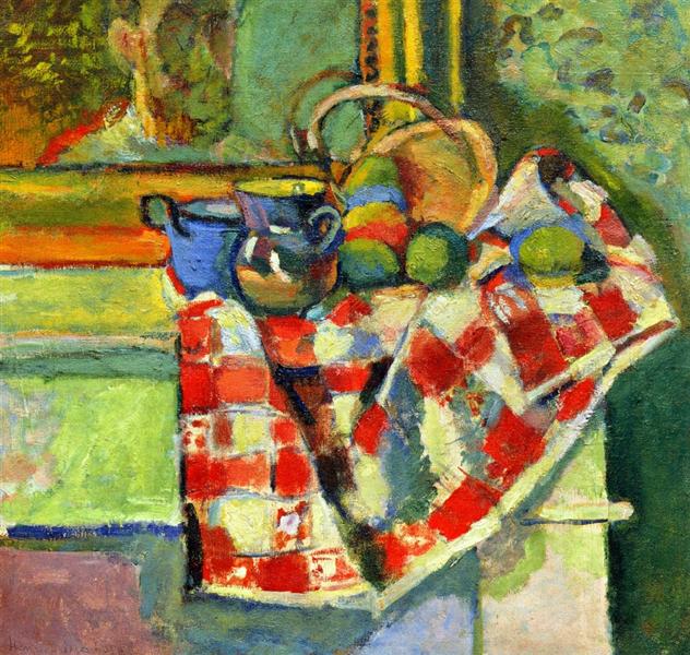
Henri Matisse, Still Life with Checked Tablecloth, 1903. Source: WikiArt
There are zillions of artists whose work you can follow for painterly inspiration — and having many choices can be daunting. For today, I suggest referencing the work of Henri Matisse, Paul Gauguin, Edouard Vuillard, Paul Cezanne — painters of the Impressionism and Post-Impressionism movements. Each artist could handily paint landscapes, still lifes, and portraits as realistically as you’d like, but their work became more exciting, interesting, and alive when they explored breaking through the traditional rules of painting. We can steal little ideas from their breakthroughs, and possibly have breakthroughs of our own.

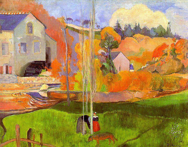
Paul Gaugin, A Breton Landscape, 1894. Source: WikiArt
Rather than painting the precise details of what the human eye sees, painters in the Impressionism movement shared the sensations and feelings of their visual experience via color, form, composition, and brushstroke. Rich dabs of orange, turquoise, yellow, green that would have seemed out of place in a more traditional, realistic painting, help communicate the richness of the world. The way light falls on an object. The feelings that wash over us, or the feelings we wish others to experience. We aren't just painting what is literally there, but our impressions of it.

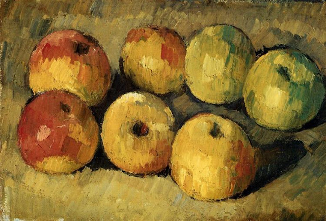
Paul Cezanne, Apples, 1878. Source: WikiArt
Controlling the brushstroke was an important part of the Impressionist artist's process. Notice how in Cezanne’s Apples, his strokes are short and thick, repetitive, almost feverish stabs of color.  The impression from the overall work still reflects light and shadow, but because of Cezanne's use of thick, staccato brushstrokes, the apples have a movement and richness that is unique and interesting.  I mean, it’s still a painting of apples. But it's a more interesting painting of apples because of the painterly details.


2. Start with the familiar

I’m not trying to frighten you with these Impressionist paintings — but hope you’ll add to your arsenal of techniques and references. I am not one to drop everything and switch up my painting style. I have a look that feels comfortable to me, and while I do try to stretch myself at times to keep things fresh, I tend to slip back into my familiar style. Hence... I started painting my pears with washes of green watercolor tinged with a pink blush...


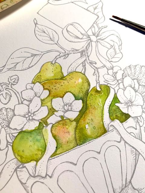
This style feels very comfortable to me. I began by layering yellow-greens, and mixed the complement of yellow-green, which is purplish-red, into areas of the pears that should feel as if they are in shadow or descending into space. Here and there I’d dab on a darker green or a bit of turquoise. I put some thought into my color scheme — and I know from color theory that using the complementary colors of yellowish green for the pears and purplish-pink for the African violets would have a pleasing visual effect. I brought in turquoise blue for the bowl to add some zip, knowing that I would use the blue again in either the little tag or the ribbon.


More layers, and adding color to the bowl and flowers — I am still in my familiar style at this point. I’ve started getting very dark with what Kathy Racoosin calls the “nooks and crannies” — what an apt term — the little spaces that, when colored extremely dark/dull, bring out a real sense of depth to the rest of the piece.


I decided for a rich purple for the ribbon. I started with a more medium lavender tone, and then added shadows with intense violet and then highlights with white mixed with lavender.

I then went to town on the nooks and crannies, using a blend of very dark blue, purple, and a touch of Van Dyke brown to bring out the form of the various elements. With everything “colored in” at this point, I was feeling pretty good about things... and decided to go on to bed before making any odd color decisions due to sleepiness, or dropping my wet paintbrush onto the canvas because my hand was tired. :)

3. When in doubt, sleep on it

Waking up refreshed, the next step of adding painterly details jumped out at me. Add turquoise!

Strokes of turquoise were added the pears, the ribbon, leaves, and shadow areas in my “painterly details” phase. (Notice in the Matisse painting at the beginning of his post, how he has brought in those tangy colors around the pears!) See how my tiny turquoise dabs bring a bit of zing to the painting?


When you look up close, you can see that in some areas I’ve blended my colors, and in others, I’ve deliberately left brushstrokes showing (note the leaves and ribbon). I feel areas like this reflect the artist’s hand. A thoughtful, yet freeing process of deciding which ares to give a little more attitude, a little attention. Remember, I’m not going for realism (not sure I can even paint all the realistically if I tried). I am going for a painterly look with a bit of whimsy.


I put in a washy background of yellow, blue, turquoise, chartreuse.... very light washes over and over. I added thin horizontal lines behind and beneath the bowl to add texture and more painterly detail.


After the background was put in, I loved the sunny feeling of the yellowy glow so much, I decided to dab it around the main content of the painting, too. A dab of yellow on each pear. Dabs on all the leaves, even a bit on the purple ribbon. But it really shows up nicely on the bowl. As if sun is splashing across it. 

And.... that is it for me today. I’d love to see you all adding painterly details inspired by any artists that speak to you. It is a great exercise in experiencing color and one step further in deepening your artistry. XOXOXO!! 

Sunday

Instant Garden January Release: My Favorite Pair


Sometimes the 15th of the month turns into the 20th of the month. 

Introducing: My Favorite Pair


Happy January! I’m super stoked to share the second image in a series I’ve been working on: bouquets nestled into vintage French café au lait bowls. The vessels are rustic and charming, with simple patterns that you can coordinate to the flower colors. My Favorite Pair is a refreshing mix, one I don’t know that you’ve seen before in an image for coloring: pears on the branch and African violets accented by meandering ribbons.


African violets (Saintpaulia) are plants native to Tanzania, but have come to be known to be wonderful, cheery windowsill plants for those of us not in tropical climates. Their color range is vast: every shade of blue, purple, magenta, pink, through to coral, white, even bright green. Their glaucous leaves have lovely indentations, and are a nice foil for the bright green, spotty flesh of our pears! There’s a lot too love about My Favorite Pair.

 The Instant Gardeners have created some GORGEOUS cards for today’s release - and will be sharing cards through to January 25th.


I want to share some inspiration images... I really do enjoy “playing” with textures, styles, and colors that I think will go well together and be lots of fun for you to work with. Here’s a little combination featuring African violets in salmon with a rosy edging — notice how you can work in a bit of a pinkish-salmon flush on the pears, and then bring in a pink tone in your café au lait bowls. The ribbon is a muted pink with tinges of pale green. I mean, come on, people, this stuff is so much fun!!


My Favorite Pair is a detailed drawing that comes both with and without my handlettered sentiments. And I’ve included light grey versions of each for “no-line” coloring.


Always remember that you can enlarge the image or crop in if it seems too daunting. That’s part of the fun of digital stamps. 

Enjoy seeing the cards of today’s release cards in their entirety — the Instant Gardener team went above and beyond.


Thank you, than you, for your GORGEOUS WORK, ladies!

If you’re interested in taking a class RIGHT NOW featuring My Favorite Pair, you are in luck, my friends. Amy Shulke of Vanilla Arts has just launched a class sharing the fundamentals of complementary colors — and where to add those colors. 


Isn’t that fantastic?? Color along with Amy in her livestream — and get a special discount on this digital stamp. Click here for info.

Visit us here for Inspire Me Monday hosted by yours truly. I’ll share my painted version of My Favorite Pair along with some of my favorite tips! 

Thank you for coming by today, sweet ones. xoxoxo

Friday

Room for Good Vibes!


Hello Happy Stampers! If you are wondering what this little quote is above, Marcy and I were chatting and she just so happened to tip me off to some of the amazing things the Pulitzer Prize-winning poet, Mary Oliver, said in her life. Do a Google Search or click HERE  and you'll just feel as though reading her words is like breathing in a healthy dose of fresh mountain air. 


Sadly, she passed away yesterday after a battle with lymphoma. Because her words are so incredibly inspiring, Marcy thought it might be nice to headline a post with one of her quotes as our little way to honor her and share some of her incredibly wise good vibes! If you click on the link, you should know it's pure gold, honestly. It begs the question, do you leave a little room for the unimaginable? For that sense of wonder? I can honestly say I don't do it enough. I am hoping 2019 is a year where I do leave a little more room. My word of the year gives a nod to that -- NURTURE -- as in nurturing not only myself with good health but nurturing friendships, nurturing my family in love, nurturing experiences and making sure that even the simplest, most mundane things are seen in a way that makes them anything but simple and mundane.


Maybe one of Mary's quotes will light a little fire inside you? Let us know in the comments if you searched her out and what YOUR favorite quote is! 


In the meantime, I have a little eye candy to tease you with! Marcella has been working on a big project, so the digital stamp set we shared a snippet of recently has been delayed a few days. With some of the samples from the Instant Gardeners "sprouting," I thought I'd share a little teaser so you can see what's coming down the pike! Squeeeeee! Keep it tuned right here to the Power Poppy blog! This baby is going to be released sometime between the 20th and 25th! 


Check it out! 


With that little taste of wonderful thrown before you, I have a little bit more! A few of the Bloomies are on standby, ready to share the beautiful things they've worked on this week to brighten your day!  


And that, my friends, is it! We sure hope you've enjoyed this microdose of good vibes and that it jumpstarts your weekend with positivity! 


Until next time!


~Julie 


Tuesday

Creative Confetti: Let's Go Half & Half!

Hello sweet peeps! Today we're throwing up another handful of sparkly fun and Creative Confetti to see just how it inspires you in your craftsy spaces! This one is a fun one because I really think this challenge will turn into some amazing, beautiful and bold cards! Can't wait to see your take on this challenge! So, here we go!


HOW TO PLAY: Just as simple as above. Split your card front -- any which way you like -- into at least two colors (you can split it more if you like!) and let the main image float between the colors. You might have to use an embossing powder or another medium to help that image to show up on the darker portion of your card or maybe you want to color the two sides differently? This is ALL up to your creative interpretation!

On to my card!


I have to tell you, I had no idea where I was going when I started this card and, honestly, I am still not sure I got there! ;-) Do you ever have card making sessions like that? Man, anymore these days, that's all I have!

To start, I grabbed my MISTI, and lined up the paper to know where that large, lush, and beautiful flower from Power Poppy's set Abundant Petals might fall. Instead of making both halves in black ink, I decided to make the bottom half more soft and subtle so I stamped using Memento Rosebud ink. The top is Memento Tuxedo Black. After I was done stamping, I stenciled a bit of Baby Pink Memento on top using a Tim Holtz die -- Dot Fade and then I used the stencil and Worn Lipstick Distress ink on the bottom.

Here's a closeup for you!


You can see I added a little sparkle to the lines of the Thank You sentiment with a bit of glitter pen. Gotta have just a smidge of sparkle -- no matter what! I should say that I colored up the flower using Copic markers and reached for R32, R35, R43 and RVOOOO. I highlighted around the flower using BG0000, BG10 and BG11. Add a few little doo-dads with the help of a white embossed sentiment strip (all sentiments are from the same Abundant Petals set) and some pennant flag stickers and... done!

If you need a little more inspiration... 
Ally Cope crafted an Inspire Me Monday which kind of touches on this concept. She called it "Yin and Yang!" She divided her card into more than just two halves. You could too if you like and be inspired by her tutorial HERE!  It's a fun one so click the link, grab a cup of your favorite beverage and enjoy!

And that, my friends, is it! Did you play along with us last week and show us a little smidge of Father Time or did you vow to start all things new and try a creation with a nod to Baby New Year? Have no idea what on earth I'm talking about? Click HERE to travel back to last week's challenge! All four challenges of the month are open until the close of January meaning any time during the month you can try all four -- giving you extra chances to win a $25 gift code to the Power Poppy Shop! Woohooo!! Let's see what you've got my sweet stamping friends! ;-)

So, try last week's challenge or go "Half & Half" and cue up this week's Creative Confetti Challenge. No matter which one you choose, don't forget to link up your creation so we can 1. see it and 2. get you in the running for some Power Poppy goodness! 

Until next week!
~Julie 
Creative Confetti Thrower


Monday

Inspire Me Monday: Coloring with ZIGs


Welcome to Inspire Me Monday!  I’m Allison Cope. Today I’ve gathered a variety of floral and other images stamps and were going to make a simple square card.  We’re going to be coloring in our images with ZIG Clean Color Real Brush Markers.

Come and join me at my desk and join along in the fun!

https://www.youtube.com/watch?v=d1L55v4SgB0&feature=youtu.be


The gorgeous stamp sets that I used today included “Abundant Petals” (Maidenhair fern), “O Hoppy Day” (Wheat), “Succulent Singles” (2 Succulents), “Peony Muse” (Peony bloom & bud) and the “Cabbage and Kale” stamp set.


And here's a close up of all the different layers...


Thanks for joining me today!  I hope you enjoyed my card making process.  I'd love to hear what you think in the comment section below.

Happy crafting!

~ Ally ~


stamps: Power Poppy (Abundant Petals, O Hoppy DaySucculent Singles, Peony MuseCabbage and Kale)

dies: Power Poppy (Abundant Petals Dies, Succulent Singles Dies,  Peony Muse Dies, Cabbage & Kale Dies), Catherine Pooler (Circle Dies
inks: Kraftin’ Kimmie Stamps (Wicked Black), Catherine Pooler (Flirty Fuchsia, Sweet Sixteen), ZIG Clean Color Real Brush Markers 
sequins: Pretty Pink Posh (Sparkling Clear)
cardstock: Recollections (110# White)
other: Stickles (Star Dust)

Friday

Ready for Good Vibes?


Well, hello there my sweet Power Poppy Peeps and... HAPPY FRIDAY! With this fabulous end to the week comes a brand new splash of inspiration to get you started on a wonderfully creative weekend! So, are you ready for a short burst of artistry in our weekly edition of Good Vibe 5? I sure am! Let's get to it, shall we?


GOOD VIBE 5 HIT LIST!

1. Cheers to YOU! Essie's creation designed to deliver wedding cheer to a fab friend delightfully grabbed our attention! Visit the link to see how she so creatively used Power Poppy's Dream Wedding. 

2. A Dose of Sunshine Sathya worked wonders with Power Poppy's Heart Abloom digital stamp set. That beauty of a flower is just a single image in the set but Sathya worked her magic to make that double petaled hellebore stacked and full of color and pizazz! Love it! 

3. Foiled Again! There have been so many video tutorials lately on using foil to add a little gilded bit of razzle-dazzle to cards and creations. Jenny Colacicco took it one step further to share her tips and tricks on using this accent with watercolor! Here's a link to her jam-packed video where she shares all the tips and tricks to creating a watercolor foil resist creation!  

4. ICYMI Did you happen to see the fun tutorial Tosh shared for this week's Inspire Me Monday? We thought her wrap around technique was so fun, it was worth a mention here on our Good Vibes 5! Click HERE to see how she brought out the best in one of our favorite Power Poppy illustrations -- Artistic Bouquet -- by wrapping it all the way around her card. You have to check this one out! Pure and simple genius!

5. New Digi Brewing! I know you're going to squeal (like I did) when I first set my sights on the next digital stamp set that is set for release TUESDAY! It's the second in the release of Marcy's Cafe Au Lait series! I've only shown off a snippet. Trust me, the whole image is downright glorious! Be sure to swing back and see what she has in store!


With the first full week after the holidays under our belts, a trio of Bloomies were able to steal away to some time in their stamping spaces and we are sure glad they did! Be sure to hop on over to see what these ladies whipped up for all to see!

Cindy Lawrence >>> check out her video! 


And that, my friends, is it for us today!
We do have some excitement in the works to share. Like I mentioned, be sure to check back in on Tuesday for a new digital stamp set release called My Favorite Pair! And on Monday, Ally Cope has cued up some tips on coloring with ZIG brush markers! Can't wait!


Until then, have a beautiful weekend!
~Julie Koerber 

Tuesday

Keeping the Old? Or Ushering in the New?

Hello, sweet stamping friends & Happy New Year! As we rip off another month and another year from the old calendar, how do you plan to spend 2019? That's what our challenge is all about today! So, let's throw up the Creative Confetti and see what we have in store for you all this week!


So, you might ask, "How do I make a card to show my intentions for 2019? Well, there's a bit of a formula to this one!  Which one of these iconic figures will you follow? Baby New Year? Or Father Time? 


IF YOU CHOSE BABY NEW YEAR, that means you have already picked out your New Year's Resolutions and hope for bigger and better things in 2019! So if that's your plan, to follow this challenge all you need to do is create a card for this brand new bundle of joy -- a baby card!

IF YOU CHOSE FATHER TIME, that means you don't really want to embrace new things. You're good with the way you are and, who loves resolutions anyway? So, if you plan to follow Father Time and keep on living the good life as you are, create a card to honor him with a masculine creation!

On to my creation! 

Well, as you are about to see, I have big plans for 2019 and it all boils down to my health. In October, I started a major health overhaul and really dialed in my nutrition and fitness. Not to bore you with the details but I have come a long way - cholesterol is down 40 points, weight is down 15 pounds and I just feel so much better. BUT, I am nowhere near done yet. So, say hello to my creation!


Yes... a baby creation! I have to admit, this is not a new creation. I was lifting something recently and injured my wrist which makes coloring downright painful. Ouch! So, I am going to lay low creatively for a bit. I knew you wouldn't mind seeing one of my previously made creations! I did this using Power Poppy's set Precious Baby.  If you'd like to read up on all the details surrounding this card, all you need to do is click HERE and it will take you to my blog post, which shares exactly how I made it! ;-)

Here's a few close ups for you!


And that, my friends, is it! A baby creation to help Baby New Year make a splash in 2019!

Now, since it's the first Tuesday of the month, that means we get to throw all the entries from last month's challenges into a virtual hat to see who will win our $25 shopping trip to the Power Poppy Shop! So, without further ado...


That means this month's lucky winner is.....

***  JOYCE CASALDI!  ***


Joyce used Power Poppy's Poinsettia stamp set and created a tag for our Tag You're It Challenge! What a lovely creation! I love how she staged her photo in her actual tree too, just to add to the wow factor! :-)

Joyce, to claim your prize, simply email us at bloom@powerpoppy.com and we will get you your code to shop right away! Congrats and thank you so much for playing along and sharing your beautiful tag!

And that, my friends, is it! We can't wait to see how you are sizing up 2019 with your creations! Once you're done creating, of course, be sure to link up your project so that everyone can see your awesomeness! And, if you do, you'll be in the running for a $25 gift code to the Power Poppy Shop! One random winner is chosen every month. We could all use a little extra Power Poppy goodness, right? So dig out your favorite stamps create something with an OLD or NEW twist and get those fingers inky! ;-)


Happy Stamping! 
~Julie
Creative Confetti Thrower