Showing posts sorted by date for query Make it Move. Sort by relevance Show all posts

Monday

Inspire Me Monday: One Image, Three Ways!


Hi all and welcome to Inspire Me Monday with yours truly.... Julie! Long ago... when I was teaching classes at my local stamp store, one of my favorite classes was to unveil new stamps and then lead a class to show people three or four ways to use that image. I thought it would be fun to not only have a new stamp but be inspired to create with it in a multitude of ways!

And, today, I am showing you a BRAND NEW image from Power Poppy! That's right folks, a new image just for YOU! This one is called Sketches of Spring and it is downright gorgeous with a mix of daffodills, a tulip and a duo of bell flowers! Look for some fanfare from the Bloom Brigade soon as we show off our takes on this beauty! 

Now, onto my "one stamp, three ways!" Here's a look at all the cards I whipped up! 

So, my challenge was to create something that really looked so different between cards. I used some no-line coloring, some monochromatic coloring and then, color in full force!

Card #1

For my first card, I wanted it to be somewhat straight up and simple. I printed this image pretty much full size, so it would cover a full card front. Then... I picked up my Copics and went to town! 

I honestly can't tell you the colors of all the yellow and orange shades I used because I believe that in making these daffodils colorful, I picked up every single one I own! The tulip in the back was colored up with R20, R30 and R32. The bell flowers are B60, B63 and B66. And, the greens were G40, G43 and G63. 

After I colored my base image, I decided I wanted to make the sentiment somewhat of a focal point. So, I printed and isolated one of the daffodils on the far left side and cut and colored just that portion so that I could pop it up and set it on top of my sentiment for a little added dimension. See?


Card #2

Moving on! I have always been a sucker for a monochromatic card. I think they can be done in a way that keeps some dimension and interest. For some reason, I feel one color seems to have that peaceful and serene feel.


For this card, I opened up the digital image in my PhotoShop Elements program and changed the color of my flower to a sage green. If you have the program, all you need to do is hit the Enhance tab, then hit Adjust Color and then Adjust Hue/Saturation. When that box pops up, click the Colorize box and move the slider on the top back and forth until you get the color you like. If you want a lighter version of that hue, just move the slider below it which controls lightness. 

If you're not quite sure what I am talking about, make sure to check out THIS POST that I wrote forever ago about the tips and tricks of using digital stamps! 

Here's a little bit of a closeup to show that I did color up the flowers just adding a little dimension with Copic Markers. I used just two colors -- G20 and BV0000. I really like how it turned out! From there, I added a vellum die cut, some gilded fringe ribbon and a sentiment that was embossed using detail gold embossing powder. Add a button and some ribbon and... voila! 

I should mention with this card and the first, I did use a stitched edge rectangle that is very close to the size of my card front, allowing just a sliver of the card base to show beneath it. 

Card #3

This last card is one of the no-line options offered in the set. I have to tell you, I always get nervous coloring no-line images. You have to think about the depth you are adding and doing it in a way that still looks soft and inviting. I ended up coloring up the image and then adding some depth using a fine tip Staedtler Triplus marker. 


For my card base, I added some stenciled dots using a light peach ink. After I colored up my image, I fussy cut around a portion and then stuck the cut portion through the stitched die circle so that that part of my image wouldn't get lopped off! ;-) I trimmed down the circle and then matted it on a piece of gold stardream paper. See? 


From there, I added a little sentiment and gold cording to help make it pop and... that's all she wrote! 

So, there you have it! One beautiful image done up in three very different ways! Let me know if a tutorial like this is helpful. I plan to join you every second Monday of the month so we can keep up this tradition if you like! 

Thanks so much for stopping by. I hope you have a beautiful and creative week!

Until next time, 
Julie 

12 Days of Christmas ~ Day 7~ Let It Glow


Hello, Friends and welcome to Day 7 of the 12 Days of Christmas!  It’s Barbara W. here and today I am showcasing the Let It Glow clear stamp set and the Let It Glow: Lights digital stamp set from the Quiet Christmas release. 


I am sharing a clean and simple design that can easily be mass produced using a digital image and minimal supplies. I elected to go with no embellishments so the card is not only easy to make, it’s also easy to mail. Let me show you what I've done here...


I printed the string of lights and the sentiment from the Let It Glow digital set onto a piece of white card stock. Then I colored it using just a few Copic markers. I didn’t bother to use shading or to leave highlights on the bulbs because I went over them with a shimmer pen and then added a clear glaze, which gives the bulbs a natural highlight. I used the little light rays stamps from the Let It Glow clear stamp set for the accents around three of the bulbs and then I used a glitter pen on the lines to add a bit more sparkle. I matted the focal image with holographic card stock and adhered that onto my card base. And that's all there was to it!


When I make clean and simple cards, I incorporate details that add interest, like the stitching, the glitter pen and the embossing on the background panel. And just LOOK at the sparkle, shine and dimension the clear glaze gives those Christmas lights! And the holographic card stock matting really makes the simple design pop.  The focal panel is popped up with foam tape but it's not bulky and will still be easy to mail. If I were to mass produce these, I would approach it assembly line style, completing all of one task at a time; die cutting all of the focal panels, embossing all of the background panels, adding the shimmer pen to all of the pieces, etc. That way things stay organized and move along swiftly.


The holographic card stock is really showing off in this photo!  But imagine it with a glitter card stock, or with red or green or whatever colors you choose! Oooo..how about non-traditional colors? Pink and teal. Black and gold. Or all of the colors of the rainbow! Will you try it? I hope you do. Whatever you decide, just have fun with it!

Now here's something I think you'll really like...There's a lot going on!


You can read all of the details on our Day One post, linked HERE. Please stop by tomorrow for Day 8 to see what my Bloomin' Buddy, Gloria has created to share with you.

Thank you for visiting with me today!  I hope you had fun and got inspired!

Wishing you and yours a very Merry Christmas!


Inspire Me Monday: So, You've Taken a Class, Now What?


Hello, colorists! The last time I was here, I talked about taking a class to help you get past creative block. Well, perhaps you've taken a class or two...or three! But, are you saying, "Now what, Gloria?" since you've finished your class?

That is a good question! We often take a class and enjoy ourselves very much. We come away feeling that we've learned a lot. But, then we get back to our desks and studios and...have no idea what to do next! It seems as if all that wonderful information has leaked right out of our brains!

I took THIS class from Vanilla Arts in which we were to color the Bowl of Beauty image. I learned how to shade green leaves with pink (yes, pink!) and how to color glass, and a host of other things. My project turned out fantastic, if I do say so myself.

I also took THIS class where we were to color the Tree Peony image. I learned about distress ink backgrounds and how to add interest to leaves, plus how to make light colors look deeper and darker while still being pale colors. Oh, and a host of other cool stuff. 

I confess, I "failed" at a few of the concepts and wanted to work on just those tasks again. I did not return to my desk and try to recreate each of these pieces! I really did not want to simply copy Amy's project a second time. I wanted to move forward, meaning I did not want to re-take the class or re-color the same images! 

I wanted to use what I'd learned. But, how? It all seemed very overwhelming. I feel that I am a seasoned colorist, but I still felt that I had information overload! What to do?!

Since one of the concepts I wanted to try again was coloring a two-toned flower, I decided to print the Rose All Day image onto printer paper. Yes, I said that. I just printed it onto plain old printer paper! 

The image is about 6 1/2" x 6 1/2", which means it is on the larger side. I printed it on 8 1/2" x 11" paper and then trimmed the paper down and matted with black cardstock once I was finished coloring. 
You are now asking, "Why did you print on such terrible paper?" Well, I wanted to try out some new pencils and I always test them on various papers, even plain printer paper! (These pencils are called Schpirerr Farben oil-based pencils, which are a budget-friendly oil pencil.)

Not all pencils work on all papers, so I always do some test coloring on various papers before I judge the quality of the pencils. This brand is a creamy, oil pencil, and seems to like ALL papers. And, let's face it. Sometimes I just want to color for fun with no plan to make something out of the finished project!  
As I was coloring, the pencils were doing very well on the printer paper, so I just kept going! As I colored, I had a list of techniques to try next to me. It helped me focus on a few things, rather than trying to focus on EVERYTHING. I ended up trying the leaf technique from one class and the flower technique from another, and the next thing...the picture was finished!
Don't be afraid to "waste" paper and printer ink trying new techniques or new tools! Sometimes you need to make some mistakes to learn! This picture is FAR from perfect, but I learned new things and had FUN!
If you are new to coloring digital images, this project is proof that you don't need all the bells and whistles to get started! If you have paper for your printer and something to color with...get going! (I will say, if you plan to color with alcohol markers or watercolors you do need a type of paper suited for those mediums, but if you plan to try colored pencils, try them on printer paper if that's all you have at the moment!)
Also, don't think every image you print must be small and fit on a card. This finished picture is 8 1/4" x 8 1/4". Far too large for a card. When learning new techniques, a larger picture will help you to have more space to "stretch out"!

Plus this large image is perfect to put in a frame or stand on an easel, or even attach to the front of a scrapbook or journal! 

Once you have taken a class, go back to your desk and try ONE technique that you learned from class. The more you use your new skills, the more likely you are to have these techniques at your fingertips every time you color.

And don't forget to have fun!


Artist’s Notebook: How to Create Rich & Complex Color (Monarchs and Milkweed)

Want to improve your Copic Marker or colored pencil with more sophisticated color and blending combinations? Power Poppy’s guest author Amy Shulke from VanillaArts.com offers artistic coloring tips for Copic Markers or colored pencil. | VanillaArts.com | #realistic #howtocolor #copic


Color that makes your heart thump louder.

That’s why we love coloring, right? Bold and beautiful color.

So why do we chicken-out when it comes to our Copic Marker or colored pencil selections? Not only do we use the same colors over and over again but we use the same colors over the top of each other.

We love color but we’re afraid to actually use it.

I know it’s scary, but let’s talk about how to get crazy. Let’s be bold and wild!

Rich and vibrant color? Who doesn’t want more of that?

Want to improve your Copic Marker or colored pencil with more sophisticated color and blending combinations? Power Poppy’s guest author Amy Shulke from VanillaArts.com offers artistic coloring tips for Copic Markers or colored pencil. | VanillaArts.com | #realistic #howtocolor #copic

Hello, my name is Amy Shulke and I’m the illustrator and art instructor at VanillaArts.com. I’ve got a whole series of artistic coloring articles here at the Power Poppy blog; here’s a quick link to a bunch of my previous articles.

Today’s project uses Marcella’s amazing Monarchs and Milkweed digital stamp. I’ve colored it with a combination of Copic Markers and Prismacolor Premier Pencils on Stonehenge Kraft paper.

Yes, you can use Copic Markers on brown Kraft paper. That’s part of what we’ll be talking about today. The sandy brown paper is helping to set the mood for a sweltering summer scene. The Kraft paper makes my color choices look richer more complex.


Want to improve your Copic Marker or colored pencil with more sophisticated color and blending combinations? Power Poppy’s guest author Amy Shulke from VanillaArts.com offers artistic coloring tips for Copic Markers or colored pencil. | VanillaArts.com | #realistic #howtocolor #copic

Light, Medium, and Dark

As a coloring newbie, you didn’t really know what to do, so you fell back on grade school crayon habits. You colored the center of a daisy with one yellow marker or pencil. The petals were one solid color of pink. The leaves were one green.

It was fun but you quickly noticed it looked flat.

So you searched for “dimensional coloring” and found tons of online tutorials about shading with blending combinations. Blending combinations combine a light, medium, and dark marker or pencil. You learned to use combinations to add a bit of dimension to your projects.

But now what?

Now that you’ve got the combo concept mastered, why do your projects still look candy-colored?

Are you still missing something? Is there some next step beyond blending?

Yes, but the internet doesn’t talk much about the next step, does it?

Maybe you should find better blending combinations?

Or maybe you need more color? You could add more colors to the simple light-medium-dark blending combination. How about light, light-medium, medium, dark-medium, and dark?

Should you layer on another medium? A different kind of colored pencil? Watercolor? Pan Pastels?

Stop!


The deep, interesting, and complex color you’re searching for is already at your fingertips. You’ve had the tools all along.


Instead of finding new coloring tutorials, let’s look at how artists create sophisticated color.


Want to improve your Copic Marker or colored pencil with more sophisticated color and blending combinations? Power Poppy’s guest author Amy Shulke from VanillaArts.com offers artistic coloring tips for Copic Markers or colored pencil. | VanillaArts.com | #realistic #howtocolor #copic

"Add some Phthalo Blue to this Alizarin Crimson and a touch of Burnt Sienna..."


Think back to watching Bob Ross paint on PBS.

Did Bob ever say:

“Okay friends, let’s pick up this tube of ultramarine blue and squeeze it right here on to the canvas. Get a really big blob! Now spread it all around until you come to the edge of a tree or the mountain. Yes, let’s make that summer sky one big solid expanse of pure ultramarine blue!”

We loved watching Bob mix brand new colors on his big wooden palette. He’d start with green, he added a bit of violet, then a touch of sienna, and he’d lighten it up with white...

Or he’d start with a weird pinkish brownish color that he originally made for tree trunks, but then he’d add blue to create the perfect color for river rocks.

Bob knew the artist’s secret: 

Pure color is pretty... but color mixtures are what makes the show-stopping beauty.


Want to improve your Copic Marker or colored pencil with more sophisticated color and blending combinations? Power Poppy’s guest author Amy Shulke from VanillaArts.com offers artistic coloring tips for Copic Markers or colored pencil. | VanillaArts.com | #realistic #howtocolor #copic

Shading green with more green

The reason why your projects look candy colored is because of the light-medium-dark blending combination process.
Unlike Bob Ross, you’re using color straight out of the tube.

You’re shading a green leaf with more of the same green.

A blending combination of YG21 - YG23 - YG25 is all the same green. It’s all YG20-something. Green on green on green on green.

Sure, you’re blending. But that’s the problem.


Psssttt… confession time. 

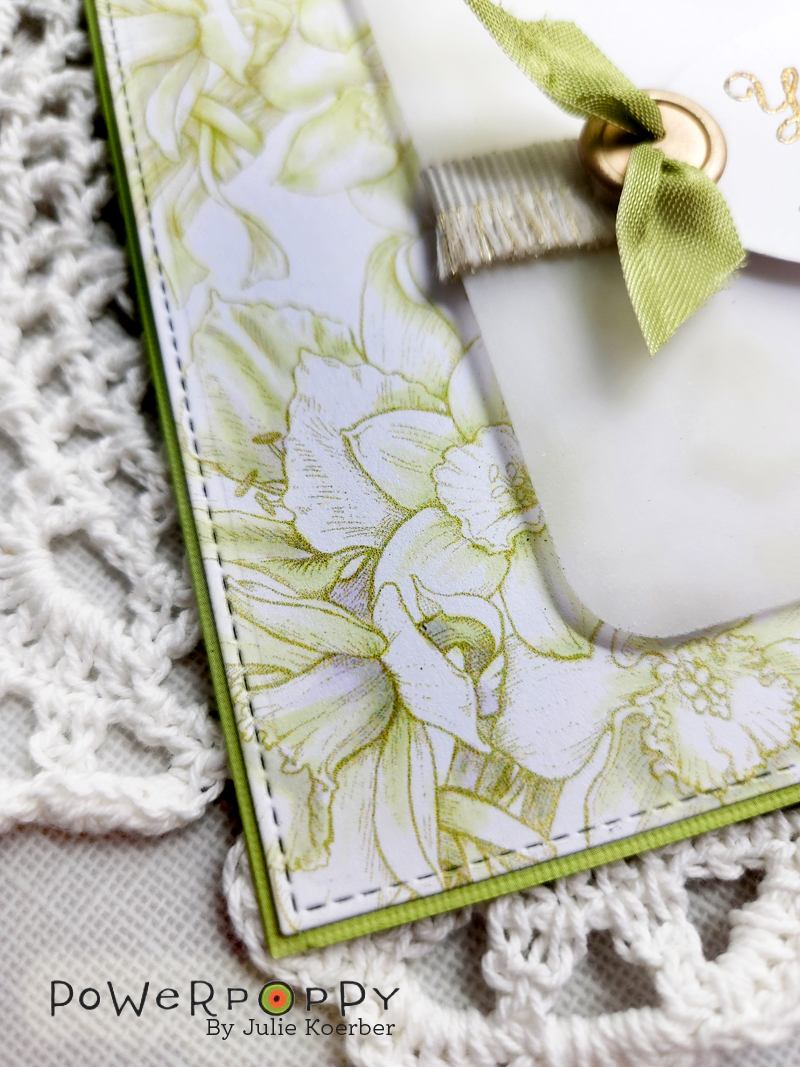
My green leaves here use layers of yellow green marker over gray violet marker. That’s something Bob Ross would do.

Then there are no green pencils on top of the marker. I’ve used a warm purple, goldenrod, and cream pencils. And it’s all going over the top of a krafty-brown colored paper which neutralizes and softens the look of everything I’ve used.

I’m not doing green on green on green.


If you want complex sophisticated color, you’ve got to add more to your leaves than green.


Want to improve your Copic Marker or colored pencil with more sophisticated color and blending combinations? Power Poppy’s guest author Amy Shulke from VanillaArts.com offers artistic coloring tips for Copic Markers or colored pencil. | VanillaArts.com | #realistic #howtocolor #copic

The colors I use are not the colors you see


The trick to upping your color game? Move away from the blending mindset. Blends are nice but light-medium-dark blending combinations are holding you back.

Think aboutlayering instead of blending.

Your markers and pencils are just ingredients, not the final color.

Brownies are made from flour, eggs, butter, and cocoa powder. But nobody wants to eat a brownie one spoonful of flour at a time. The magic happens when you make something new out of standard ingredients.

Right now, you’re not baking.

With blending combinations of green-green-green, you’re not creating anything new. You’re just displaying your greens next to each other.

Mix, stir, and layer your markers and pencils to create new colors. New colors that aren’t made in any factory. That’s the key to eye-popping, mind-blowing, creative color.


Green on green on green will always look like plain old green.


But violet under green with goldenrod on top?

Now you’re Bob Ross!


Want to improve your Copic Marker or colored pencil with more sophisticated color and blending combinations? Power Poppy’s guest author Amy Shulke from VanillaArts.com offers artistic coloring tips for Copic Markers or colored pencil. | VanillaArts.com | #realistic #howtocolor #copic

It’s only paper!


But wait, you ask... how do I do this?

Where are the tutorials or recipes for sophisticated color mixes?

Psssttt... artistic color is the result of experimentation, not tutorials.

If you want to color a Monarch butterfly, instead of scouring the internet for someone else’s Monarch tutorial, try finding a photo of a Monarch with colors that make you smile. What colors do YOU see in the photograph? Which markers or pencils look like Monarch colors to you?

Then make a few test swatches. Try some markers or pencils and see what they look like together. If it works, great! You just invented your own unique Monarch recipe. 
If not, try again.

It’s just ink. It’s only paper.

There’s no pressure here, just play and learn.

If you can blend, then you already have the skills! You know enough about markers or pencils to create your own combinations!


So here’s my Artist’s Notebook challenge for you this month...

Want to improve your Copic Marker or colored pencil with more sophisticated color and blending combinations? Power Poppy’s guest author Amy Shulke from VanillaArts.com offers artistic coloring tips for Copic Markers or colored pencil. | VanillaArts.com | #realistic #howtocolor #copic
Play with your colors. Test them out in new combinations.

Fly. Be free!

Keep in mind, freedom is sometimes a little scary. That’s okay. Acknowledge the fear remind yourself that we’re just coloring. It’s only ink, it’s only paper.

Relax and play.

Want a little boost to get you started?

If you’re not sure where to start, my Undercover Swatch series is completely free and full of wonderful quirky color combinations that are all richer and more interesting than anything you’ll create using the light-medium-dark theory. My dear friend Elena makes the Undercover swatches and two years ago, she was just like you-- new to markers and no clue what to do. She learned and now she’s helping you experiment too!

Once you’re confident about underpainting with crazy colors, experiment with crazy overcolors.
I used a gray violet marker under the green marker, so then I played with a few violet pencils to see what looked good over the top.

No combination is too weird! In this rose class using Power Poppy’s Vital Rose stamp, we went nuts with turquoise markers and pencils. There’s turquoise under the red, under the green, and then turquoise pencils over the top of it all. It’s wild and it’s gorgeous!

Rich color is the result of playtime.
Ditch the green on green on green.

Fly! Be Free!


Want to improve your Copic Marker or colored pencil with more sophisticated color and blending combinations? Power Poppy’s guest author Amy Shulke from VanillaArts.com offers artistic coloring tips for Copic Markers or colored pencil. | VanillaArts.com | #realistic #howtocolor #copic

Want to color Power Poppy’s “Monarchs and Milkweed” with me?


Want to improve your Copic Marker or colored pencil with more sophisticated color and blending combinations? Power Poppy’s guest author Amy Shulke from VanillaArts.com offers artistic coloring tips for Copic Markers or colored pencil. | VanillaArts.com | #realistic #howtocolor #copic
My Illustrated Monarch class is part of the Vanilla Livestream series for intermediate to advanced Copic colorers. 

This lesson is near and dear to my heart. I’m sharing the education & clarity concepts I used in my technical illustration career. You can use the same techniques to create accurate animal or botanical studies that any biologist or science teacher would love.

Illustrated Monarch uses Power Poppy’s beautiful Monarchs and Milkweed digital stamp set.

You can find out more about Vanilla Livestream classes here.

And I’ll see you back here next month for another glance into my Artist’s Notebook!