While I’ll get into the inspiration and how-to’s for my card today, I'm also going to share the strategies I’ve been using to tackle big coloring projects - like this big pile of poppies! So if you’ve ever needed to color a set of images over and over again—perhaps to make a set of note cards, place cards, bookmarks, or tags, but thought it’d be too difficult to keep track of colors, or would just take too long: this info is for you!
So, I had my inspiration. And I had the gorgeous Poppies stamp set in mind. But to make a poppy-covered wreath, I would need to color a whole bunch of blooms!
First, I devised a color scheme for my flowers. I wanted to recreate the iconic red Flanders poppies, so I found some images (right here on this blog! ), and saw that "red" poppies are actually shades of persimmon, with scarlet shadows and highlights of flame. I pulled enough markers from my collection to cover natural variations among the petals, and then I created a labeled sampler for reference. I usually stick it right to my coloring sheet, so it never gets lost.
I cut up some white card stock and used my MISTI to stamp at least ten of the larger poppy images from the set. I like to use a clipboard whenever I color because I find that I can hold and turn it to get the best angles for my strokes. As I chose three flowers per stamped image to color (so at least 30 flowers!), it was simpler to color first, then fussy cut. I could fit four stamped poppy clusters on the clipboard at a time.
To keep the cut cardstock pieces in place while I’m coloring, I have been using Tombow’s removable adhesive (in the green dispenser). It holds well enough and rubs off easily and completely when finished. I have used this for stamped/die-cut images too, as I prefer to color after die-cutting.
With four sets of flowers on my board, I was able to refer to earlier coloring choices as I completed sets of flowers. So I could choose to go darker, or lighter, or redder or more orange as I worked. In other words, a nice amount of “poppy” variation, but staying within the range of my palette.
A side benefit of this set-up -- I was able to try out different coloring approaches, and compare them side-by-side. For example, I colored a few flowers with an “under color” of YR000, then started in with my shadow colors (R59, R39). For other flowers, I started with my mid-tone red (R24), then went to shadows and then highlights. Other flowers got some final swipes of Y15 to pull out a brighter edge. Also, notice that my color palette now has more shades listed than when I started! I also ended up not using a couple of the colors I had originally chosen.
The centers of the flowers were filled with dark grey (BV29) and a few dots of black (110), and a bit of maroon (R89) and deep purple (V09) at the very center. I stippled colorless blender over top to add texture and keep the centers from looking like a shadowy mass. Then I topped it all off with a white colored pencil, to bring out the fine details.
As I finished coloring a flower cluster, I’d peel the card stock off of the clipboard, and then rub off the removable adhesive. Once I had made a stack of these colored panels, I grabbed some scissors and started fussy cutting. As I cut a batch of flowers, I used a Memento marker to finish off the edges.
I also took some scratch paper and started tracing some of my circle dies to get an idea of how big I wanted my poppy wreath to be. I arranged my first cut batch of flowers on the sketches so I could plan the layout for the rest of the wreath.
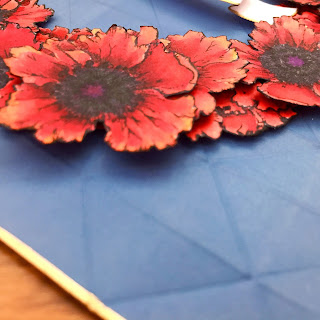
Then I cut a proper wreath base from some dark orange cardstock and adhered everything down. I used a few foam squares to add depth. Believe it or not, I only needed to cut apart two of the smaller blooms to fill in a few gaps. When I was satisfied, and everything was secure, I set the wreath aside and got to work on the remaining components of the card.
For the background, I wanted sharp edges and angles that would contrast with the organic shapes present in the wreath, something reminiscent of a medal display. I started with a 6" piece of white cardstock. Since the poppies are a such a vibrant red, I was looking for less saturated colors to use as the background. Turns out Distress Oxide ink in Faded Jeans, blended with a foam tool and very lightly spritzed with water, made the perfect matte blue to go behind my poppy wreath. I added some subtle texture by embossing the inked paper with a folder from WRMK. The repeated triangles in the design reminded me of folded flags. I trimmed the embossed square to 5 1/2”.
I used the Krylon pen again to add a gold edge. I attached the wreath to this background with glue dots and then used a tape runner to adhere the whole thing to an 110# card base.
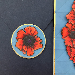
There was just one poppy bloom leftover, so I used it to make an envelope seal from a scrap of my background.
Whew! I hope you enjoyed reading today, and are feeling more ready than ever to tackle a big coloring project, or maybe you are inspired to make a patriotic card of your own, or even play around with a flower wreath. Please, feel free to ask questions in the comments!
Have a wonderful week!
Elizabeth
Supplies Used:
stamps: Power Poppy (Poppies)
markers: Copic sketch (BV29, R05, R14, R24, R29, R37, R39, R59, R89, Y15, YR000, YR07, V09, 110, 0), Memento (Tuxedo Black)
colored pencil: Faber-Castell Polychromos (white)
dies: Simon Says Stamp (Tilted Banner die)
ink: Ranger Distress Oxide Ink (Faded Jeans), Memento (Tuxedo Black), Krylon (18kt gold leafing pen)
card stock: Neenah Classic Crest (Solar White 80#, Solar White 110#), Paper Source (Persimmon 80# cover, Night 5.75" envelope)
embossing folder: WRMK (Next Level embossing folder - geometric)
tools: Minc mini, Minc foil (gold), MISTI, Tombow Removable adhesive, glue dots


17 comments:
That's some GORGEOUS coloring. What a beautiful piece of art to commemorate Memorial Day!
Thanks for the great tutorial, especially about keeping track of which markers you used! Gorgeous coloring.
Thank you Wendy and Ellen for the kind words, and thank you Ellen for letting me know what you found useful in my post! I appreciate feedback, especially for how-to type stuff.
Wow!! This is stunning!! Thanks for sharing all the tips.
Elizabeth, what a gorgeous card, and I love that you've posted this on Memorial Day...a very special day here in the United States as we remember those who have sacrificed their lives for our freedom and liberty. I loved reading your entire post and found it very interesting that you and I do a number of similar things. I also keep a little chart to the side with the colors I've used, and I also color on a clipboard...thought I was the only (weird) one to do it! Hehe! And I also love to fussy cut! What stunning coloring and arrangement for your wreath, and I love the embossed background with the banner inside...of course beautifully accented with the gilded edges. Stunning card in every way! Thanks for sharing all your tips, and I love seeing your work and posts on Instagram! Hugs!
Wonderful piece and a great bunch of tips we can all try--well done, and thank you, Elizabeth!
Thanks Berina, Essie and Cheryl for commenting (and saying nice things ;)). I hope that my post was useful in your coloring and crafting adventures.
Cheryl, I think you are the lady who encouraged me to try the Krylon pen a ways back, so thank you for that! Funny thing about the clipboard--I really want an animation desk (with rotating disc), like they have at Disney $$$. However, the clipboard is free, and seems to do the job. Very cool that you use one too :D
Thank you Elizabeth for such a striking and beautiful card on this holiday. Your time and effort in making this card is extraordinary. I have never thought to color and cut only a few flowers from a stamp, but I will certainly be doing that in the near future. I appreciated your history of the poppy as well. As a Canadian, living in the U.S., I am always telling people the significance of the poppy I wear on those days we would wear one in Canada. Thank you again for such a lovely card.
Thanks Barbara, for your lovely comment! I'm so glad you were (literally) inspired by today's post! Also, thanks for sharing your poppy-wearing experience. I had heard of the poem before, but never saw Remembrance poppies until I visited the UK. I think Remembrance Day in Canada is around when we have Veterans' Day in the US--certainly a fitting time to wear the poppy...
Beautiful and gorgeous colouring. Thank you.
Wow!! What a strikingly beautiful card. What a great way to send Memorial Day wishes to loved ones too. I remember when I was so little my mom getting hand made poppies from the veterans and my mother, sis & I wearing them proudly for weeks. I have kept the tradition <3 Your card is amazing. I thought it had crinkled dimension!! When I saw the side view flatness I was "delighted" with your amazing coloring!! (I was already amazed with your fussy cutting patience!!) Thanks for your beautiful share :) Have a lovely day ;)
Thanks Littlelamb and Wendy for reading and commenting! I've worked on getting more dimension in my coloring by going darker with my shadows than I might have originally planned. It works, but it definitely looks kinda weird for a while. Try it!
Wendy, thanks for your story about your mom and the poppies. I'm so glad the imagery is inspiring folks to share :)
Beautiful tribute to those who "gave all".
Thanks Ann, for reading and commenting!
This is STUNNING!! I like how you stamped and only colored specific flowers from each card. Would not have thought of cutting them out like this. Makes stamps more economical!!! Thanks for all your inspiration!!
Thank you for reading and commenting Nora! I gotta tell you, I almost made my post about cutting up stamped images, but then I saw that I had to color 30 (!) poppies, and figured folks might like to know how to tackle a big job like that instead. But I'm so glad you picked up some tips for your own stamps. Enjoy!
Oh my! Ditto to all the above comments. Amazing project!
Post a Comment