Color that makes your heart thump louder.
That’s why we love coloring, right? Bold and beautiful color.
So why do we chicken-out when it comes to our Copic Marker or colored pencil selections? Not only do we use the same colors over and over again but we use the same colors over the top of each other.
We love color but we’re afraid to actually use it.
I know it’s scary, but let’s talk about how to get crazy. Let’s be bold and wild!
Rich and vibrant color? Who doesn’t want more of that?

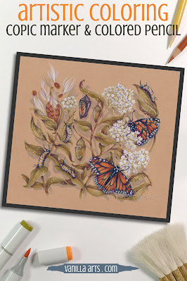
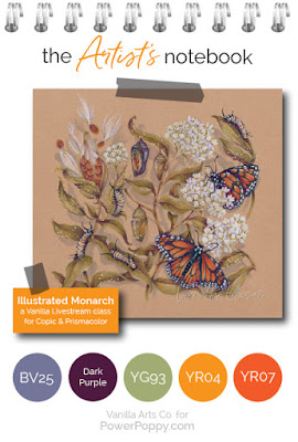
Today’s project uses Marcella’s amazing Monarchs and Milkweed digital stamp. I’ve colored it with a combination of Copic Markers and Prismacolor Premier Pencils on Stonehenge Kraft paper.
Yes, you can use Copic Markers on brown Kraft paper. That’s part of what we’ll be talking about today. The sandy brown paper is helping to set the mood for a sweltering summer scene. The Kraft paper makes my color choices look richer more complex.

Light, Medium, and Dark
As a coloring newbie, you didn’t really know what to do, so you fell back on grade school crayon habits. You colored the center of a daisy with one yellow marker or pencil. The petals were one solid color of pink. The leaves were one green.
It was fun but you quickly noticed it looked flat.
So you searched for “dimensional coloring” and found tons of online tutorials about shading with blending combinations. Blending combinations combine a light, medium, and dark marker or pencil. You learned to use combinations to add a bit of dimension to your projects.
But now what?
Now that you’ve got the combo concept mastered, why do your projects still look candy-colored?
Are you still missing something? Is there some next step beyond blending?
Yes, but the internet doesn’t talk much about the next step, does it?
Maybe you should find better blending combinations?
Or maybe you need more color? You could add more colors to the simple light-medium-dark blending combination. How about light, light-medium, medium, dark-medium, and dark?
Should you layer on another medium? A different kind of colored pencil? Watercolor? Pan Pastels?
Stop!
The deep, interesting, and complex color you’re searching for is already at your fingertips. You’ve had the tools all along.
Instead of finding new coloring tutorials, let’s look at how artists create sophisticated color.
"Add some Phthalo Blue to this Alizarin Crimson and a touch of Burnt Sienna..."
Think back to watching Bob Ross paint on PBS.
Did Bob ever say:
“Okay friends, let’s pick up this tube of ultramarine blue and squeeze it right here on to the canvas. Get a really big blob! Now spread it all around until you come to the edge of a tree or the mountain. Yes, let’s make that summer sky one big solid expanse of pure ultramarine blue!”
We loved watching Bob mix brand new colors on his big wooden palette. He’d start with green, he added a bit of violet, then a touch of sienna, and he’d lighten it up with white...
Or he’d start with a weird pinkish brownish color that he originally made for tree trunks, but then he’d add blue to create the perfect color for river rocks.
Bob knew the artist’s secret:
Pure color is pretty... but color mixtures are what makes the show-stopping beauty.
Shading green with more green
The reason why your projects look candy colored is because of the light-medium-dark blending combination process.
Unlike Bob Ross, you’re using color straight out of the tube.
You’re shading a green leaf with more of the same green.
A blending combination of YG21 - YG23 - YG25 is all the same green. It’s all YG20-something. Green on green on green on green.
Sure, you’re blending. But that’s the problem.
Psssttt… confession time.
My green leaves here use layers of yellow green marker over gray violet marker. That’s something Bob Ross would do.
Then there are no green pencils on top of the marker. I’ve used a warm purple, goldenrod, and cream pencils. And it’s all going over the top of a krafty-brown colored paper which neutralizes and softens the look of everything I’ve used.
I’m not doing green on green on green.
If you want complex sophisticated color, you’ve got to add more to your leaves than green.
The colors I use are not the colors you see
The trick to upping your color game? Move away from the blending mindset. Blends are nice but light-medium-dark blending combinations are holding you back.
Think aboutlayering instead of blending.
Your markers and pencils are just ingredients, not the final color.
Brownies are made from flour, eggs, butter, and cocoa powder. But nobody wants to eat a brownie one spoonful of flour at a time. The magic happens when you make something new out of standard ingredients.
Right now, you’re not baking.
With blending combinations of green-green-green, you’re not creating anything new. You’re just displaying your greens next to each other.
Mix, stir, and layer your markers and pencils to create new colors. New colors that aren’t made in any factory. That’s the key to eye-popping, mind-blowing, creative color.
Green on green on green will always look like plain old green.
But violet under green with goldenrod on top?
Now you’re Bob Ross!
It’s only paper!
But wait, you ask... how do I do this?
Where are the tutorials or recipes for sophisticated color mixes?
Psssttt... artistic color is the result of experimentation, not tutorials.
If you want to color a Monarch butterfly, instead of scouring the internet for someone else’s Monarch tutorial, try finding a photo of a Monarch with colors that make you smile. What colors do YOU see in the photograph? Which markers or pencils look like Monarch colors to you?
Then make a few test swatches. Try some markers or pencils and see what they look like together. If it works, great! You just invented your own unique Monarch recipe.
If not, try again.
It’s just ink. It’s only paper.
There’s no pressure here, just play and learn.
If you can blend, then you already have the skills! You know enough about markers or pencils to create your own combinations!
It’s just ink. It’s only paper.
There’s no pressure here, just play and learn.
If you can blend, then you already have the skills! You know enough about markers or pencils to create your own combinations!
So here’s my Artist’s Notebook challenge for you this month...
Play with your colors. Test them out in new combinations.Fly. Be free!
Keep in mind, freedom is sometimes a little scary. That’s okay. Acknowledge the fear remind yourself that we’re just coloring. It’s only ink, it’s only paper.
Relax and play.
Want a little boost to get you started?
If you’re not sure where to start, my Undercover Swatch series is completely free and full of wonderful quirky color combinations that are all richer and more interesting than anything you’ll create using the light-medium-dark theory. My dear friend Elena makes the Undercover swatches and two years ago, she was just like you-- new to markers and no clue what to do. She learned and now she’s helping you experiment too!
Once you’re confident about underpainting with crazy colors, experiment with crazy overcolors.
I used a gray violet marker under the green marker, so then I played with a few violet pencils to see what looked good over the top.
No combination is too weird! In this rose class using Power Poppy’s Vital Rose stamp, we went nuts with turquoise markers and pencils. There’s turquoise under the red, under the green, and then turquoise pencils over the top of it all. It’s wild and it’s gorgeous!
Rich color is the result of playtime.
Ditch the green on green on green.
Fly! Be Free!

Want to color Power Poppy’s “Monarchs and Milkweed” with me?
My Illustrated Monarch class is part of the Vanilla Livestream series for intermediate to advanced Copic colorers.
This lesson is near and dear to my heart. I’m sharing the education & clarity concepts I used in my technical illustration career. You can use the same techniques to create accurate animal or botanical studies that any biologist or science teacher would love.
Illustrated Monarch uses Power Poppy’s beautiful Monarchs and Milkweed digital stamp set.
You can find out more about Vanilla Livestream classes here.
And I’ll see you back here next month for another glance into my Artist’s Notebook!
Illustrated Monarch uses Power Poppy’s beautiful Monarchs and Milkweed digital stamp set.
You can find out more about Vanilla Livestream classes here.
And I’ll see you back here next month for another glance into my Artist’s Notebook!


4 comments:
So many wonderful tips in here, loved this information so much. A BIG thank you for sharing this 😊
Beautiful, I love it! Thanks for sharing.
Marisela Delgado said: Wow! Absolutely gorgeous! I use color pencils only for my cards. Granted, you make me want to give up! haha haha I choose to believe that if I keep at it, maybe one day I will be awesome like you! 😀😀😀😀 Gorgeous images! mariandmonsterd@yahoo.com
Your tips are as always great Amy, I love your colouring.
Thank you so much and have a wonderful day.
Post a Comment