Showing posts sorted by relevance for query foil. Sort by date Show all posts

Monday

Inspire Me Monday: Making Japanese Paper-Inspired Designs with Digital Stamps


Hi there! Elizabeth Zaffarano here with another edition of  Inspire Me Monday!

Today, I’m going to share techniques and tips for creating your own chiyogami-inspired designs with digital stamps, Copic markers and foiling!

Chiyogami paper (sometimes called Yuzen paper) is that brightly-colored and sometimes busily-patterned-and-gilded paper from Japan.  The “good stuff” is laboriously silk-screened over and over again with all of the various colors to create a very delicate and detailed look.
Examples of chiyogami from my own collection
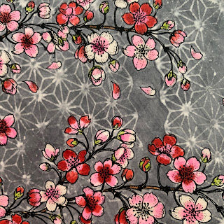
When Marcella released the Blossoming Cherry digital stamp, it reminded me of that beautiful paper. I wanted to see if I could create my own pattern, then color and foil it to make a similar design on card stock (spoiler alert: it came out very pretty). Then, when Miraculous Mushrooms came out, I wanted to do it all over again!


While I haven't needed to set up my own print shop (yet), creating these designs took several steps, some specialized equipment, and a lot of Copic ink and coloring! But it can be fun to experiment and make your own custom designs.
Because this project involves several techniques, I created headings to separate each part of the project.  This way, you can skip to the section(s) that most interest you.

Creating the Digital Image and Printing
To create the cherry blossom pattern, I opened my word-processing program (Pages) and overlapped different sizes of the cherry-blossom branch across the page.  I also isolated a few blossoms and petals from the design. There's a wonderful tutorial on how to do those things HERE.  I've found that word-processing programs have come a long way in terms of what image-editing tools are provided right in the software.  You can crop, remove the background, mirror and flip, as well as resize. So you might be able to do everything you want in Word or Pages.
Blossoming Cherry in Pages
For the mushroom pattern, I just imported the digital image into my word processing program, and copied and pasted a few different sizes.  I also flipped a few of the images (there’s a button for that!), for variety.  Using the line tool, I drew some dashed lines to add some motion to my pattern and provide a border for different background colors.

Miraculous Mushrooms in Pages
I printed my design on a laser printer, on 80lb Neenah Classic Crest Solar White card stock.  If you want to foil your design, you will need to print with a laser printer, or use a photocopier that uses toner. Toner is what makes the heat-transfer foil stick to the image.

Coloring the Design
Yes, you can color a laser printed image with Copic markers and then foil right over your coloring. And you don’t have to worry about staying in the lines, as the toner is apparently unaffected by the alcohol ink in the markers. It’s a technique I use all the time, and is a great way to get shiny effects from digital stamps.

coloring the background first

When I'm coloring before foiling, I try to shade a little simpler and bolder than usual.  This is because foil thickens the line work ever so slightly, and subtle shading or fine details can get lost.

coloring the main images first

While some chiyogami papers have very light backgrounds, many designs use darker colors.  If you have a collection of neglected deep hues, now's the time to use them.

Adding Background Patterns with Blending Solution 
Are you wondering how I got the subtle(-ish) patterning in the gray and blue backgrounds I colored? I used a technique that might be a little controversial, because I stamped with Copic Blending solution, which is 77% ethyl alcohol.

So I’ve read that alcohol is considered detrimental to the material that stamps (red rubber and clear varieties) are made of.  I’ve also viewed posts and videos with folks using alcohol on their stamps to no ill effect. Perhaps it takes time to see any changes?

That said, I do not recommend you try this technique with your most treasured/irreplaceable stamps! I’ve personally not seen any changes to the red rubber stamps that I’ve been using with blending solution for the past 6 months. I have not tried this technique with clear stamps and would not recommend it.


To ink up my stamp with the Copic blending solution,  I used a foam blending tool, and squirted a bit of the blending solution onto the foam.  Then I quickly dabbed it onto my background stamp.  I pressed the stamp onto my colored background and held the stamp on there for several seconds, then lifted up. When you lift the stamp, a very faint “bleached” impression of the stamp design will appear.  Wait another minute, and the design will continue to lighten and appear more distinct.

As soon as I finished stamping, I washed my stamp off with soap and water.


This is a technique that you’ll definitely want to practice first. I just colored some scrap card stock with at least 2 layers of ink and then compared pressing the stamp for 5 seconds, 10 seconds etc., until I got the desired look.  Tip: If you don't want to have to mask-off any already-colored areas, color the background first, then apply this technique, and then color the rest of the image.  I did not do that for the cherry blossoms, and I ended up having to recolor a few areas!


Do you want that pretty background look but don’t want to worry about alcohol on your stamps? You may achieve a similar effect using a stencil, and applying the blending solution with a foam blender through the openings.

Foiling
Once the designs are completely colored, it's time to foil, using the heat-transfer technique.  This part requires heat-transfer foil and a laminator or a Minc machine.  For the cherry blossoms design, I foiled the entire sheet at one time, using silver foil.  For the mushrooms, I cut my 8.5x11" sheet into shapes and then foiled them separately. I needed smaller shapes because I wanted to try out a more matte/satin finish gold foil that came in a 6x6" package.


I followed my usual process of using a parchment paper carrier sheet, with a layer of card stock in between to provide stiffness, and set my Minc machine to heat setting 2.  The foil sets right over the Copic ink!


Finishing
I haven't decided what to do with the mushrooms yet, but I made the cherry blossoms into at least one completed card.


I'm normally not a compulsive scrap saver, but there was a lot of time and ink put onto that card stock! Larger scraps can be cut into borders and smaller scraps can be turned into fancy stickers.

These scraps can be foiled later
Thanks for joining me today! Feel free to ask questions in the comments!

Inspire Me Monday: Vellum Overlays


Hi everyone, Elizabeth here and welcome to the latest Inspire Me Monday! Experimentation was the name of the game for this week’s post.  Well that, and the fact that I bought a whole bunch of vellum on sale, and therefore decided to put my laser printer and foiling machine through their paces! I ended up making two Thanksgiving cards that contrast warm gilding with a frosty glow, perfect for that late November holiday.


Please keep in mind, while I’ll be talking about printing and foiling in my post, the design concepts of these cards can absolutely be repeated with your clear stamps and heat embossing: So hopefully there’s a bit of something for everyone today. Also check out a great introduction to lots of other techniques using vellum right HERE on this very blog.


For today's cards, I chose to work with the Bittersweet Wreath digital stamp. While I was initially attracted to the autumnal theme, I also realized that if I was going to layer vellum over my coloring (thus obscuring it), I wanted an image that didn’t require too much time-consuming and subtle shading that folks might not get to see!

I imported the wreath image into Pages (my Mac word processing software), and sized it to about 5.25”/13.4 cm high.  I wanted to place the Happy Thanksgiving sentiment in the center of the wreath, so I needed the wreath to have a big enough opening to accommodate that (but not end up being too big to mail). Here's one go at sizing the various images from the stamp set.


I printed my wreaths on both 80# Neenah Solar White card stock and 29# vellum. PLEASE NOTE: You’ll need a laser printer to do foiling. I got the best printing results from using 29# vellum, vs. a heavier 48# vellum.  The heavier vellum printed up with streaky toner lines obscuring the images.  This is the opposite of what I expected, because when you heat emboss a stamped image on vellum, a heavier paper weight keeps the heat tool from warping the vellum as you melt the embossing powder. Lesson learned!


Tip: If you have a printer that feeds from the front - so the paper path makes a 180 degree turn to exit - you can usually get good results with up to 80# card stock by putting one sheet of card stock (by itself) into the regular paper tray.  This seems to create a less severe curve to the paper than feeding via the manual slot or on top of a stack of paper in the tray. I manage to successfully print on all sorts of heavy paper with my ornery HP laser printer via this method.

While I heated up my foiling tool (the Minc mini), I quickly colored my bittersweet wreaths. There are lots of tiny berries and leaves in the design (that's what makes it look so delicate!), but I filled them in with dots of color, and the image came to life. I found that varying the shades I used for each component made the wreath look a little more true to life.  Not all berries ripen the same way, and not all leaves mature and fade at the same time.


I used orange-reds for the berries, and shades of green for the leaves. But I wanted to incorporate one more color, in order to create a softly lit, but still earthy background. At first I wanted to try sponging some Antique Linen distress ink, but I couldn’t get the coverage I wanted.  Instead, I returned to my copic markers and chose a pale yellow, pale peach and a pale yellow green and blended tiny dots in the background to approximate that same shade.

Coloring done, I started foiling the images printed on vellum.  I like to use parchment paper as my carrier, and for flimsy papers, like the lightweight vellum, I’ll add a shim of card stock.  I used Deco Foil’s Rose Gold foil, and heat level 2 on my Minc Mini.


You can see that I also foiled - but ended up not using - a sentiment that came from the same stamp set.  Since I had the Minc out, I figured I’d foil some extra pieces.  These sentiments can be saved for another day.


Now it’s time for layering.  For the card with the orange frame, I used the whole foiled image.


I anchored the vellum on top of the copic-colored card stock with four tiny drops of multi medium matte.  I had to use tiny clothespins in the corners until the glue dried, but then it held the vellum in place well.  While the glue dried, I made tiny dots of Liquid Pearls on non-stick craft sheet. When these dried, I’d adhere them to the same corners of the vellum, to hide any trace of the glue.  You could make the Liquid Pearl dots right on the vellum and save a couple of steps, but I wasn’t brave enough for that.


The vellum doesn’t sit perfectly flat on the card beneath, so the image of the wreath changes in intensity, depending on how you grip the card. You can also peek under the vellum to see the the intense color below.


If you want to show off more of your coloring efforts, you can choose to use a partial vellum overlay, and I did this with the green-framed card.


Most of the time, I’ve seen folks wrap the vellum around the card front, and adhere the ends to the back. This solves the problem of lines of adhesive showing through the translucent vellum.  But, in the spirit of experimentation, I decided to run my foiled and cut vellum through my Xyron.  This produced a thin layer of adhesive edge-to-edge on the bottom of my piece, which I could then stick onto the card - right over the printed and colored wreath. Let me tell you, lining up the designs was not for the faint of heart! The adhesive was so sticky, and I’m not sure I managed to get every part of the wreath perfectly aligned.  I think next time, if I want a seamless and edgeless look, I will use this particular method with simpler designs or sentiments.


I completed the cards by attaching my card fronts to larger squares of colored card stock.  The green card got a layer of fun foam between the card front and background.  Then I attached my finished card fronts to scored and folded 80# Neenah card stock.


Bonus: When you’re foiling, you’ll usually end up with negative images left in your piece of foil. If these leftovers are in good shape, it’s possible to upcycle them into card fronts! For these coppery examples, I spritzed a little spray adhesive onto the silver side of my leftover foil, then quickly flipped and smoothed them onto some white card stock. I grabbed a couple of large open-shape dies, and die cut through the layers!


Four cards for the price of two  - not too shabby!


Supplies Used:
Power Poppy digital stamps: Bittersweet Wreath
Copic Markers: R05, R08, YR09, YR18, Y15, Y17, G43, YG1, YG67, YG93, YG00, Y11, E50, 0
Foil: Rose Gold by Deco Foil
Vellum: 29# transparent vellum from Paper Source
Cardstock: 80# Solar white by Neenah (card fronts, card bases, 80# Spruce/80#Persimmon from Paper Source (card backgrounds)
Other supplies: Liquid Pearls in Copper Pearl, Xyron 9” creative station, Ranger Multi-Medium Matte.

Tuesday

Art Imitating Life

Hello sweet peeps! Are you ready to see what creative confetti we throw into the air in the hopes of inspiring YOU in your stamping space? Well, I sure am! This challenge is for those times when you see things in nature that kind of give you pause. Is it a spectacular sunset? A blossom illuminated with light? Or, in my case, a creature that just wears a work of art on it's body each and every day. 

Let's get right to it so that you can see what I mean! 


I was sitting outside not too long ago when I turned my head and spotted this little guy below! Isn't he something else? Look at that iridescent sheen! Trust me, he was even more lovely in real life. Not quite sure what kind of beetle he is -- a jewel beetle perhaps? --  but... he's kind of awesome! I knew he would be the perfect inspiration for a card. :-)


So, after staring at his beauty for a bit to see which stamp set would really work, I settled on this one -- Big Sexy Leaves --  I know. It's perfect, right?

And then, I decided I would make this card a really sweet and simple creation -- something that didn't require a ton of coloring and one that could just "sing" on its own! So, I stamped the leaves, scanned the image and then printed using my laser printer so that I could add a little razzle dazzle in the form of some gold foil! I should mention, I decided to print this image on some dark green card stock -- to bring out its inner beetle!


I also chose the sentiment from this digital stamp set -- Hyacinth Bulb in Glass. I printed this on black card stock so that the sentiment would really pop. See?


It's funny, the foil looks like it is variegated. It isn't. It's just plain old gold foil but because I took the shot outside, You see the sky and my silhouette casting a bit of a shadow so that it looks like a multi-colored foil. Oh, one more note! I die cut my sentiment panel using a stitched die and decided after the fact to layer it over top some mirror gold card stock so that you would see some gold peeking out beneath the little stitched marks created by the die.

To accent, I added some gold cording and some iridescent sequins to bring the beetles shimmer to the forefront of my creation.


And that, my friends, is it! Art imitating a real, live beetle! ;-) So go out with eyes wide open and see those cool things around you. Snap a photo and use it as inspiration to create! I will love seeing not only your cards but the photos as well! And, when you are done, don't forget to link up your creation. There's a $25 gift code on the line folks! One lucky stamper will be chosen at the end of the month -- so keep creating with us each week!


Happy Tuesday & Happy Creating! 

~Julie
Creative Confetti Thrower


Monday

Inspire Me Monday: Quick & Easy Gift Idea

Howdy everyone!  Welcome to Inspire Me Monday!  I’m Allison Cope, your hostess this week and today we’re talking a little bit about that last minute gift idea.

I’m always on the look out for a few items that I can tuck away somewhere in the house so that I know I have as a last minute gift to grab.  I especially love edibles in fun and funky tins or cool containers.

For today, I’m featuring some festive digital stamps we offer here at Power Poppy.  I’m using Hollyberries, Wreath: Felt Leaves & Fruit and Wreath: Succulents & Baubles.  You can see both of these wreath stamp sets plus TWO more in our fun Wreath Multipack CollectionPsst... it's on sale right now!!!

So join me today while I jazz up a simple candy tin for a quick and easy gift using these fabulously festive digital stamps…

After all my videoing was complete, I broke down and coloured up my foiled creations for my tins.  So I used my Copic Markers to quickly colour up my holly and parts of my pretty wreath.  I used some bold yellows and soft greens to complete it.


Copics Markers: Y15, YR23, E47, YG00, G43

I think my little tin topper turned out cute and was so quick to make!

So the next time you’re looking to jazz up a gift and make it your own, think digital stamps and fancy foil!

Don't forget to play along with our Power & Spark Challenge this month.  For more details, please visit HERE.

Thanks for joining me today!  Have a great time decorating and personalizing your holiday gifts this month.  Happy Holidays all!

~ Ally ~

stamps: Power Poppy (Hollyberries, Wreath: Felt Leaves & Fruit, Wreath: Succulents & Baubles)
paper: XPress It (Copic), Green Foil Cardstock (DCWV)
dies: Stitched Circles (MFT), Scalloped Circles (Spellbinders)
foil: Green (iCraft Deco Foil), Gold, Teal (Heidi Swapp)
ink: Copic Markers

Tuesday

Gilded Hues!

Hello sweet peeps & welcome to yet another set of color cues that are ripe to use for all of your creative and crafty endeavors! Today, I not only have the hues for your viewing pleasure, but a sneaky peek of a fun little technique that I am going to share for Power Poppy's next Inspire Me Monday! So... so much to stay tuned for!

First, let's check out the color palette for this week's.....

So, what's this little sight above? Well, according to the fabulous Ms. Marcy, it's a photo she snapped just a few weeks ago showcasing the Yellow Bishop's Hat and Virginia Bluebells that were sprouting up all over her "terrarium" a.k.a. her backyard garden! Don't they just look like they are reaching up to the camera to say "Well, hello there?" ;-)

SO, HOW DO YOU PLAY ALONG? Well, my friends, it is as easy as 1-2-3! Simply use all three colors in your next creation and then, don't forget to link up your fine work using the linky below! Just that simple! 

Today, I am sharing a little bit of an experiment using Deco Foil, Copics, and a little digital manipulation! If you want the full low down on how I created this card, you'll have to stay tuned for a step-by-step tutorial coming your way next Monday. But, for now, here's a peek at what I whipped up using the color palette above! 


So, as you can see, I took Power Poppy's Graceful Still Life and did a little "surgery" on it before I colored it up with Copic Markers. Word art is really big in stamping right now and I knew I wanted to try my hand at doing some digitally. After I was done creating this image, I grabbed my Copic markers and used these ones below to color it up! I really wanted to create an image with an antique feel so, most of the colors are dusty in tone! The earth tones were used to color up the letters and bring out that sandy color in the color palette. The flowers are the purple in this week's hues and my card base is the lighter shade of purple in the Hues to Use!


And, here's a closeup so that you can see how I used the Deco Foil! I will say, I didn't let my laminator warm up long enough and you can see that the coverage of my foil isn't perfect. In real life, you can't tell there are spots missing -- it looks really crisp -- but in this photo-- you can see them!


And that, my friends, is it! Like I mentioned, be sure to come back and see how I created this card and a few others! And be sure to put these colors into play and join me for this week's Hues to Use! You never know when a card or creation might have us asking you to guest host this weekly challenge! Wouldn't that be fun?

So get those fingers inky and join me!
~Julie


Friday

The Last Bit of Vibes for 2018!


Hi-dee Ho Sweet Power Poppy Fans! It's Friday and I have to tell you, it's been a few weeks since we've thrown a handful of good vibes your way. So, I think I know the answer to the question, "Are you ready?" I know I am! Did you have a beautiful holiday and are you looking forward to ringing in the New Year? At Power Poppy, we sure are! And so, let's throw this last little bit of eye candy your way for 2018 to inspire you all as we step into a brand new calendar full of creativity!


1. Candy Crush! This creation by Lori Johnson took my breath away. I mean, come on! Look at the depth she created in this little duo of candy canes? And that plaid on the bow? I mean, really! Lori, you killed it girl! If you want to give this illustration a try with your own special twist of artistry, all you need to do is click HERE to pick up and download your own Candy Cane Classic! Christmas might be over but Candy Canes are always en vogue! ;-)

2. For the Love of Foil! Kelly Rix just discovered a wonder with digi stamps and we thought her results were so awesome, we had to share! Check out THIS creation! She used the Chickadee in Barberry digital stamp and discovered that if you print using a laser printer -- you can foil it! Just in case you want to get in the know on this fabulous technique, click HERE for a whole slew of tutorials on the Power Poppy blog about adding a splash of foil a.k.a. razzle dazzle to your cards and creations!

3. An Attitude of Gratitude This time of year it seems we need an abundance of "thank you" notes to have on hand. While Kathy Jones created this thank you for the 100th Anniversary of Armistice Day -- a day to reflect on the sacrifice of so many called to fight for their countries -- I thought her design was so classic and beautiful. I love the stenciled backdrop and who doesn't just find their jaws dropping with Kathy's Copic coloring? I thought it was a great bit of inspiration for the sea of thank you notes that, if you're anything like me, probably need to start making soon!

4. Fur Real! A few weeks ago, we shared some well wishes for the talented Ms. Amy Shulke, who is recovering from an arm injury. It was so bad, it sidelined her online classes for a bit! We hope she's feeling better! Thankfully, her next class is on the calendar for January 18th.You can check it out HERE using Power Poppy's digital stamp Christmas Corgi and learn some mad skills on how to color up animal fur. If you can't make the class, Amy has some AMAZING tips on how to color animals realistically in her blog post HERE. She also kindly tells us all what to look for in an animal stamp, before we buy, to get the best possible coloring results!

5. Thanks for the 2018 Memories! I know I speak for Marcella when I say "Thank You!" to all of our fabulous Power Poppy Customers. You wow us on a regular basis with the things you do with Marcella's images. I know for a fact, she is 100% giddy whenever she sees your creative takes on things! We want to thank you, our wonderful customers for making this year --- and every year for that matter -- so fulfilling for all of us! Cheers to you in 2019! We can't wait to see the creative boundaries you'll break through this coming year! Can't wait!

This is normally part of the post where I share some of the wonderful links to our beloved Bloomies so that they can show off their works of art that they whipped up during the week. I am so glad to be able to say that they are taking some time off to be with loved ones and make some memories! They will all be back soon! Promise! Just so you know -- Inspire Me Monday is taking a creative hiatus until the first full week of January and our Creative Confetti Challenge will be back January 8th! So hold tight and know we....

WISH YOU A WONDERFULLY HAPPY NEW YEAR! 

Until we meet again in 2019! Blessings to you and yours!
~Julie 

Monday

Inspire Me Monday: Digital Ink!


Hello all and welcome to another edition of Inspire Me Monday! Since I love working with and fiddling with digital stamps, today I thought I'd share a few 10-minute cards that involve -- no coloring! That's right, no coloring! That is, unless you want to! Today, we'll be dabbling in a little "digital ink!"

I love bright, bold colors on my cards and this technique lets your printer do all the work so that you could make a bright and cheery card in a jiffy! 

Let's take a peek at what we'll be making today!


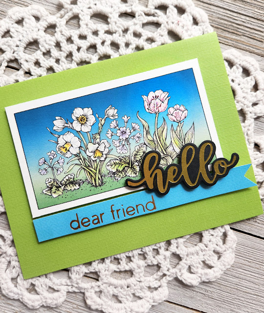
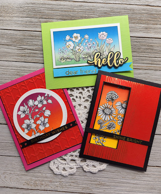
I used these digital stamps: Orchid Cascade, Spring Border One and Asters Abuzz

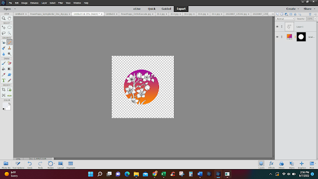
So, how did I do this? Well, you'll need photo editing software that allows you to add some effects. My tutorial today will share tips using Photoshop Elements. It's a budget version of Photoshop and I really love it for digital stamps! 

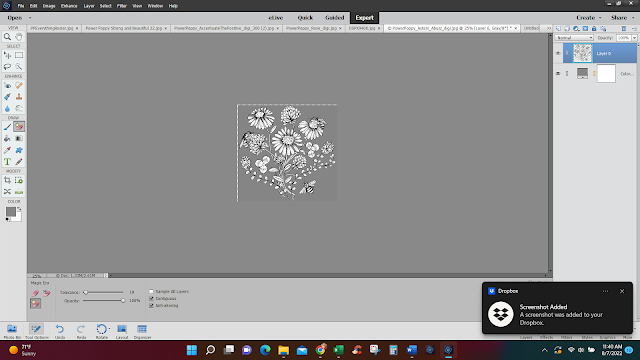
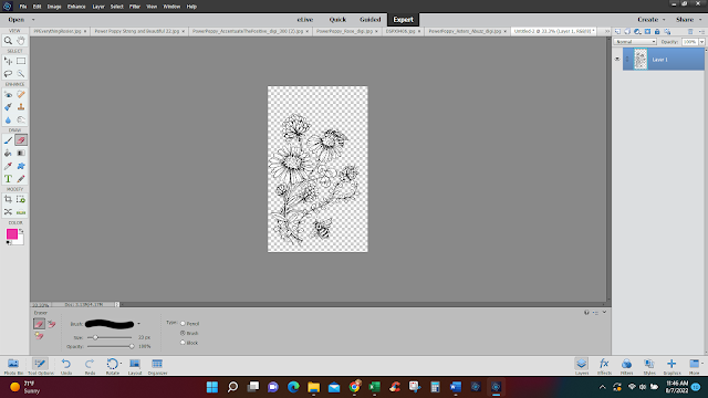
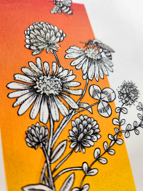
I started by opening up the digital stamp Aster's Abuzz and erasing the background behind the image. I used the Magic Eraser tool and just clicked around until the background was gone. 


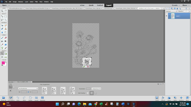
From there, I cropped it down into more of a rectangle and erased the part of the image that hung over the cut line. 


I also cropped the bee out and then, by dragging and dropping, managed to arrange him more at the top of the image instead. 


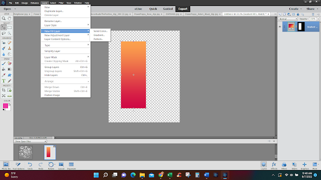
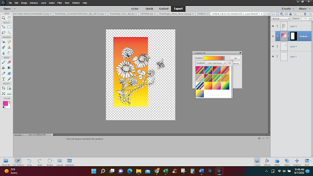
Now it's time for our digital ink! I created a canvas that was the same size as a card front. Using the rectangle marquee tool, I created by rectangle, clicked on "layer" and then clicked on "new fill layer" and "gradient." I chose this red to orange gradient to serve as the backdrop for my aster cluster! 


From here, I just dragged the rectangle over to my aster image and situated it right behind. 


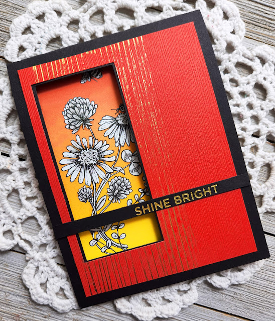
And, here's a look at how this card shaped up! I created a little window because I wanted the inside to be a kind of "surprise!" You can see that I also added a bit of sparkle thanks to some foil accents and a foiled sentiment. TIP: When you print your image, make sure that you are on "best detail" for printing. I know every printer has this type of version. It just ensures that the color is laid down on the paper in the highest saturation. 


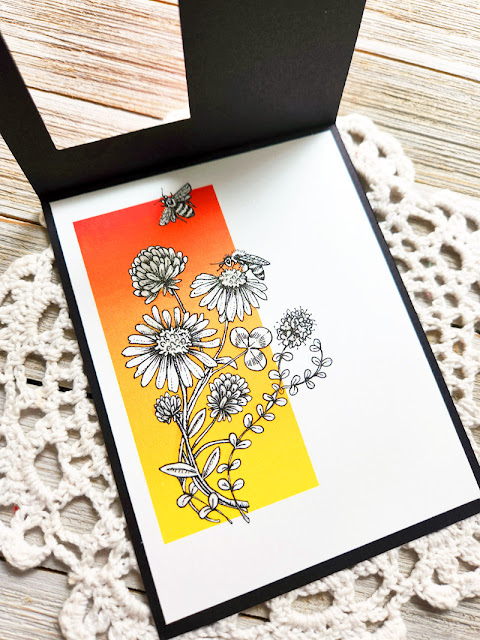
Here's a peek at the inside! 

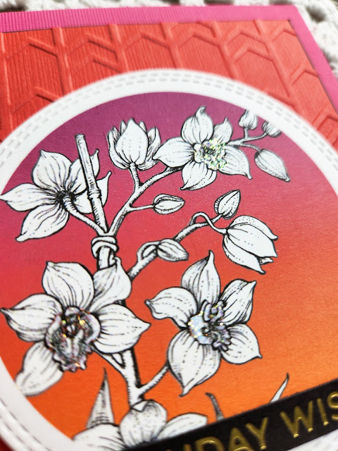
And, you can see that I did try to create a little razzle-dazzle by coloring the image with Wink of Stella clear glitter brush pen. It really sparkles in real life - just adding that little bit of interest! 


See that bit of sparkle? 


And, here are some more ideas! 


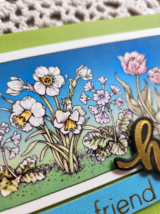
For this image, I created the rectangle and then used the "stoke" accent around my gradient box just for a little extra pop. I also splashed some color on the flowers and stems. This is still a 10-minute creation because I literally scribbled on the color, for just a soft effect. The sentiment was created by some of my foil dies. 


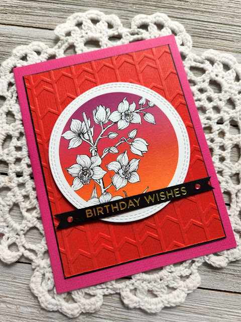
For my last card, I did want to explain how I got my image in a circular shape. You simply open up the image, remove the background and then, using the circular marquee tool, you can cut out a portion of the digital stamp in a circular shape. From there, I created a circle using my marquee tool and then using the same steps as the rectangle shape I created, I added a new fill layer in gradient color. 


And here's a look at how my finished card ended up!


For this creation, I added some pizazz with an embossed background, some rhinestones, a foiled sentiment and then, I added some stickles to portions of my orchid just to make it pop a bit! See? 


And, here's one last look at all three cards together!


I hope you enjoyed today's tutorial and maybe learn a new technique that you hadn't even considered before -- digital ink! Learning little tips and tricks like this sure helps to give your digital stamps a little more longevity. You never really get bored of them! Why? Because they can be used in so many different ways, they can evolve to serve so many different "styles!"

Thanks, everyone for stopping by! I hope you have a fabulous and creative week!